Forum Replies Created
-
AuthorPosts
-
Hey Shane,
Thanks for the login, when I looked at your header it was “sticky” that is that it stays visible after scroll, so after looking at your mockup and our documentation demo I assumed that you didn’t want this so I removed it so the header scrolls up now.
I also made some other tweaks, please clear your browser cache and check.Best regards,
MikeJanuary 26, 2020 at 2:41 pm in reply to: Can you please help me to get rid of the lines at (1) and remove the blank space #1178498Hey diefleischerei,
Thanks for the screenshot and link, Please try this code in the General Styling > Quick CSS field or in the WordPress > Customize > Additional CSS field:#top.home .main_color .avia-content-slider .slide-image { background: transparent !important; } #top.home .avia-smallarrow-slider-heading.no-logo-slider-heading { display: none !important; } #top.home #text > div > div { padding-top: 0px !important; } #top.home #av_section_1 > div > div > div > div > div { margin-top: 0px !important; }After applying the css, Please clear your browser cache and check.
Best regards,
MikeJanuary 26, 2020 at 2:18 pm in reply to: set the same font for different languages frontpage #1178493Hi,
Thanks for the login, I can see your bold or “strong” tags in your newest post in Chrome, so I believe you are experiencing a caching issue, for me, the easiest way to clear the Chrome cache is to hit “F-12” (on Windows) to open the developer console and then right-click on the reload button next to the address bar and choose the “Empty Cache and Hard Reload” option.
I tried the create a test post to see your text color issue, I used the Advanced Layout Builder and added a “text block” element, but when I clicked preview the color was black, I also tried the default wordpress editor, but that was also black.
But the text in the “element preview” panel did look a little gray, but this part of the element doesn’t show the colors 100% correctly, it is only meant to give you an idea. Is this what you are talking about, or do you mean after it is published?
Can you create a test post and publish it so we can see the gray text? This will let us see what css is being applied and fix it for you. Sometimes depending on the base demo you used, the “em” and “blockquotes” might be a gray color but we can correct this with the Enfold Theme Options > Advanced Styling options.Best regards,
MikeHi,
Glad we were able to help, we will close this now. Thank you for using Enfold.For your information, you can take a look at Enfold documentation here
For any other questions or issues, feel free to start new threads in the Enfold forum and we will gladly try to help you :)Best regards,
MikeHi,
Well, I tested the plugins but it doesn’t help for this, that is they make it sticky but don’t move the sidebar to the top. But if you ever need a sticky element I recommend Sticky Menu (or Anything!) on Scroll, it works the best.
So I wrote this script to make a sidebar sticky and fixed it to the top of the page over color sections, but I recommend using columns inside of the color section so content is not stuck behind the sidebar unless you want an image to stretch behind the sidebar. You should be able to adjust some of the css inside of the script to suit your needs. Try adding this code to a “code block” element on every page you want this to work, this might be better than adding it to your functions.php and have it accidentally affect some other pages.<script> (function($){ $(document).ready(function(){ $('.inner_sidebar').css({ "top":"130px", "position":"fixed", "background-color":"#f8f8f8", "right":"5px", "padding-left":"20px", "padding-top":"20px", "z-index":"509"}); }); $('.units.alpha').css({ "border-color":"transparent"}); $('#top #wrap_all #footer').css({ "z-index":"0"}); })(jQuery); </script> <style> #top #wrap_all #footer { z-index: 0 !important;} </style>
Best regards,
MikeHi,
Yes this is true, you can try adding the widget element inside of the color section to fake a sidebar, but then it won’t go down the full page. Or perhaps you could try a sticky plugin like WP Sticky Sidebar to force the sidebar to “float” over the color section.Best regards,
MikeHi,
Sorry for the late reply, I was able to apply the color overlay to the grid row that had a background image, but I couldn’t also add the special heading or a text block to the grid row as it though it off, so I’s not very useful. You can give it a try by adding the custom class “grid-hover” to a grid row cell and try this css:.grid-hover:hover:before { content:""; display: block; height: 100% !important; visibility: visible !important; top: 0; left: 0; width: 100%; background-color: rgba(235,111,49,0.9)!important; } .grid-hover { padding: 0px !important; }I did find in our documentation that you can get closer to this effect with a title caption in the portfolio grid

this is the css I tested:/* Portfolio overlay with title */ /* Disable default animation */ #top .grid-entry a:hover .image-overlay .image-overlay-inside { animation: none; } /* Overlay color */ #top .grid-entry .image-overlay { background: rgba(235,111,49,0.9)!important; } /* Remove hover icon */ #top .grid-entry .image-overlay .image-overlay-inside:before { display: none !important; } /* Remove default title below */ .grid-content .avia-arrow, #top .grid-entry .grid-content { display: none; } /* Display title on hover*/ .grid-entry a:hover:before { content: attr(title); position: absolute; width: 100%; z-index: 1000; text-align: center; opacity: 1; font-size: 18px; color: #ffffff !important; top: 50%; transform: translateX(-50%); animation: avia-fadein 0.75s 1 cubic-bezier(0.175, 0.885, 0.320, 1.275) !important; }Hope this is helpful.
Best regards,
MikeHi,
Thanks for the link, when using a color section, or any full-width element the sidebar is forced below it, so in this case remove the color section and just put the video at the top of the page.Best regards,
MikeHi,
The issue is coming from this css:#menu-cja-menu-left { position: absolute; }to correct please add this css:
@media only screen and (max-width: 767px){
.responsive #top #wrap_all #header_main .container {
    height: 30px !important;
}
#top #wrap_all #menu-cja-menu-left {
    position: relative !important;
}
}
After applying the css, Please clear your browser cache and check.
Best regards,
MikeHi,
Thank you for the link, I found “not an option” as bold, here is what it looks like for me:

was there also other ones? Does it not show only in preview before it is published?
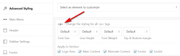
You also said that the text is white by default? What is the color set at Enfold Theme Options > General Styling > Main Content > Main Content font color

also check Enfold Theme Options > Advanced Styling > p in case the color was set there:
If this doesn’t help please include an admin login so we can investigate further.Best regards,
MikeHey smarta-brett,
Sorry for the late reply, and thanks for the screenshot, but we are unable to view the page in question to test without a login, please include an admin login.
Did you also add the css from the solution post?.single-product-main-image { width: 25%; } .single-product-summary { overflow: hidden; width: 45%; float: left; margin-right: 5%; } .single-product .sidebar { width: 25%; }If you didn’t that could be why it’s not working for you, or perhaps try clearing your browser cache.
Best regards,
MikeHi,
Glad to hear :) If you have tried adding your buttons to other products and the buttons continue to work properly, then perhaps we can close this thread?Best regards,
MikeHi,
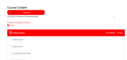
I took a look at your page and found that your “learn dash” css requires the class “learndash-wrapper” for the section in question, but this class has not been applied. I don’t see any errors for this and I don’t see a way to add the class properly though the backend, and since I have not worked with this plugin before so I recommend asking the learn dash support if they have seen this before.
I can not imagine anything in Enfold that would remove any classes. I do see that you have a custom “course.php” in your child theme that I assume is used to create this page but the other classes are not matching up so I don’t want to try editing it. Perhaps whoever created this for you will be better suited to modify it.
But if none of this helps you I wrote this script to add the class for you based on the page you linked to. Try adding this code to the end of your child theme functions.php file in Appearance > Editor:function add_learndash_wrapper(){ ?> <script> (function($){ $(document).ready(function(){ $(".ld-item-list.ld-lesson-list").addClass("learndash-wrapper"); }); })(jQuery); </script> <?php } add_action('wp_footer', 'add_learndash_wrapper');expected results:
Best regards,
MikeHey jelle,
Sorry for the late reply, we can’t see your settings without logging in but when you edit your contact element you can look under “backend” > “Your email address” to enter the aaddresses you want the email to go to:
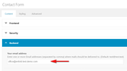
you can enter one or more Email addresses (separated by comma) where mails should be delivered to.
Unfortunately, we don’t have a way to create headings in the email for the responses you receive.
You may find a plugin such as the “Contact Form 7” offers more options like this for you.Best regards,
MikeHey anantharam,
To add the “add to cart” button to your homepage and categories, try adding this code to the end of your functions.php file in Appearance > Editor:add_action( 'woocommerce_after_shop_loop_item_title', 'woocommerce_template_loop_add_to_cart', 10 );To make your breadcrumbs fit into your titles ares, Please try this code in the General Styling > Quick CSS field or in the WordPress > Customize > Additional CSS field:
@media only screen and (max-width: 767px) {
	.single-product .title_container {
		height: 90px !important;
	}
}
for your related products did you add this css:
.related.products li {
    width:18%!important;
}
it is what is making is very small, it should be removed.
For your 4 product tabs, on large phones they may fix into one line with this css:#top div.product .woocommerce-tabs ul.tabs a { padding: 5px !important; }but on small phones, such as the iPhone 6, they will not and to make the buttons smaller may make them not usable.
To remove your footer widget spacing, Please try this code in the General Styling > Quick CSS field or in the WordPress > Customize > Additional CSS field:@media only screen and (max-width: 767px) { .responsive #top #wrap_all #footer .widget,.responsive #top #wrap_all #footer .flex_column.av_one_fourth { margin-top: 0 !important; margin-bottom: 0 !important; } }After applying the css, Please clear your browser cache and check.
Best regards,
MikeHey flordelizamejia,
Thank you for the links, you could open a “easy slider” in a “popup” lightbox by adding the easy slider shortcode into the popup light box.
First I used the “popup lightbox tutorial” but in this case I modified it a little so I could publish all of the code needed into a “code block” element, this makes it only work on page with the “code block”.<script type="text/javascript"> jQuery(window).load(function(){ jQuery('.open-popup-link').magnificPopup({ type:'inline', midClick: true }); }); </script> <!--/*triger*/--> <a href="#test-popup" class="open-popup-link">Click this button to open a lightbox</a> <!--/*popup box*/--> <div id="test-popup" class="white-popup mfp-hide"> YOUR CODE GOES HERE </div> <style> /*css*/ .white-popup { position: relative; background: #FFF; padding: 20px; width: auto; max-width: 500px; margin: 20px auto; } </style>then in the code above where you see
YOUR CODE GOES HEREI added the “easy slider” shortcode created with the “shortcode wand” from a “Classic Editor” post:
You could add other element shortcodes the same way if you wish, such as a “call to adtion” button

you can also edit the css in the code above to change the size of the popup or make the background transparent.Best regards,
MikeJanuary 25, 2020 at 3:42 pm in reply to: set the same font for different languages frontpage #1178372Hi,
Try adding multiple layerslider elements to your page, then the layerslider that is first will have the ID#layer_slider_1and the one below will have the ID#layer_slider_2then use this css to hide or show the IDs based on screen width:@media only screen and (min-width: ?px) and (max-width: ?px) { #layer_slider_1 { display: block; } #layer_slider_2 { display: none; } } @media only screen and (min-width: ?px) and (max-width: ?px) { #layer_slider_2 { display: block; } #layer_slider_1 { display: none; } }change the
?pxto the numbers you want.Best regards,
MikeHi,
Sorry about that, looks like I forgot a line, please try this instead:function custom_next_prev(){ ?> <script> (function($){ $(document).ready(function(){ var getprev = $("a.avia-post-nav.avia-post-prev").attr("href"); var getnext = $("a.avia-post-nav.avia-post-next").attr("href"); $(".woocommerce-product-details__short-description .avia-buttonrow-wrap a.avia-button:nth-child(2)").attr("href", getprev); $(".woocommerce-product-details__short-description .avia-buttonrow-wrap a.avia-button:nth-child(3)").attr("href", getnext); }); })(jQuery); </script> <?php } add_action('wp_footer', 'custom_next_prev');Best regards,
MikeHi,
@Kahil I tried to simulate this by adding a button to one of my pages for it to open the editor in a popup iframe, but I noticed that the link had two question marks where you should only use one, so please try this format:
http://test.test/wp-admin/post.php?post=626&action=edit&iframe=true
Best regards,
MikeJanuary 25, 2020 at 2:32 pm in reply to: set the same font for different languages frontpage #1178360Hi,
Thank you, I tried to look in the layerslider documentation for another way to better fine-tune the background-position for different screen widths, but I didn’t find one. It seems that the layers have better control, so perhaps if your background was just white and you added the images as another layer you can set a position from the top top as a pixel value
or you could try creating different sliders for different screens as your suggestion.Best regards,
MikeJanuary 24, 2020 at 2:52 pm in reply to: How to enable (small) fixed/sticky header for mobile/tablet? #1178127Hi,
Please try this code in the General Styling > Quick CSS field or in the WordPress > Customize > Additional CSS field:@media only screen and (max-width: 989px) { .html_stretched.responsive.html_mobile_menu_tablet.html_header_top #top #main { margin-top: 90px !important; } .html_stretched.responsive.html_mobile_menu_tablet #top #wrap_all #header { position: fixed !important; } }After applying the css, Please clear your browser cache and check.
Best regards,
MikeHi,
No, it’s fine, just glad we could help, unless there is anything else we can help with on this issue, shall we close this then?Best regards,
MikeHi,
Sorry for the late reply, and thank you for the login, I have investigated your issue with the button colors and found that your default color options are not correct, in this screenshot I compare my theme color options with yours and you will see that you are missing the “Theme Color Highlight” option:
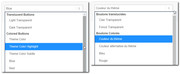
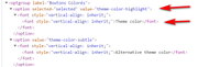
but if you look at the source code for the element you will see that when you choose “Theme Color” it is actually setting the “Theme Color Highlight” option:
when I change the language setting in the user profile for the “enfold” user that you gave us to English the correct “Theme Color” color option returns. I was able to reproduce this error on my localhost.
So I edited the fr_FR language files to correct this and it seems to work on my localhost, so please try downloading the language files linked in the Private Content area and upload them to your site via FTP at\wp-content\themes\enfold\lang\
please save a copy of your original files in case you encounter an error.
fr_FR.po & fr_FR.mo
I used Google Translate to make “Theme Color Highlight” read “Surbrillance de la couleur du thème” I hope this is correct.
After you upload the files please clear your browser cache and try selecting the colors again for the buttons to see if you have the correct options.Best regards,
MikeHi,
Thank you for the ftp login, I also got the white screen when I renamed the themes, that was unexpected, I guess it has to do with your version of WordPress 4.9.13, I also understand why you want to wait to update WordPress.
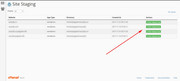
Please check your webhost to see if you have the one-click staging site option, this is an option in most cPanels to create a staging clone of your site so you can test on it and your live site will stay up and running untouched.
Here are some screenshots of what it would look like:

If you can set up the staging clone then you can try updating WordPress first on it and then rename the themes to update, and then you can test the site well to ensure everything works well, and if something needs to be corrected we can work on the clone, that way you will be prepared for when you try this for your live site.
Should the stanging clone crash when you update WordPress still try renaming the themes to update because it could just be the Enfold v4.4.1 having a hard time with WordPress v5.3.2
If it’s a total loss you can always delete the staging clone and create a new one and we will try something else.
I also recommend using your webhosting backup tool to create a full backup, it’s good practice to do so.Best regards,
MikeJanuary 24, 2020 at 11:07 am in reply to: set the same font for different languages frontpage #1178075Hi,
It seems the login token has expired, please update.
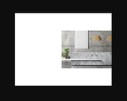
I believe we are going to need to move the layerslider background image up a little because it contains the white space under the header. See here:
Best regards,
MikeHi,
I see that you were using HTML inline commenting in your css:<!-- Table styling -->
so I corrected to css inline commenting:/* Table styling */
and now your css is working, please clear your browser cache and check.Best regards,
MikeHi,
@jr-music thanks for the login, you wrote:Once I renamed the folder everything was white and nothing was working so I had to revert
so did you do this via FTP? You would rename your old theme “enfold-old” and your new theme “enfold” via FTP whichever theme folder is named “enfold” is the one that will be active.
The only customization I saw in your functions.php was:/** * Remove the generated product schema markup from Product Category and Shop pages. */ function wc_remove_product_schema_product_archive() { remove_action( 'woocommerce_shop_loop', array( WC()->structured_data, 'generate_product_data' ), 10, 0 ); } add_action( 'woocommerce_init', 'wc_remove_product_schema_product_archive' );so you will want to add this to your new functions.php after renaming the theme folders, do you think there are other files that have been edited?
If you still have an issue then please include ftp access and we can help.Best regards,
Mike -
AuthorPosts