Forum Replies Created
-
AuthorPosts
-
Hi,
Glad to hear, the one testimonial entry that has a different font size is in some extra div’s, please check this one and adjust to how the others are.Best regards,
MikeHi,
Please try going to Enfold Theme Options > Layout Builder > General Builder Options and ensure your developer options are not hidden.

Best regards,
MikeHi,
Glad that helped, but to override this for a single button with the custom class “button-2” you will need to be more specific in your CSS Specificity, like this:#top #wrap_all #main #custom-id-section .avia-button.button-2:hover { background-color: #efefef !important; color: #000 !important; }note the section custom ID in the rule
#custom-id-section.Best regards,
MikeHi,
@milkytech, thanks for the reminder, but I reported this to the dev team the day I said I did.
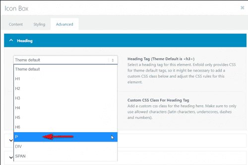
Do you see the heading tag option in the icon box element like this?
Best regards,
MikeHi,
Sorry for the late reply and thanks for the link, try adding this code to the end of your functions.php file in Appearance > Editor:function custom_script(){ ?> <script> (function($){ $(window).load(function(){ $( '#top.blog .post-entry.multi-big' ).each(function() { $( this ).find( 'span.post-meta-infos' ).css({ 'margin-top': '0px','padding-top': '0px'}).insertBefore( $(this).find('span.blog-categories.minor-meta')); $( this ).find('span.blog-categories.minor-meta').css({ 'margin-top': '15px','padding-top': '10px'}).insertAfter( $(this).find('div.entry-content')); }); }); })(jQuery); </script> <?php } add_action('wp_footer', 'custom_script');Then clear your browser cache and check.
Best regards,
MikeHey wacky32,
Sorry for the late reply, it looks like your image is showing at 175px by 150px, have you already solved this?
Please see the screenshot in the Private Content area.Best regards,
MikeHey El,
Sorry for the late reply and thanks for the link, it looks like your site is loading all of the css in a single file, but it doesn’t seem to include the mobile css, please try disabling your caching or minifying plugins and clearing your browser cache.Best regards,
MikeHey kate_ha_agency,
Sorry for the late reply, it looks like this element is already aligned “baseline” Please explain a little more where you would like the link.Best regards,
MikeHey sitesme,
Sorry for the late reply, this css will change the hover color of all buttons#top #wrap_all #main .avia-button:hover { background-color: #777777 !important; color: #fff !important; }Please adjust to suit, then clear your browser cache and check.
Best regards,
MikeHey wtechgr,
Sorry for the late reply and thanks for the screenshots. When I look at your menu it doesn’t look like the screenshots, can you describe how I can recreate the error? Or can you recreate the error on your site and tell us which column is braking it and include an admin login in the Private Content area.
I understand you want the “after” layout, I imagine there is a point you are almost there and then one more item shifts the layout to the “before” image, correct?Best regards,
MikeHey Brand,
Sorry for the late reply, Enfold uses the default WordPress player, but I didn’t find any options to add this. Perhaps an audio plugin would have this option.Best regards,
MikeHi,
Sorry for the late reply and glad you were able to sort this out. You can add a custom class to your column such as “custom-class” and use that as the class for the rule.

Best regards,
MikeHi,
Sorry for the late reply, it looks like the error above is caused by the plugin “WP Copy Protect”, but I’m not sure why your text would not show but I added this css to correct:.avia_transform .av_slideshow_full .avia-caption-title,.avia_transform .av_slideshow_full .avia-caption-content { visibility: visible !important; }Please clear your browser cache and check.
Best regards,
MikeHi,
Try reinstalling the theme via ftp like this: First, download the newest version from Theme Forest and rename your current theme folder to “enfold-old” via ftp then upload the new “enfold” folder and check that your site is working correctly and you can see the options above.
Should for some reason you wish to roll-back to the old version, it’s easy to do, simply rename the new “enfold” folder to “enfold-new” via ftp and then rename “enfold-old” to “enfold” then refresh your page.
Once you are happy you can delete the “enfold-old” folder via ftp, (not the WP theme page)
Please don’t try to overwrite the theme folder, as this will leave old files behind and cause errors.Best regards,
MikeHi,
Glad we were able to help, we will close this now. Thank you for using Enfold.For your information, you can take a look at Enfold documentation here
For any other questions or issues, feel free to start new threads in the Enfold forum and we will gladly try to help you :)Best regards,
MikeMay 16, 2020 at 10:02 pm in reply to: Layerslider plays a second time when page scrolls on mobile device #1213666Hi,
Sorry for the late reply and thanks for the login and links, I tested on an Android device and when I scrolled the page the slider played again. I tried many settings in your slider, but it still seems that the scroll triggers the slider. This doesn’t occur on desktop dev tools emulating a mobile device.Best regards,
MikeMay 16, 2020 at 8:49 pm in reply to: Woocommerce shop page shows gallery images, not product/featured image #1213653Hey Maarten,
Sorry for the late reply and glad to hear it is resolved. If you don’t mind sharing the solution it may help someone in the future.Best regards,
MikeHi,
Sorry for the late reply, when I check your links page I find the link to the tab section is#Tabsectionbut it should be#tabbransch.
I don’t believe that script is needed anymore, you can link to a tab using the ID, but you can not link to a section inside of a tab.Best regards,
MikeHi,
Please see the solution at your other thread with the same question, please reply to that one.Best regards,
MikeHi,
Please see the solution at your other thread with the same question, please reply to that one.Best regards,
MikeHi,
Thanks for the link, the following script looks for each testimonial slider and finds the tallest inner content and then sets all of the sliders to the same height. Try adding this code to the end of your functions.php file in Appearance > Editor:function custom_testimonial_height_script(){ ?> <script> (function($){ $(window).load(function(){ $('.avia-testimonial-row').each(function(){ var $columns = $('.avia-testimonial_inner',this); var maxHeight = Math.max.apply(Math, $columns.map(function(){ return $(this).height(); }).get()); $columns.height(maxHeight); }); }); })(jQuery); </script> <?php } add_action('wp_footer', 'custom_testimonial_height_script');This code sets the height of
.avia-testimonial_innerwhich keeps the testimonial author title close to the content, this screenshot highlights the area.

If you replace.avia-testimonial_innerwith.avia-testimonial-contentin the code then the testimonial author title will stay in the same place for each slider, this screenshot highlights the area.

This script will work across your whole site, you can always restrict this to the one page by adding the page ID#top.page-id-5666to the beginning of.avia-testimonial-rowwith a space like this:
#top.page-id-5666 .avia-testimonial-row
Please clear your browser cache and check after adding this code.Best regards,
MikeHi,
Thank you, I was able to update your site by renaming your current theme directory to “enfold-old” and upload the new version to “enfold” Please clear your browser cache and check. If you are satisfied with how the new version works you can delete “enfold-old” via ftp, if you wish to roll back to your old version, simply delete “enfold” via ftp and rename “enfold-old” to “enfold”.Best regards,
MikeHi,
Ok, I removed the custom class, please clear your browser cache and check.Best regards,
MikeHi,
Please try this code in the General Styling > Quick CSS field or in the WordPress > Customize > Additional CSS field:.entry-content-wrapper a:hover .aligncenter { margin: 0 !important; }After applying the css, Please clear your browser cache and check.
Best regards,
MikeHi,
Thank you for the links and the login, this is odd because the “Personal Theme Packs” looks thinner to me also, but I don’t see any roge css changing the font-weight, and the element tree is the same. If this is the only page with the error we can adjust by adding a custom class to your titles, for example, I added the custom class “font-fix” to your title like this:<h5 style="text-align: center;"><span class="font-fix" style="color: #000000;">Personal Theme Packs</span></h5>and then I added this css in your Quick CSS:
.font-fix {
text-shadow: 3px 0 0 currentColor;
}
and this seems to help, please clear your browser cache and check.
Best regards,
MikeHi,
Sorry for the late reply, I see the “RICHIEDI PREVENTIVO” button at the top of your page opens an iframe to a blank page, if you try to load the page directly it leads to a “500 internal error”, so I would say that your error is with the content of the page and not so much the iframe. What is supposed show on the page, a shortcode for a plugin?Best regards,
MikeHi,
Sorry for the late reply, is the page in the Private Content area the correct one to see the images with a border that disappear on hover? If not please include a link to see the issue.Best regards,
MikeHi,
Sorry for the late reply, according to this article you can use both google analytics and google tag manager on same page, I understand you don’t need to do this but it would trigger the opt out option of the cookie notification.Best regards,
Mike -
AuthorPosts