Forum Replies Created
-
AuthorPosts
-
Hi,
Glad we were able to help, if you have any further questions please create a new thread and we will gladly try to help you. Thank you for using Enfold.Best regards,
MikeHi,
Glad we were able to help, if you have any further questions please create a new thread and we will gladly try to help you. Thank you for using Enfold.Best regards,
MikeHey jenhames,
Thanks for the link to your page, from the frontend the Postal Code and Email fields don’t seem like they are required fields, could you include an admin login so we can see the backend?Best regards,
MikeHi,
I took a look at your page but didn’t find this css in your stylesheets or page source code, please check again.#sub_menu1 #menu-main-menu a { padding-bottom: 8px; }Best regards,
MikeHi,
Thanks for the video, on hover the css above adds 8px, 2px for the border & 6px for the padding, so try adding this css to add the 8px so when you hover there is no change:#sub_menu1 #menu-main-menu a { padding-bottom: 8px; }After applying the css, please clear your browser cache and check.
Best regards,
MikeHey ronellenfitsch,
Thank you for the link to your two pages, when I compare the latest posts on the pages both seem the same, please see the screenshot in the Private Content area, from your explanation I was not expecting these to match. But I continued to examine the loaded .js files for each page and found the /news-events/ doesn’t seem to be loading shortcodes.js, so perhaps allowing this to be excluded will help/wp-content/themes/enfold/js/shortcodes.js
I also notice that it looks like you are using Autoptimize & WP Rocket at the same time, double caching like this could cause issues, so if you continue to have issues please try disabling Autoptimize.Best regards,
MikeHi,
Thank you for the feedback, I see that you have many custom sort customizations in your child theme functions.php, but the file can not be edited because of the wrong file permissions,

please correct the file permissions on your web host and remove these customizations for now while we try to sort out why your new events are pointing to a 404, also do you see any errors in your web host error logs?Best regards,
MikeHi,
Glad we were able to help, if you have any further questions please create a new thread and we will gladly try to help you. Thank you for using Enfold.Best regards,
MikeHi,
Thank you for your patience and for the screencast, to add a menu item hover please try this css:#sub_menu1 #menu-main-menu a:hover { display: inline-block; visibility: visible; border-bottom: 2px solid #fff; background: transparent !important; opacity: 1; padding-bottom: 6px; }I tested the scrolling issue and the jump occurs when the sub-menu position is changed from absolute to fixed, this is part of the script for the sticky sub-menu and this added script doesn’t programmatically affect this, it measures the height and distance of the element. I say “programmatically” but strange things can happen.
Anyways I stared at this for a long time scrolling up & down & reviewing your video, and I believe that this is based on the manual scroll speed. When I test with & without the script (on Chrome & Windows 10) if I scroll slowly the jump is almost not there and is the same with & without the script, but if I test quickly the jump really shows, but it seems to be the same with & without the script. I note that in your video the test without the script was slow, and the test with the script was fast.
So for me it was hard to be consistent manually scrolling, so I tested with this script which waits 2 seconds for the pages to load then scrolls down 1200px over 2 seconds, so it’s slow. I also adjusted the speed to 1 second so it was faster and 5 seconds so it was very slow. I did this with & without the script enabled, and in all cases the behavior was the same.
This was the test script if you would like to try in your your functions.php file:function scroll_test_script() { ?> <script> (function($) { setTimeout(function () { $('html, body').animate({scrollTop: (1200)}, 2000); }, 2000); }(jQuery)); </script> <?php } add_action('wp_footer', 'scroll_test_script');Please see the videos below.
So I guess I don’t really have a solution for you, but considering that the auto scroll test went so well perhaps there is a script to force a slower mouse wheel scroll, but perhaps that would just frustrate users?Best regards,
MikeHi,
Thank you for your patience, I took a look at your grid row “Rasterzeile” I only found one on your homepage, it has the ID “zamma-mobile-9” but it is set to be hidden on screens larger than 990px and the iPad viewport is 1024px, so it will be hidden.
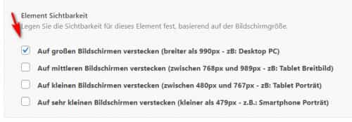
I see you have a custom class “zamma-screens-mobile” assigned to it but I don’t find any matching css, try un-checking the visibility option and creating a css rule to allow the visibility up to 1024px if you want this element to show on the iPad.
As for the blue bar, in my test on a Mac with Safari in Responsive Design Mode simulating an iPad (9.7″) & iPad Pro (10.5″) the bar is fullwidth in portrait view, in landscape it is hidden, iPad Pro (12.9″) it is hidden on portrait 7 landscape.
Which iPad are you using and was it your intention to only show the bar in portrait view?Best regards,
MikeHi,
Very good, please let us know once you confirm this is working for you and we can close this thread.Best regards,
MikeOctober 12, 2021 at 12:55 pm in reply to: Can't log into WordPress — All plugins turned off #1324534Hi,
Glad to hear that you have this sorted out and thank you for sharing the info about the woocommerce bug and solution.
If you have any further questions please create a new thread and we will gladly try to help you. Thank you for using Enfold.Best regards,
MikeHi,
Thanks for the feedback, I had not noticed this before, I asked the Dev Team to review and advise and I will reply when I hear back, Thank you for your patience.Best regards,
MikeHi,
Thank you, I was able to login after many tries and stalls, eventually I tried loading the homepage and saw the admin toolbar and got in via the user profile.
Your WordPress Site Health Status has no errors, the browser console has no errors, your PHP version is fine (v7.4), and you can access post, pages, plugin, etc, but not the dashboard /wp-admin/index.php
So it seems that something is blocking that, as it is also the login destination.
I tried disabling these plugins:
BackupBuddy
Booster Plus for WooCommerce
Classic Editor
Classic Editor Addon
Limit Login Attempts Reloaded
Redirection
Squirrly SEO 2021 (Smart Strategy)
but it didn’t help, you said above that the htaccess looks normal, so I don’t know what this could be.
Try looking at your server error logs for references to /wp-admin/, since the browser console is not giving any errors I assume it’s on the server-side.Best regards,
MikeHi,
Thanks for the screenshot, for the new button I assumed that you wanted the border around it and the same styling as the other two, so I added this, I also aligned the third button to be centered below the other two on mobile with this css:@media only screen and (max-width: 767px) { #top #header_meta #menu-item-1817 { display: flex; line-height: 38px; justify-content: center; padding: 10px 0; } }I believe this also solved the padding between the buttons and phone number, please clear your browser cache and check.
Best regards,
MikeHi,
Glad to hear that you have this sorted out, I researched this in our GitHub and found that the Dev Team is aware of this but currently the youtube-nocookie doesn’t support an API so only manual embed is possible, the team will keep an eye out for the availability of a API.
So using a self-hosted mp4 is your best solution, and faster as you noted.
If you have any further questions please create a new thread and we will gladly try to help you. Thank you for using Enfold.Best regards,
MikeOctober 11, 2021 at 11:56 am in reply to: Footer Navigation is missing after the update of today #1324397Hi,
Glad to hear that you have this sorted out, if you have any further questions please create a new thread and we will gladly try to help you. Thank you for using Enfold.Best regards,
MikeOctober 11, 2021 at 11:51 am in reply to: make contact form scroll to sucess or error message after submission #1324395Hi,
Glad we were able to help, if you have any further questions please create a new thread and we will gladly try to help you. Thank you for using Enfold.Best regards,
MikeHi,
Schön, dass wir helfen konnten, bei weiteren Fragen bitte einen neuen Thread erstellen und wir werden versuche dir gerne zu helfen. Vielen Dank, dass Sie Enfold verwenden.— Translated with Google —
Glad we were able to help, if you have any further questions please create a new thread and we will gladly try to help you. Thank you for using Enfold.
Best regards,
MikeOctober 11, 2021 at 12:01 am in reply to: make contact form scroll to sucess or error message after submission #1324324Hi,
Thank you for your patience, how about a popup modal of the form response, I based this script on this article.
Try adding this code to the end of your functions.php file in Appearance ▸ Editor:function custom_script() { ?> <script> (function($){ // Defining our jQuery plugin $.fn.paulund_modal_box = function(prop){ // Default parameters var options = $.extend({ height : "250", width : "500", title:"", description: "", top: "2%", left: "30%", },prop); var divbox = $('#result_ajax_response_1').eq(0).html(); return this.click(function(e){ add_block_page(); add_popup_box(); add_styles(); $('.paulund_modal_box').fadeIn(); }); function add_styles(){ $('.paulund_modal_box').css({ 'position':'absolute', 'left':options.left, 'top':options.top, 'display':'none', 'height': options.height + 'px', 'width': options.width + 'px', 'border':'1px solid #fff', 'box-shadow': '0px 2px 7px #292929', '-moz-box-shadow': '0px 2px 7px #292929', '-webkit-box-shadow': '0px 2px 7px #292929', 'border-radius':'10px', '-moz-border-radius':'10px', '-webkit-border-radius':'10px', 'background': '#fff', 'z-index':'50', }); $('.paulund_modal_close').css({ 'position':'relative', 'top':'-25px', 'left':'20px', 'float':'right', 'display':'block', 'height':'50px', 'width':'50px', 'background': 'url(https://img.icons8.com/ios/50/000000/cancel.png) no-repeat', 'background-color':'#fff', 'border-radius':'25px', '-moz-border-radius':'25px', '-webkit-border-radius':'25px' }); /*Block page overlay*/ var pageHeight = $(document).height(); var pageWidth = $(window).width(); $('.paulund_block_page').css({ 'position':'absolute', 'top':'0', 'left':'0', 'background-color':'rgba(0,0,0,0.6)', 'height':pageHeight, 'width':pageWidth, 'z-index':'10' }); $('.paulund_inner_modal_box').css({ 'background-color':'#fff', 'height':(options.height - 50) + 'px', 'width':(options.width - 50) + 'px', 'padding':'10px', 'margin':'15px', 'border-radius':'10px', '-moz-border-radius':'10px', '-webkit-border-radius':'10px' }); } function add_block_page(){ var block_page = $('<div class="paulund_block_page"></div>'); $(block_page).appendTo('body'); } function add_popup_box(){ var pop_up = $('<div class="paulund_modal_box"><a href="#" class="paulund_modal_close"></a><div class="paulund_inner_modal_box">' + divbox + '</div></div>'); $(pop_up).appendTo('.paulund_block_page'); $('.paulund_modal_close').click(function(){ $(this).parent().fadeOut().remove(); $('.paulund_block_page').fadeOut().remove(); }); } return this; }; $(document).ready(function(){ if($("#result_ajax_response_1").is(":visible")){ $('#result_ajax_response_1').paulund_modal_box().trigger('click'); } }); })(jQuery); </script> <?php } add_action('wp_footer', 'custom_script');This is the result from my test

Best regards,
MikeHi,
Thank you for your patience and for the login, I changed your css rule fromclear: none;toclear: both;now the page shows two columns at laptop width, 1024px
Please see the screenshot in the Private Content area and clear your browser cache and check.Best regards,
MikeHi,
Vielen Dank für die Anmeldung, ich sehe, dass Sie eine alte Version 4.7.6.4 verwenden, also aktualisieren Sie bitte auf die aktuelle Version 4.8.6.5
Wenn Sie dies tun, sollten Sie die Datei functions-enfold.php aus Ihrem Child-Theme entfernen, da die darin enthaltenen Funktionen veraltet sind und wahrscheinlich einen Konflikt verursachen.
Wenn dies nicht hilft, versuchen Sie bitte, Ihre Plugins nacheinander zu deaktivieren, um sicherzustellen, dass keines einen Konflikt verursacht.— Translated with Google —
Thanks for the login, I see that you are using an old version 4.7.6.4, so please update to the current version 4.8.6.5
When you do you will want to remove the functions-enfold.php file from your child theme as the functions in it will be out of date and probably cause a conflict.
If this doesn’t solve then please try disabling your plugins one at a time to ensure none are causing a conflict.Best regards,
MikeHi,
Thank you for the login, this was caused by the lazy load feature of SmushPro, the element#top.home #av_section_2 .avia-slideshow-innerwas getting a height of 780px on page load add via javascript the correct height was 433px, since this height was changed via javascript in the DOM it overwrites any css rule added to try to control this behavior, the plugin offers a possible excludion control Classes & IDs which I tested by add the ID exclude_this_slider to the element and the control, but it didn’t work, but using the option to exclude the frontpage does work.
Please clear your browser cache and check.Best regards,
MikeHi,
Glad Yigit could help, if you have any further questions please create a new thread and we will gladly try to help you. Thank you for using Enfold.Best regards,
MikeHi,
Glad we were able to help, if you have any further questions please create a new thread and we will gladly try to help you. Thank you for using Enfold.Best regards,
MikeHey ilowelife,
Try adding the special heading with the call to the title as a shortcode instead, for example use the shortcode wand to get the special heading shortcode:

after using the element popup you will have the element shortcode:

now we can create our shortcode function replacing the word “title” with the WordPress call". get_the_title() . "please note the double quotes around the call:

//use this as the shortcode: [page_title]
function page_title_sc( ){
	echo do_shortcode("[av_heading heading='". get_the_title() . "' tag='h1' style='' subheading_active='' show_icon='' icon='ue800' font='entypo-fontello' size='' av-medium-font-size-title='' av-small-font-size-title='' av-mini-font-size-title='' subheading_size='' av-medium-font-size='' av-small-font-size='' av-mini-font-size='' icon_size='' av-medium-font-size-1='' av-small-font-size-1='' av-mini-font-size-1='' color='' custom_font='' subheading_color='' seperator_color='' icon_color='' margin='' margin_sync='true' padding='10' icon_padding='10' headline_padding='' headline_padding_sync='true' link='' link_target='' id='' custom_class='' template_class='' av_uid='' sc_version='1.0' admin_preview_bg=''][/av_heading]");
}
add_shortcode( 'page_title', 'page_title_sc' );
here I added it to a text element in an Advanced Layout Builder page with the real title hidden with the layout option:

and here is the result:

Please give this a try.Best regards,
MikeOctober 10, 2021 at 6:21 pm in reply to: Background Image in Colored Section Not Displaying #1324301Hi,
Glad we were able to help, if you have any further questions please create a new thread and we will gladly try to help you. Thank you for using Enfold.Best regards,
MikeHey mobar,
This is probably the transparency logo from the theme option at Enfold Theme Options ▸ Header ▸ Transparency Options ▸ Transparency Logo try deleting this logo to see if helps.
If this doesn’t help please include an admin login in the Private Content area so we can be of more assistance.Best regards,
MikeHey Ramiro,
You could try using this filter in your child theme functions.php/*Use a different logo on mobile*/ add_filter('avf_logo','av_change_logo'); function av_change_logo($logo) { if(wp_is_mobile() ) { $logo = "http://kriesi.at/wp-content/themes/kriesi/images/logo.png"; } return $logo; }Please adjust the url to yours.
Best regards,
Mike -
AuthorPosts
