Forum Replies Created
-
AuthorPosts
-
Hi,
Please remove the above solution and add this script to the end of your child theme functions.php file in Appearance ▸ Editor:function custom_script_pa_autore() { ?> <script> window.addEventListener('DOMContentLoaded', function() { (function($){ $('.shop_attributes .woocommerce-product-attributes-item--attribute_pa_autore').each(function() { $(this).clone().wrapInner('<p class="pa-autore"/>').children(0).unwrap().appendTo('.woocommerce-product-details__short-description').css({'margin':'0'}); $('.pa-autore .woocommerce-product-attributes-item__label').wrapInner('<p class="autore-label"/>').children(0).unwrap().css({'display':'inline-block','margin':'0'}); $('.pa-autore .woocommerce-product-attributes-item__value').wrapInner('<p class="autore-value"/>').children(0).unwrap().css({'display':'inline-block','margin':'0'}); $('.pa-autore .autore-value p').css({'margin':'0'}); }); })(jQuery); }); </script> <?php } add_action('wp_footer', 'custom_script_pa_autore');Please ensure to copy the code from the forum and not an email notification so the symbols are not converted.
The expected results:

Best regards,
MikeHi,
I adjusted the script to this to account for the languages:function custom_script() { ?> <script> window.addEventListener('DOMContentLoaded', function() { (function($) { $('html[lang="en-GB"] #header_main #media_image-4').css({'padding':'0'}).detach().insertAfter($('.av-sidebar-social-container').css({'border-bottom':'1px solid #e1e1e1'})); $('html[lang="el"] #header_main #media_image-5').css({'padding':'0'}).detach().insertAfter($('.av-sidebar-social-container').css({'border-bottom':'1px solid #e1e1e1'})); })(jQuery); }); </script> <?php } add_action('wp_footer', 'custom_script');Please clear your browser cache and check.
Best regards,
MikeFebruary 16, 2023 at 12:27 am in reply to: Error message: cURL error 28: Connection timed out after 10001 milliseconds #1398144Hi,
Thanks, I tried a manual import but I got a Internal Server Error with this message:
File is empty. This error could also be caused by uploads being disabled in your php.ini file or by post_max_size being defined as smaller than upload_max_filesize in php.ini.
Please check your server error log to see if there are any other clues, also ask your webhost if they are blocking our site: kriesi.at
and ask if “allow_url_fopen, “allow_url_include” and “register_globals” are “off”
then try turning these “on”.Best regards,
MikeHi,
For the new page for mobile up to 450px please try this css:@media only screen and (max-width: 450px) { #top .avia-testimonial-content { width: 100%; } #top #main .avia-slider-testimonials.av-slideshow-ui .avia-slideshow-arrows a { opacity: 1; top: 12%; } }Please see the screenshot in the Private Content area of the expected results
Best regards,
MikeFebruary 15, 2023 at 9:10 pm in reply to: How to place multiple icon boxes in a single container in order to save a model #1398134Hi,
Glad we were able to help, if you have any further questions please create a new thread and we will gladly try to help you. Thank you for using Enfold.Best regards,
MikeFebruary 15, 2023 at 7:21 pm in reply to: How to place multiple icon boxes in a single container in order to save a model #1398124Hey Elena,
Thanks for the login, I created a single full-width column with the custom class six-icons and the 6 icon boxes inside, each icon box either has the custom class icon-right or icon-left and I added this css in your Enfold Theme Options ▸ General Styling ▸ Quick CSS field.six-icons .icon-left { width: 48%; display: inline-block; } .six-icons .icon-right { width: 48%; float: right; display: inline-block; }This block of icons will stay in the portfolio content and not overlap the sidebar, and you will be able to add it to the builder Templates to add it to other pages.
Please check if this is what you had in mind.Best regards,
MikeHey troupdim,
The Photography Demo uses a sidebar header, so please see our documentation for Adding a header widget area, this will place the image before the social icons:

to move it after the social icons try adding a script like this to the end of your child theme functions.php file in Appearance ▸ Editor:function custom_script() { ?> <script> window.addEventListener('DOMContentLoaded', function() { (function($) { $('#header_main #media_image-2').css({'padding':'0'}).detach().insertAfter($('.av-sidebar-social-container').css({'border-bottom':'1px solid #e1e1e1'})); })(jQuery); }); </script> <?php } add_action('wp_footer', 'custom_script');please note that your image widget ID maybe different, if you need help adjusting please link to your page so we can examine.
This is the expected results:

Best regards,
MikeHi,
Glad Günter could help, if you have any further questions please create a new thread and we will gladly try to help you. Thank you for using Enfold.Best regards,
MikeHey Gagik Vardanian,
Yes lifetime for one domain and 6 months of support, for only $17.63 more you can get one year of support on our forum.Best regards,
MikeFebruary 15, 2023 at 1:04 pm in reply to: Woocommerce attribute filter redirected to blog archive page #1398067Hi,
Glad Ismael could help, if you have any further questions please create a new thread and we will gladly try to help you. Thank you for using Enfold.Best regards,
MikeHi,
Thanks for the feedback, to automatically open the popup you would need some custom javascript, which is possible, but you may find it easier to use a plugin as it will give you more options as when to popup, etc.
The free WP Popups typically works well with Enfold.Best regards,
MikeHey Michael Lerchster,
Thanks for your question, it sounds like you are uploading the full zip file with documentation, try to download the installable WP version from your Theme Forest account, there are two links, one is the full zip the other is the installable zip.
Otherwise, try extracting your zip file to your computer and then find the directory enfold then create a new zip of just that directory enfold.zip and try installing it.Best regards,
MikeHi,
Glad Nikko was able to help, if you have any further questions please create a new thread and we will gladly try to help you. Thank you for using Enfold.Best regards,
MikeHey Singer,
Thank you for your question, Enfold v3.8.4 will not work with PHP v8, the current version of Enfold is v5.4.1, you can purchase it here.
You would simply create a new Theme Forest account to make the purchase.
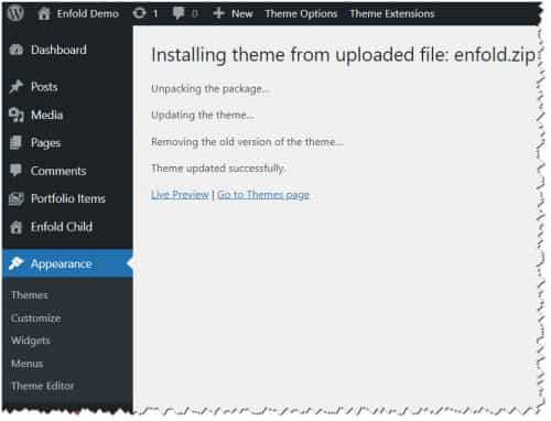
To update your version of Enfold you will need to download the latest installable WP version from your Theme Forest account and upload it to your WordPress ▸ Appearance ▸ Themes ▸ Add Themes ▸ Add New

after you choose the zip file and click install, you will see a This theme is already installed message because you are updating, you can continue

then you will see the Theme updated successfully message.

After you update then see our documentation for creating a Envato Token and registering your theme.
I recommend creating a full server backup before updating for fallback, but typically updating from your version should work fine.Best regards,
MikeHi,
Sorry I guess I misunderstood, I thought you wanted the image and the box the same size, when the image is a background of the column or when the image is an element in the column the width of the column is what determines the width of the image, the height of the image is based on it’s aspect, it looks like you are using a landscape image in a portrait layout try using a double width column of the image if you want is larger, or try changing you image into a portrait layout, and use independent height for the columns
The text box fills the column, if you want it larger try using a larger column or try a Grid element to remove the space between the columns and make the text larger.
I couldn’t login to see your test page as there is only a password and no user info.Best regards,
MikeFebruary 15, 2023 at 11:46 am in reply to: Although all of my pages are accessible in admin mode, they do not show live #1398049Hi,
Please post the login link in the Private Content area below, we don’t receive any emails to the above address.Best regards,
MikeFebruary 15, 2023 at 11:43 am in reply to: Delay in visualizing image positioned absolute over Fullscreen Slider #1398048Hi,
Unless there is anything else we can assist with on this issue, shall we close this then?Best regards,
MikeHi,
Can you show an example so we can understand better, the tab section and accordion loads the content on page load and it just not visible, then clicking makes it visible, if you are only adding content after a click then try adding a delay, but I would recommend adding the content on page load. I don’t have much experience with angular.Best regards,
MikeFebruary 15, 2023 at 11:33 am in reply to: Error message: cURL error 28: Connection timed out after 10001 milliseconds #1398045Hi,
Please see this link.Best regards,
MikeHey Dablec di Tiziano Moletta,
To update an old version of Enfold you will need to download the latest installable WP version from your Theme Forest account and upload it to your WordPress ▸ Appearance ▸ Themes ▸ Add Themes ▸ Add New

after you choose the zip file and click install, you will see a This theme is already installed message because you are updating, you can continue

then you will see the Theme updated successfully message.

If you don’t have a Theme Forest account because the theme was installed by someone else you can create one when you make a new purchase so you will always have access to the latest versions in the future.
Once you update please see our documentation for creating an Envato Token.Best regards,
MikeFebruary 14, 2023 at 6:43 pm in reply to: Background images and CSS on pages are not loading since last update #1397975Hi,
Can you create a staging site with the function disabled and an admin login so we can see the error? We have not experienced this on our sites so I wonder if it is related to a server setting, can you tell us about your server is it using object-oriented cache? Have you tried disabling your server cache or any CDN cache?
Once we can see the error I will ask the rest of the team for ideas, The Dev Team states that
/wp-content/uploads/avia_posts_css was used prior to 5.3 and was only kept for cache backward compatibility, it is no longer used.
Saving the Theme Setting after the update should have copied the css files to /wp-content/uploads/dynamic_avia/avia_posts_css after the update and used going forward.
It sounds like a cache, either a plugin, server, or CDN, etc, is still calling the old location, since we can’t recreate the issue it is hard to say.Best regards,
MikeHi,
Thanks, perhaps they have a filter that can be added to the child theme functions.php that will only show the TOC on the actual post. I will post any ideas that the team reports.Best regards,
MikeHi,
Thanks for the feedback, I had looked for “Table of Contents” to show in the excerpt and when I didn’t see it I thought the TOC links were also not showing, but I see that they are now.
I’m not sure how to address this other than creating manual excerpts, so I have asked the rest of the team for ideas, I will reply when I hear back, thank you for your patienceBest regards,
MikeHi,
Glad we were able to help, if you have any further questions please create a new thread and we will gladly try to help you. Thank you for using Enfold.Best regards,
MikeHi,
We will close this as you have requested, if you have any further questions please create a new thread and we will gladly try to help you. Thank you for using Enfold.Best regards,
MikeHi,
Try adding this css:#main #teaserhome .av_textblock_section { z-index: 1; position: relative; }for a complete solution like this:
@media only screen and (max-width: 1249px){
#main #teaserhome:before {
  content:"";
  display: block;
  height: 100%;
  position: absolute;
  visibility: visible !important;
  top: 0;
  left: 0;
  width: 100%;
  background-color: rgba(255, 255, 255,.5)!important;
}
#main #teaserhome .av_textblock_section {
	z-index: 1;
    position: relative;
}
}
Best regards,
MikeHi,
Glad we were able to help, if you have any further questions please create a new thread and we will gladly try to help you. Thank you for using Enfold.Best regards,
Mike -
AuthorPosts

