Forum Replies Created
-
AuthorPosts
-
Hi,
Glad that we could help, if you have further questions please open a new thread and we will try to help. Thanks for using Enfold.Best regards,
MikeHi,
Thanks Guenni007 for helping. If you have further questions please open a new thread and we will try to help. Thanks for using Enfold.Best regards,
MikeHey tchamp77,
Your product grid Pagination is set to 20 items
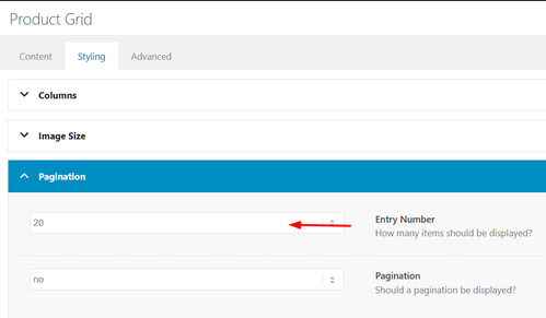
Try choosing a different number or AllBest regards,
MikeHi,
Glad that Ismael could help, if you have further questions please open a new thread and we will try to help. Thanks for using Enfold.Best regards,
MikeMarch 18, 2026 at 8:11 pm in reply to: The “Horizontal Gallery” and “Accordion” combination is malfunctioning. #1496148Hi,
Glad that we could help, if you have further questions please open a new thread and we will try to help. Thanks for using Enfold.Best regards,
MikeHi,
I will message Yigit, I don’t have access to it. It may take a few days. Thanks for your patience.Best regards,
MikeMarch 18, 2026 at 7:53 pm in reply to: The “Horizontal Gallery” and “Accordion” combination is malfunctioning. #1496142Hi,
This is a sidebar widget:
You can remove the widget shortcode or use this css to hide it:.single-product .sidebar #block-7 { display: none; }Let us know if this helps, if you have any further questions please open a new thread and we will try to help, we ask that each thread stays on one topic to be easier for everyone.
Best regards,
MikeHi,
We have seen a couple of claims from COPYTRACK on behalf of genious2000de, the author of the image that you linked to. Who is claiming the same images that we own extended licenses for, by the user francesco83 from 2014
Perhaps these are the same person, we are not sure. Kriesi states that his extended license allows end users to use the images in the theme, but not outside the theme. Please see these threads.This seems shady, perhaps your best course of action would be to follow Ismael’s advice and use a royalty-free image or create one with AI which can not have a claim against them. Double check your local laws though, we can not offer legal advice.
https://www.reuters.com/world/us/us-appeals-court-rejects-copyrights-ai-generated-art-lacking-human-creator-2025-03-18/
Hope that this helps.Best regards,
MikeHi,
Perhaps if you want the logo just a little bigger and don’t mind the header to be a little bigger, then this css may help.@media only screen and (min-width: 768px) { #top #menu-item-logo svg, #top #menu-item-logo img { max-height: 150px; } .html_header_top.html_header_sticky.html_large .av_minimal_header #header_main .container,.html_header_top.html_header_sticky.html_large.html_main_nav_header .av_minimal_header .main_menu ul:first-child > li a { height: 150px; line-height: 150px; } }Best regards,
MikeHey famerise,
Your siteground-optimizer plugin is giving this error: Uncaught SyntaxError: Unexpected identifier ‘Array’ try disabling the plugin.
If you have a header.php or footer.php file in your child theme, please remove these.
You can download a Child Theme here.Best regards,
MikeHey jordi,
Our current version is 7.1.4
You can update and we do not expect any issues, but some things to keep in mind, if you have a custom header.php or footer.php in your child theme, you should remove these first, as they have changed. After you update you can review the new version of these files and make copies with your customizations into your child theme. I recommend tring to find a different way to add your customizations without using these files, or you will run into this issue again in the future.
The same is for any custom elements that you have in your child theme. If your child theme only has a style.css & functions.php & screenshot.png then you are fine.
If you have added any custom code to any parent theme files, you should save the code as it will be lost when you update.
You will not be able to automatically update via the theme options, as Theme Forest has changed since your version, after you manually update you will be able to update via the theme options for future updates.
A good practice is to use your web host options to create a stagging site and update it first to ensure your site looks & works the same, and then update your live site. If you are not able to do this, at least ask your web host to create a full backup, including the database for a fallback just in case.
To update your version of Enfold you will need to download the latest installable WP version from your Theme Forest account and upload it to your WordPress ▸ Appearance ▸ Themes ▸ Add Themes ▸ Add New
after you choose the zip file and click install, you will see a This theme is already installed message because you are updating, you can continue,
then you will see the Theme updated successfully message.
After which you can go to your Theme Forest account and create a new Token for future automatic updates.Best regards,
MikeHey Velair,
You can update and we do not expect any issues, but some things to keep in mind, if you have a custom header.php or footer.php in your child theme, you should remove these first, as they have changed. After you update you can review the new version of these files and make copies with your customizations into your child theme. I recommend tring to find a different way to add your customizations without using these files, or you will run into this issue again in the future.
The same is for any custom elements that you have in your child theme. If your child theme only has a style.css & functions.php & screenshot.png then you are fine.
If you have added any custom code to any parent theme files, you should save the code as it will be lost when you update.
You will not be able to automatically update via the theme options, as Theme Forest has changed since your version, after you manually update you will be able to update via the theme options for future updates.
A good practice is to use your web host options to create a stagging site and update it first to ensure your site looks & works the same, and then update your live site. If you are not able to do this, at least ask your web host to create a full backup, including the database for a fallback just in case.
To update your version of Enfold you will need to download the latest installable WP version from your Theme Forest account and upload it to your WordPress ▸ Appearance ▸ Themes ▸ Add Themes ▸ Add New
after you choose the zip file and click install, you will see a This theme is already installed message because you are updating, you can continue,
then you will see the Theme updated successfully message.
After which you can go to your Theme Forest account and create a new Token for future automatic updates.Best regards,
MikeHey velair,
You can update and we do not expect any issues, but some things to keep in mind, if you have a custom header.php or footer.php in your child theme, you should remove these first, as they have changed. After you update you can review the new version of these files and make copies with your customizations into your child theme. I recommend tring to find a different way to add your customizations without using these files, or you will run into this issue again in the future.
The same is for any custom elements that you have in your child theme. If your child theme only has a style.css & functions.php & screenshot.png then you are fine.
If you have added any custom code to any parent theme files, you should save the code as it will be lost when you update.
You will not be able to automatically update via the theme options, as Theme Forest has changed since your version, after you manually update you will be able to update via the theme options for future updates.
A good practice is to use your web host options to create a stagging site and update it first to ensure your site looks & works the same, and then update your live site. If you are not able to do this, at least ask your web host to create a full backup, including the database for a fallback just in case.
To update your version of Enfold you will need to download the latest installable WP version from your Theme Forest account and upload it to your WordPress ▸ Appearance ▸ Themes ▸ Add Themes ▸ Add New
after you choose the zip file and click install, you will see a This theme is already installed message because you are updating, you can continue,
then you will see the Theme updated successfully message.
After which you can go to your Theme Forest account and create a new Token for future automatic updates.Best regards,
MikeHi,
Glad that we could help, if you have further questions please open a new thread and we will try to help. Thanks for using Enfold.Best regards,
MikeHi,
Glad that we could help, if you have further questions please open a new thread and we will try to help. Thanks for using Enfold.Best regards,
MikeHey bemodesign,
Try this css:@media only screen and (max-width: 767px) { #top #wrap_all .av-burger-overlay .av-burger-overlay-scroll #av-burger-menu-ul li a { font-size: 22px; } .html_av-overlay-full #top #wrap_all #av-burger-menu-ul li,.html_av-overlay-full #top #wrap_all #av-burger-menu-ul li li { line-height: 1em; } .responsive #top #wrap_all #av-burger-menu-ul li { font-size: 22px !important; } }Adjust to suit.
As for your anchor link, the ID #book-call is in the second section column with the title “Free 15-Minute…” if you want the first section title “CONTACT BEMO DESIGN” to show, then move the ID to that section.Best regards,
MikeHi,
Glad that you have this sorted out now, if you have further questions please open a new thread and we will try to help. Thanks for using Enfold.Best regards,
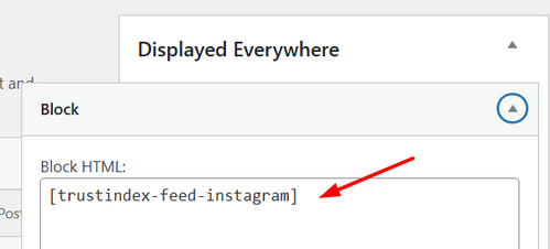
MikeHi,
As I understand your plugins Smash Balloon and Logo Translate, have now updated? So is resolved now?Best regards,
MikeHey waveseven,
Please see these threads:If neither of these work for you, please link to your site.
Best regards,
MikeHi,
Glad that Guenni007 & Ismael could help, if you have further questions please open a new thread and we will try to help. Thanks for using Enfold.Best regards,
MikeMarch 16, 2026 at 8:44 pm in reply to: Migrating to new website crashes WordPress due to the Enfold theme (part 2) #1496078Hey Coen Verkuyl,
Envato (Theme Forest) handles all of our licensing and theme downloads though user accounts there.
We are not able to create licenses or access user accounts. I understand your situation, but unfortunately can not help in this case. Perhaps you would be able to roll your web host PHP version back to v7.4 for now, most web hosts have many versions of PHP available to use.Best regards,
MikeHey,
We do not have access to the API keys, as they are created in the Envato system and not shared with us, we do have Purchase Codes if users create a support account for our support forum. I have checked all of the email addresses that you posted, but no user was found. Perhaps the former webmaster did not create an account.
Please try contacting Envato as they handle all of our licensing.Best regards,
Mike-
This reply was modified 6 days, 18 hours ago by
Rikard.
March 16, 2026 at 8:05 pm in reply to: Bug: Template only imports first section – but visually imports everything #1496076Hi,
Glad that you have found the error, invalid html without a closing tag.
If you have invalid html, such as no closing tag, it will break the layout. It is not a bug and it is not new.Best regards,
MikeHi,
Ok, try adding this css:@media only screen and (max-width: 767px) { .responsive #top.post-type-archive-tribe_events #main { padding-top: 30px !important; } #main > .container_wrap.container_wrap_first { border-top-width: 0; } }Then clear your cache and check.
Best regards,
MikeHi,
Glad that we could help, if you have further questions please open a new thread and we will try to help. Thanks for using Enfold.Best regards,
MikeHi,
Try this css:.container .av-content-full.units { width: 95%; }Best regards,
MikeHey nioperik2,
If you want it to only show on ipad landscape you will need a custom solution.
Add this custom class to your element ipad-landscape then add this css to your Quick CSS field:.ipad-landscape { display: none;} @media only screen and (min-width: 1024px) and (max-width: 1366px) and (orientation: landscape) { .ipad-landscape { display: block; } }This should cover most ipads in landscape mode, then clear your cache.
Please note that testing with iPads & iPhones can be hard to clear the cache, often you need to also clear the history to fully purge the cache, following these steps for Safari and note Step 4 where you will Clear the History.Best regards,
Mike -
This reply was modified 6 days, 18 hours ago by
-
AuthorPosts