Forum Replies Created
-
AuthorPosts
-
Hi,
Glad to hear that you have this sorted out, if you have any further questions please create a new thread and we will gladly try to help you. Thank you for using Enfold.Best regards,
MikeApril 3, 2023 at 6:28 pm in reply to: How to use lightbox for videos/images as media element in Accordion-toggle? #1403436Hi,
Thanks for the feedback and the link to your test page, while your video is opening in a new window and playing on Windows, it’s not opening in a lightbox as in my example, please review the steps above and if you have further trouble Please include an admin login in the Private Content area so we can check.Best regards,
MikeApril 3, 2023 at 5:59 pm in reply to: My Avia Advanced editor won’t save content (most of the time). #1403433Hi,
@Jmcguiness03 you seem to have a different issue than this thread, please create a new thread and include a recap, and WordPress admin access in the Private Content area. Since this is not your thread posting your login here will not be private and you will not see anything we write in the Private Content area.Best regards,
MikeHi,
Glad we were able to help, if you have any further questions please create a new thread and we will gladly try to help you. Thank you for using Enfold.Best regards,
MikeApril 3, 2023 at 12:09 pm in reply to: Enfold theme not updating and cant find API key its referring to #1403380Hi,
Since you are using v4.1.2 you will not be able to update via the API, you will need to manually update first and then create a new Envato Token.
The error you are getting The link you followed has expired sounds like the PHP ZipArchive Extension is disabled on your server, please ask your webhost to check.
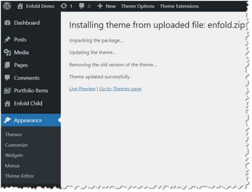
To update your version of Enfold you will need to download the latest installable WP version from your Theme Forest account and upload it to your WordPress ▸ Appearance ▸ Themes ▸ Add Themes ▸ Add New

after you choose the zip file and click install, you will see a This theme is already installed message because you are updating, you can continue

then you will see the Theme updated successfully message.

Best regards,
MikeHey Martin,
Please try adding this css to your Enfold Theme Options ▸ General Styling ▸ Quick CSS field:#main .av-masonry-entry .av-masonry-entry-title { text-align: center; }After applying the css, please clear your browser cache and check.
Best regards,
MikeApril 3, 2023 at 11:54 am in reply to: customize panel not loading, widget panel only partially loads, missing widgets #1403374Hi,
Seems that we missed the 6 hour window, so let us know later in the week when the site is available again.
Also let us know what webhosts are experiencing this issue and if they are “managed hosts” and if they are using “optimized WordPress” installs, or if they have “must-use” plugins that can not be disabled.Best regards,
MikeApril 2, 2023 at 11:33 pm in reply to: customize panel not loading, widget panel only partially loads, missing widgets #1403346Hi,
Yes the theme is but you would need to check with the plugin authors for the plugins that you use yourself.Best regards,
MikeHi,
Ok, this will make it all white:#av-burger-menu-ul li { background-color: #fff !important; }Please see the screenshot in the Private Content area.
After applying the css, please clear your browser cache and check.Best regards,
MikeHi,
I’m not sure that I understand your post, is this your solution?Best regards,
MikeApril 2, 2023 at 10:36 pm in reply to: customize panel not loading, widget panel only partially loads, missing widgets #1403339Hi,
Try comparing your webhost PHP extensions for PHP 7.4 & 8.0, I found on my webhost the zip extension was not enabled by default in PHP v8.0
This didn’t cause any real issues and I don’t think it is your issue, but there could be a different extension causing a issue in your case.
Here is what my test site is using for v8

Best regards,
MikeHi,
Ok, very good then, but I still don’t understand what you wish to achieve.Best regards,
MikeHi,
Thanks for the link to your site try disabling your wp-rocket lazy load, this seems to be blocking all of the jQuery on your site until scroll, then the rest of your jQuery loads, some before jQuery causing a Uncaught TypeError: $ is not a function error.
Please see the screenshots in the Private Content area.You may have misunderstood what Yigit was saying about your expired support,
The theme is sold with lifetime updates, but you will need a valid support period for support in the forum, the contact form is not appropriate for support requests.
If you have further questions please renew your support and open a new request thread.Best regards,
MikeApril 2, 2023 at 9:35 pm in reply to: customize panel not loading, widget panel only partially loads, missing widgets #1403330Hi,
Have you tried disabling the Mailchimp API and removing the Mailchimp element on the homepage and the Mailchimp widget and then try PHP v8?
I don’t have any issues with Mailchimp on my test site and PHP v8.0.23, but this is what your error seems to be pointing to.Also as a side point, I don’t recommend testing with your child theme as you have a custom header.php & footer.php and these will most likely need to be updated, we don’t recommend adding custom header.php & footer.php in your child theme as it is the number one cause for site crashes after major updates. I recommend adding any customizations to your child theme functions.php to avoid this issue in the future.
Best regards,
MikeHi,
Thanks for your patience the version of Enfold you had installed, v4.0.2, was not compatible with v6+ of WordPress or some of your plugins causing the crash, I installed Enfold v5.0.1 and disabled your plugins.
You should update your theme to v5.5, I see that you wrote that you have purchased a new license so please register for the support forum and then if you have any further questions please create a new thread and we will gladly try to help you.
First to update your version of Enfold you will need to download the latest installable WP version from your Theme Forest account and upload it to your WordPress ▸ Appearance ▸ Themes ▸ Add Themes ▸ Add New

after you choose the zip file and click install, you will see a This theme is already installed message because you are updating, you can continue

then you will see the Theme updated successfully message.

After you update go to your Theme Forest account and create a new Token so that you can easily update in the future.Best regards,
MikeHey Adil,
Thanks for the link to your page, when I check the slides zoom in as you have described, so I assume that you have already sorted this out.
I also see in this thread with Yigit you may have misunderstood what Yigit is saying,
The theme is sold with lifetime updates, but you will need a valid support period to start new threads, the contact form is not appropriate for support requests.
Please see the support policy Yigit linked to, and Envato (Theme Forest) Extend or renew Item Support page.
Thank you for your patience and understanding and for using Enfold.Best regards,
MikeHi,
When I check your page the burger menu has a yellow background color, not gray, and there are no drop-downs all links are shown.
Please see the first screenshot in the Private Content area.
Rikard’s css changes the color of the submenu items that would be in a drop-down:
Please see the second screenshot in the Private Content area.
Please explain further what you wish to achieve, perhaps a screenshot would help.Best regards,
MikeHey sdigit,
Thanks for your question, I have not noticed this issue or seen any threads about it, but can you link to an example of this occurring on your site so we can see what might be causing it?Best regards,
MikeHey Munford,
This sounds like your web host has not enabled the PHP ZipArchive Extension You can check if the PHP ZipArchive Extension is installed by going to the layerslider dashboard and clicking the three dots in the upper right corner and click the System Status

then look under the Server Settings to see if PHP ZipArchive Extension is enabled.

If it is not enabled you will need to ask your web host to enable.Best regards,
MikeHi,
Glad we were able to help adjust this for you, if you have any further questions please create a new thread and we will gladly try to help you. Thank you for using Enfold.Best regards,
MikeHi,
I’m unable to login due to this error:500 (Internal Server Error)please check your server error logs to find the issue.
I did see that you were getting a 404 error for the 3 icon fonts that are related to your error: /avia_fonts/justice/ I uploaded them for you via FTP.Best regards,
MikeHey OguenKingInternet,
This is typically due to a plugin, try disabling all of your plugins then reactivate each one individually until you find the cause.Best regards,
MikeHey Sebastian,
Thanks for your question, I don’t have much experience with Polylang, but I believe I have a workaround for the Modal Window Custom Content
I added text for both DE & EN to my Modal Window Custom Content Tab Label & Tab Content wrapping the text with spans and a custom language class, like this:<span class="lang-de">...</span> <span class="lang-en">...</span>
Then I added this css to my WordPress ▸ Customize ▸ Additional CSShtml[lang="en-US"] .lang-de { display: none; } html[lang="de-DE"] .lang-en { display: none; }and when my site language is EN the Modal Window Custom Content popup shows only the EN text:

and same for DE

Perhaps someone else will know how to get Polylang to translate the Modal Window Custom Content popup, but hopefully this will help.Best regards,
MikeHi,
It’s been a while since I helped you create this, so I tried to recreate this on my test site and found that changing the label in the function to di like this works correctly:echo '<p> di : ' . $value . '</p>';

But after re-reading the original support thread after this solution was created you asked for the author’s name to be also linked.
So I believe you are not using this function and you are using the script instead.
In this case please add this script to your child theme functions.php:function custom_replace_autore_script() { ?> <script> window.addEventListener('DOMContentLoaded', function() { (function($){ $('.pa-autore .autore-label').contents().filter(function() { return this.nodeType == 3 }).each(function(){ this.textContent = this.textContent.replace('Autore','di'); }); })(jQuery); }); </script> <?php } add_action('wp_footer', 'custom_replace_autore_script');Best regards,
MikeHi,
I see that you are using Enfold v5.3.1.1 with updates disabled, please update to v5.5
If you have trouble enabling a Token that allows you to update within the theme then please follow these steps to manually update:
To update download the latest installable WP version from your Theme Forest account and upload it to your WordPress ▸ Appearance ▸ Themes ▸ Add Themes ▸ Add New

after you choose the zip file and click install, you will see a This theme is already installed message because you are updating, you can continue

then you will see the Theme updated successfully message.

Best regards,
MikeHi,
Glad Rikard could help, if you have any further questions please create a new thread and we will gladly try to help you. Thank you for using Enfold.Best regards,
MikeHey Munford,
Thank you for the link to your site please try adding this css to your Enfold Theme Options ▸ General Styling ▸ Quick CSS field:#top.av-framed-box.page-id-110 .av-submenu-container { left:0px; border-style: none; } #top.av-framed-box.page-id-110 .av-subnav-menu > li > a { border-left-style: none; }After applying the css, please clear your browser cache and check.
Best regards,
MikeHi,
Glad we were able to help, if you have any further questions please create a new thread and we will gladly try to help you. Thank you for using Enfold.Best regards,
MikeApril 2, 2023 at 3:12 pm in reply to: Avia Builder / Masonry Gallery: miniatures in the editor #1403291Hi,
The Dev Team replies: There is an option “Short description for backend” in Advanced -> Developer Settings. Here you can enter a short description for the masonry. This should help most users. There is currently no plan in near future to extend the canvas layout because this is pretty complicated.Best regards,
MikeHi,
As Guenni007 points out, you can set the social icons in the topbar at Enfold Theme Options ▸ Header ▸ Extra Elements ▸ Header Social Icons ▸ Display in top bar at the right and Enfold Theme Options ▸ Header ▸ Extra Elements ▸ Header Secondary Menu ▸ Secondary Menu in top bar at the left


The button style doesn’t show but you could adjust with css to suit your needs.Best regards,
Mike -
AuthorPosts

