Forum Replies Created
-
AuthorPosts
-
Hi,
Thanks for the feedback, the one you linked to is a page and not a post so to also include these try this css instead:#top #main .container_wrap_first.fullsize .flex_column.av_one_full { padding:0 15% 0 15%; }After applying the css, please clear your browser cache and check.
Please check if this works and also check if there are any pages are affected that should not be and link to them so we can adjust further.Best regards,
MikeHi,
Thanks for the login it seems that Safari was having trouble with calculating this css:div .av_one_half { margin-left: 20px; width: calc(50% - 10px); }I have adjusted it to this and added it to your WordPress ▸ Customize ▸ Additional CSS
#top.single-product.postid-14655 div .av_one_half {
    width: calc(48%);
}
and now your page is showing correctly.
I created another test page with just two half columns and they showed correctly calculating the calc(50% – 10px); so I believe there is a conflict with a plugin or some customization but I was unable to examine your child theme files. I see you have some side button links going to products but I’m not sure if this is related or if it is something else.
I see that this is your only product built with the Advanced Layout Builder so you could just leave the css in place, or if you are going to create more products like this remove the pasg ID from the css .postid-14655 and it will work for all of your products.
Otherwise if you want to find the conflict, try disabling all of your plugins. If that resolves the issue, reactivate each one individually clearing your browser cache between each one until you find the cause. Or switch to your parent, if this solves then it is related to a customization in your child theme so you will need to investigate there. It seems to be related only to products because in my test on a page the column worked correctly. It is strange the issue only occurs in Safari.Best regards,
MikeHi,
Thanks for the feedback, try this CSS in your Enfold Theme Options ▸ General Styling ▸ Quick CSS field:#top .avia-slideshow-arrows a:before { padding-left: 0px; padding-right: 0px; }After applying the css, please clear your browser cache and check.
Best regards,
MikeHi,
I see it when I chek your site:

Try clearing your browser cache following these steps for Safari and note step 4 where you will Clear the History.Best regards,
MikeHi,
Thanks for your patience, please update the theme to v5.6.2 and try disabling your plugin except woocommerce core, if this doesn’t help then please include an admin login in the Private Content area so we can investigate.
Also please include a link to the example product that the variations are not showing the prices.
As I understand you have built the product with the ALB using the product elements, correct?Best regards,
MikeHi,
Thanks for the link to your post, try this CSS in your Enfold Theme Options ▸ General Styling ▸ Quick CSS field:#top.single #main .container_wrap_first.fullsize .flex_column.av_one_full { padding:0 15% 0 15%; }After applying the css, please clear your browser cache and check.
Best regards,
MikeHi,
It would be easier for me to help if I could see the page to examine thie elements and ensure the solution has the correct specificity, but perhaps this would work:#top #main flex_column[style*="padding: 0 20% 0 20%;"] { padding:0 15% 0 15% !important; }The css you posted above tells me that the element is a full width column that is the first element on the page, with no sibling, if this is true for all for the elements this would be good to add to target the elements so other columns are not affected by mistake. But if this is from your template those conditions might not be true once it is added the finished page.
Are they all the same post, page, portfolio, or product?Best regards,
MikeHi,
I don’t think this is what that means, but I have asked the rest of the team for advice and will reply back when I hear from them, thank you for your patience.Best regards,
MikeHi,
Glad we were able to help, if you have any further questions please create a new thread and we will gladly try to help you. Thank you for using Enfold.Best regards,
MikeHi,
Glad we were able to help, if you have any further questions please create a new thread and we will gladly try to help you. Thank you for using Enfold.Best regards,
MikeHi,
Glad we were able to help, if you have any further questions please create a new thread and we will gladly try to help you. Thank you for using Enfold.Best regards,
MikeHi,
Please create a special category or tag for the author you want to display, it would be a big job to change the element to use different taxonomies like authors.Best regards,
MikeHey DanielDM,
Unfortunately you would have to do this manually.
But perhaps it can be done with css if they follow a certain pattern.
Such as if they are all used in the same situation on multiple pages or posts, try explaining about them and link to one of them so we can examine.Best regards,
MikeHey Martijn,
Unfortunately not in the theme settings, but perhaps with css if they follow a certain pattern.
Such as if they are all used in the same situation on multiple pages or posts, try explaining about them and link to one of them so we can examine.Best regards,
MikeHi,
I see that you are using an outdated version of the theme, you are using v4.7.6.4, please update to v5.6.2
This version also had an issue with the Envato private token so you will need to manually update.
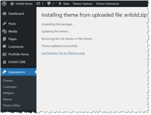
To update your version of Enfold you will need to download the latest installable WP version from your Theme Forest account and upload it to your WordPress ▸ Appearance ▸ Themes ▸ Add Themes ▸ Add New

after you choose the zip file and click install, you will see a This theme is already installed message because you are updating, you can continue

then you will see the Theme updated successfully message.

Best regards,
MikeJune 14, 2023 at 8:32 pm in reply to: Different amount of columns per row in a masonry gallery #1410639Hi,
Glad to hear that you have this sorted out, if you have any further questions please create a new thread and we will gladly try to help you. Thank you for using Enfold.Best regards,
MikeHi,
In order to see the responsive settings for the global settings at Enfold Theme Options ▸ General Styling ▸ Typography ▸ Advanced Options: Customize Typography Settings you need to first toggle the heading for it to expand and show all of the options:

Please note the sizes listed:

Best regards,
MikeHi,
Please try the modification that Ismael suggested, or perhaps try adding this code to the end of your child theme functions.php file in Appearance ▸ Editor:function custom_script_change_nav_role() { ?> <script> window.addEventListener('DOMContentLoaded', function() { (function ($) { $(".menu-item-avia-special").attr('role','menu' ); })(jQuery); }); </script> <?php } add_action('wp_footer', 'custom_script_change_nav_role');Best regards,
MikeHi,
This is due you using an outdated version of the theme, you are using v4.7.3, please update to v5.6.2
This version also had an issue with the Envato private token so you will need to manually update.
To update your version of Enfold you will need to download the latest installable WP version from your Theme Forest account and upload it to your WordPress ▸ Appearance ▸ Themes ▸ Add Themes ▸ Add New

after you choose the zip file and click install, you will see a This theme is already installed message because you are updating, you can continue

then you will see the Theme updated successfully message.

Best regards,
MikeHi,
Glad to hear that you have this sorted out, if you have any further questions please create a new thread and we will gladly try to help you. Thank you for using Enfold.Best regards,
MikeHi,
Thank you for the link to your site, I found you had a missing bracket in your Enfold Theme Options ▸ General Styling ▸ Quick CSS field, I corrected for you and now it works correctly. Please clear your browser cache and check.Best regards,
MikeHi,
I believe you are referring to this on small mobile:

Try this CSS in your Enfold Theme Options ▸ General Styling ▸ Quick CSS field:@media only screen and (max-width: 387px) { #socket #menu-item-651 { padding-top: 20px; } }After applying the css, please clear your browser cache and check.
This is the expected results:

Best regards,
MikeHi,
Glad we were able to help, if you have any further questions please create a new thread and we will gladly try to help you. Thank you for using Enfold.Best regards,
MikeJune 14, 2023 at 5:16 pm in reply to: blog menu – if too short – makes date move up next to it. #1410613Hi,
Glad we were able to help, if you have any further questions please create a new thread and we will gladly try to help you. Thank you for using Enfold.Best regards,
MikeHi,
Glad to hear that you have this sorted out, if you have any further questions please create a new thread and we will gladly try to help you. Thank you for using Enfold.Best regards,
MikeHi,
Try this CSS in your Enfold Theme Options ▸ General Styling ▸ Quick CSS field:.main_menu .sub-menu .avia-bullet { display: block; left: 3px; } .header_color .main_menu ul.sub-menu { padding-left: 15px; border: none; } .header_color .main_menu ul.sub-menu li, .header_color .main_menu ul.sub-menu li a{ border: none; }After applying the css, please clear your browser cache and check.
Best regards,
MikeJune 14, 2023 at 11:59 am in reply to: Mobile layout pictures not changing correctly to align with content #1410571Hey newvisionnew,
Thank you for your patience, I believe that you are refuring to your color section with the text “MEMBERSHIP HAS ITS…” this text is taller than the image on mobile because the background image is set as “contain” by default to show the whole image, to change it to “cover” so the image fills the space try this CSS in your Enfold Theme Options ▸ General Styling ▸ Quick CSS field:@media only screen and (max-width: 990px) { #top .avia-full-contain { background-size: cover !important; } }After applying the css, please clear your browser cache and check.
Best regards,
MikeHi,
If you would like to request this feature the Dev Team has opened a new Github Feature Request for users to place requests and follow them as the Dev Team reviews them.Best regards,
MikeHi,
Glad we were able to help, if you have any further questions please create a new thread and we will gladly try to help you. Thank you for using Enfold.Best regards,
Mike -
AuthorPosts
