Forum Replies Created
-
AuthorPosts
-
February 14, 2024 at 12:16 pm in reply to: Custom Field “Hide on sigle entry”, and Gravity Forms #1434287
Hi,
Glad we were able to help, if you have any further questions please create a new thread and we will gladly try to help you. Thank you for using Enfold.Best regards,
MikeFebruary 14, 2024 at 12:15 pm in reply to: Request to check page editing errors (Avia Layout Builder) #1434286Hi,
Glad Ismael could help, if you have any further questions please create a new thread and we will gladly try to help you. Thank you for using Enfold.Best regards,
MikeHi,
Thank you for your patience, try this CSS in your Enfold Theme Options ▸ General Styling ▸ Quick CSS field:.responsive #top #av_section_4 .container { width: 100%; } @media only screen and (max-width: 767px) { #top #av_section_4 .avia-icongrid .av-icon-cell-item .avia-icongrid-flipback { padding: 0 3em; } .avia-icongrid-flipbox .av-icon-cell-item .avia-icongrid-front .avia-icongrid-inner, .avia-icongrid-flipbox .av-icon-cell-item .avia-icongrid-flipback .avia-icongrid-inner { padding: 0 3em; } }Please ensure to copy the code from the forum and not an email notification so the symbols are not converted.
After applying the css, please clear your browser cache and check.Best regards,
MikeFebruary 13, 2024 at 12:39 pm in reply to: Custom Field “Hide on sigle entry”, and Gravity Forms #1434174Hi,
I don’t know about your plugin so I don’t know how the form that you have created will be able to add to a custom field.
But this post will explain how to use the add a custom field to add a custom body class.Best regards,
MikeHi,
Try this CSS in your Enfold Theme Options ▸ General Styling ▸ Quick CSS field:.html_header_top.html_header_sticky #top.blank #wrap_all #main { padding-top: 0 !important; }the pages shown in the lightbox have the class “blank” added to the body, so #top.blank can be used to target elements inside the lightbox.
The lightbox has the class “mfp-iframe-holder” but the page in the lightbox is in a iframe and the parent page css can not effect the iframe page, so the css must be added to the child page css, thus the #top.blank.
If you clear the cache and the above css still doesn’t work, try adding it to your WordPress ▸ Customize ▸ Additional CSS, it has a highest priority.Best regards,
MikeHi,
I The Shop demo has a lot of resources, I think your site is timing out on the import. Please try updating your server to these:
PHP max input variables 10000
PHP time limit 300
Max input time 120
Upload max filesize 128M
PHP post max size 128M
Then reset your site again and try again.Best regards,
MikeFebruary 12, 2024 at 12:21 pm in reply to: Custom Field “Hide on sigle entry”, and Gravity Forms #1434076Hi,
In my research I fould the custom fields that begin with an underscore are hidden custom fields and are not displayed in the WordPress edit post page and can only be updated programmatically.
This is why you can not add it manually, I found and function that will allow the field to be shown, but you still can not manually update it:add_filter( 'is_protected_meta', function( $protected, $meta_key, $meta_type ) { $allowed = array( '_avia_hide_featured_image', '_test', '_wp_page_template' ); if( in_array( $meta_key, $allowed ) ) return false; return $protected; }, 10, 3 );See these pages for reference:
https://melapress.com/support/kb/wp-activity-log-log-changes-hidden-custom-fields/
https://wordpress.stackexchange.com/questions/116534/how-to-allow-hidden-custom-fields-to-be-added-from-wp-admin-post-phpPerhaps your best solution will be to create a new custom field that will add a custom class to the page body and then use css to hide the featured image when ever the class is on the page.
Best regards,
MikeFebruary 12, 2024 at 12:15 am in reply to: Removing category tags on advanced product builder page #1434036Hi,
Glad to hear that you have this sorted out, this would be the solution that I would recommend also, if you have any further questions please create a new thread and we will gladly try to help you. Thank you for using Enfold.Best regards,
MikeHi,
I tried to recreate the post that you linked to, so I created a test page with two links:

the first link opens a Classic Editor post in a new tab, the second opens the same post in a lightbox, in order for the link to work this must be added to the end of the post url:
?iframe=true&modal
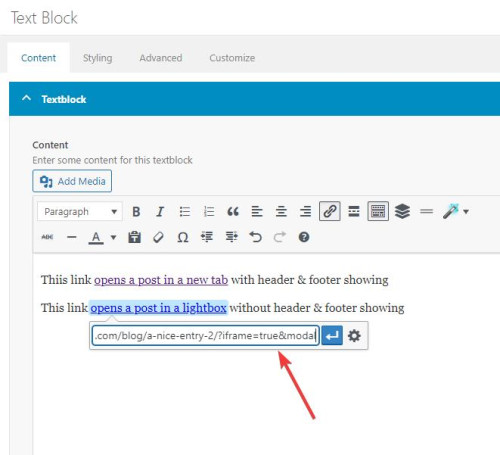
Then I added two snippets in my WP Code plugin, the first is a PHP snippetfunction add_modal_qs(){ if(isset($_GET['modal'])) { global $avia_config; if(isset($avia_config)) { $avia_config['template'] = 'blank'; } } } add_action('init', 'add_modal_qs');the second is a CSS snippet
#top.blank .title_container,#top.blank #main .sidebar{display:none;}
#top.blank .container .av-content-small.units {width: 100%;}
#top.blank .container .content {border: none;}
#top.blank #main .sidebar {border: none;}
The PHP snippet opens the post in a lightbox with no header or footer, the CSS snippet hides the titlebar and the sidebar and makes the post content full width.
So the first link, with the normal url, opens the post in a new tab with everything showing:
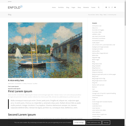
the second link with ?iframe=true&modal added to the url open a lightbox with only the content showing:

Best regards,
MikeHey Gianluca,
Thank you for your patience, I see that you have imported many demos and so your menu shows “home” pages from many different demos. The demos were not designed to work together like this so perhaps a conflict occurred. Try resetting your site with the plugin WP Reset and then try importing the shop demo again, if you still have problems then please include a admin login in the Private Content area so we can examine.Best regards,
MikeHey ausgesonnen,
This seems to ba a duplicate thread, I offered a solution in your other thread, please review.Best regards,
MikeHi,
Don’t be embarrassed, it can happen to the best of us :) Glad we were able to help, if you have any further questions please create a new thread and we will gladly try to help you. Thank you for using Enfold.Best regards,
MikeHi,
Thank you for your patience and your screenshots, try this CSS in your Enfold Theme Options ▸ General Styling ▸ Quick CSS field:#main .avia-timeline-vertical.av-milestone-placement-left .av-milestone-content-wrap { width: 44%; }Please ensure to copy the code from the forum and not an email notification so the symbols are not converted.
After applying the css, please clear your browser cache and check.Best regards,
MikeHey northorie,
Try starting with the theme options to have the cookie bar at the bottom of the page, and then add this CSS in your Enfold Theme Options ▸ General Styling ▸ Quick CSS field:#top .avia-cookie-consent.avia-cookiemessage-bottom { bottom: unset; left: unset; margin: 0; position: absolute; top: 50%; left: 50%; transform: translate(-50%, -50%); background-color: rgba(0,0,0,0.3); } #top .avia-cookie-consent .avia-cookie-consent-button { display: block; width: 60%; margin: 10px auto; } #top .avia-cookie-consent p { display: block; padding-bottom: 20px; } #top .avia-cookie-consent-button { border-radius: 50px; } @media only screen and (max-width: 767px) { #top .avia-cookie-consent.avia-cookiemessage-bottom { width: 80%; } } @media only screen and (min-width: 768px) { #top .avia-cookie-consent.avia-cookiemessage-bottom { width: 25%; } }the desktop results:

tablet:

mobile:

Please ensure to copy the code from the forum and not an email notification so the symbols are not converted.
After applying the css, please clear your browser cache and check.Best regards,
MikeHey jeel147,
Thank you for your patience, to remove the pencil icon try this CSS in your Enfold Theme Options ▸ General Styling ▸ Quick CSS field:.fallback-post-type-icon { display: none; }The space between each item is created by the padding, this css will reduce it in half, but feel free to adjust to suit.
.bloglist-compact.post-entry {
    padding: 7px 0;
}
Please ensure to copy the code from the forum and not an email notification so the symbols are not converted.
After applying the css, please clear your browser cache and check.Best regards,
MikeHi,
I logged into your site and review your css and found the error, your comment error disabled a large section of css:

in the screenshot all of the green css is disabled my the misplaced comment. I corrected it for you, please clear your browser cache and check.Best regards,
MikeFebruary 11, 2024 at 7:53 pm in reply to: Custom Field “Hide on sigle entry”, and Gravity Forms #1434019Hi,
Thanks for the video, I’m not sure how your plugin works, but your test post is a Block Editor post on the backend, but if I publish it it seems to be a ALB post on the frontend, so I believe this causes an issue. Similar to if you try to switch editors after a post is created, this often causes errors with the content.
If you don’t want the featured image to show you can use this css to hide it:.single-post .big-preview.single-big { display: none; }This might be the best way to work around this.
Best regards,
MikeHi,
Glad we were able to help, if you have any further questions please create a new thread and we will gladly try to help you. Thank you for using Enfold.Best regards,
MikeHey rqn,
If you want to hide the prev / next post navigation and add a new blog post navigation to the bottom of the posts, above the share buttons, try adding this code to the end of your child theme functions.php file in Appearance ▸ Editor:add_filter( 'the_content', 'prev_next_post_nav' ); function prev_next_post_nav( $content ) { if ( is_singular('post') ) { $content .= '<div style="clear:both;"></div>'; $content .= '<div class="prev-next-nav-container">'; $content .= '<div class="prev-nav">'; $content .= get_previous_post_link(); $content .= '</div>'; $content .= '<div class="next-nav">'; $content .= get_next_post_link(); $content .= '</div>'; $content .= '</div>'; return $content; } else { return $content; } }Then add this CSS in your Enfold Theme Options ▸ General Styling ▸ Quick CSS field:
.prev-next-nav-container {
	width: 100%;
	height: 70px;
    padding-top: 20px;
    padding-bottom: 10px;
}
.prev-next-nav-container .prev-nav {
	display: inline-block;
	float: left;
    border-style: solid;
    border-width: 2px;
    border-radius: 0px;
    text-align: center;
    padding: 5px;
    text-decoration: none;
}
.prev-next-nav-container .next-nav {
	display: inline-block;
	float: right;
    border-style: solid;
    border-width: 2px;
    border-radius: 0px;
    text-align: center;
    padding: 5px;
    text-decoration: none;
}
.prev-next-nav-container .prev-nav:hover,
.prev-next-nav-container .next-nav:hover {
	background-color: rgba(0,0,0,.2);
	color: #fff;
}
.prev-next-nav-container .prev-nav:hover a,
.prev-next-nav-container .next-nav:hover a {
	color: #fff;
}
.prev-next-nav-container .prev-nav a,
.prev-next-nav-container .next-nav a {
	display: inline-block;
}
.prev-next-nav-container .prev-nav:empty,
.prev-next-nav-container .next-nav:empty,
.single-post .avia-post-nav.avia-post-prev,
.single-post .avia-post-nav.avia-post-next {
  display: none;
}
This will make post navigation buttons like this:

The buttons only have a light styling, you can adjust to suit.
On Advanced Layout Builder posts they will show at the bottom of the post page:

Please ensure to copy the code from the forum and not an email notification so the symbols are not converted.Best regards,
MikeHi,
The css that Rikard posted above is specific for the one image on your page, note the specific class .av-lsh4cogd-a3efe67e0d537b1ce26e3bade8c60c08.
You can also add the page ID if you wish:.page-id-1076599 .av-lsh4cogd-a3efe67e0d537b1ce26e3bade8c60c08 .av-image-caption-overlay-center { vertical-align: bottom; }Please ensure to copy the code from the forum and not an email notification so the symbols are not converted.
Best regards,
MikeHi,
Glad we were able to help, if you have any further questions please create a new thread and we will gladly try to help you. Thank you for using Enfold.Best regards,
MikeHi,
Try this CSS in your Enfold Theme Options ▸ General Styling ▸ Quick CSS field:#top .main_color .avia-data-table.avia_pricing_minimal.not-accepted th { background-color: red; color: white; text-align: left; }Please ensure to copy the code from the forum and not an email notification so the symbols are not converted.
After applying the css, please clear your browser cache and check.Best regards,
MikeHey carmen,
Thanks for your question, if you use the Enfold builder, (ALB) Advanced Layout Builder, to build a page please don’t edit it with another builder, like the WP Classic Editor, Block Editor, etc. This can lead to issues, if you want to see the raw page shortcode please Enable the Avia Layout Builder Debugger and this will show a new area under the builder that shows the shortcode.Best regards,
MikeHi,
Perhaps you have an error in your css like a missing bracket, the css above doesn’t change the position, it only adds padding. Try removing the code above and add it to WordPress ▸ Customize ▸ Additional CSS, perhaps you should also check your custom css with a css validator for a missing bracket.
If it still doesn’t work then remove it so your site works as before, and include a admin login in the Private Content area so we can examine.Best regards,
MikeHi,
Try this javascript it will get url of the product page with the “more info” button when clicked and then redirect to your contact form page and add the original page url into a form field. For this example it adds the url into the message field, but you could add another field for the url so your visitors don’t write over the url.
Try testing this javascript as is first by adding this code to the end of your child theme functions.php file in Appearance ▸ Editor:function custom_script_to_add_product_url_into_contact_form() { ?> <script> document.addEventListener("DOMContentLoaded", function() { var button = document.getElementById('woocommerce-catalog_custom_button'); if (!!button) { button.removeAttribute('href'); button.onclick = function() { redirectToForm(); }; } function redirectToForm() { var currentPageUrl = window.location.href; window.location.href = 'https://www.officineditrevi.com/en/contact-us-products-info/?source=' + encodeURIComponent(currentPageUrl); } var urlParams = new URLSearchParams(window.location.search); var sourceUrl = urlParams.get('source'); if (sourceUrl) { var formField = document.querySelector('.cf7-txt-c'); formField.value = sourceUrl; } }); </script> <?php } add_action( 'wp_footer', 'custom_script_to_add_product_url_into_contact_form', 99 );Please ensure to copy the code from the forum and not an email notification so the symbols are not converted.
If it then works you can try adding another field to your form and adjust the code above.
I tested this by injecting it in the browser and it worked for the test page and form that you linked above, I assume that all of the buttons on your product pages are the same.Best regards,
MikeHey ausgesonnen,
Try this CSS in your Enfold Theme Options ▸ General Styling ▸ Quick CSS field:@media only screen and (max-width: 1190px) { #top .avia-icongrid.av-flex-cells.av-break-989 .av-icon-cell-item { flex: 1 1 100%; } }Please ensure to copy the code from the forum and not an email notification so the symbols are not converted.
After applying the css, please clear your browser cache and check.Best regards,
MikeFebruary 10, 2024 at 11:30 pm in reply to: So I need two menus and I need to choose which menu should be displayed on each #1433957Hi,
Very well, if you have any further questions please create a new thread and we will gladly try to help you. Thank you for using Enfold.Best regards,
MikeHey beverlystone,
Thank you for the link to your site and the screenshot, try this CSS in your Enfold Theme Options ▸ General Styling ▸ Quick CSS field:@media only screen and (max-width: 767px) { .responsive .avia_responsive_table .avia-data-table tr:first-child th { display: block; } .responsive .avia_responsive_table .avia-data-table td:before { display: none; } }Please ensure to copy the code from the forum and not an email notification so the symbols are not converted.
After applying the css, please clear your browser cache and check.Best regards,
MikeFebruary 10, 2024 at 10:58 pm in reply to: So I need two menus and I need to choose which menu should be displayed on each #1433954Hi,
I’m not sure if WPML works with the Elementor elements, I assume that it does.
I don’t recommend using Elementor, Enfold has it’s own built-in builder and typically other builders can cause a conflict.
Unless there is anything else we can assist with on this issue, shall we close this thread then?Best regards,
MikeHi,
Thank you for the link to your site but the login gives this error:
Unknown email address. Check again or try your username.
Please check.When you say that the “comments are not being received” do you mean that you are not getting the email or they are not in the comment section of WordPress?
Enfold doesn’t customize the WordPress comment function, so if you are not getting the email alerting that you have a new comment it could be that it is going to your email spam folder, or some webhosts use Apache SpamAssassin which will sometimes delete the spam before it goes to your spam folder.Your site should be using the email address for your domain and you should be using a SMTP plugin to send emails, like WP Mail SMTP, because the built-in WordPress PHP mail can trigger a spam rating. You should also not use a free email box like Gmail.
Try setting this up and see if it helps, otherwise correct the login and install the plugin WP Mail Logging to help.Best regards,
Mike -
AuthorPosts