Forum Replies Created
-
AuthorPosts
-
Hey Elena,
Thank you for the inquiry.
The slider area on renders at 1702x760px on our end, but the uploaded image is only 1500x840px and with a different aspect ratio compare to the slider area — which is why part of the image is getting cut off.
To fix this, please upload a new slider image that is at least 1702x760px with an aspect ratio of approximately 16:7 (or 2.24:1) as the safest option going forward.
Let us know the result.
Best regards,
IsmaelHi,
Sorry for the delay. We’re now able to publish a page without issue. We edited the enfold/config-templatebuilder/avia-template-builder/php/class-shortcode-template.php file around line 2502:
$this->config['self_closing'] = is_array( $params ) && array_key_exists( 'content', $params ) && is_null( $params['content'] ) ? 'yes' : 'no';Please confirm if the fix is working on your end.
Best regards,
IsmaelMarch 25, 2026 at 2:36 pm in reply to: Bug report: filesize column shows pre-conversion size when attachment file is replaced #1496324Hey,
Thank you for the detailed bug report. We will forward the issue to our channel.
Best regards,
IsmaelMarch 25, 2026 at 2:18 pm in reply to: Enfold ALB save routine strips closing tags from _aviaLayoutBuilderCle #1496323Hi,
Sorry for the confusion. We misread your first post and thought that you were intentionally saving html with unclosed tags. Please post the html or content that you’re trying to add to the page and provide the login details in the private field so we can test this further.
Best regards,
IsmaelMarch 25, 2026 at 2:14 pm in reply to: Removal of my support request from your website/forum #1496321Hey Stefan,
Thank you for the inquiry.
We have moved the content of the thread to the private field so only you and the moderators can see the content. Let us know if there’s anything else we can help you with.
Best regards,
IsmaelHi,
Thank you for the update.
We saved the content of the Welcome page as a template called “welcome temp a”, applied it to another page, and added new elements, but we are unable to reproduce the issue. Please try editing the page in the private field to see if you can reproduce the issue there.
Best regards,
IsmaelHi,
Thank you for the update.
The screenshot is not displaying correctly on our end. Could you please share it again so we can better understand what you need help with?
Best regards,
IsmaelHi,
Glad to know that this has been resolved! Please don’t hesitate to open another thread if you have more questions.
Have a nice day.
Best regards,
IsmaelHey,
Thank you for the inquiry.
To add a custom social icon in the current version, you need to make sure the icon is registered through the iconfont manager. If you are using a custom fontello font, you need to upload it via Enfold > Import/Export first so the theme recognizes the font family and unicode character.
After uploading the icon pack, update your snippet like this:
function avia_add_custom_icon( $icons ) {
    $icons['spotify'] = array(
        'font'  => 'fontello',
        'icon'  => 'ue907'
    );
    return $icons;
}
add_filter( 'avf_default_icons', 'avia_add_custom_icon', 10, 1 );

function avia_add_custom_social_icon( $icons ) {
    $icons['spotify'] = 'spotify';
    return $icons;
}
add_filter( 'avf_social_icons_options', 'avia_add_custom_social_icon', 10, 1 );
A couple of things to check:
1. Make sure the code is placed in your child theme’s functions.php, not the parent theme.
2. Confirm the font family name in the uploaded pack is exactly “fontello” and the unicode value matches what is in the font.
3. Go to Enfold > Performance and disable file compression temporarily, then clear your cache and test.If the icon still does not appear after confirming those steps, please share a screenshot of your Enfold > Import/Export tab showing the uploaded font pack, and also let us know where exactly the icon is not showing up (social icons in theme options, or inside the page builder). You can post login details in the private field if needed.
You can also refer to the icon documentation here for more context:
— https://kriesi.at/documentation/enfold/icon/
Let us know the result.
Best regards,
IsmaelHey Advantage09,
Thank you for the inquiry.
After reviewing the page, we can see that there are three Separator/White Space elements placed below the Grid Row element. These are causing the large gap on mobile.
You have two options to fix this:
1. Remove the three Separator/White Space elements entirely if they are not needed.
2. Keep them but set their visibility to desktop only. You can do this by editing each Separator element, going to Advanced > Responsive, and adjusting the Element Visibility setting so they only show on desktop.Please make sure to purge the cache before testing. Let us know the result.
Best regards,
IsmaelHi,
Glad we could be of help! Please feel free to open another thread if you have more questions.
Have a nice day.
Best regards,
IsmaelHey,
Thank you for the update.
Sections disappearing from the page is usually caused by invalid html in one of the layout builder elements. If any Text Block or Code element on the page contains an unclosed html tag or malformed markup, it can break the structure of the entire page and cause sections below it to collapse or disappear entirely.
Could you check if you have added any custom html or script tags inside any of the elements on that page? If so, please make sure all tags are properly opened and closed. For example, a missing closing tag like div or section can silently break everything below it.
A quick way to test this is to temporarily disable elements one by one (starting from the top of the page) until the missing sections reappear. That will help narrow down which element is causing the issue.
If you are not sure where to start, please share your login credentials in the private field below and we will take a look directly.
Let us know the result.
Best regards,
IsmaelHey maryenvato,
Thank you for the inquiry.
There are a few things that could be preventing the Google Maps iframe from displaying correctly in Enfold.
First, check if Google Maps is enabled in the theme options. Go to Enfold > Google Services and make sure the Google Maps feature is not disabled there. If it is disabled, the map element will not render on the frontend.
Second, it’s possible that a privacy, cookie consent, or GDPR plugin is blocking the embedded map from loading. These plugins sometimes intercept external resources like Google Maps iframes and prevent them from rendering until the user gives consent. Please try disabling any such plugin temporarily to see if the map loads correctly without it.
You should also check the built-in cookie handling settings in the theme. Go to Enfold > Privacy & Cookies > Cookie Handling and review the settings there, as Enfold has its own conditional loading options for external services like Google Maps.
If you’re using the built-in Google Map element in the layout builder, make sure you have a valid API key entered under Enfold > Google Services as well, since Google now requires an API key for maps to load.
Let us know the result, and feel free to share a screenshot or the code snippet you mentioned if the issue persists.
Best regards,
IsmaelHey Gonmyr,
Thank you for the inquiry.
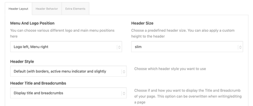
To get a header that look something closer to the samanthasiffring.com site, try to go to Enfold > Header > Header Layout and set Menu and Logo Position to “Logo center, Menu above”. On the specific page, open the Layout tab and set the header transparency to transparent or glassy. Build the hero section using a fullscreen Color Section or slideshow in the Advance Layout uilder.
For a full overview of the available header options, please check the documentation:
— https://kriesi.at/documentation/enfold/header/
Let us know if you have more questions.
Best regards,
IsmaelHey tchamp77,
Thank you for the update.
The duplicate title seems to be coming from a custom modification. We can see the extra title is wrapped in a .custom-loop-title container, which is not part of theme’s default output.
Could you check if any plugins or custom code were recently added that might be injecting that extra title? A good first step would be to temporarily deactivate your plugins one by one to see if the duplicate disappears. Also check if there are any custom php snippets in your child theme’s functions.php that might be hooking into the product loop.
Let us know the result.
Best regards,
IsmaelHey webzies,
Thank you for the inquiry.
It looks like the critical error is caused by the create_function() in your child theme. This function was deprecated in php 7.2 and completely removed in PHP 8.0, which is why switching to PHP 8.1 triggers a fatal error.
You’ll need to replace any instances of create_function() in your child theme. Since this change is in your child theme and not Enfold core, you’ll need to make those updates yourself. You can search your child theme files for “create_function” to locate all instances.
Let us know if the issue persists after making those changes.
Best regards,
IsmaelHey paulgross,
Thank you for the inquiry.
This is expected behavior. The tab element in Enfold uses anchor-based navigation (hash URLs), so clicking a tab only toggles the content on the current page. When you navigate to a detail entry URL like https://cprn.org/about-us/entry/200578/, the tab section from the parent page is no longer present, so clicking a tab just appends the hash to the current URL without redirecting back.
To get the behavior you’re looking for, the tab links on the detail page would need to redirect back to the parent page with the appropriate hash (e.g., https://cprn.org/about-us/#board). This would require custom js or modifications to the view template.
One approach is to override the tab click behavior using a small js snippet in your child theme:
add_action( 'wp_footer', function() {
    ?>
    <script>
    jQuery(document).ready(function($) {
        $('.tabcontainer .tab_titles .tab').on('click', function() {
            if (window.location.href.indexOf('/entry/') !== -1) {
                var hash = $(this).data('fake-id');
                window.location.href = 'https://cprn.org/about-us/' + hash;
            }
        });
    });
    </script>
    <?php
} );
This checks whether the user is on a detail entry URL and redirects them back to the parent page with the correct tab hash instead of just appending it. Another thing that might help is to create a custom layout that you can apply to multiple pages.
— https://kriesi.at/documentation/enfold/custom-layout-and-dynamic-content/
— https://kriesi.at/documentation/enfold/custom-element-templates/Let us know how it goes
Best regards,
IsmaelHey famerise,
Glad to know the issue has been resolved.
To avoid conflicts, make sure the same optimization tasks are not being handled by both plugins at the same time. We recommend disabling file compression in Enfold > Performance > File Compression and let SiteGround Optimizer handle that instead. If you notice any issues, try to disable the “Combine CSS” and “Combine JS” options in SiteGround Optimizer first.
For more details, please refer to the SiteGround Optimizer documentation.
Please feel free to open a new thread if you have more questions.
Have a nice day.
Best regards,
IsmaelHey newki75,
Thank you for the update.
We were able to reproduce the issue on a fresh page using only the ALB editor, which means the problem is not related to the mixed editor usage or any custom shortcode. To proceed, we will need access to your server via S/FTP. Please provide the login credentials in the private field below.
Before we begin testing, please make sure you have a full site backup in place, as we may need to temporarily disable or modify files while investigating. Please confirm that the backup has been made before sharing the credentials.
Best regards,
IsmaelHi,
Thank you for the update.
To check your theme version, go to Appearance > Themes and click the Enfold theme thumbnail. The version number should appear there. Please make sure you are on the latest version (7.1.4).
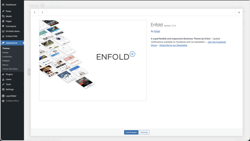
Looks like your site has two-factor authentication enabled — asking for a 9-digit code. Could you temporarily disable that so we can log in, or alternatively clone the site to a staging environment and share the staging URL and credentials instead?
Let us know once that’s done and we’ll investigate further.
Best regards,
IsmaelHey thebusybee,
Thank you for the inquiry.
This looks like a plugin conflict issue causing the builder to not load correctly. Could you try disabling all plugins temporarily, then go to Enfold > Performance panel and disable the File Compression settings, purge your cache and test again.
If the issue persists, please share your login credentials in the private field so we can take a closer look.
Best regards,
IsmaelHey famerise,
Thank you for the update.
To help us narrow down the issue, could you let us know if you have added any custom css or php modifications to your child theme’s style.css or functions.php, or override any template files? Even small additions can sometimes interfere with how the theme renders certain elements like the full width slider. If you have any custom code in the child theme, please try to temporarily remove or disable it and check if the slider display correctly again.
Make sure to purge the cache before testing. If the issue persists, please post the login credentials in the private field so we can take a closer look.
Best regards,
IsmaelHi,
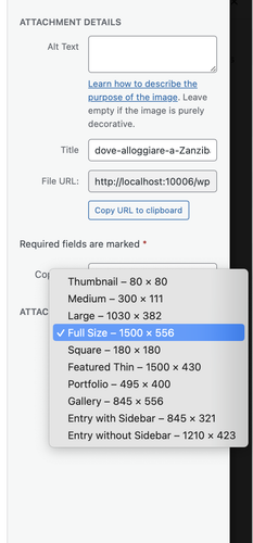
Thank you for the update.
When you insert an image from the Media Library as background for a Color Section, make sure you select “Full Size” from the size dropdown before inserting it. The default selection is often a smaller cropped or resized version, which will appear soft or blurry when stretched to fill a full-width section.
Please give that a try and let us know if the image looks sharper after switching to full size.
Best regards,
IsmaelHey lara666,
Thank you for the inquiry.
Could you please let us know which version of the Enfold theme you are currently running? You can check this under Appearance > Themes. Please make sure you are on the latest version (7.1.4). You can find instructions on how to update the theme here:
— https://kriesi.at/documentation/enfold/theme-update/
In the meantime, please try going to Enfold > Performance > File Compression, disable the CSS and JS file compression options, save the settings, then purge your cache and reload the page editor. If the issue persists after that, please share the site URL and provide the login credentials in the private field so we can take a closer look.
Let us know the result.
Best regards,
IsmaelHi,
Thank you for the inquiry.
Regarding the logo shrinking on smaller screens and the burger menu/search icon overlapping, you can add the following css to Enfold > General Styling > Quick CSS field:
@media only screen and (max-width: 1290px) {
  .responsive #top .logo img {
    max-width: 62%;
  }

  #avia-menu {
    margin-right: 0;
    padding-right: 0;
  }
}

@media only screen and (max-width: 767px) {
  .responsive #top .logo img {
    max-width: 35%;
  }
}
Adjust the max-width value as needed to fit your logo within the header. Please make sure to purge the cache before testing.

Let us know if the issue persists.
Best regards,
IsmaelMarch 17, 2026 at 6:13 am in reply to: Few Content Element not showing up for editing and few errors appearing #1496090Hey epurchase,
Thank you for the inquiry.
The Advanced Layout Builder seem to be working correctly when we checked. The errors you’re seeing are probably coming from a plugin related to “gd-mcp”, not the theme itself. Those notices are causing the “headers already sent” warnings which can interfere with the backend.
We also noticed that there are older versions of the Enfold theme still present in your themes folder. Please remove them or move them outside of the themes directory, as having multiple copies of the theme can cause unexpected conflicts. We would also recommend upgrading your PHP version — PHP 7.4 is end of life and some newer WordPress features work better on php 8.1 or higher.
Let us know if the issue persists after trying those steps.
Best regards,
IsmaelHey jpassmann,
Thank you for the inquiry.
The demo images bundled with Enfold may or may not include a license for use on live websites — it varies by image. We cannot guarantee that any of them are safe to use publicly.
The safest course of action is to replace all demo images with your own. There are several royalty-free sources you can use:
— https://unsplash.com
— https://www.pexels.com
— https://pixabay.comIf you still want to check the origin of a specific image first, you can do a reverse image search to find the source and confirm its license terms:
— https://images.google.com
— https://tineye.comWe tried checking your site but it redirects to a 404, so we were unable to verify which image you are referring to.
Let us know if you have more questions.
Best regards,
IsmaelHey Sabina,
Thank you for the inquiry.
Regarding the registration issue, you will need your Themeforest purchase code to register on our support forum. You can find this in your Themeforest account under your downloads. Once you have it, please use it to register here:
— https://kriesi.at/support/register/
For the image quality issue, we would need to take a closer look at your site to diagnose what’s happening. The blurriness could be caused by a few things, such as the image being scaled up beyond its original dimensions, css filters applied to the section, or the image compression settings in WordPress.
Could you share a link to your site or a screenshot so we can check it out? Please post the link or screenshot in the private field below.
Let us know if you have more questions.
Best regards,
IsmaelHey bemodesign,
Thank you for the inquiry.
You can disable the breadcrumb from the Enfold > Header > Header Layout > Header Title and Breadcrumbs — set it to “Hide Both”.
Let us know if you have more questions.
Best regards,
IsmaelHey kreativeseite,
Thank you for the inquiry.
Sorry to hear you’re having trouble updating plugins. There are a few things you can try:
1. Make sure Enfold is updated to the latest version (7.1.4). You can check and update from Enfold > Theme Updates or login to your Themeforest account.
2. Try switching to a default WordPress “twenty” themes temporarily and attempt the plugin update again. This will help determine whether the issue is theme-related or not.
If the problem persists even with the default theme active, this is likely a WordPress core, server or hosting issue rather than something related to Enfold. In that case, we’d recommend reaching out to your hosting provider or the plugin developers directly for further assistance.
Best regards,
Ismael -
AuthorPosts