Forum Replies Created
-
AuthorPosts
-
March 5, 2026 at 6:08 am in reply to: Enfold ALB save routine strips closing tags from _aviaLayoutBuilderCle #1495753
Hey nebuddlho,
Thank you for the inquiry.
This is the expected behavior, which is why there are warnings in the element fields to ensure that the html added to the builder is valid. Please review the content, specifically the html tags and make sure that all tags are properly closed and valid before saving the page.
Let us know if you have any further questions.
Best regards,
IsmaelHi,
Great! Glad to know that you’ve found a working solution. Please feel free to open another thread if you have more questions.
Have a nice day.
Best regards,
IsmaelHi,
@ivloulinghong: In the Enfold > Footer > Copyright field, simply add the placeholder [nolink] to remove the default copyright text. Please check the screenshot below.
Best regards,
IsmaelHi,
Sorry for the delay. Unfortunately, adding swipe functionality to the tab section would require modifications that are beyond the scope of support. At the moment, the tab titles are accessible only by clicking and are not swipeable. Please feel free to open another thread if you have any more questions about the theme.
Best regards,
IsmaelHi,
Great! Glad to hear that you’ve found a working solution — it looks good on our end. Please don’t hesitate to open another thread if you have any further questions.
Have a nice day.
Best regards,
IsmaelHi,
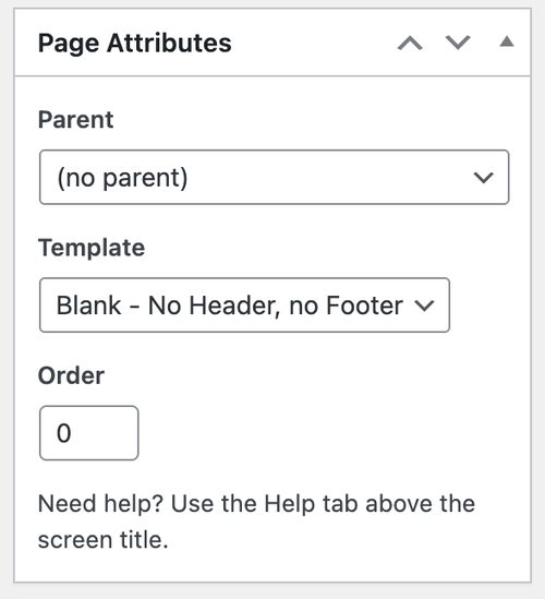
Thank you for the inquiry.
You can find the Order field in the page editor. Edit the page, then look for the Page Attributes box.
Let us know if you need more info.
Best regards,
IsmaelMarch 4, 2026 at 6:15 am in reply to: Filter avf_form_autoresponder_copy greift nicht – Formular-Kopie entfernen #1495715Hey tebitron,
Thank you for the inquiry.
You can use this filter in the functions.php file to strip down the form data from the autoresponder message.
add_filter( 'avf_contact_form_autoresponder_mail', function( $mail_array, $new_post, $form_params, $form_obj ) {
    if( isset( $mail_array['Message'] ) ) {
        $marker = '<strong>' . __( 'Your Message:', 'avia_framework' ) . '</strong>';
        $pos = strpos( $mail_array['Message'], $marker );

        if( $pos !== false ) {
            $mail_array['Message'] = rtrim( substr( $mail_array['Message'], 0, $pos ) );
        }
    }
    return $mail_array;
}, 10, 4 );
Best regards,
IsmaelMarch 4, 2026 at 5:59 am in reply to: Cart symbol no longer showing in Shopping Cart box in header #1495714Hi,
Thank you for the update.
The cart icon displays fine on our own installation, so it’s likely a conflict with one of your plugins or a recent modification to the theme. Please try disabling the compression settings and the cache plugin to see if that makes a difference. For now, keep the css code to maintain the cart icon color.
Best regards,
IsmaelHi,
Great! Glad this has been resolved. Please don’t hesitate to open another thread if you have more questions.
Have a nice day.
Best regards,
IsmaelHey there,
Thanks for reaching out and for your interest in improving compatibility with Enfold — we really appreciate it.
We have sent you a copy of the latest version of the theme for your development and testing purposes. Please let us know if you need anything specific from our side or if there are particular areas where we can assist to ensure smooth compatibility with your plugins.
Looking forward to collaborating with you.
Best regards
Kriesi TeamHi,
Thank you for this translation @BigBatT. We’ll forward this to our channel and possibly include it in the next patch.
Best regards,
IsmaelHi,
Sorry for the delay. The header or footer should not display or flash if this option is enabled because they are not rendered in the document at all. Please make sure to purge the cache or check the site on incognito mode.
We’ll need access to or at least be able to view the site. Please provide the site URL and login details in the private field. If possible, also include a short video clip or screenshots of the issue.
Best regards,
IsmaelHi,
Thank you for the confirmation. Is this the only notice left? We’ll investigate the issue further.
Best regards,
IsmaelHi,
Glad to know that you managed to find a working solution. Please feel free to open another thread if you have any further questions.
Have a nice day.
Best regards,
IsmaelHey annevoelkel,
Thank you for the inquiry.
The site is currently in maintenance mode, so we’re not able to check it. Please provide the login details in the private field and if possible, share a screenshot as well. In the meantime, you can try using a plugin such as Fonts Plugin to configure existing fonts or add additional fonts to your installation.
— https://wordpress.org/plugins/olympus-google-fonts/
Best regards,
IsmaelMarch 3, 2026 at 5:29 am in reply to: Cart symbol no longer showing in Shopping Cart box in header #1495678Hey zimbo,
Thank you for the inquiry.
What happens when you add the following css code?
#top #header .av-main-nav>li>a>svg:first-child, #top #wrap_all .header_color .cart_dropdown_first .cart_dropdown_link.avia-svg-icon svg:first-child {
    fill: #000;
    stroke: #000;
}
Best regards,
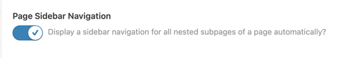
IsmaelHey JennyGr,
Thank you for the inquiry.
You might be referring to the Enfold > Sidebar Settings > Page Sidebar Navigation option. When enabled, this option displays sidebar navigation containing the nested subpages of the active page. Let us know the result.
Best regards,
IsmaelHi,
Great! Let us know if you have more questions. Have a nice day.
Best regards,
IsmaelFebruary 27, 2026 at 6:38 am in reply to: Enfold Accordion Toggles Randomly Missing (Preview + Front-End) #1495557Hi,
Thank you for the details.
The Cloudflare-side changes that were made included the following:
• Bot Fight Mode enabled
• Rate limiting / protection rules added for:
• /wp-admin/admin-ajax.php
• /wp-json/*
We did find an access error for admin-ajax, so this might be what caused the builder to not work correctly. Try removing the rate limiting configuration for this.
• /wp-admin/admin-ajax.php • /wp-json/*We tried creating a test page (see private field), and the builder seems to be loading correctly. However, we noticed that another builder (WP Bakery) is enabled, which might be conflicting with the theme.
Best regards,
IsmaelFebruary 27, 2026 at 6:31 am in reply to: Not registered dependencies for Enfold css and js #1495556Hi,
Glad to know that this resolved the issue. For the remaining notice, please replace the admin_enqueue_scripts hook with the following code.
add_action( 'admin_enqueue_scripts', function() {

    if ( ! wp_style_is( 'avia-layout', 'registered' ) ) {
        wp_register_style( 'avia-layout', false );
    }

    if ( ! wp_style_is( 'avia-shortcodes', 'registered' ) ) {
        wp_register_style( 'avia-shortcodes', false );
    }

    if ( ! wp_script_is( 'avia-shortcodes', 'registered' ) ) {
        wp_register_script( 'avia-shortcodes', false );
    }

    if ( ! wp_script_is( 'avia_element_js', 'registered' ) ) {
        wp_register_script( 'avia_element_js', false );
    }

}, 1 );
Best regards,
IsmaelFebruary 27, 2026 at 6:25 am in reply to: 7.1.4 VERSION seems to be causing issue with images in portfolio and posts #1495555Hey volpagirl,
Thank you for the inquiry.
Would you mind providing a screenshot of the issue or posting the login details in the private field? You can use platforms like FreeImage, ImgBB, PostImages or Dropbox to upload and share the screenshot. Here are the steps to follow:
1.) Visit the website of your chosen platform, such as Savvyify, ImgBB, PostImages or Dropbox.
2.) Locate the option to upload a file or an image.
3.) Select the screenshot file from your computer or device and upload it to the platform.
4.) After the upload is complete, you will be provided with a shareable link or an embed code.
5.) Copy the link or code and include it in your message or response to provide us with the screenshot.Thank you for taking the time to share the screenshot. It will help us better understand the issue you’re facing and provide appropriate assistance.
Best regards,
IsmaelHi,
How did you add the code before? We didn’t find a functions.php file in the child theme, so we created one and added the admin_enqueue_scripts hook, which removed the notices in the Pages panel. Please make sure to purge the cache before checking.
Best regards,
IsmaelFebruary 27, 2026 at 6:11 am in reply to: Burger and Social Media icons position on Mobile view #1495553Hi,
Odd. This is not the menu style I saw yesterday. Please try to use this css code instead:
#av-burger-menu-ul li.av-show-submenu > .sub-menu > li > a > .avia-menu-text {
    color: #ffffff;
    font-size: 0.8em;
}
To add a submenu indicator, try to add this css code:
.av-width-submenu > a::after {
    content: "›";
    display: inline-block;
    margin-left: 6px;
    transform: rotate(90deg);
    font-size: 0.9em;
}

.av-width-submenu.av-show-submenu > a::after {
    content: "";
}
Best regards,
IsmaelHi,
Great! Glad to know that you have found a working solution. Thanks for sharing!
Have a nice day.
Best regards,
IsmaelHi,
Yes, that seems to be the case. Please feel free to open another thread if you have more questions about the theme. Thank you for your understanding.
Best regards,
IsmaelHi,
Great! Glad to hear that the issue has been resolved. Please feel free to open a new thread if the issue occurs again.
Have a nice day.
Best regards,
IsmaelFebruary 26, 2026 at 6:21 am in reply to: Enfold Accordion Toggles Randomly Missing (Preview + Front-End) #1495512Hi,
We can see a lot of script errors when we try to edit the same page. Did you install a plugin recently? Please try deactivating all plugins temporarily, then reactivate them one at a time to identify which one is causing the script errors.
Let us know the result.
Best regards,
IsmaelHey Tilman,
Thank you for the inquiry.
You can add this css code to apply a minimum height to the horizontal gallery container on smaller screens.
@media only screen and (max-width: 767px) {
    .responsive .av-horizontal-gallery-inner {
        position: static;
        min-height: 400px;
    }
}
Result:

Best regards,
IsmaelHi,
Thank you for the login info.
We tried logging in, but it’s asking for a 9-digit authentication code. The issue occurs because the post css file for that particular page is being deleted and returns a 404 error. You can try adding this code to the functions.php file to disable post css file generation for the home page.
add_filter( 'avf_post_css_create_file', function( $create ) {
    if ( is_singular() && get_the_ID() === 248 ) {
        return false;
    }

    return $create;
});
Best regards,
Ismael -
AuthorPosts