Forum Replies Created
-
AuthorPosts
-
Hey Thorsten,
Thank you for the inquiry.
There is no option for this, unfortunately. You’ll have to manually lock the options you don’t want editors to have access to. Let us know if you have any other questions.
Best regards,
IsmaelHi,
Did you apply the changes we recommended here https://kriesi.at/support/topic/cpt-sticky-posts-in-masonry/#post-1493891 before adjusting the date format? If you can create a test and provide the login details in the private field, we’ll try to take a closer look.
Best regards,
IsmaelHey Pierre,
Thank you for the inquiry.
Would you mind providing a screenshot of the issue and post the site URL in the private field? You can use platforms like FreeImage, ImgBB, PostImages or Dropbox to upload and share the screenshot. Here are the steps to follow:
1.) Visit the website of your chosen platform, such as Savvyify, ImgBB, PostImages or Dropbox.
2.) Locate the option to upload a file or an image.
3.) Select the screenshot file from your computer or device and upload it to the platform.
4.) After the upload is complete, you will be provided with a shareable link or an embed code.
5.) Copy the link or code and include it in your message or response to provide us with the screenshot.Thank you for taking the time to share the screenshot. It will help us better understand the issue you’re facing and provide appropriate assistance.
Best regards,
IsmaelHi,
The site is still not accessible on our endas mentioned in our previous reply: https://kriesi.at/support/topic/woocommerce-features-not-working/#post-1493886
We recommend hiring a freelance developer if you’re having trouble implementing the changes we suggested above. Thank you for your patience.
Best regards,
IsmaelHi,
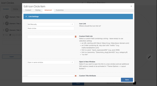
It’s possible, but you’ll need to modify the enfold/config-templatebuilder/avia-shortcodes/icon_circles/icon_circles.js file. Unfortunately, this is beyond the scope of our support. Let us know if you have any other questions.
Best regards,
IsmaelJanuary 19, 2026 at 6:15 am in reply to: Subject: Favicon not showing in Google SERP despite following all forum recommen #1494061Hi,
Great! Let us know if you have more questions. Have a nice day.
Best regards,
IsmaelHi,
Glad to know this has been resolved! Please feel free to open another thread if you have more questions.
Have a nice day.
Best regards,
IsmaelJanuary 19, 2026 at 5:43 am in reply to: Code Block with CSS Animation Only Works on One Specific Page #1494057Hey dlambers,
Thank you for the inquiry.
We copied the html into a test page and it seems to be working as expected (see private field). Please create a test page so we can check the issue properly.
Best regards,
IsmaelHi,
Thank you for the update.
Have you tried the steps provided in the following link? https://kriesi.at/documentation/enfold/contact-form/#my-contact-form-is-not-sending-emails-
Try to configure a plugin like WP Mail SMTP using your domain email (eg. (Email address hidden if logged out) ) to make sure messages are sent via an authenticated mail server, set the form’s From email to match your domain (avoid gmail, yahoo or outlook), and make sure SPF/DKIM/DMARC records are correct — please contact your hosting or email provider. If the issues persist, consider using Contact Form 7, Gravity Forms or WPForms.
Best regards,
IsmaelHi,
What is the format of the termin_datum date field? Have you tried setting the format to Ymd or Y-m-d? WordPress meta_query with the type “DATE” expects the value in YYYY-MM-DD format or YYYYMMDD, so adjusting the date field format might help.
— https://developer.wordpress.org/reference/classes/wp_meta_query/
The ‘type’ DATE works with the ‘compare’ value BETWEEN only if the date is stored at the format YYYY-MM-DD and tested with this format.
Best regards,
IsmaelHi!
Looks like this is no longer possible based on our previous reply: https://kriesi.at/support/topic/use-of-avia-editor-in-popup-maker-plugin/#post-1467843
Please continue in this thread: https://kriesi.at/support/topic/pop-up-maker/
Cheers!
IsmaelHi,
Thank you for the clarification.
You can try this css code to apply your own toggle password icon to the password input field.
.show-password-input {
  width: 24px;
  height: 24px;
  border: 0;
  background-color: transparent;
  background-repeat: no-repeat;
  background-position: center;
  cursor: pointer;
  position: absolute;
  top: 4px;
  right; 9px;
}

.show-password-input[aria-label="Show password"] {
  background-image: url("eye-closed.svg");
}

.show-password-input[aria-label="Hide password"] {
  background-image: url("eye-open.svg");
}
Make sure to replace eye-closed.svg and eye-open.svg images with your own images.
Best regards,
IsmaelHey condonp,
Thank you for the inquiry.
Do you want to enable the ALB for the popup maker? We are not sure if this is possible and we may need to check the element to properly understand the issue. Please create a test page, then include the URL in the private field.
Best regards,
IsmaelJanuary 16, 2026 at 4:59 am in reply to: add description to video elements for accessibility #1494003Hey sky19er,
Thank you for the inquiry.
We recommend using an embed code so you don’t need to modify the video templates in the theme.
You can use the Text or Code Block element to add the embed code.If you do want to proceed with the modification, you can find the video element template in the
config-templatebuilder/avia-shortcodes/video/video.php file.Let us know if you need more info.
Best regards,
IsmaelJanuary 16, 2026 at 4:50 am in reply to: Open custom portfolio link only works partially with "load more" function. #1494002Hi,
Great! Glad to know that this has been resolved. Please don’t hesitate to open another thread if you have more questions.
Have a nice day.
Best regards,
IsmaelJanuary 15, 2026 at 6:07 am in reply to: Open custom portfolio link only works partially with "load more" function. #1493948Hi,
Thank you for the link.
We adjusted the script a bit, added change detection to the .av-masonry-container, then apply the target attribute to its child elements or entries. It should work correctly now.
add_action('wp_footer', function () {
    ?>
    <script>
    jQuery(function ($) {
        function applyTargetBlank(container) {
            container.find('a').each(function () {
                if (!$(this).attr('target') || $(this).attr('target') !== '_blank') {
                    $(this).attr('target', '_blank');
                }
            });
        }

        var masonryContainer = $('.av-masonry-container');

        applyTargetBlank(masonryContainer);

        var observer = new MutationObserver(function (mutationsList) {
            mutationsList.forEach(function (mutation) {
                if (mutation.addedNodes.length) {
                    $(mutation.addedNodes).each(function () {
                        if ($(this).hasClass('av-masonry-entry') || $(this).find('.av-masonry-entry').length) {
                            applyTargetBlank($(this));
                        }
                    });
                }
            });
        });

        if (masonryContainer.length) {
            observer.observe(masonryContainer[0], {
                childList: true,
                subtree: true
            });
        }

        $(window).on('debouncedresize', function () {
            setTimeout(function () {
                applyTargetBlank(masonryContainer);
            }, 2000);
        });

        $(document).on('click', '.av-masonry-load-more', function () {
            setTimeout(function () {
                applyTargetBlank(masonryContainer);
            }, 2000);
        });

    });
    </script>
    <?php
}, 9999);
Best regards,
IsmaelJanuary 15, 2026 at 5:44 am in reply to: How to get more space between Portfolio Grid pictures? #1493943Hi,
Thank you for the update.
You can add this css code to make the grid items transparent and add spaces between them.
#top .grid-entry.av_one_fourth {
    width: 20%;
    margin-right: 5%;
}

#top .grid-entry .inner-entry {
    background-color: transparent;
}

#top .grid-entry .grid-image img {
    width: 100%;
    max-width: 100%;
    height: auto;
}
Let us know the result.
Best regards,
IsmaelHi,
WooCommerce filter to our home page.
Please note that the default Woocommerce filters or widgets will only display on standard product pages or templates, such as product category pages or the base shop page. They will not display on custom pages, such as your homepage. This behavior is determined by the widget function, which we don’t have control over. You may need to look for a custom solution if you want to display filters on the homepage.
For the single product page, please try to follow these steps: https://kriesi.at/support/topic/enfold-sidebar-on-single-product-pages/#post-1162484
Best regards,
IsmaelJanuary 15, 2026 at 5:19 am in reply to: Contact form has stopped working on several websites #1493936Hey Andrew,
Thank you for the inquiry.
Have you tried setting a From address or activating an SMTP plugin? You should also try using a different email address to test whether the issue is related to the email provider. Please check the link below for more information on how to troubleshoot contact form issues:
We would like to check this further, but it looks like you may have forgotten to include the site URL in the private field. Please provide this information so we can investigate the issue further.
Best regards,
IsmaelHi,
Thank you for the update.
that if not using a fullscreen Slider the portfolio navigation disappears completely
The post navigation should not be affected by the slider — it should actually not display when a slider is added to a page, not the other way around. Please create a test page and post the URL in the private field so we can check the issue properly.
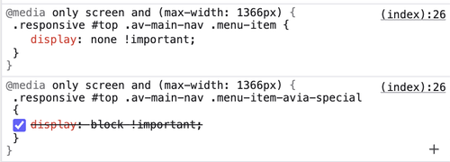
To bring back the post navigation on mobile view, please add this css code:
@media only screen and (max-width: 767px) {

  /* Add your Mobile Styles here */
  .responsive #top .avia-post-nav {
    display: block;
  }
}
Best regards,
IsmaelHi,
Thank you for the update.
Do you have a site backup or restore point? Please create one if you haven’t already. Try to deactivate all plugins, then check the Widgets panel to see if anything changes. After that, reactivate the plugins one at a time until the custom widget editor returns. This should help you identify the plugin responsible for the custom widget panel.
Best regards,
IsmaelHey Sonno,
Thank you for the inquiry.
Add a Fullscreen Slider, then add a Color Section below it with a unique ID or Custom CSS Class. You can then apply some css modifications to move the Color Section over the slider and set its background to transparent. If you can create a test page, we’ll try to check it further.
— https://kriesi.at/documentation/enfold/add-custom-css/
Best regards,
Ismael -
AuthorPosts

