Forum Replies Created
-
AuthorPosts
-
May 29, 2024 at 11:51 pm in reply to: The Events Calendar – Recurring Events, every event visible #1446996
How should I react to your last question? First, you mention you don‘t have The Events Calender at hand, then you say, you can‘t reproduce the issue.
May 29, 2024 at 12:06 pm in reply to: The Events Calendar – Recurring Events, every event visible #1446934Hello Mike,
thank you again. No, the max limits of 100 events in the list don’t matter. I chose this just for showing you the difference between ALB generated event lists and shortcode generated event lists.
It comes down to just one issue – ALB generated lists show all recurring events (including all the 10 events, that are part of a series) wheres shortcode generated lists show just the next event in a event series. This is a functionality, that can be set in the settings. I guess, too, it would be beneficial for enfold, when this behaviour would find consideration.
 May 28, 2024 at 5:51 pm in reply to: The Events Calendar – Recurring Events, every event visible #1446863
Hey Mike,
thanks for your reply! We use the pro version of The Events Calender und everything is updated to the newest available version.
I have updated the ALB-page so that it shows a maximum of 100 events. Take “Figuren, Tiere & Comic (6 – 7 Jahre)” for example. On the ALB-Page all of its recurring events is shown (6 instances), wheres the shortcode generated page only shows 1 instance.
It’s a pity that it seems, that showing all of the recurring events would be the correct order. Especially, as The Events Calendar has a setting to aviod this behaviour (“Veranstaltungen in Serien zusammenfassen – Nur die nächste Veranstaltung jeder Serie anzeigen (betrifft nur Listenansichten). –
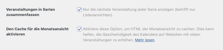 The Events Calendar settings" />.
Do you think, it is possible to realize this within the ALB page?
Awesome, thank you VERY much!
have a nice day!
RobertHi, thank you for your answer.
I am sorry – the website went live in the meantime. You can find it on cubes.co.at now.
On “Tipps und Trends” we use the “flexible mansonry” style. We’d like to have it on one column below a screen size of 640px wide (as the iPhone 5). Is this possible?Best regards,
Robert -
AuthorPosts