Forum Replies Created
-
AuthorPosts
-
but btw. why don’t you use the video element and set your image as preview /fallback image on that element?
On advanced privacy settings (on the video element itsself) you can choose to show the video in the lightbox.maybe this helps you on that:
only to show that you can have video, websites or images in one lightbox group.
INFO: due to GDPR ( DSGVO in Germany ) i can not show the working script for video content – it is hard to block this – playing videos from a masonry or from an image linked to a video.
or not only for masonries:
https://kriesi.at/support/topic/lightbox-pdf-not-working-shows-up-black-multiple-solutios/#post-1495451February 24, 2026 at 10:07 pm in reply to: Lightbox Pdf not working – shows up black multiple solutios #1495451can you try this:
place that snippet inside your child-theme functions.php:function lightbox_with_mixed_content_type() { ?> <script type="text/javascript"> window.addEventListener("DOMContentLoaded", function () { (function($){ $('.mixed-contenttype a').each(function(){ var anchorLink = $(this).attr('href'); if (/\.(jpg|png|gif|webp|jpeg)$/.test(anchorLink)) { //console.log(anchorLink + " is an image link"); } else { $(this).attr('rel', 'lightbox').addClass('mfp-iframe'); } }); })(jQuery); }); </script> <?php } add_action('wp_footer', 'lightbox_with_mixed_content_type', 999);on your page place a button and give that custom class to the elment (or to one parent element) : mixed-contenttype
now link to your pdf.
See: https://webers-testseite.de/pdf-in-lightbox/
But: Not all browsers will display this, especially mobile browser variants.INFO: due to GDPR ( DSGVO in Germany ) i can not show the working script for video content – it is hard to block this – playing videos from a masonry or from an image linked to a video.
i guess you only want to influence the lightbox images source. And because Enfold uses on default the large image. This does not always uses the original aspect ratio.
I would not influence the thumbnail sizes of the gallery. Only the lightbox source image.
If you are usiing the gallery element try:function custom_alb_lightbox_image_size( $size, $context ){ if( $context == ('av_gallery' || 'avia_masonry') ){ return 'original'; } return $size; } add_filter( 'avf_alb_lightbox_image_size', 'custom_alb_lightbox_image_size', 10, 2 );February 24, 2026 at 4:34 pm in reply to: 2 different logos on one page , depending on active menu item #1495436yes – enter your red logo to the enfold logo input field.
on media library determine the path to your : ETH_galabau_Logo
guess it looks like this one :

insert that url to the is_tree(265) url:
place this snippet to your child-theme functions.php:function is_tree($pid) { global $post; if ( is_page() ) { if ( is_page($pid) ) { return true; } $ancestors = get_post_ancestors($post->ID); if ( in_array($pid, $ancestors) ) { return true; } } return false; } function av_change_logo($logo){ if (is_tree(265)) { $logo = "/wp-content/uploads/…/…/your_green_galabau_Logo.png";} return $logo; } add_filter('avf_logo','av_change_logo');the first function (function is_tree($pid) ) is for having all subpages to your galabau page (which has the id: 265.
from this moment – you do not need to add a new page-id to your page_array. If a page is a child of that 265 it will have that green logo.February 24, 2026 at 3:14 pm in reply to: 2 different logos on one page , depending on active menu item #1495428in your case i would create a is_tree conditional and then change the logo for all subpages by that conditional
function is_tree($pid) {
    global $post;
    if ( is_page() ) {
        if ( is_page($pid) ) {
            return true;
        }
        $ancestors = get_post_ancestors($post->ID);
        if ( in_array($pid, $ancestors) ) {
            return true;
        }
    }
    return false;
}

function av_change_logo($logo){
        if (is_tree(265)) { $logo = "[logo url]";}
    elseif (is_tree(509)) { $logo = "[logo url]";}
    elseif (is_tree(530)) { $logo = "[logo url]";}
return $logo;
}
add_filter('avf_logo','av_change_logo');
your Landschaftbau is page ID: 265
by the way enfold has now a class on subpages for that on body tag: parent-pageid-265 – but this will only work for the next level of direct children.
then you can have that conditional:if ( is_page(265) || $post->post_parent == 265 ) { // ... }But: the is_tree seems to be more elegant.
is it a horizontal scrolling page? thats extraordinary.
Nearly all enfold demos could have even that rule:html.responsive, .responsive body { overflow-x: hidden !important; }the scroll in y-direction should work as expected.
February 23, 2026 at 1:12 pm in reply to: Make preview image on top of Gallery element sticky as user scrolls thumbnails? #1495369let me please see how you solved it now.
February 21, 2026 at 10:45 pm in reply to: Make preview image on top of Gallery element sticky as user scrolls thumbnails? #1495328There is no way around side positioning. The large image will always take up so much space that you will always find scenarios where you can only see very little of the thumbnails scrolling underneath.
iPad landscape etc.February 20, 2026 at 8:28 pm in reply to: Again “…vulnerable to Cross Site Scripting (XSS)” 😳 #14953007.1.4 is downloadable now
February 20, 2026 at 5:22 pm in reply to: Enfold Cross Site Scripting (XSS) – problem with 10 websites – patch release #14952967.1.4 is downloadable now
February 20, 2026 at 5:21 pm in reply to: When is 7.1.4 Available? Enfold: Cross Site Scripting (XSS) vulnerability #14952957.1.4 is downloadable now
February 20, 2026 at 5:08 pm in reply to: update to 7.1.4 Cross Site Scripting (XSS) vulnerability #1495294by the way – i guess 7.1.4 is online !
my values are A+ and 120/100. ;) yes that is possible with extra points on mdn observatory
for wordpress pages with all its plugins you can not have better settings on style-src than ‘unsafe-inline’
February 19, 2026 at 8:51 pm in reply to: Enfold Cross Site Scripting (XSS) – problem with 10 websites – patch release #1495240Please be honest – go to securityheaders.com and enter your website there. If you don’t have an F, then you’re okay – if you have an A+, it’s almost the gold standard for online banking.
If you close these gates, a fix wouldn’t be necessary at all.
https://securityheaders.com/?q=https%3A%2F%2Fwebers-testseite.de%2F&followRedirects=onand this csp header for scripts : script-src ‘nonce-KbhxgiTjJyYd7tEq282YPA’ ‘strict-dynamic’ ‘self’ is the nonplusultra.
Each time you open that site – the nonce (number only used once) key will be randomly changed . if script does not include that nonce – it will be blocked!February 19, 2026 at 2:34 pm in reply to: Multi Columns (4 and more) in Post-Module (Blog) doesn’t work #1495224No – i’m participant as you are.
Das sind in solchen Fällen häufig die Stolpersteine. Da musst du auf einen Mod warten, eventuell hast du eine Anweisung in deiner child-theme functions.php die es auf 3 Einträge beschränkt; dafür muss sich aber jemand mit Sachkenntnis denke ich bei dir einloggen und nachschauen.
Schau doch mal ob WP-Rocket der Verursacher ist und nur 3 Beiträge im Cache hat.
Mal den Cache im Plugin löschen und eventuell mal kurz deaktivieren. Dann Enfold veranlassen die css und scripte neu anzulegen.February 19, 2026 at 11:31 am in reply to: Multi Columns (4 and more) in Post-Module (Blog) doesn’t work #1495217ich mach das jetzt mal auf deutsch: und du zeigst nur eine Kategorie (news) ? oder mehrere in diesem Blog Post?
Falls ja schau bitte nach ob du bei der Logic (Content – select Entries) nicht und (and) gewählt hast. Sollten dann nämlich nur 3 Beiträge sowohl in die eine als auch die andere Kategorie gehören wäre es klar.February 19, 2026 at 9:06 am in reply to: Multi Columns (4 and more) in Post-Module (Blog) doesn’t work #1495205so tell me what element did you use
it is the same with blog-posts: see:
Since you can hardly see it anyway, I would first remove it from Click event as follows:
If that’s not enough, you just need to increase the z-index of the overlay.
.av-burger-overlay-active .logo > a {
  pointer-events: none;
}

.av-burger-overlay-bg {
  z-index: 102;
}

.av-burger-overlay-scroll {
  z-index: 103;
}
If you want to prevent the content from scrolling under the overlay:
html.av-burger-overlay-active {
  overflow-y: hidden;
}
February 18, 2026 at 4:30 pm in reply to: update to 7.1.4 Cross Site Scripting (XSS) vulnerability #1495193All of you who are impatiently waiting for a fix. Have you ever tested your site on
securityheaders.com, or on MDN Observatory for example?
Please start by securing your pages against attacks in general and closing the huge gate to your pages before you try to plug small loopholes.February 18, 2026 at 4:06 pm in reply to: Make preview image on top of Gallery element sticky as user scrolls thumbnails? #1495191the classes (yes two classes here – only because i like to show both on the same page) are
av-gallery-sticky-scroll and besides
Thats all.PS : on that code – you see that i manage the amount of thumb columns by pure css. Because i like to rule it differently on small screens and orientation – as you can see at the bottom of the snippet.:
@media only screen and (min-width: 768px) and (orientation: portrait) {
  #top .avia-gallery.av-gallery-sticky-scroll.besides .avia-gallery-thumb {
    grid-template-columns: repeat(2, 1fr);
  }
}
on mobile devices with small screens – ( iPhone etc. ) this behaviour makes no sense – not only because of missing hover style …
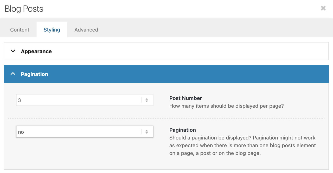
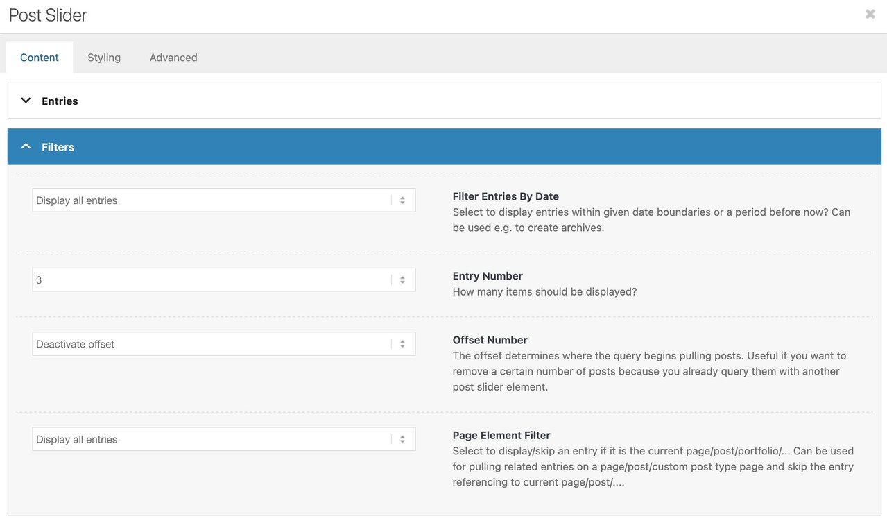
February 17, 2026 at 11:21 pm in reply to: Multi Columns (4 and more) in Post-Module (Blog) doesn’t work #1495175this is the post-slider Element? what is your setting on content – filters?
maybe there is a 3 filled out on the Entry Number Field:
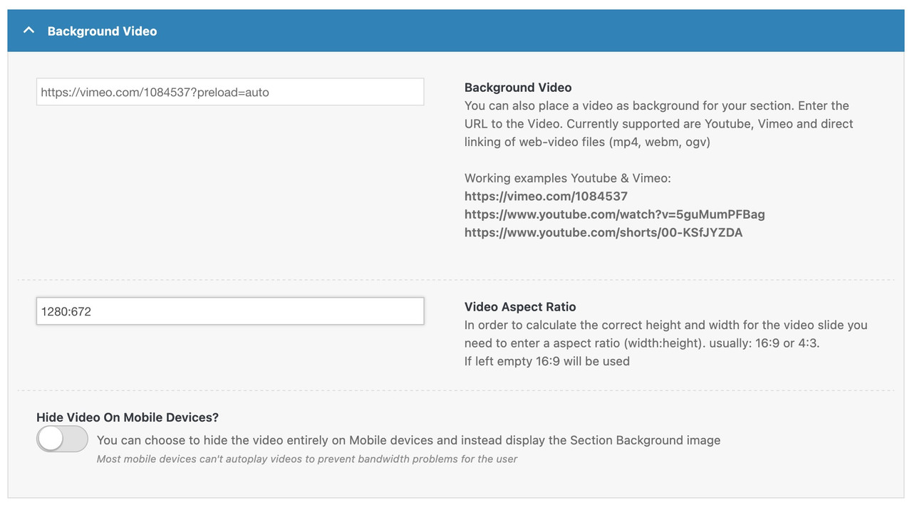
However, the reason for this is that your “720p” video – isn’t one – it has an aspect ratio of: 1280:672
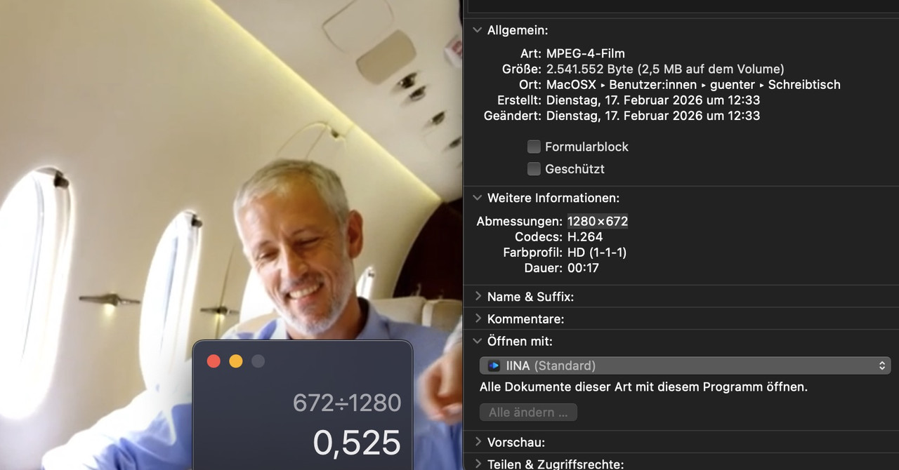
so enter this instead the 16:9 format
first – your logo is already on top with that z-index of 101. But the logo could not be seen due to that dark overlay background. Not enough contrast. – you see it if you set a background-color for it
.logo.avia-standard-logo {
  background-color: #d5d9d3
}
so – my first thought is to replace that png by a svg logo – where you can change the fill color by the status of the hamburger open or not.
e.g. take this svg instead for logo: https://webers-testseite.de/logo-femke-boschker.svg
and set for the change :
svg .fb {
  transition: all 0.3s linear;
}
.av-burger-overlay-active .fb {
  fill: #FFF;
}
____________
Or: why don’t you place an image (your logo image) inside the menu?
you can do that replacing the home menu-item or add an additional home menu item and replace that: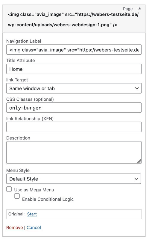
for navigation label you put in a standard img tag
<img class="avia_image" src="https://www.maartenwebsites.nl/dev-femke/wp-content/uploads/2026/02/logo-femke-boschker-scaled.png" />PS: because you do not need to differ here between burger-menu and desktop text menu – you do not need that extra class.
PPS: maybe you use in this case a white alternative logo.
Contact Form 7 comes with turnstile integration in default.
but you have seen on top left – the project settings ?
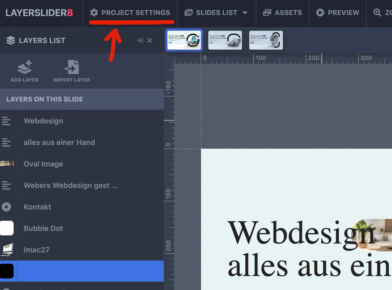
That page offers you the option for the advanced Layerslider Project.
On layout there is the option to have a popup slider.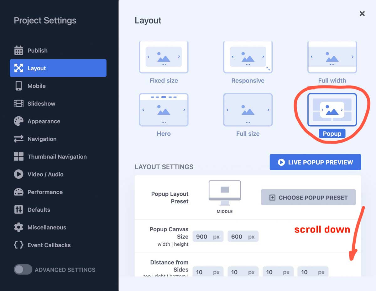
You can choose the position and the dimension; you can have that popup open automatically – etc.
or in your case : open by click
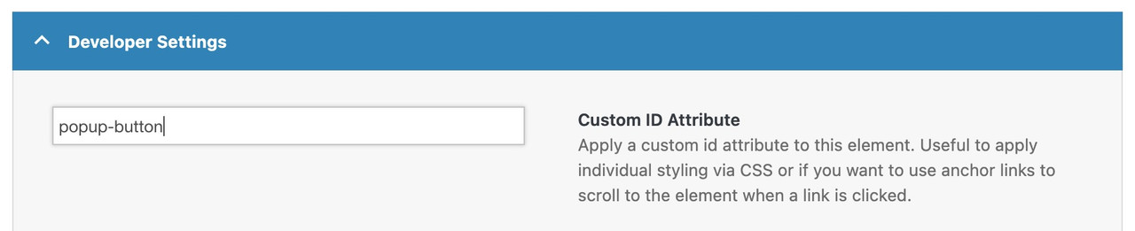
enter a trigger ID or trigger class :Enter a CSS selector to trigger the Popup when clicking a target element. Use a dot for class (e.g., .popup-trigger) or a hashtag for ID (e.g., #popup-button). The Popup will toggle open/close with repeated clicks. Leave blank if no trigger is needed.
next hint: if you like to have the chance to reopen the popup on another click to that button – scroll down again to Repeat Control:
and uncheck “prevent from reopening”.Depending on your settings, the same Popup can be displayed in multiple times without reloading the page. Such example would be when you use a scroll trigger and the user scrolls to that location a number of times. Enabling this option will prevent opening this Popup consequently.
PS: do not forget before you leave the layerslider dashboard – to save and publish with these popup settings.
now link on your page a button to only # but give the custom-id (or custom class) to that button element: popup-button !!!
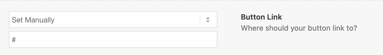
Do not link to the trigger ID (or class) just fill in the trigger ID or class on advanced tab – developer settings.
PPS: do not forget to place the layerslider to that page ;)
see: https://webers-testseite.de/advanced-layerslider/
-
This reply was modified 2 months, 1 week ago by
Guenni007.
February 12, 2026 at 7:40 am in reply to: Search Box in Main Menu while using Mega Menu Plugin #1495018how did you insert the search box to the mega-menu drop-downs?
Why am I asking this? It might be possible to limit the search to only the relevant menu item. So when Parts is expanded, the search would only be performed for Parts.btw. I actually think that placement is better because it doesn’t cause you any problems with responsiveness.
Edit: See—it seems that tools are a subcategory of parts. Then there would be two possibilities. If you search in the parts dropdown menu, tools will also be included—or not—we exclude them from the search, and only when I search for tools in the dropdown menu of tools they will be found there.
Remember to adjust this value of 755px—this is because my installation has a maximum width of 1510px for content there.
You can also achieve this with your layout, but it is easier to do it the other way around.
Here you can see your layout with color section (custom class: stretchy). In the column with only the background image, I have placed a whitespace separator for the forced height.February 9, 2026 at 1:43 am in reply to: Make preview image on top of Gallery element sticky as user scrolls thumbnails? #1494866hm – wasn’t it before in a 1/1 column?
February 8, 2026 at 8:15 pm in reply to: Make preview image on top of Gallery element sticky as user scrolls thumbnails? #1494858test :
/* 1. GLOBAL STICKY PERMISSION */
html.html_stretched,
html.html_stretched body#top,
#top #wrap_all,
#top #main {
    overflow: visible !important;
}

@media only screen and (min-width: 768px) {

    /* 2. MAIN CONTAINER
       We use CSS Grid for the 65% / 1fr split */
    #top .avia-gallery.av-gallery-sticky-scroll {
        display: grid !important;
        grid-template-columns: 65% 1fr !important;
        gap: 30px !important;
        align-items: start !important; /* Crucial: prevents big-wrapper from stretching to full height */
        overflow: visible !important;
        position: relative !important;
        width: 100% !important;
    }

    /* 3. STICKY WRAPPER (Left Column) */
    #top .avia-gallery.av-gallery-sticky-scroll .avia-gallery-big-wrapper {
        grid-column: 1 !important;
        position: -webkit-sticky !important;
        position: sticky !important;
        top: 100px !important; /* Adjust based on your header height */
        z-index: 100 !important;
        height: auto !important;
        margin: 0 !important;
        background: #ffffff !important;
    }

    /* 4. IMAGE ELEMENT */
    #top .avia-gallery.av-gallery-sticky-scroll .avia-gallery-big {
        position: relative !important;
        display: block !important;
        height: auto !important;
    }

    #top .avia-gallery.av-gallery-sticky-scroll .avia-gallery-big img {
        display: block !important;
        width: 100% !important;
        height: auto !important;
        max-height: 80vh;
        object-fit: contain;
    }

    /* 5. THUMBNAILS (Right Column) */
    #top .avia-gallery.av-gallery-sticky-scroll .avia-gallery-thumb {
        position: relative !important;
        z-index: 10 !important;
        padding: 0 !important;
        width: 100% !important;
      min-height: 100vh;  /*** we need the gallery thumbs container bigger than the big image *** /
    }
}
the min-height option is necessary only because my thumbs container is less high than the big image – guess your
And change the 65% to your needs in : grid-template-columns: 65% 1fr !important;
-
This reply was modified 2 months, 1 week ago by
-
AuthorPosts