
Tagged: media queries, Responsive Design
-
AuthorPosts
-
August 6, 2021 at 1:53 pm #1314854
Hey guys,
I want to change the responsive media queries settings for smartphones, tablets and desktop for the whole website and all the settings I can make for responsiveness. I also want to set a range from minimum size to maximum size for the tablet section. Not only the maximum size. The given settings are to small for the mobile devices today.
My settings I want to have are:
Desktop:@media only screen and (min-width: 1008px) { }/** tablet **/
@media only screen and (min-width: 641px) and (max-width: 1007px) {
}
/** mobile **/
@media only screen and (max-width: 640px) {
}
Where I can change this?
August 8, 2021 at 2:33 am #1315072Hi coolicious,
You can use those codes to override the current ones, just place it in Enfold > General Styling > Quick CSS.
Best regards,
NikkoAugust 8, 2021 at 1:31 pm #1315115Yeah I know that but for this I have to overwrite massiv code – and thats not so good for performance etc. you know?
August 10, 2021 at 4:33 am #1315919Hi,
Thanks for the update. There is no single place in the theme where you can change the switch to mobile/tablet/desktop unfortunately, you would have to override the CSS for more specific cases. If you try to explain what you are trying to achieve a bit further, then we might be able to help you out with some custom code.
Best regards,
RikardAugust 24, 2021 at 5:30 pm #1318155Hi
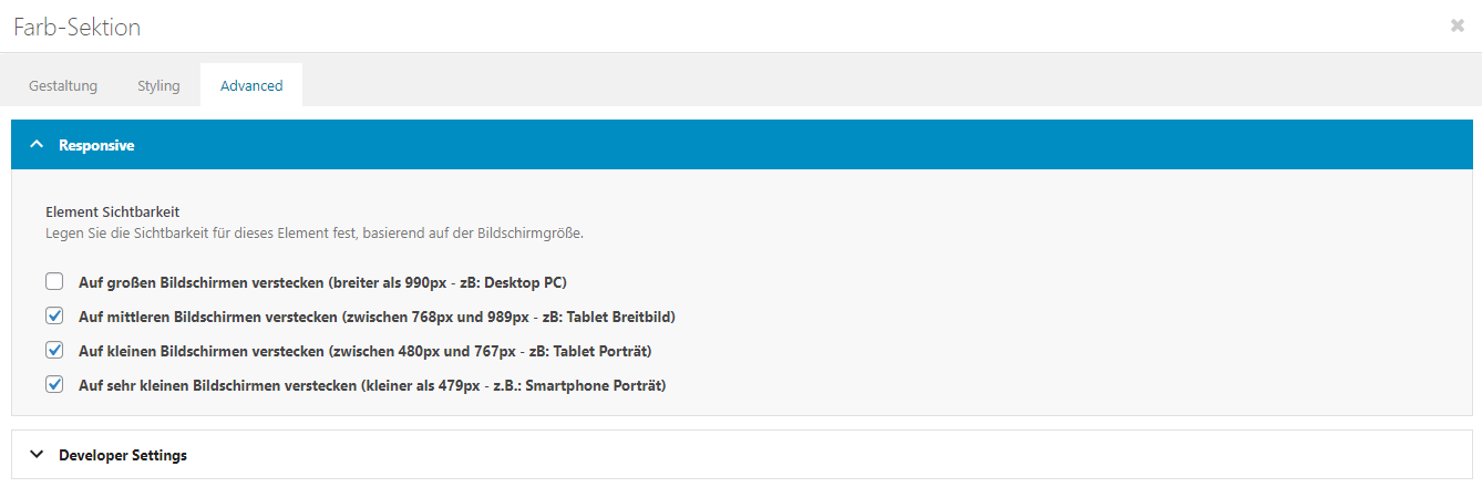
I have set up my website so that certain areas should only be seen on the desktop view and certain areas only on the tablet and mobile view (see PScreen).
Unfortunately, however, the desktop view (with display errors) is still shown on the tablet. What can I do so that only the defined mobile view is seen on the tablet?
Best regards
DaveAugust 24, 2021 at 5:33 pm #1318157August 26, 2021 at 7:05 am #1318386Hi,
Thank you for the info.
is still shown on the tablet.
A lot of tablet devices today have almost the same screen resolution as desktop or laptop screens (e.g iPad Pro). Enabling the tablet option in the Element Visibility settings will only hide the element when the screen width is lower than 989px and higher than 768px. Some tablet devices have wider screens, so the color section still displays.
What is the actual model of the tablet device where you are checking the page?
You can use this css code if you really need to hide the element on tablets with higher screen resolutions.
/* Wider Tablets */
@media only screen and (min-width: 768px) and (max-width: 1366px) {
      .responsive #top .av-hide-on-tablet{display:none !important;}
}
Best regards,
IsmaelAugust 26, 2021 at 1:40 pm #1318463Hi Ishmael
Thank you very much for your information.
I pasted the code in the Quick CSS, but the desktop view is still shown on the vertical iPad view.
My iPad model is A1430.
Do I have to do something special to make it work?
Best regards
DaveAugust 26, 2021 at 1:46 pm #1318465Sorry I meant in the horizontal iPad view, not vertical.
August 27, 2021 at 9:31 am #1318605Hi,
Thank you for following up.
Did you toggle or temporarily disable the Enfold > Performance > File Compression settings after adding the css code? Also, please make sure to remove the browser history or try to check the site on incognito mode to ensure that you are actually viewing an uncached version of the page with the updated stylesheets.
A list of css media queries for specific devices can be found here.
// https://css-tricks.com/snippets/css/media-queries-for-standard-devices/
Best regards,
Ismael -
AuthorPosts
- You must be logged in to reply to this topic.