
-
AuthorPosts
-
July 2, 2021 at 6:29 pm #1308536
Help! I’m trying to show a different logo on my mobile view. I’ve tried all three recommended solutions described here:
(1) The original CSS solution
@media only screen and (max-width: 480px) {
.logo img { opacity: 0; }
.logo a { background-image: url(https://kriesi.at/wp-content/themes/kriesi/images/logo.png); background-repeat: no-repeat; background-size: contain; background-position: 50% 50%; }}
(2) The function solution
function av_dif_mobile_logo(){
?>
<script>
(function($){
	$(window).load(function(){
	if ($(window).width() < 480) {
		$(".logo img").attr("src", "http://kriesi.at/wp-content/themes/kriesi/images/logo.png");}
	});
})(jQuery);
</script>
<?php
}
add_action('wp_footer', 'av_dif_mobile_logo');
(3) The new CSS solution:
@media only screen and (max-width:976px){
.mobile-individual-logo {
background: url('https://kriesi.at/wp-content/uploads/2019/04/Logo.png') center center no-repeat scroll;
}
}
None of these solutions is working for me. Can anyone see what I’m doing wrong? Thanks in advance.
As an aside, with so many people apparently struggling with this alternate mobile logo, wouldn’t it be easier to make this a customizable setting?
July 4, 2021 at 5:14 am #1308622Hey michaelspencer,
I can see a different logo on mobile on your site, I’m guessing you got one of the methods working?
We’ll check if we can add an option to add a different logo to mobile, in a future release of the theme.
Best regards,
RikardJuly 4, 2021 at 2:48 pm #1308645Hi Rikard,
Thanks for the reply. Unfortunately we have not yet succeeded to get this working. But I see now how my description of our problem was unclear. Please allow me to explain further…
For all pages on our site, our logo is black and our background is white. We want this combination throughout the site – EXCEPT on the home page. On the homepage we are using a dark blue section background at the top of the page with a transparent header over the section background. Our transparent logo is white and this is showing correctly in the full size web view. However, in mobile view, the home page reverts from our white transparent logo back to our black standard logo. The black logo does not work against our dark blue section background and so we don’t want to show this in ANY view on our home page.
So the problem that we are trying to address is how to force our white transparent logo to appear in both the full size web view AND also in the mobile view.
Thanks for your help.
Best,
Michael
July 5, 2021 at 10:40 am #1308746Hi Michael,
Thanks for the update. If you are using CSS, then you can use the .home class to give the home page a different rule. For example:
.home .mobile-individual-logo {
  background: url('URL of your logo') center center no-repeat scroll;
}
If you prefer to use the function, then you should be able to a conditional statement to it, like this:
function av_dif_mobile_logo(){
if(! is_front_page()) {
?>
<script>
(function($){
	$(window).load(function(){
	if ($(window).width() < 480) {
		$(".logo img").attr("src", "http://kriesi.at/wp-content/themes/kriesi/images/logo.png");}
	});
})(jQuery);
</script>
<?php
}
}
add_action('wp_footer', 'av_dif_mobile_logo');
https://developer.wordpress.org/reference/functions/is_front_page/
Best regards,
RikardJuly 5, 2021 at 1:21 pm #1308780Hi Rikard,
Thank you for this.
The CSS method is not working for us. However, the function method is working and our transparent white logo is now appearing correctly on mobile.
However, when we shrink our desktop web browser to mobile size (eg < 480), the logo continues to revert to our standard black logo. I don’t imagine many people doing this, but still, we would prefer this not to happen. Any suggestions?
Best,
Michael
July 6, 2021 at 6:26 am #1308864Hi Michael,
The script only runs on load as far as I know, so it won’t apply if the window size is above 480 pixels. If you want to avoid that behaviour, then the CSS solution is likely the way to go. If you need further help with then, please try to explain exactly what is not working with your CSS.
Best regards,
RikardJuly 8, 2021 at 6:35 pm #1309289Thanks Rikard.
Unfortunately the CSS that you shared is not working – the alternate logo does not appear on either mobile or on the desktop browser shrunk below 480 pixels. The function method works on mobile but not on the shrunken desktop browser.
If you want to troubleshoot, the link I shared privately currently has the CSS implemented and the function removed. You can see for yourself that the site shows the original black logo on mobile and shrunken desktop. The alternate white logo only appears on desktop above 480 pixels.
July 10, 2021 at 6:15 am #1309476Hi,
Please try this CSS:
@media only screen and (max-width: 480px) {
.responsive .logo img {
    opacity: 0;
}
.responsive .logo a {
    background-image: url(https://www.smartmoneyinternational.com/wp-content/uploads/2019/07/sm-logo-black.png);
    background-position: center;
    background-repeat: no-repeat;
    background-size: contain;
}
}
Best regards,
RikardJuly 10, 2021 at 8:31 am #1309483If you like to use the function :
Always remember that on new jQuery 3.5.1 this is deprecated$(window).load(function(){and you had to use now:
$(window).on('load', function(){if you are talking about the logo that could be seen on transparency header – this is the one in .subtext
may i see the page it concerns too. I’m participant as you are – so private Content area can not be seen by me.If you see the demo page : https://kriesi.at/themes/enfold-2017/
and on mobile view there will be no transparency – that seems to be the default behavior – but on my home page ( test page ) i got this too.
on mobile view there will be transparency first – after scroll there will be a fixed white header then.
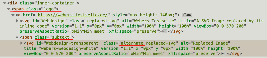
https://webers-testseite.de/
( the only difference here is that these imgs are replaced by svgs )So is i want to change only the transparency logo on home page – i had to replace the logo in the subtext ( alternate class )
 July 11, 2021 at 9:53 am #1309561July 11, 2021 at 1:25 pm #1309575
Thanks Rikard and @guenni007 for your continued help with this.
For us, the function is so far the best solution because it correctly shows our white transparent logo with mobile view. The only shortcoming with the function solution is that it only runs once on load and so in desktop view if someone shrinks their browser to <480 after load, the transparent logo switches back to the standard logo when the browser shrinks past the 480 threshold. For this reason I was hoping we could get the CSS solution to work. But if we cannot, I will go with the function as the best of all options so far.
I applied Rikard’s latest CSS. Unfortunately the white transparent logo is now not showing at all with mobile view.
@guenni007, here is the page:password=beta (i’ll change password when we finish troubleshooting)
July 12, 2021 at 4:52 am #1309663Hi,
Thanks for the update. I can see the the white logo disappearing on my end under 767 pixels. If you are not seeing that, then please try loading the page in an incognito or private browser window.
If you need further help with this, then please include admin WordPress login details in private, and let us know which logo you want to display on the mobile home page.
Best regards,
RikardJuly 12, 2021 at 11:47 am #1309735Thanks Rikard.
We do not want the white logo to EVER disappear. We want it to always show for our home page, both with mobile view and desktop view at any size.
WP login details in private.
July 15, 2021 at 4:47 am #1310177Hi,
Thanks for the update. I’ve added this inside your 480 pixel media query in Quick CSS:
.responsive .page-id-869 .logo a {
    background-image: url(https://www.smartmoneyinternational.com/wp-content/uploads/2019/07/sm-logo-white.png);
    background-position: center;
    background-repeat: no-repeat;
    background-size: contain;
}

.responsive .page-id-869 .logo img {
  opacity: 0 !important;
}
Please review your site.
Best regards,
RikardJuly 15, 2021 at 3:40 pm #1310303Hi Rikard,
Thanks, the white logo is now showing correctly on mobile. This is great. Can the logo be left aligned?
However, and more importantly, the desktop view is still changing to the black logo when the desktop browser is resized down to smaller widths. In needs to remain white, always, at all sizes on both mobile and desktop.
See screenshot link in private.
Best,
Michael
July 16, 2021 at 10:46 am #1310374July 16, 2021 at 1:53 pm #1310403Rikard,
Thank you for the excellent and determined support. The site looks perfect on mobile and desktop, at all sizes.
Congratulations and I’m sorry this was so difficult.
Best,
Michael
July 17, 2021 at 4:57 pm #1310514Hi,
I’m glad this was resolved. If you need additional help, please let us know here in the forums.
Best regards,
Jordan Shannon -
AuthorPosts
- The topic ‘Using a different logo for mobile view (redux)’ is closed to new replies.