
-
AuthorPosts
-
September 6, 2025 at 8:07 am #1489025
Dear Sirs
I ahve added two widgets from your documentation https://kriesi.at/documentation/enfold/example-of-widget-left-logo-center-widget-right-menu-below/#toggle-id-2. What I am tring to achive is to Have the logo on Left and Widget one central and widget two to the right by widget 1. See examples I read the doc on flex and have added the CSS from documentation but am unsure how to achieve this can you help please,
What I am tryng to achieve is here https://peter-test1.co.uk/wp-content/uploads/2025/09/Image1.jpg
What I have currently is here https://peter-test1.co.uk/
September 7, 2025 at 1:35 pm #1489033Hey condonp,
Thanks for the mockup image:

it looks like you are close to achieving this, but I only see one widget in the header:

to change the color of your widget and move the menu try adding this css:.responsive #top #header #header_main .inner-container .widget>div { background: rgb(77, 172, 56); } .topconatiner { align-items: center; } .responsive #top #header #header_main .inner-container .main_menu { justify-content: right; } .responsive #top #header #header_main .inner-container .main_menu { margin-right: 6%; }for this:

The snippet from the documentation that you are trying to follow looks nothing like your mockup.

Best regards,
MikeSeptember 8, 2025 at 11:46 am #1489048I would probably do things differently, especially when it comes to responsive layouts.
The grid box layout has several advantages, especially if you want the containers to be in different positions than in the DOM.
In this case, I would define the individual elements as special grid areas. You can choose the names of the areas freely, but some names are obvious choices.The whole thing would then possibly respond as follows (however, this can also be customized to your requirements):
(click to enlarge)
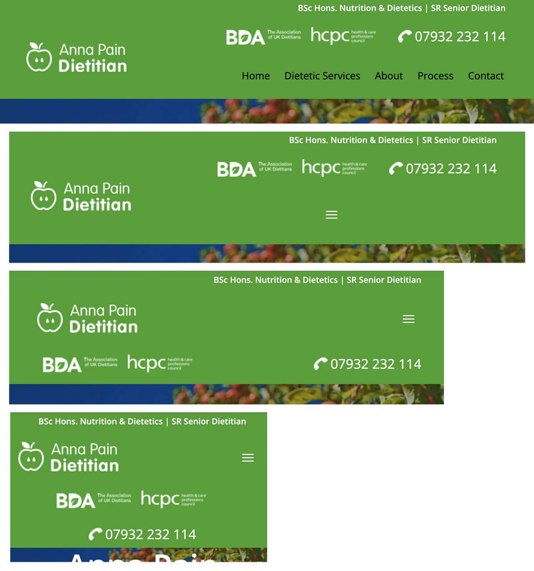
The best thing would definitely be to remove the settings that are already set from your CSS, but for testing purposes, I think it will also work if you add this CSS to the end of your quick CSS.
i would change the settings for your widget divs to:
/* and change these values */
.phone {
  background-image: url(https://peter-test1.co.uk/wp-content/uploads/2025/09/phone-icon.png);
  background-repeat: no-repeat;
  background-position: left 4px;
  padding-left: 30px;
  padding-top: 0;
  font-size: 24px;
  color: #fff;
  overflow: visible !important;
  line-height: 30px;
}

.headlogos {
  background-image: url(https://peter-test1.co.uk/wp-content/uploads/2025/09/bda-hcpc-logos.png);
  background-repeat: no-repeat;
  display: block;
  width: 269px;
  height: 54px;
  background-position: center left;
  Float: left;
}
and grid-layout settings:
#top #header #header_main .container.av-logo-container .inner-container { display: grid !important; gap: 10px; grid-auto-flow: row; grid-template-columns: 210px 1fr; grid-template-areas: "logo widget" "logo menu"; } #top #header #header_main .container.av-logo-container .logo { grid-area: logo; } #top #header #header_main .container.av-logo-container .main_menu { grid-area: menu; } #top #header #header_main .container.av-logo-container .widget { grid-area: widget; justify-self: end; } .header_color .av-hamburger-inner, .header_color .av-hamburger-inner::before, .header_color .av-hamburger-inner::after { background-color: #FFF; } #top #header #header_main .container.av-logo-container .widget:before, #top #header #header_main .container.av-logo-container .widget:after { display: none; } @media only screen and (max-width: 1000px) { #top #header #header_main .container.av-logo-container .main_menu { justify-self: center } } @media only screen and (max-width: 889px) { .responsive #top #wrap_all .container { width: 95%; max-width: 95%; } #top #header #header_main .container.av-logo-container .inner-container { display: grid !important; gap: 10px; grid-auto-flow: row; grid-template-columns: 1fr 80px; justify-content: space-between; grid-template-areas: "logo menu" "widget widget"; } #top #header #header_main .container.av-logo-container .widget { justify-self: auto; } #top .topcontainer { display: flex; gap: 20px; flex-flow: row wrap; justify-content: space-between; } } @media only screen and (max-width: 605px) { #top .topcontainer { justify-content: center; } } -
AuthorPosts

- You must be logged in to reply to this topic.