
-
AuthorPosts
-
July 29, 2023 at 2:16 am #1414793
Hey, I’m trying to get the social media icons to show in the mobile menu on https://gatcomdev.wpengine.com/, using the code @ismael provides in https://kriesi.at/support/topic/social-icon-in-mobile-menu/#post-1226347 but they don’t seem to be showing. I’m using the menu overlay, but I’ve tested with the classic flyout, too — any clues for me? I’m including a temp login link in the private content, so you can poke around, if you want. Thanks!
July 29, 2023 at 10:04 am #1414796These icons are there : scroll inside your overlay menu – they are placed at the bottom.
on my opinion a nested ul should be inside a li element. Then it would be easier to position the sub-level element inside that List element.Next tip: i would use for it the socket social icons. If you do not like to see them – it would be easy to set them to display: none.
Because – we do not run into conflict with the header_meta social icons. : it could happen that on bigger mobile devices ( tablets ) when opening the hamburger and closing it again switching to landscape view social icons may not be visible on header_meta.July 29, 2023 at 11:30 am #1414805Hi,
The social icons are already in your mobile menu, do you want to display them differently maybe? If so, then please specify how.
Thanks @guenni007 for helping out :-)
Best regards,
RikardJuly 29, 2023 at 7:50 pm #1414854Yes – Rikard but they are here:
 July 29, 2023 at 9:29 pm #1414866
Hi,
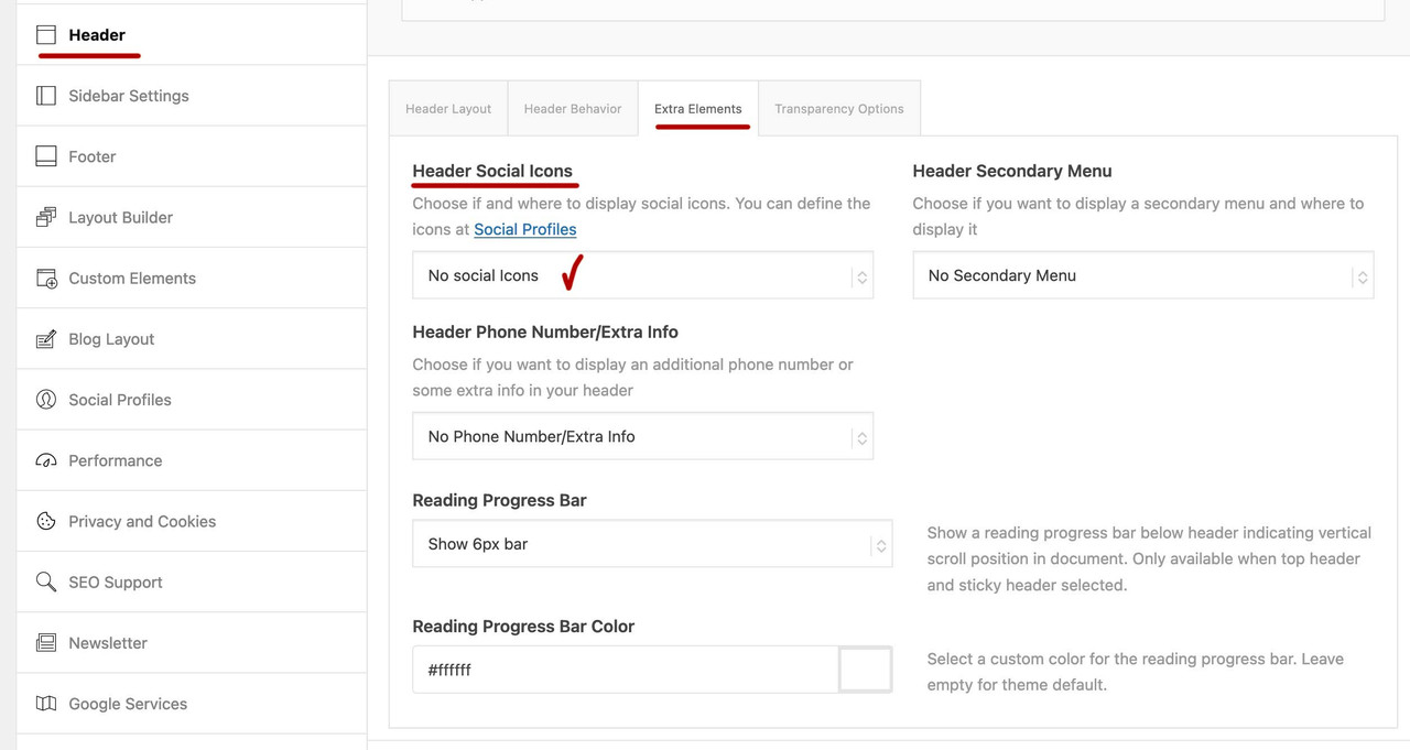
Please try this solution instead and ensure that your Header Social Icons are set to Display in main header area

Best regards,
MikeJuly 29, 2023 at 10:20 pm #1414876if you like to try a littel different solution – as said above – using socket social icons
see result on : https://pureinstall.webers-testseite.demy snippet for child-theme functions.php:
function social_footer_icons_to_hamburger_menu(){
?>
<script>
(function($){

  $('#header').one('click', '.av-main-nav-wrap', function() {
    var isMobile  = $('.av-burger-menu-main').css('display'),
      isHeading = "Social Bookmarks",
      social    = $('#socket .social_bookmarks').clone(true).addClass('sub-menu').css('display','block'),
      mobileMenu  = $('.av-burger-overlay');

    mobileMenu.find('#av-burger-menu-ul').append('<li class="menu-item-social av-active-burger-items" role="menuitem"><span class="avia-menu-text">'+isHeading+'</span></li>');

    if( social.length ){
      mobileMenu.find('.menu-item-social').append(social);
    }
  });

})(jQuery);
</script>
<?php
}
add_action('wp_footer', 'social_footer_icons_to_hamburger_menu');
this to quick css ( had to be adjusted to your needs)
#socket .social_bookmarks {
    display : none ;
}

#top #av-burger-menu-ul {
   padding: 120px 0px 0px !important
}

#av-burger-menu-ul .menu-item-social {
  display: table;
  width: 100%;
}

#top #av-burger-menu-ul .menu-item-social .avia-menu-text {
  display: block;
  width: 100% !important;
  padding: 15px 50px 5px;
  text-align: left !important;
  font-style: italic;
}
July 29, 2023 at 11:18 pm #1414883Oops — thanks, guys! I couldn’t even see them on my phone, but once I saw the screenshot from Guenni, I found them on my emulator, in tablet view.
And yeah, I think you’re right, Guenni, about wrapping them in an li. And I’d like to keep them in the top strip, on desktop — so, thanks, Mike, I don’t think I want them in the main header area on this site, but I’ll keep your solution in mind if I do!
So I went with Guenni’s code using the socket socials, but they were still showing at the left edge of my mobile overlay menu. I was able to center them by changing isHeading=”Social Bookmarks” in the php to isHeading=”” (deleting that whole line seemed to vanish the icons), and setting the css to width=”fit-content”; margin: auto; — so here’s my code, if it helps anyone else.
Thanks again, guys!!!
<?php
function social_footer_icons_to_hamburger_menu(){
?>
<script>
(function($){

  $('#header').one('click', '.av-main-nav-wrap', function() {
    var isMobile  = $('.av-burger-menu-main').css('display'),
      isHeading = "",
      social    = $('#socket .social_bookmarks').clone(true).addClass('sub-menu').css('display','block'),
      mobileMenu  = $('.av-burger-overlay');

    mobileMenu.find('#av-burger-menu-ul').append('<li class="menu-item-social av-active-burger-items" role="menuitem"><span class="avia-menu-text">'+isHeading+'</span></li>');

    if( social.length ){
      mobileMenu.find('.menu-item-social').append(social);
    }
  });

})(jQuery);
</script>
<?php
}
add_action('wp_footer', 'social_footer_icons_to_hamburger_menu');
And then this css seems to work for me:
.html_av-overlay-full #av-burger-menu-ul li.menu-item-social {
    width: fit-content;
    margin: 30px auto;
}
.html_av-overlay-full #top #wrap_all #av-burger-menu-ul li.menu-item-social li {
    font-size: 1em;
	margin: 5px;
}
July 30, 2023 at 1:47 am #1414890Are they still here on header options dialog:
 July 30, 2023 at 1:58 am #1414891
Sorry, Guenni, did it sound like I was still having trouble? I think I’m all set on this — I’m keeping the socials in the top strip on desktop, and your code helped me add them to the mobile menu, for when they disappear from the header on mobile. Thanks again for your help!
July 30, 2023 at 3:33 am #1414894Hi,
sky19er I believe that you are mistaking, Guenni007 script is getting the social icons from the socket, your editing isHeading = “”, doesn’t change the location, check out the line below that:
social = $(‘#socket .social_bookmarks’).clone(true).addClass(‘sub-menu’).css(‘display’,’block’),
see #socket in the line, try disabling Enfold Theme Options ▸ Footer ▸ Social Icons

I’m only pointing this out for future readers so they understand where the icons are coming from and why this won’t work if Enfold Theme Options ▸ Footer ▸ Social Icons is disabled.
Thank you for sharing Guenni007
the css I had to use was different from above, I got it from your example site, perhaps it will help someone in the future.#av-burger-menu-ul .social_bookmarks.sub-menu li { display: block; margin: 3px 10px; float: left; } #av-burger-menu-ul .social_bookmarks.sub-menu li a { padding: 10px !important; border-radius: 0 !important; } .html_av-overlay-side-classic #top .av-burger-overlay li.menu-item-social a { border: none !important; } .responsive #top #av-burger-menu-ul .social_bookmarks.sub-menu { margin-left: 30px; margin-top: 0; overflow: visible; height: auto; } #top #av-burger-menu-ul .menu-item-social .avia-menu-text { display: block; width: 100% !important; padding: 15px 50px 5px; text-align: left !important; font-style: italic; }
Best regards,
MikeJuly 30, 2023 at 3:57 am #1414896Thanks, Mike, but I’m using the Full Page Overlay Menu, where the menu items are centered. I wanted to center the social icons, like all the other menu items, and the quickest way I could find to do that was to change the width of the list item containing the social icons ul from 100% to fit-content, and then set the margins to auto. But that “Social Bookmarks” text (even though it wasn’t showing on the front end) was adding a bunch of width to the list item, preventing me from perfectly centering the icons. Removing that text from the php code solved the problem. Does that make sense now?
July 30, 2023 at 10:14 am #1414897i would have centered them in a different way. Not only because the fit-content is not supported on all mobile browsers or IE’s: Link
The isHeading is only the “first level” Menu Item text. I did not set it as a first level item with a submenu (expandable) in the code. That would be quite possible. But I didn’t want to do without a heading for the sub-menu items.
July 30, 2023 at 7:56 pm #1414955Ah, good to know, Guenni — thank you. I set the width to a pixel value instead. But I’m not sure what you’re saying about the heading — is not having a heading an accessibility issue or something?
July 30, 2023 at 8:03 pm #1414959Oh, and Mike, you may notice I did end up switching (at least for now) to using the icons in the main header area, but Guenni’s code with my css still seems to be working, so I’m inclined to leave it as is, unless you think it’s a problem. Thanks again, guys!
July 30, 2023 at 8:28 pm #1414965the heading is only a “heading” for those bookmark links: you can see it in the screenshot of mike:
“Social Bookmarks” thats allor here:
 July 30, 2023 at 8:30 pm #1414966
Right, but unless it needs to be there for accessibility, I’d rather not have it at all.
July 30, 2023 at 8:33 pm #1414967That’s up to you: I make no claims to copyright ;)
July 30, 2023 at 8:34 pm #1414968Heheh, ok, thanks again, Guenni!
-
AuthorPosts
- The topic ‘social media icons in mobile menu’ is closed to new replies.