Well you can have classes on menu list points each – so create a main-menu
the one that should be displayed on desktop devices got then a different class then the mobile devices menu list points.
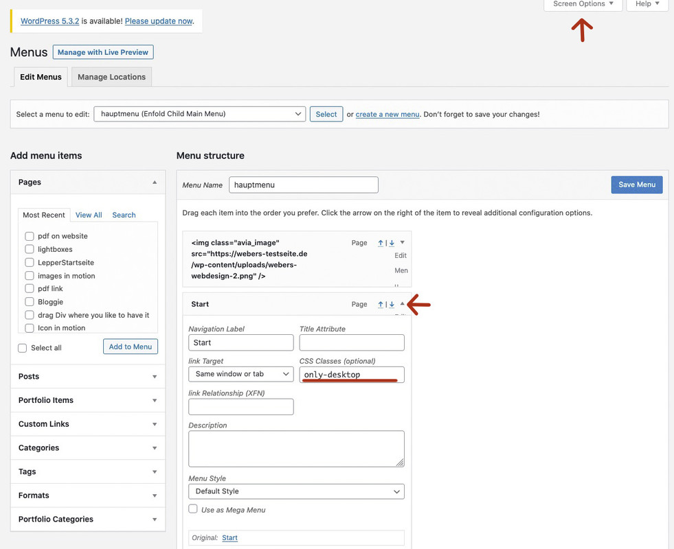
the red arrows on menu page shows how to activate the menu-item classes field – open first on top “Screen Options” Flyout- then mark “CSS classes”.
that littel arrow besides each menu list point – click it – then you can set a custom-class for each Menu Listpoint.
The rest is quick css with display:none
By the way – Enfold sets on default :
desktop devices got on html a custom class : avia_desktop
and mobile devices got: avia_mobile
so for example: ( see image above)
.avia_mobile .only-desktop {display: none}
.avia_desktop .only-mobile {display: none}
or if it is not meant for devices but for screen-width do it with mediaquerries.
