
-
AuthorPosts
-
November 24, 2022 at 12:12 pm #1373727
i think that this could be a nice feature – but it is not working the way as it should on all ALB Elements.
I would expect that if I also put smaller source images in the content ( e.g. the portfolio image ), that then despite the smaller source in the lightbox, the appropriate variant is used for the mfp-content width. This usually means a larger variant of the source image.
Ideally it would even be so that from the srcset after tilting the screen (e.g. on mobile devices) the corresponding source changes to me.On Image ALB it works the way it should. But on galleries not. If the gallery has ( and that is on performance reasons the better way) smaller images to show on content – the lightbox opens that smaller image.
Sense is to show the visitor who is interested in the image a better resolution in the lightbox.
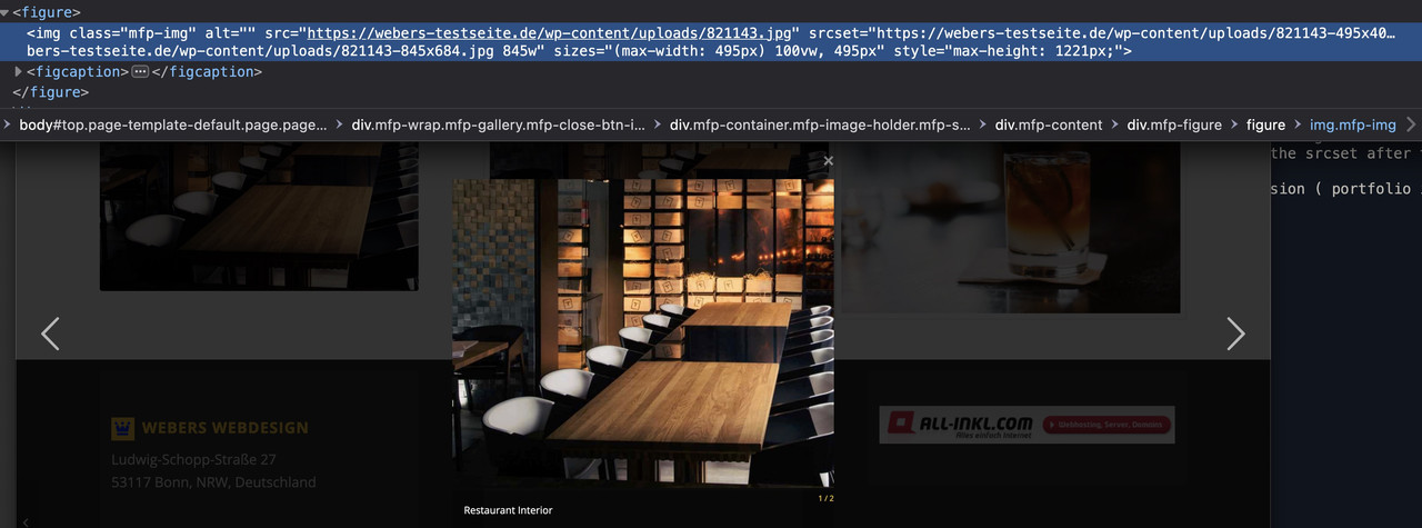
See: https://webers-testseite.de/images-compare/
on the sourcecode you can see that the higher resolution is set as src – but on the srcset the lower resoulution is taken because the sizes are set to max-width: 495px ( portfolio ) …
 November 24, 2022 at 5:22 pm #1373795
Hey Guenter,
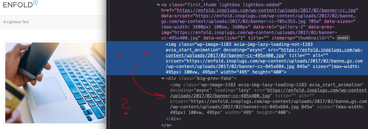
Please have a look at https://enfold.inoplugs.com/a-lightbox-test/
I used the following filter:
and return ‘original’.
As far as I see depending on screen width the largest image is loaded.
By default it is ‘large’.
Am I missing something.
Best regards,
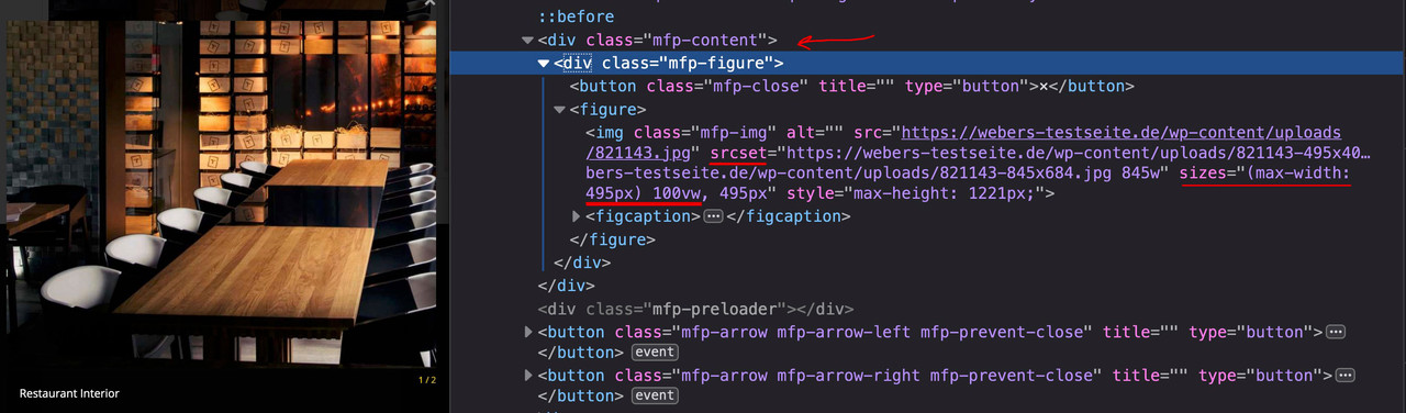
GünterNovember 24, 2022 at 8:30 pm #1373814i see the first time that this is normal DOM of gallery – with a kind of double-content. Why is that necessary? For what do i need that div.big-prev-fake
 November 24, 2022 at 8:45 pm #1373815
Aha : and you haven’t checked the “Responsive Images For Lightbox (currently in beta only)” on your test-page.
– but if you do so – the small images are loaded –
– when i switch off that option – the bigger images open without that filter.So my point is – if i use that option “Responsive Images For Lightbox” – that the opend lightbox image is a small one allthough the src and srcset have other source options – and i guess the reason is the size calculation:
it may have to do with the size setting being passed to the mfp content. jQuery.magnific-popup.js 1301ff in:
if( $( 'body' ).hasClass( 'responsive-images-lightbox-support' ) )
{ …
November 24, 2022 at 9:05 pm #1373818Edit : i switched the option on your test installation to responsive image support on lightbox- but there it opens the bigger image ?
i do not see the reason why ?November 24, 2022 at 10:50 pm #1373820probably it is because of a child-theme functions.php which already had a size of over 4500 lines.
I am currently cleaning out.
Edit: ;) from 4500 to 2650 linesGuess it can be closed
November 25, 2022 at 11:16 am #1373854 -
AuthorPosts
- The topic ‘Responsive Images For Lightbox (currently in beta only)’ is closed to new replies.