
-
AuthorPosts
-
February 15, 2017 at 11:30 pm #747715
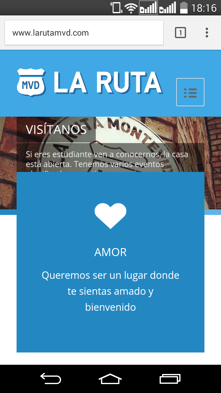
Hi guys, great theme.
I’m having problems with the Slider on the mobile version of my site, the text does not appear entirely and the video that I’m using (Youtube) does not show.
I’ve attached some screenshots.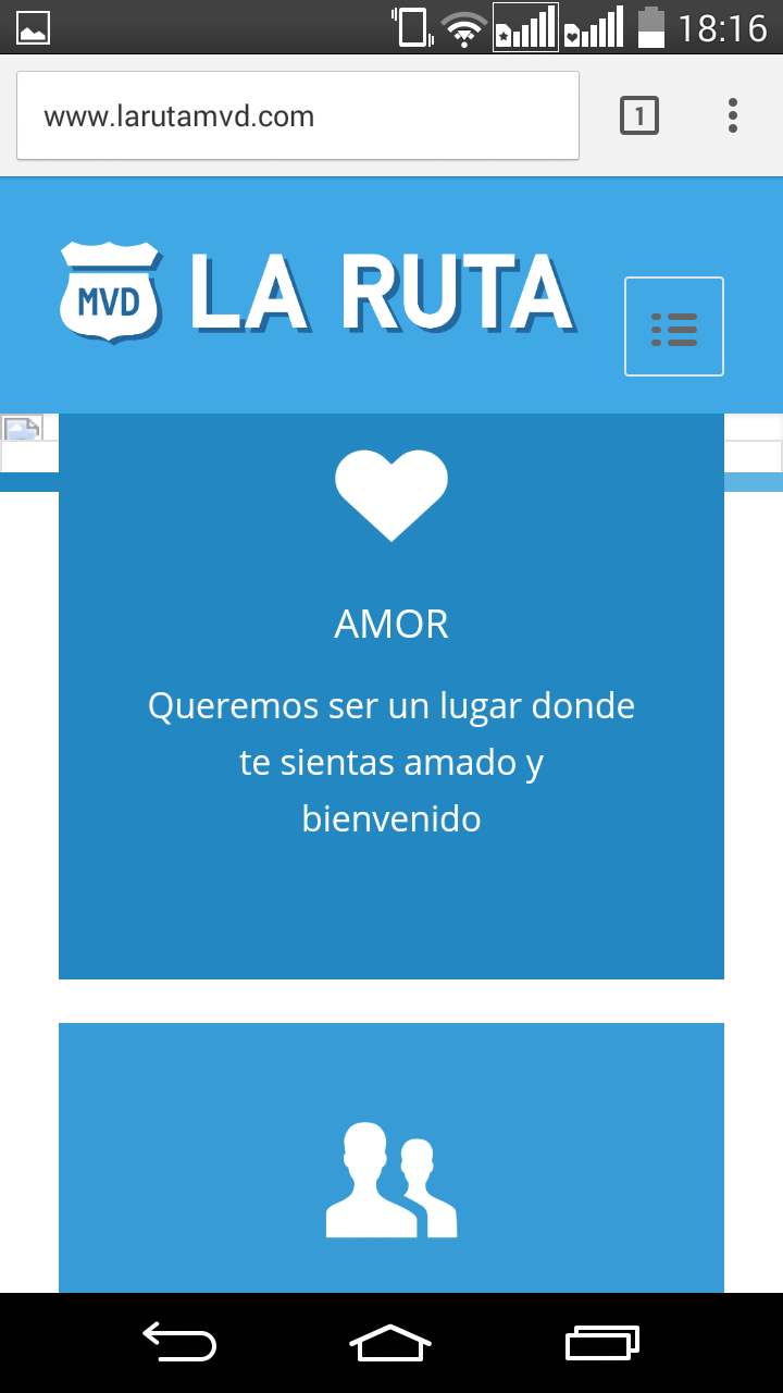
 February 20, 2017 at 2:46 pm #749379
Hey!
Sorry for the late reply!
Please try adding this code to the Quick CSS section under Enfold > General Styling or to your child themes style.css file:
@media only screen and (max-width: 768px) {
.caption_left .slideshow_caption {
    width: 100%;
}
#top .flex_column_table {
margin-top: 0 !important;
}}
Due to compatibility issues, videos in sliders are disabled on mobile. However you can refer to this post – http://kriesi.at/documentation/enfold/hide-menu-itemselements-on-mobile/ and add video element to your page and only display it on mobile
Best regards,
YigitFebruary 22, 2017 at 2:32 am #750224Thanks for the reply Yigit, now the title and the description shows but the button still is not fully visible
February 27, 2017 at 7:09 am #752167Hi,
Please try to increase the height of the slider on mobile view.
@media only screen and (max-width: 767px) {
    .avia-slideshow-inner, .avia-slideshow-inner img {
        height: 400px !important;
    }

    .avia-slideshow-inner img {
        min-width: 1200px !important;
        margin-left: -600px !important;
    }
}
This modification might distort some of the images so adjust the values until you get the best result.
Best regards,
IsmaelMarch 7, 2017 at 3:27 pm #757036Thanks for the reply, I sort of fixed it.
I’m still having problems with the mobile version, the width of the pictures on my pages are not responsive, so I have cropped images.
 March 8, 2017 at 11:07 am #757693
Hi!
That is perfectly normal because the theme is trying to keep the aspect ratio of the image. We can set the background-size (https://www.w3schools.com/cssref/css3_pr_background-size.asp) property from “cover” to “100%” or “contain” but it will distort the image or leave white spaces around the container.
@media only screen and (min-width: 768px) {
    .flex_cell {
        background-size: 100% 100% !important;
     }
}
Best regards,
Ismael -
AuthorPosts
- You must be logged in to reply to this topic.