
Tagged: columns, mobile, responsive, side by side
-
AuthorPosts
-
March 12, 2016 at 1:39 pm #597200
Hi there,
i’m developing a website with a one-pager 2-column layout. On a certain point of complexity, the mobile switch of 2-columns going from one-by-one to under each other doesn’t work anymore. This is for example visible in the footer where it works on home or contact:
but not on the longer page with the portfolio:
I had a similar problem with an left-menu layout where i had to disable all color overlays to get rid of that bug. But this is no option here. ANY IDEA?
Thanks all,
TobiMarch 14, 2016 at 5:18 am #597521Hi Tobi,
I couldn’t see any problems with the responsiveness on your site, could you post screenshots highlighting the issues please?
Best regards,
RikardMarch 14, 2016 at 11:11 am #597653Hi Rikard,
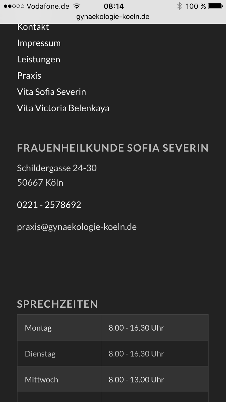
thanks for your message. Look here, the footer of home,
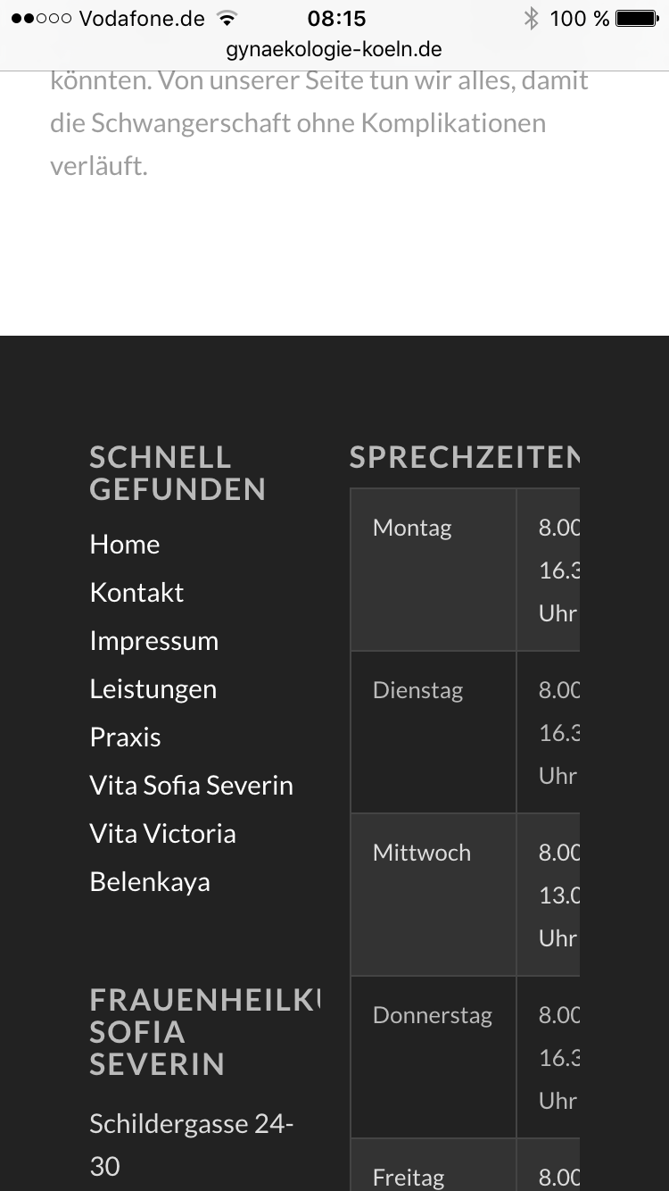
and here, same footer on “Leistungen”.
Looking forward to your answer
TobiasMarch 15, 2016 at 9:07 am #598263Hi,
Thanks for the screenshots, please try the following in Quick CSS under Enfold–>General Styling:
@media only screen and (max-width: 767px) {
#footer .av_one_half {
    width: 100% !important;
}
}
Best regards,
RikardMarch 15, 2016 at 11:16 am #598304Hi Rikard,
thank you a lot, this already helps. But there is still a question mark left, as the responsive footer should be a standard behavior which didn’t work on this single site. You have an idea why?
I had a quite similar problem with a different layout in an other Topic, so it would be nice to solve this to the core of the problem:
Also with your quick CSS the footer still looks a bit different in contrast to the other sites: The second widget area is shifted to the right and not inline with the first widget area above.
Kind regards
TobiasMarch 18, 2016 at 4:57 am #600061Hi,
Sorry for the late reply. To be honest I don’t know why you footer is breaking on that particular page, it usually due to content on the page but it’s unfortunately very difficult to find. Please try using the following CSS instead of what I previously sent your, it should render your footer the same on mobile:
@media only screen and (max-width: 767px) {
#footer .av_one_half {
    width: 100% !important;
    margin-left: 0% !important;
}
}
Regards,
Rikard -
AuthorPosts
- You must be logged in to reply to this topic.