
-
AuthorPosts
-
September 16, 2019 at 5:16 pm #1138876
Hi,
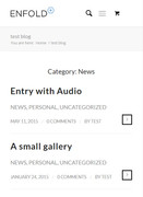
Mega menu on mobile does not seem working. I obtain a normal menu.What I would like to obtain is that all categories and posts are like on the example. It is like if categories and posts on desktop view are one on top the other on mobile view.
Thanks,
MarcoSeptember 18, 2019 at 4:11 am #1139306Hey Marco,
The mega menu does not work on mobile devices no, that is correct. I’m not sure I understand the second part of your post though, could you post a link to where we can see the problem?
Best regards,
RikardSeptember 18, 2019 at 12:02 pm #1139427Hi Rikard,
yes sorry, I forgot to share the example :-) September 22, 2019 at 12:37 am #1140514
Hi,
Sorry for the late reply, thanks for the screenshot, you can create this with a blog post element for each category and choose “List layout – simple” but it will still show the meta data for each post which could be hidden with css if you wish. For example:

Best regards,
MikeOctober 4, 2019 at 9:47 pm #1145132Hi Mike,
I am sorry, not sure I can understand what you mean. The example I gave you, the screenshot, is a mobile menu.What you see is actually the menu on a mobile phone which shows name of category and then right below all the posts. I like it because it is clear and tidy.
Any idea?
Marco
October 7, 2019 at 7:14 am #1145652Hi,
Thank you for the update.
Can we see the actual site? We would like to check how the menu is setup currently. Please provide the link in the private field. Are you using the mega menu option?
Best regards,
IsmaelOctober 7, 2019 at 11:51 am #1145728Hi Ismael,
I saw anyway that I have quite a few limitations with your mega manu, I just bought Ubermega menu.I will test it with Enfold.
A question about it.
are there any known issues on the integration between Enfold and Ubermenu?I am just testing it and i can see that there is something wrong on how the menu displays the pics and I am not sure if it is because of enfold or because of ubermenu.
It shows half a picture instead of the full element (which is there if I use the inspect element to highlight the element)
http://www.ninserviziogratuito.co.uk https://www.screencast.com/t/CllFdZ3aqKfz
Thanks,
MarcoOctober 9, 2019 at 4:42 am #1146354Hi,
Thank you for the update.
The images in the menu seem to be displaying properly now. If you require further assistance, let us know.
Best regards,
IsmaelOctober 9, 2019 at 11:43 am #1146473Hi Ismael,
Thanks for answering.
With regards to the menu, I have 2 questions:
1) how do I make the position of the logo (set on the left) relative? When I resize the screen I see that the bar goes on top of the logo therefore I’d like the logo to move.
2) Only on mobile menu, the WPML language flags are set within the menu while I’d like to have them just next to the toggle which is set at the top right of the page. I tried with a plugin but i do not know if it is the best procedure. Can you please point me out?Thanks
Marco-
This reply was modified 6 years, 6 months ago by
marcoabis81. Reason: Second logo and relative position logo
October 11, 2019 at 4:22 am #1146995Hi,
Thank you for the update.
1.) You can set the mobile menu to display earlier or when the screen width is equal or less than 1024px, instead of adjusting the logo.
@media only screen and (max-width: 1024px) {
.ubermenu-responsive.ubermenu-responsive-collapse {
    max-height: 0;
    overflow: hidden !important;
    visibility: hidden;
}

.ubermenu-responsive.ubermenu-responsive-collapse:not(.ubermenu-in-transition) {
    border-top-width: 0;
    border-bottom-width: 0;
}

.ubermenu-responsive-toggle {
    display: block;
}

.ubermenu-skin-blue-silver.ubermenu-responsive-toggle {
    margin: -63px 10px 0px 0px;
}
}
2.) You will need to contact the plugin developer for that. Unfortunately, we are not that familiar with their code.
Best regards,
IsmaelOctober 11, 2019 at 12:05 pm #1147095Hi Ismalel,
thanks for your answer.At your question 2 it is ok, I will contact WPML.
1) It is possible that with just a short line of code I obtain exactly the same result?
/* Relative logo */
#header_main .logo{
position:relative;
}Unfortunately anyway, both the codes give me this issue. When the bar goes down, the bar does not push the content below but it covers the content. See the screenshot. How can I push the contento below the bar?

2) Also, I am getting very confused with the breaking points. I cannot manage to have them when I want. I can with the bar but not with the whole content of the website, can you please help me? I would like the breakpoint to be 959 for everything. It means that when the size of the screen goes below 959, the site will switch to mobile responsive view. Is it a good procedure?
thanks
MarcoOctober 14, 2019 at 7:02 am #1147728Hi,
Thank you for the update.
1-2.) The suggested code above almost amounts to nothing if you’re worried about its size, so it will not affect the page speed. It’s going to display the mobile menu when the screen width is equal to or less than 1024px — changing the breakpoint. Did you try it?
Please post the login details in the private field so that we can test it. You should also contact the plugin authors for additional help because we don’t usually provide support for third party plugins.
Best regards,
IsmaelOctober 14, 2019 at 11:07 am #1147801Hi Ismael,
details below.I tested your code in addition to mine. My code make the position of the logo relative and your code pushes the content down. The only thing is that with your code, the menu (on desktop view) disappears most of the time. It completely goes away and I do not know why.
Thanks,
MarcoOctober 15, 2019 at 3:09 pm #1148106Hi,
Thank you for the update.
We removed an invalid comment line from the Quick CSS field and added the css code that we suggested above. This is how the site should look on iPad view now.
Screenshot: <https://imgur.com/a/8EB5cGF
Best regards,
IsmaelOctober 15, 2019 at 3:32 pm #1148115Hi Ismael,
not really. What I see is that when I open the toggle the bar does not push anything down.Text is below the bar

Marco
October 16, 2019 at 11:49 am #1148419Hi,
Thanks for the screenshot.
We fixed that particular issue by including this css code.
.ubermenu-responsive.ubermenu .ubermenu-nav {
    display: block;
}

.ubermenu-responsive.ubermenu-responsive-single-column .ubermenu-item-level-0 {
    float: none;
    clear: both;
    width: 100%;
}

.ubermenu-responsive-toggle {
    display: block !important;
}
This is how it should look now.
Screenshot: https://imgur.com/a/d5yauI6
For further modifications, please contact the plugin author.
Best regards,
IsmaelOctober 16, 2019 at 5:48 pm #1148543Hi Ismael,
Unfortunately it does not work, I so removed this code.I am talking about the bar when on desktop view. When the bar goes down the logo, the bar covers the content.
With the res arrow I indicate the white text hidden below the bar. Basically I would like that when the bar goes below the logo, t pushes down all the content of the page without hiding it.
Thanks,
MarcoOctober 18, 2019 at 6:46 am #1149128Hi,
Thank you for the update.
We adjusted the breakpoint to 1366px to prevent the menu from going below the logo. That’s the easiest workaround that we can think of. Unfortunately, we can’t modify the main style of the menu, so you need to contact the plugin developer for that.
This is the css code:
@media only screen and (max-width: 1366px) {
.ubermenu-responsive.ubermenu-responsive-collapse {
    max-height: 0;
    overflow: hidden !important;
    visibility: hidden;
}

.ubermenu-responsive.ubermenu-responsive-collapse:not(.ubermenu-in-transition) {
    border-top-width: 0;
    border-bottom-width: 0;
}

.ubermenu-responsive-toggle {
    display: block;
}

.ubermenu-responsive.ubermenu .ubermenu-nav {
    display: block;
}

.ubermenu-responsive.ubermenu-responsive-single-column .ubermenu-item-level-0 {
    float: none;
    clear: both;
    width: 100%;
}

.ubermenu-skin-blue-silver.ubermenu-responsive-toggle {
	top: 20px;
	position: relative;
}

.ubermenu-responsive-toggle {
    display: block !important;
}

.ubermenu-responsive.ubermenu-responsive-collapse {
	display: none !important;
}
}
Best regards,
IsmaelOctober 20, 2019 at 10:47 pm #1149667Hi Ismael,
Thank you so much.I changed a little bit the size but it is ok :-)
Thanks again
MarcoOctober 21, 2019 at 9:55 am #1149762Hi marcoabis81,
Glad you got it working for you! :)
If you need further assistance please let us know.
Best regards,
Victoria -
This reply was modified 6 years, 6 months ago by
-
AuthorPosts
- You must be logged in to reply to this topic.