
-
AuthorPosts
-
December 7, 2013 at 2:58 pm #197294
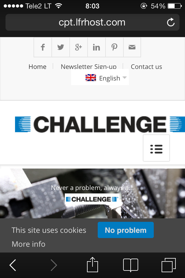
Hi, we would like our logo to be 285px X 40px when it shows up on the site on desktop, it should be in the center vertically. and when in mobile the mobile menu should not cover the logo. we are using the fixed heder with social icons and additional navigation. the test site is here cpt.lfrhost.com – we are confused as to what size logo we should upload and what css to change. Can you help please? Many Thanks
December 7, 2013 at 9:48 pm #197437Hi mrlreynolds!
Firstly you should edit your logo. You can add following code to Quick CSS in Enfold theme options under Styling tab to achieve what you would like but logo image will be stretched
@media only screen and (min-width: 989px) { .logo, .logo a, .logo a img { width: 285px!important; height: 40px!important; }}
@media only screen and (max-width: 480px) { .responsive .mobile_slide_out .logo { margin-bottom: 30px; }
#advanced_menu_toggle { top: 75%; } }
Cheers!
YigitDecember 8, 2013 at 3:43 am #197594This reply has been marked as private.December 8, 2013 at 3:58 am #197608Hey!
Just upload the logo with size more than 285x40px. The CSS will stretch it because of Yigit’s code above.
Cheers!
IsmaelDecember 8, 2013 at 4:00 am #197609This reply has been marked as private.December 8, 2013 at 4:12 am #197615Hey!
Please remove Yigit’s code:
@media only screen and (min-width: 989px) { .logo, .logo a, .logo a img { width: 285px!important; height: 40px!important; }}Replace it with:
@media only screen and (min-width: 989px) {
.logo, .logo a, .logo a img {
width: 285px!important;
height: 80px!important;
top: 20px;
}
}
Cheers!
IsmaelDecember 8, 2013 at 4:14 am #197617Hey!
Try adding this code to the Quick CSS:
.logo {
    position: relative;
    top: 38px;
}
.header-scrolled .logo{
    top: 8px;
}
Cheers!
JosueDecember 8, 2013 at 4:25 am #197620This reply has been marked as private.December 8, 2013 at 6:14 am #197638This reply has been marked as private.December 8, 2013 at 8:17 am #197653Hi!
I have just checked your website on my iphone and your logo looks fine on my end and i do not think it needs to be resized. Please see screenshot here http://i.imgur.com/Y0rS1wJ.png
You can add following code to Quick CSS to move the logo more to the left on mobile view@media only screen and (max-width: 480px) { .responsive .mobile_slide_out .logo { margin-left: -15px; }}Regards,
YigitDecember 8, 2013 at 8:37 am #197659This reply has been marked as private.December 9, 2013 at 5:19 am #197894Hi!
Please add following code to Quick CSS as well
@media only screen and (max-width: 480px) {
.responsive .mobile_slide_out .logo img, .logo, .logo a { width: 245px!important; }
#advanced_menu_toggle { top: 30%; }}
Best regards,
YigitDecember 10, 2013 at 4:38 am #198390This reply has been marked as private.December 10, 2013 at 12:29 pm #198499Hi!
Please apply Devin’s first code in here https://kriesi.at/support/topic/top-menu-with-the-social-icons-bigger/#post-134332
That will change the width to switch to mobile menuCheers!
YigitDecember 10, 2013 at 12:47 pm #198504This reply has been marked as private.December 10, 2013 at 6:02 pm #198623Hey!
Please add following code to Quick CSS
#header .avia_mega_div { width: 1010px; }
@media only screen and (min-width: 767px) and (max-width: 1120px) {
#header .avia_mega_div { width: 800px; } }
Flush browser cache after applying the code and refresh your page a few times
Cheers!
YigitDecember 11, 2013 at 2:28 am #198796This reply has been marked as private.December 11, 2013 at 8:32 am #198869Hi!
Please change this line of code on Yigit’s solution:
@media only screen and (min-width: 767px) and (max-width: 1120px) {
#header .avia_mega_div { width: 800px; } }
Replace it with:
@media only screen and (min-width: 767px) and (max-width: 1120px) {
#header .avia_mega_div.avia_mega6 { width: 800px; } }
Regards,
IsmaelDecember 11, 2013 at 10:40 am #198925This reply has been marked as private. -
AuthorPosts
- The topic ‘logo resize’ is closed to new replies.