
-
AuthorPosts
-
March 16, 2019 at 1:22 am #1079311
Hi guys
I’ve just launched this website update, but have since experienced that all of my CTA are displaying wrong on mobile devices. I use the ?iframe=true to activate a lightbox.
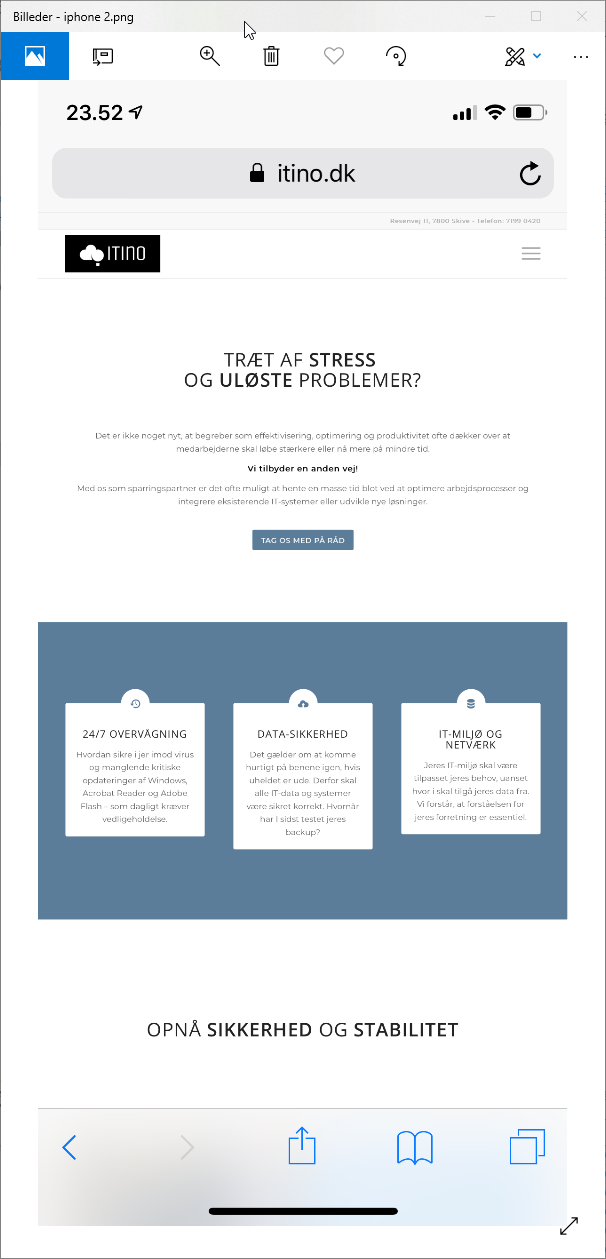
If you click on the first button – or any other CTA – it opens up nicely on a PC. But if you try on a mobile device like an iPhone or iPad it is very oversized and unusable.
Follow this link to see the buttons in action: https://itino.dk/it-support/
The CTA opens up this page: https://itino.dk/kontakt/kontaktform/
I use this link https://itino.dk/kontakt/kontaktform?iframe=true to activate lightboxI use this CSS to fit the lightbox size – but no matter if I modify or remove it the result is the same on a mobile device.
.mfp-bg {
background-color: #657b96 !important;
}

.mfp-iframe-holder .mfp-content {
    width: 50% !important;
    max-width: 960px !important;
    min-height: 51vh;
}

.mfp-iframe-scaler {
    min-height: 51vh;
}
Display on PC

Display on iPad

Display on iPad zoomed out

-
This topic was modified 7 years, 1 month ago by
Gudi.
March 16, 2019 at 11:10 pm #1079504Hey Gudi,
I was not able to reproduce this on Chrome in PC or on an Android device, but I recall reading about this on iOS a while back, the solution was to change the viewport in the header. If you look in your header.php on line 65 you will see this code:<meta name="viewport" content="width=device-width, initial-scale=1, maximum-scale=1">I have removed the maximum-scale=1 in the code, because I believe that was the solution.
Please test with your iOS devices, if that doesn’t work try changing it to this:<meta name="viewport" content="user-scalable = yes">Best regards,
MikeMarch 17, 2019 at 12:59 am #1079511Hi Mike
Thank you for your support, much appreciated!My line 65 was already like this
<meta name="viewport" content="width=device-width, initial-scale=1">I tried the other user-scalable=yes and the website then displays as on a PC. The full width of the website. But the lightbox pop-up is the same on iOS. Even tried to add maximum-scale=1 – but the outcome is the same.
It seems to me as if the lightbox at first opens at 50% width, but then before the content is loaded bloats up 400%.
March 17, 2019 at 11:55 am #1079570Just wanted to post two screenshots from my iPhone, to show the result from the above suggestion.
View on iPhone before ‘clik on Call-to-action’
View on iPhone when I click the call-to-action button
 March 17, 2019 at 3:04 pm #1079593
Hi,
Thanks for the feedback, I took another look at your contact form popup and see that it is inside a color section which always is given 100% width, since you say that when the popup starts it’s the right size and then when the content loads it increases in size so I removed the color section. Please give that a try.
If that doesn’t work then look for this css in your Quick CSS”.mfp-iframe-holder .mfp-content { width: 50% !important; max-width: 960px !important; min-height: 51vh; } .mfp-iframe-scaler { min-height: 51vh; }and try with it removed, as a test. and then test with this code as a replacement:
.mfp-iframe-holder .mfp-content {
    width: 50% !important;
    min-height: 51vh;
}

.mfp-iframe-scaler {
    min-height: 51vh;
width: 50vw !important;
}
Sorry, if I had a iPhone I could test it myself.
Please be sure to clear your browser cache and your cache plugin with each test.Best regards,
MikeMarch 17, 2019 at 3:19 pm #1079594Hi Mike
Tried to remove it, and also adding the modified CSS. No difference sorry. I’m also disabling my W3 caching to be sure I’m not reviewing old code. I added the color section in hope of being able to throw some CSS its way. Also thought about having two versions on the contact form depending on what device was viewing it. But the CSS seems to have no impact in my testing.
Sorry I don’t know any iOS emulators.
Best regards,
GudiMarch 17, 2019 at 3:26 pm #1079596March 17, 2019 at 3:58 pm #1079609The emulators I just tried on the web don’t reproduce the problem, only if I use them on my iOS device.
The issue is the same on my iOS device no matter if I use Safari, Chrome or Firefox.
I run incognito and clear cache on my iPhone yes.
Here’s a video to show how it behaves: https://youtu.be/oSip2y3Vhlk
March 17, 2019 at 4:08 pm #1079614Hi,
I signed up for a trial at browserstack and tested you site, it turns out that the iframe is getting it’s width from the page that is in the iframe which is 1920px
So I added this css to your contact page in a code block:<style> .responsive .boxed#top { max-width: 400px !important; width: 400px !important; } </style>and I added this to your Quick CSS, disabling the other css:
.mfp-iframe-scaler iframe.mfp-iframe,.mfp-iframe-scaler iframe,div.mfp-content {
max-width: 400px !important;
}
Please clear your browser cache and check.
Best regards,
MikeMarch 17, 2019 at 4:30 pm #1079625Thanks Mike
That seem to have fixed it on iOS: https://youtu.be/LjMF4XWmPb4
There’s just a small spacing to the right on the iPhone.Need to fix the css to only apply on smaller devices, then I think I’m good to go. It very small on my 27″ now ;)
Is there a reason to why you add the style on the contact page directly?
Awesome support ;)!!
March 17, 2019 at 5:06 pm #1079645Hi,
I added the style to the page directly because it’s loading in a iframe and some browsers won’t let you apply css to the content of a iframe, I also wanted to see if it worked without fighting with the iframe limitations. So I added a media query to the css and made it a little smaller:@media only screen and (max-width: 767px) { .responsive .boxed#top { max-width: 350px !important; width: 350px !important; } }If this works for you then try moving it to your Quick CSS to see if it still works on the iframe, but we will add the page id to it:
@media only screen and (max-width: 767px) {
.responsive .boxed#top.page-id-1507 {
max-width: 350px !important;
width: 350px !important;
}
}
Please feel free to adjust the width, I’m just guessing at 350px from the video.
Also clear your browser cache.Best regards,
MikeMarch 17, 2019 at 6:14 pm #1079683Hi Mike
This is my display on Firefox now

It looks great on the iOS devices now. I’ll get back tonight and try to play around with it.
March 17, 2019 at 6:41 pm #1079685Hi,
It looks like we are going to have to target iOS only, I know that you can target iPhone with this:/*iPhone only - ios*/ @supports (-webkit-overflow-scrolling: touch) { /* CSS specific to iOS devices */ }But your also looking to control Mac’s which don’t have a touch screen.
This post says you can target iOS only with-webkit-overflow-scrollingPerhaps we should try to control it with javascript, such as this post.
Well please let us know how your testing goes tonight.Best regards,
MikeMarch 18, 2019 at 12:27 am #1079742Hi Mike
I’m happy to report your solution and guidance did the job ;) thank you so much, what a supportteam you guys have!!
To sum it up
Inline CSS (Code Block) added to the contact page
<style>
@supports (-webkit-overflow-scrolling: touch) {

.responsive .boxed#top {
max-width: 350px !important;
width: 350px !important;
}
}
</style>
Quick CSS added
.mfp-bg {
background-color: #657b96 !important;
}

@supports not (-webkit-overflow-scrolling: touch) {
.mfp-iframe-holder .mfp-content {
    width: 50% !important;
    min-height: 51vh;
}

.mfp-iframe-scaler {
    min-height: 51vh;
}

.mfp-iframe-holder .mfp-content {
    width: 50% !important;
    min-height: 51vh;
}

.mfp-iframe-scaler {
    min-height: 51vh;
}
}

/*iPhone only - ios*/
@supports (-webkit-overflow-scrolling: touch) {
.mfp-iframe-scaler iframe.mfp-iframe,.mfp-iframe-scaler iframe,div.mfp-content {
max-width: 400px !important;
}
}
March 19, 2019 at 4:18 am #1080202 -
This topic was modified 7 years, 1 month ago by
-
AuthorPosts
- The topic ‘lightbox page pop-up oversized width on mobile devices’ is closed to new replies.