
-
AuthorPosts
-
October 21, 2018 at 8:13 pm #1024580
Hello,
I am using an Enfold Theme for my website. I know that it has to be a full responsive theme, i.e. correctly showed on mobile devices.
However, my website does not appear correctly on mobile phones. If from a mobile device you look the Menu item “Materiali”, then “Marmi”, where I have three columns of images, they result in a irregular/messy way (without any margins, any column’s order, etc.). I attach the links of pictures of desktop and mobile view below.desktop view (correct)
https://imageshack.com/a/img922/1048/WdO9uf.pngmobile view (to be changed)
https://imageshack.com/a/img923/755/NmJocv.jpgWhat should I do in order to fix this problem?
Thank you very much in advance.
October 22, 2018 at 7:27 am #1024712Hey Matsky1,
Could you post a link to the page in question so that we can take a closer look please?
Best regards,
RikardOctober 22, 2018 at 8:23 am #1024730Hey Rikard,
attached the link of my website.menu item —-> materiali———> marmi
Thank you !
October 24, 2018 at 10:54 am #1025845Hi everybody,
can you please answer me on my question? so that i can proceed.
Thank you and best regards
October 24, 2018 at 2:28 pm #1025904Hi Matsky1,
Here is the code you can put in Enfold > General Styling > Quick Css, if it does not work, put into themes/enfold/css/custom.css
@media only screen and (max-width: 767px)
.responsive #top .container .av-content-small, .responsive #top #wrap_all .flex_column,
If you need further assistance please let us know.
Best regards,
VictoriaOctober 24, 2018 at 3:24 pm #1025932Hi Vistoria, thank you for your answering.
I tryed to put the following code:
@media only screen and (max-width: 767px)
.responsive #top .container .av-content-small, .responsive #top #wrap_all .flex_column,inside enfold > general styling Quick Css but does not work.
since i am using enfold child, where do i find “themes/enfold/css/custom.css” in order to try this way you suggest me?
thank you very much.
October 24, 2018 at 7:19 pm #1026063Hi,
as i wrote i put your code inside enfold > general styling Quick Css but does not work.
Now i tryed to put it inside editore > style.css
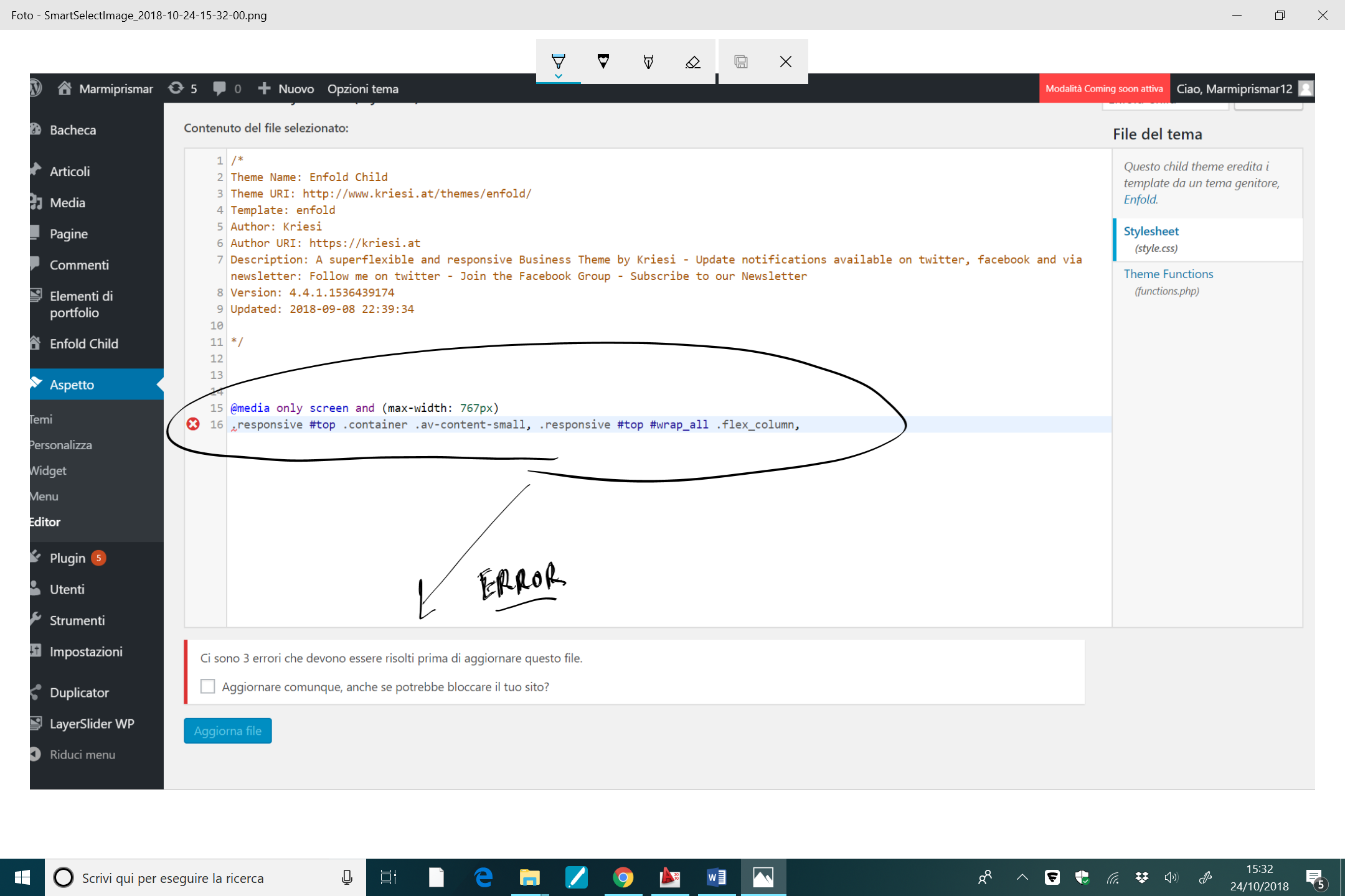
in the following link you can see the error i got…
please help meOctober 24, 2018 at 8:02 pm #1026080Hi Matsky1,
Sorry, the code did not copy properly or got lost somehow.
Here is the code:@media only screen and (max-width: 767px) { .responsive #top #wrap_all .flex_column { padding: 0 !important; } }If you need further assistance please let us know.
Best regards,
VictoriaOctober 24, 2018 at 8:23 pm #1026095Hi Victoria,
Thank you a lot. Now it works.
However, I have not specified before that I wanted the Menu item, for example, “Marmi” to look this way on mobile devices:http://imagizer.imageshack.us/a/img924/9467/meo2rO.jpg
So that there are two columns of images (instead of one as it is now). Which css I have to use for this?
Thank you a lot in advance.
Best regardsOctober 26, 2018 at 12:05 pm #1026739Hi Matsky1,
I cannot see the page at the moment, is it down?
Best regards,
VictoriaOctober 26, 2018 at 3:57 pm #1026860Here is the link.
Thank youOctober 30, 2018 at 4:18 am #1027833 -
AuthorPosts
- You must be logged in to reply to this topic.