
-
AuthorPosts
-
February 21, 2018 at 5:52 pm #915587
Hi, how can I move the logo to be left aligned on mobile/tablet?
And also how can I make the socket center aligned?
February 21, 2018 at 6:02 pm #915595Hey DROR,
Try adding the following to quick css:
@media only screen and (max-width: 767px){
.responsive #top .logo{
float:left!important;
}}
Best regards,
Jordan ShannonFebruary 21, 2018 at 6:12 pm #915604Hi Jordan, that still didn’t put the logo to the left as you can see in the screenshot.
February 21, 2018 at 6:14 pm #915605Hi,
What device is the screenshot from?
Best regards,
Jordan ShannonFebruary 21, 2018 at 6:20 pm #915612OnePlus 5 and also on an iPhone 7
February 21, 2018 at 11:00 pm #915758Hi,
Try adding the following as well:
@media only screen
and (min-device-width : 375px)
and (max-device-width : 667px) {
.responsive #top .logo a img{
float:left!important;
}
}
Best regards,
Jordan ShannonFebruary 26, 2018 at 1:52 pm #917839That didn’t work… logo is not aligned to the left. I want it to show on the left side of the menu bar, regardless of the screen size.
February 26, 2018 at 7:07 pm #917923Hi,
Please paste a screenshot of the result that my css provided. It should have worked.
Best regards,
Jordan ShannonFebruary 27, 2018 at 10:26 am #918322Screenshot attached.
February 27, 2018 at 5:28 pm #918551Hi,
Thanks for sending that over. Please provide admin info so that I can log in and look into the issue further. The css I provided should have fixed that.
Best regards,
Jordan ShannonFebruary 28, 2018 at 10:16 am #918903This reply has been marked as private.March 1, 2018 at 4:52 pm #919746Hi,
We have added the below code to the Quick CSS section please clear the browser cache to view changes on the mobile you may have to refresh several times. If you still have any issue please increase the max-width value in the very first line of the code (max-width: 767px).
@media only screen and (max-width: 767px) {
.responsive .logo img {
    float: left!important;
}}
Best regards,
VinayApril 23, 2020 at 5:18 am #1206423I’m having the same issue and none of the above code options are working.
My logo is still centered on mobile between the left edge of the phone and the burger menu icon, when I need it to flush left with the rest of my content below, so like 1-2% margin from the left edge of the phone.
Here’s a screenshot:
https://drive.google.com/file/d/1qC0psaFVjyy26NzzoQwwuOfurKrcusLp/view?usp=sharingIf it’s helpful to know, I have and SVG logo and here is some code I’ve already applied to it:
.responsive .logo img {
min-width: 355px;
right: auto !important;
left: -20px;
}@media only screen and (max-width: 767px) {
#top .logo img {
width: auto !important;
height: 100px;
}}Could someone please help me?
Thank you!
–Steph
April 24, 2020 at 6:28 am #1206729Hi Steph,
Please post a link to your site so that we can have a closer look at it.
Best regards,
RikardApril 28, 2020 at 5:16 pm #1207862Hi Rikard! Sorry for the delay.
My site is pioneerautocredit.com
Looking forward to your help!!
May 1, 2020 at 4:10 am #1208707Hi Steph,
Thanks for that. Please try the following in Quick CSS under Enfold->General Styling:
@media only screen and (max-width: 767px) {
.responsive .logo img {
    min-width: auto;
}
}
Best regards,
RikardMay 16, 2021 at 8:42 pm #1300589Hi,
I’m having the same problem as Sclark91. The logo is svg and the code I have at the moment is
.responsive .logo img {
    min-width: 120px;
    padding: 0px 0;
}
This code enables the svg logo in the first place – found it on one of the threads.
The problem is that in the mobile view, the logo is centered and I want it on the left side. I have tried the code suggested above and it didn’t work. The only code I got it to work even a bit was:
@media only screen and (max-width: 767px){
.responsive .logo img {
margin-left: -100px;
}}
This is a workaround since the logo is not “aligned” correctly so depending on the screen size, the logo isn’t always on the left hand side. Any ideas how to fix?
May 18, 2021 at 9:14 am #1300901Hi Cloaker,
Your logo is left aligned on all screen sizes on my end, did you manage to find a solution?
Best regards,
RikardMay 18, 2021 at 11:01 am #1300936@Sclark91 – his logo is a svg-logo – that is the point. If you see his edited logo now here : https://webers-testseite.de/Pioneer-Final-Logos_RGB-Green-03.svg and pull the screen height to smaller sizes – you see that it is shrinking to the left side of the screen. On default a svg does that center center.
The trick is to add this to the “head” section of the svg:preserveAspectRatio="xMinYMid meet"
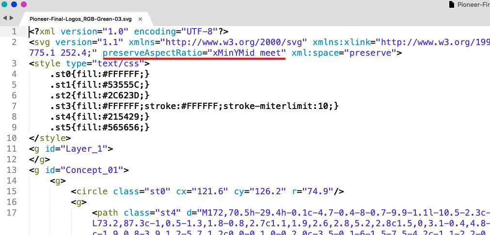
@cloaker : your logo is a svg file too – you can influence the shrink behavior by adding some code to the svg itself. See above
Open in a good text-editor ( mac f.e. Sublime Text on win: notepad++) your logo. You will see on top a similar code.
Insert on that place ( with space between the surrounded code ) :preserveAspectRatio="xMinYMid meet"
xMinYMid means that on horizontal align it is minimized to the left – and vertical align it is centered
( pay attention the x is small letter – Y is with big letters )PS: good text-editors do not insert or add meta infos to the texts. They do what they had to do and nothing else. ( in oposite to word ;) )
PPS: then you can forget about the negative margins – get rid of all that stuff – and see if there might be small adjustments – e.g. if your svg has a lot of space around the path in it.
PPPS: :) if your svg is generated in Illustrator : i do change the default classes to something else – because if you got more than one svg on that page and refill a path by its class – all .st1 etc. pp will be influenced. So to stay unique i do change it to something meaningfull. and different to “st” nomenklatura.
May 19, 2021 at 11:39 am #1301170 -
AuthorPosts
- You must be logged in to reply to this topic.