
Tagged: horizontal gallery
-
AuthorPosts
-
August 29, 2022 at 10:12 am #1363022
Hi,
I have an issue on our gallery website. The horizontal gallery looks good on the desktop view but ignores settings and cutting images in the mobile view (< 768px width).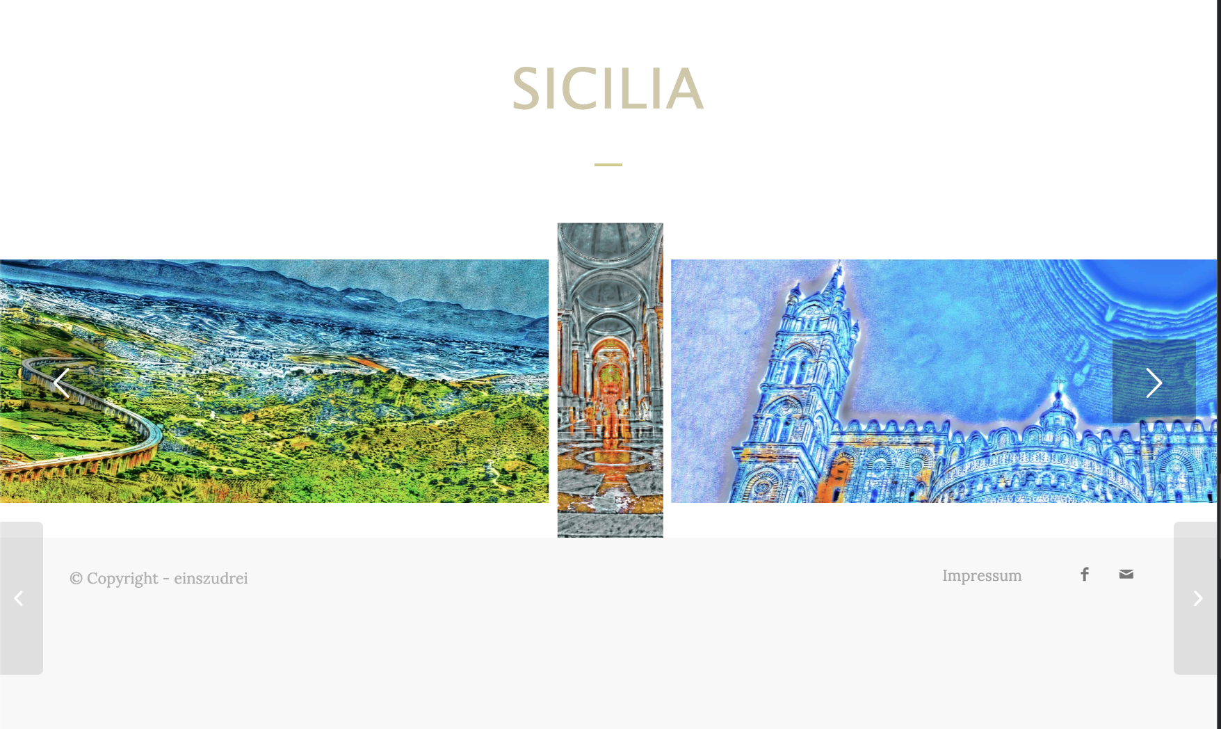
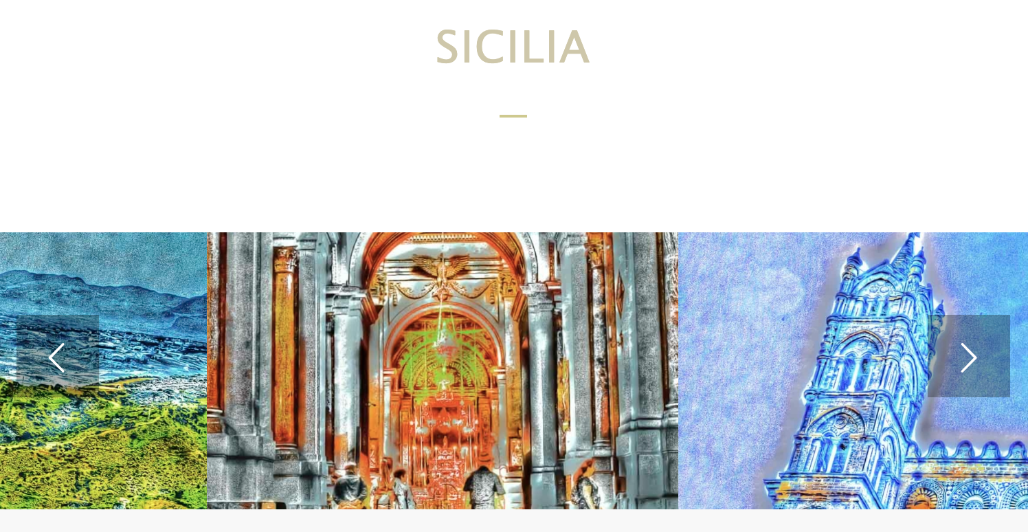
My portrait images are cropped (what is absolutely not acceptable for an art gallery) and the spaces (large spaces) are gone. I know, that a portrait will look not that good on a small display, but better than cropped.
Greets Tobias
August 30, 2022 at 3:58 am #1363133Hey Tobias,
Thank you for the inquiry.
Have you tried creating a different layout for the gallery? Perhaps displaying the images separately as their own entity using an Image element, instead of displaying them as a group using a slider or horizontal gallery.
How would you like the gallery to display on mobile view? If you want the images to fully display without overflow even on smaller screens, please use this css code.
@media only screen and (max-width: 767px) {

  /* Add your Mobile Styles here */
  .responsive .av-horizontal-gallery-img {
    height: 100%;
    width: 100%;
    transform: none;
    top: 0;
    position: relative;
  }
}
Best regards,
IsmaelSeptember 1, 2022 at 12:52 pm #1363474The CSS messes with the images:
AND I issue another problem – when I resize it to smaller width, the images get cropped on the sides to maintain the height.
I need to ensure a format 1:3 (like the page name suggests). Any idea?Greets Tobias
-
This reply was modified 1 year, 8 months ago by
tobiastoifl.
September 5, 2022 at 6:56 am #1363865Hi,
Thank you for the inquiry.
We get the following result when we apply the code directly in the browser.
// https://1drv.ms/u/s!AjjTfXSRbKTvxAiXmnMnMXORgNr8
Please switch the role of the account above to admin so that we can check the modification further.
Best regards,
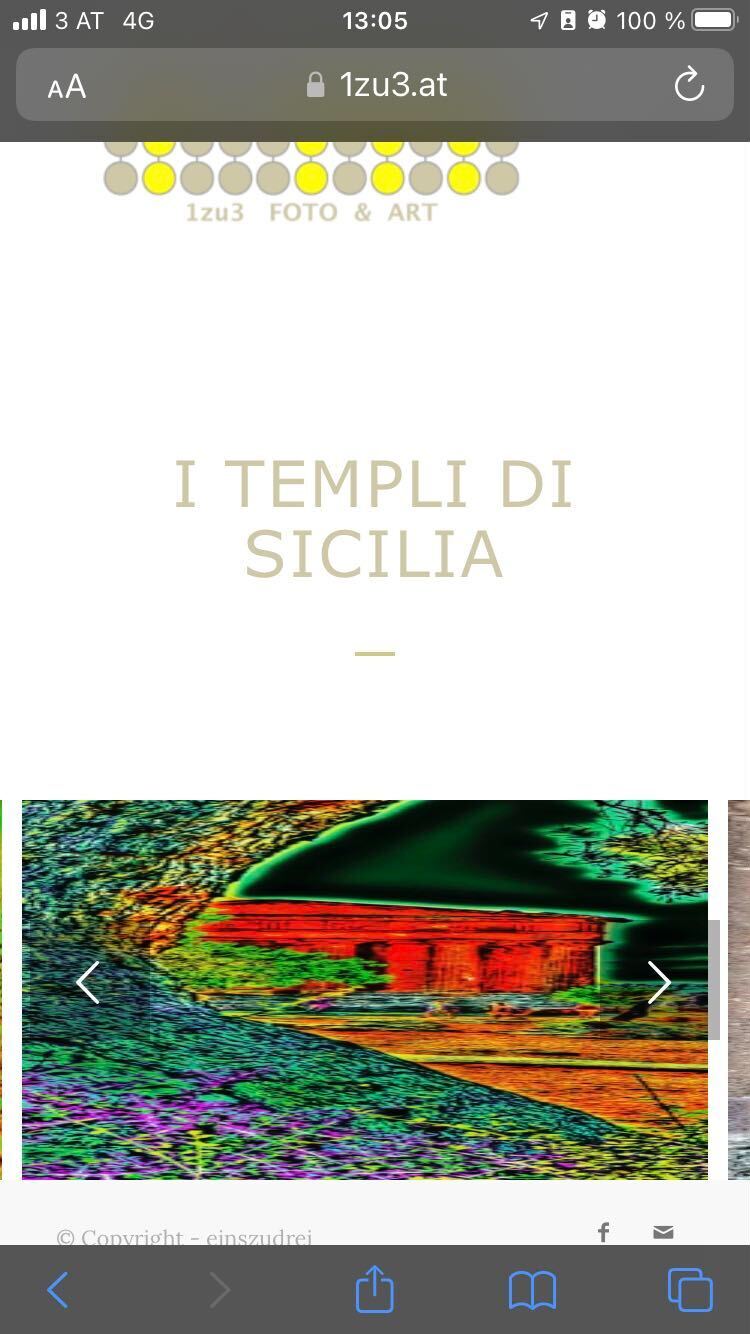
IsmaelSeptember 5, 2022 at 10:56 am #1363891Hi, the CSS works with a computer but messes on physical mobile devices (see the screenshot).
September 6, 2022 at 9:12 am #1364001Hi,
We added the css code again and disabled the Performance > File Compression settings temporarily. We got this result on an iPhone simulator.
Screenshot: https://1drv.ms/u/s!AjjTfXSRbKTvxAubyYJ8B5CPpddT?e=5gBE2o
Best regards,
IsmaelSeptember 6, 2022 at 10:26 am #1364012Hi,
unfortunately the customer claimed in the morning about the messed up pictures.
It looks like the screenshot I already gave you.
We used an old, a new, a small and a big iPhone with different iOS versions. Same result!Please check NOT on a computer – use your physical phone (maybe android or microsoft phone has the same results).
September 6, 2022 at 2:48 pm #1364061Hey,
I changed the code to following one and now it looks like the screenshot I shared in private content field
@media only screen and (max-width: 767px) {
  /* Add your Mobile Styles here */
  .responsive .av-horizontal-gallery-img {
    height: 100%;
    width: auto;
    transform: none;
    top: 0;
    position: relative;
  }
}
Could you please review your website? :)
Best regards,
YigitSeptember 8, 2022 at 10:18 am #1364301Hi, unfortunately the Images are still not in the original ratio!
I created a gallery with images that have a border and squares: Kriesi Squares (private access).As you can easily see, the ration is broken, as well as the image padding/margin is only applied to the desktop version of the gallery!
Greets TobiasSeptember 12, 2022 at 3:21 pm #1364772Hi Tobias,
Thanks for the test page! I can see that images are a bit cut from the bottom. Is that what you mean? If so, following code seems to fix it for me
@media only screen and (max-width: 767px) {
.responsive .av-horizontal-gallery-img {
  height: 99%;
}}
Could you please try adding this code and check once again?
Best regards,
Yigit -
This reply was modified 1 year, 8 months ago by
-
AuthorPosts
- You must be logged in to reply to this topic.