Tagged: mobile menu
-
AuthorPosts
-
September 5, 2017 at 10:03 pm #848337
Hello.
I recently discovered a problem with the solution that I implemented based on your feedback, here:
https://kriesi.at/support/topic/home-page-box-over-slider/
Wherein I implemented the following Quick CSS:
#after_layer_slider_1 {
   z-index: 10000;
}
In order to achieve this look:

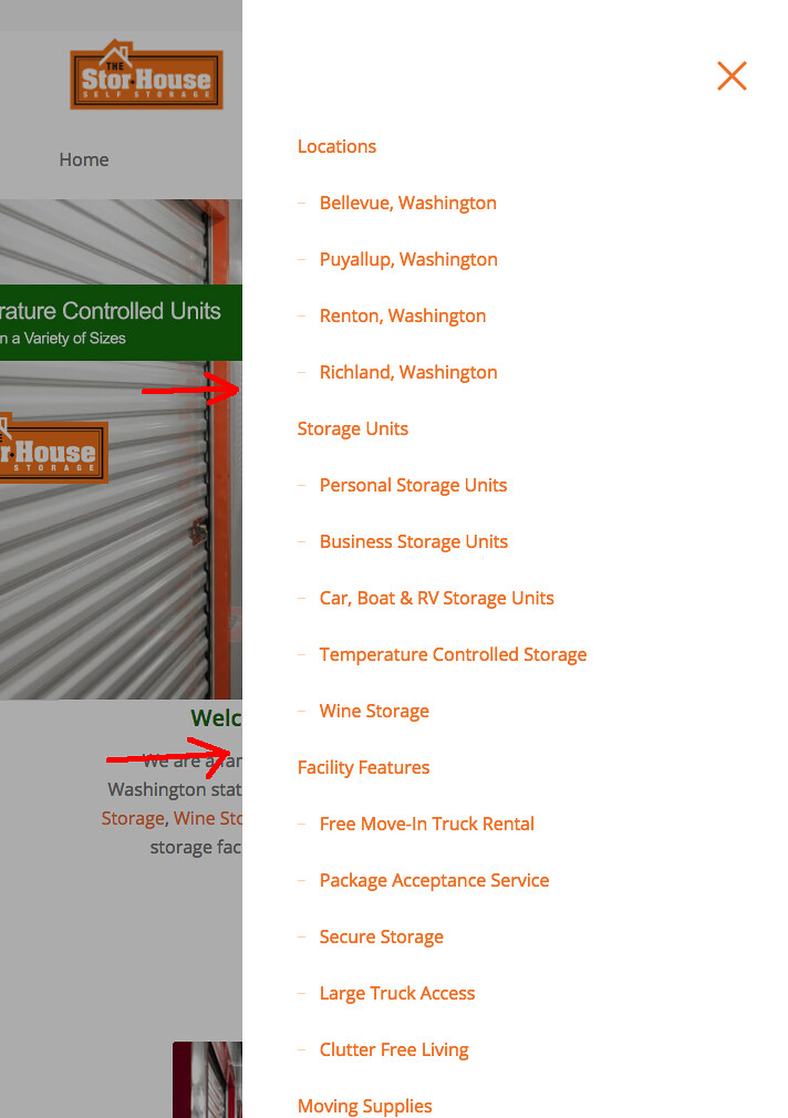
The recent update 4.2.1 created a conflict whereby the mobile menu “hides” behind the page text, like so:

If I remove the above mentioned code it returns to normal, but the layer slider is no longer overlapped:

Is there a new Quick CSS I can implement to achieve the same result without affecting the mobile menu? Many thanks in advance for your assistance!
September 6, 2017 at 8:40 am #848492Hey storhouse,
So you essentially want the header overlap to remain on mobile, but you want the menu to overlap that?
Best regards,
Jordan ShannonSeptember 6, 2017 at 11:33 pm #848888Thanks for the quick reply, Jordan Shannon.
I would like the header to overlap across all screen sizes, including mobile, yes.
In regards to the mobile / burger menu, yes, I would like that to be on top.
Thanks again.
September 7, 2017 at 6:35 pm #849177Hi,
Would you comment out the css you added so I can have the original starting point to work from?
Best regards,
Jordan ShannonSeptember 8, 2017 at 1:59 am #849353Hello. I’m afraid I don’t understand the request. If you’re asking how the layer above slider request was achieved prior to the update that precipitated my original request, linked above, I’m sorry but I don’t have that. All of the information I have in this matter has been supplied in the posts above.
Again, sorry. I wish I could be of more help.September 8, 2017 at 5:42 am #849378Hi,
You can fix it decreasing the z-index to 100. Just add the following code:
#after_layer_slider_1 {
   z-index: 100;
}
Best regards,
John TorvikSeptember 8, 2017 at 7:31 pm #849700That did the trick! Thank you, John Torvik. Please close this discussion.
-
This reply was modified 8 years, 7 months ago by
storhouse.
September 8, 2017 at 9:55 pm #849723Hi,
I’m glad you were able to get this corrected. If you need additional help, please let us know here in the forums.
Best regards,
Jordan Shannon -
This reply was modified 8 years, 7 months ago by
-
AuthorPosts
- The topic ‘Home page box over slider (mobile menu update)’ is closed to new replies.
