
Tagged: Grid Row Responsive
-
AuthorPosts
-
March 1, 2021 at 4:32 pm #1284470
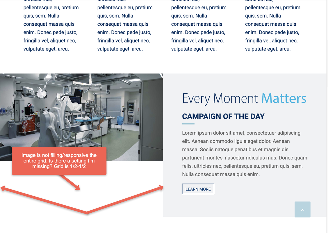
Hi, I have a 1/2-1/2 grid row, one half is an image, the other is a text box. When the screen/grid is viewed on a small tablet or laptop the image shrinks, yet it does not maintain keeping the space filled….so there is a gap below the image that appears. Hard to explain, see this link.
https://i.postimg.cc/h457yGKJ/grid-responsive.png
Is there something I may have missed in the setting to fix this?March 7, 2021 at 7:12 pm #1286220Wow!!!! I pay for support and it’s been 6 days and still no response? C’mon guys!
March 10, 2021 at 6:21 pm #1287210Hi Snerp,
We are sorry for the late reply.
I have created a private copy of your homepage (linked in private content field) and added your image as grid cell background image instead of using image element. Please review the test page and if you are satisfied with the result, apply it to your other grid cells.
Also, Enfold version you are currently using is not compatible with WP 5.6.x and 5.7 so please update the theme to the latest version 4.8.1 when you can to avoid having compatibility issues.
Best regards,
YigitMarch 10, 2021 at 7:25 pm #1287229Hi Yigit,
thanks for eventually getting back to me, not sure why it took 10 days when I can see many other posts way after mine being answered. Hopefully, this is not a trend as I do like using Enfold as my primary theme for my clients, and support is crucial for me since there are deadlines/timing.
I looked at your suggestion and this doesn’t work either (I already had done this :) as the top and bottom of the image are getting cut off. Any other suggestions?
March 12, 2021 at 3:44 pm #1287719Hi,
I set cell height to 60%. It is better but still cuts the background image at certain screen sizes and that is expected. The image you are using is not square but the cell is. If you would like to display image without crop, it would not fill the cell.
I have not tried but duplicating your Grid Row element, replacing background image with Image element in one and choose to display it only on mobile and the other on desktop only could help as well.
Best regards,
Yigit -
AuthorPosts
- You must be logged in to reply to this topic.