
-
AuthorPosts
-
January 27, 2022 at 1:54 pm #1337514
Hi Kriesi Team,
Please see my screenshot attached for the intended design/layout and your understanding and see my current status of how it looks like with Enfold right now on negotiations-masterclass.com .
I have 3 open questions regarding the design/layout for my website, which I cannot figure out:
1) How can I include a red line at the top of the header or above the header (please see screenshot)?
2) I don’t want to show a header “column” underneath the header. How can it be removed?
3) I’m using the “color section” layout element for the banner at the top of the page. While the left with the text and red colour in full width on the left looks great, the image on the right does NOT go full width to the right. Please see screenshot on how it is intended to look like. How can I adjust it so that the image spans from the center to the very right of the page (full width)?
Thank you very much in advance for your support on these, appreciate it! :-)
MarkusJanuary 27, 2022 at 1:57 pm #1337515This reply has been marked as private.January 28, 2022 at 5:46 am #1337616Hi,
1. Please try the following in Quick CSS under Enfold->General Styling:
#header_main {
    border-top: 10px solid red;
}
2. Are you referring to the page title/breadcrumbs? If so, then you can select to not show that in the Layout menu when editing the page. Look for the Title Bar Settings option.
3. Could you try to use the Grid Row element instead please?
Best regards,
RikardJanuary 28, 2022 at 8:01 pm #1337799Hi Rikard,
Thank you so much for your guidance on this, very helpful! As you can see #1 and #2 look great now!
I am still struggling with point #3. I have played around with the Grid Row element – please see the current version (https://negotiations-masterclass.com/) – and am encountering the following 2 issues:
a. While I managed to increase the font size through HTML code snippets for desktop, it looks off on mobile (it’s a good size for desktop however looks oversized on mobile). In addition, the line spacing doesn’t work on neither desktop and mobile.
How would you recommend changing it so it looks good?b. Based on the current layout/design, the image is displayed based on the text size and volume on the left hand side. However, I would like the full image to be displayed. I selected “Stretch Image”, however then the image isn’t fully visible. When I select other options, the space isn’t filled on the right.
Displaying the full image is also important for Mobile. If you have a look at the mobile layout right now, the image currently fills almost the entire first page. It should only fill about 25-35%, which would be the case if the entire image was displayed.
What would you recommend?As it may be helpful for you, I’m trying to adapt a design that is similar to this website to start with: https://online.hbs.edu/courses/negotiation/
Thank you,
MarkusJanuary 30, 2022 at 5:41 am #1337892Hi,
Thanks for the update.
a. Maybe it would be better if you used a Special Heading element for that? If that is not enough, then please assign a class in the options to the element you end up using, so that we can target it a bit easier with CSS.
b. I’m not sure I fully understand what you are looking to achieve here, but you cannot show the whole image when it’s set to cover the container element. Some loss of image data is inevitable. If you want to show the whole image at all times, then you would need to use the regular Image element. If you need further help with this, then please post a screenshot highlighting your intentions.
Best regards,
RikardFebruary 4, 2022 at 1:44 pm #1338904Hi Rikard,
Thank you so much for your advice, the Special Heading element seems to work better and I also managed to figure out the image size for Desktop. Everything is much closer now to the look and design it is supposed to have.
To finalise it, I have 3 open questions – please also see the 2 screenshots attached:
1) I’m using Special Heading H1 and still the font size is too small on Desktop. How can I increase the special heading size for Desktop while making the heading size for Mobile smaller?
2) How can I increase the font size for the button text? (I tried HTML code “<b>… </b>”, however it doesn’t work).
3) In “Edit Cell” > “Styling” > “Background” I have applied “Stretch to Fit”, which works on Desktop. However on Mobile the image does still not show in full size. What do I need to change to show the full image on Mobile as well?Thank you in advance for your support!
MarkusFebruary 5, 2022 at 4:33 am #1338983Hi Markus,
Thanks for the update.
1. Are you looking to make changes which will apply to your whole site? If so, then please do them under Enfold->General Styling->Typography. If you want to target that heading only, then please try this in Quick CSS:
.home #av-layout-grid-1 h1.av-special-heading-tag {
    font-size: 54px;
}

@media only screen and (max-width: 767px) {
.home #av-layout-grid-1 h1.av-special-heading-tag {
    font-size: 20px;
}
}
2. Please try this CSS as well:
.home #av-layout-grid-1 .avia_iconbox_title {
    font-size: 20px;
}
3. Could you try to add a Separator/Whitespace element inside of the right cell? That should make it larger in mobile.
Best regards,
RikardFebruary 5, 2022 at 2:20 pm #1339027Hi Rikard,
Thank you for your suggestions and help! I have a few open follow up questions:
1. Your advice here works very well – heading size now looks great on Desktop and Mobile! I have one more question to make the heading exactly the way it was designed: The line should break after “…who strive to” so that “Secure Maximum Value” falls into the next line. I’m not able to add “<br class=”avia-permanent-lb” />” to the heading title though. Is there a way to achieve a line break in the heading?
2. Font size is great now! What CSS code do I need to add though to make the font Bold?
3. I added a Separator/Whitespace element inside the right cell as you suggested. It didn’t change the image size on Mobile though and in addition the Separator/Whitespace element is now visible (please see the link to the current status below in private content). What do you advise to achieve showing the entire image on Mobile as well while not having any “visible overlay” on top of it?
Thank you again,
MarkusFebruary 5, 2022 at 2:32 pm #1339029By the way – if you like to have the text in your grid-cell be inline with the other content – you can see here a solution:
https://webers-testseite.de/shreinmedia/If you got your text in the right gird-cell you must calculate the padding for that case
don’t forget the custom class on the grid-rowPS – i see you got the standard width 1310px so :
@media only screen and (min-width:768px) {
	.special-grid-row .flex_cell.avia-builder-el-first {
	    padding-left: calc(50% - 655px) !important;
	}

	.special-grid-row .flex_cell.avia-builder-el-first .flex_cell_inner {
	    padding: 30px 50px !important;
	}
}
February 5, 2022 at 3:15 pm #1339033Hi @Guenni007
I’m not clear on what your recommendation refers to. I believe the heading and paragraph in the left hand cell of the Grid Row is inline with the content below (both on Desktop and on Mobile).
Nevertheless, I applied the code you shared in General Styling > Quick CSS and reloaded the website on both Desktop and Mobile and couldn’t see any visible change, hence I removed it again to avoid extra code.
Could you please explain your recommendation in a bit more detail so I understand it? :-)
@Rikard It’d be great if you could help me out once more with the 3 open topics in this thread.February 5, 2022 at 6:19 pm #1339076this is your page? : https://negotiations-masterclass.com/
you see both lines where the text is differs.

So that this rule does not take effect everywhere, I have set a custom class on the grid-row element : special-grid-row
if you remove that for inspecting purpose and insert to quick css:@media only screen and (min-width:768px) { .flex_cell.avia-builder-el-first { padding-left: calc(50% - 655px) !important; } .flex_cell.avia-builder-el-first .flex_cell_inner { padding: 30px 50px !important; } }you will see the result as follows:
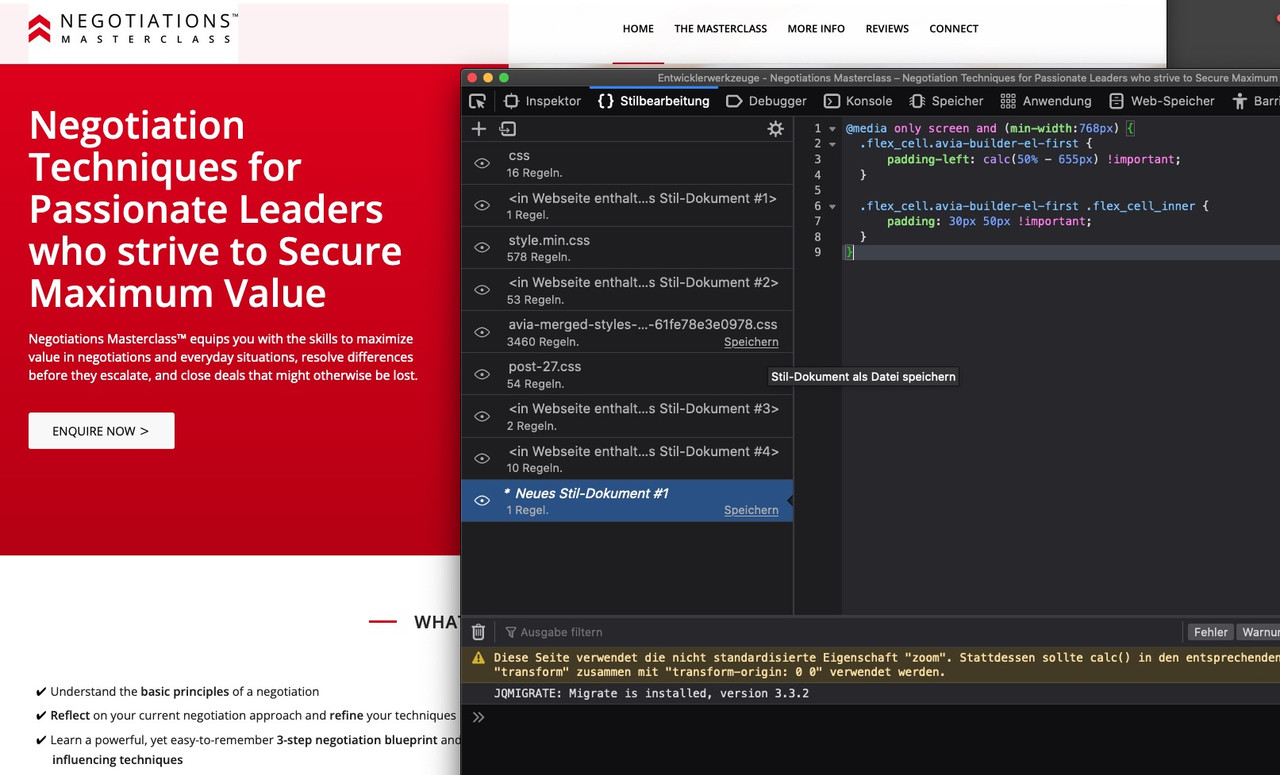
both content texts are now left-aligned in an alignment
February 5, 2022 at 6:29 pm #1339077by the way – in between 768px and 990px your cells are set to 100% – but there is a margin-bottom which looks strange in this combination.
Maybe you remove it :@media only screen and (max-width:989px) { .responsive #top #wrap_all .flex_column.av-break-at-tablet, .responsive #top #wrap_all .av-break-at-tablet .flex_cell { margin-bottom:0; } }February 5, 2022 at 11:38 pm #1339122Thank you @guenni007, that’s very helpful! It looks much better now! :-)
And yes, this is the page I’m building!To make the top of the page perfect:
For the “red banner” at the top of the page, I would like to show the first 2 words of the main heading (“Negotiation Techniques”) in the 1st line – right now “Techniques” is breaking and showing in the 2nd line. Do you know an easy way of how to achieve this? I don’t seem to be able to set a specific font size as I’m using Special Heading.As you’re very good with alignments, I’d also like to ask you about these two:
1. I would like the image (portrait photo) in the section “About the Instructor” to be aligned with no space in between with the next section “Reviews”. I tried out everything in the settings, however do not manage to bring the image down. Do you know of an easy way of how to achieve this?2. In the section “The Masterclass”, there are 3 images that I use for the 3 different sub-topics (“Negotiation Blueprint”, etc.). I would like them to be displayed a bit smaller, however don’t manage to add a transparent border or spacing around them to do so. Do you know by any chance how to do that?
Thank you again, I really appreciate your advices!! :-)
February 6, 2022 at 8:15 pm #1339204first there will be only the chance to give the heading more place to use.
Either you increase the normal content width from 1310px to something differnt – you see on my installation there is a 1510px choosen.
Or you go and set a smaller font-size:.home #av-layout-grid-1 h1.av-special-heading-tag { font-size: 42px; line-height: 58px; background-color: transparent; }On default the order is set to have on responsive case on top the first column ( cell ) – but you can change that on :
“Column behavior when fullwidth”
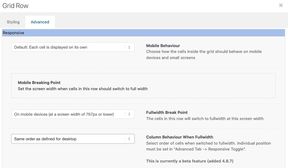 February 6, 2022 at 8:19 pm #1339206
next way – is it an option to not choose the 1/2 1/2 grid sizes ?
( but then the calculation of padding must be adjusted )
Grid-Row Element you got on the bottom right corner : “Set Cell Size” to have f.e.: 3/5 2/5February 6, 2022 at 11:02 pm #1339231Thank you @guenni007!
Set the font size to 45px, that works without the first 2 words breaking. I like the 1/2 and 1/2 grid sizes, hence didn’t like to adapt that.
What Quick CSS code could I apply to break the heading into specific 4 lines? I’d like it to be displaying specifically like this as it is easier to read:
1st line – Negotiation Techniques
2nd line – for Passionate Leaders
3rd line – who strive to
4th line – Secure Maximum ValueI believe Quick CSS could do that even for a Special Heading?
February 6, 2022 at 11:56 pm #1339240to keep such word sequences together, I use the so called nonbreaking space html-entity.
Unfortunately, if you put this entity in the space between two words in a heading ALB, it disappears the next time you open/edit it. For this Günter has written here a small plugin which prevents exactly that. Among other things also e.g. the use of less than and greater than characters.
https://kriesi.at/documentation/enfold/intro-to-layout-builder/#using-special-characters
Unfortunately, it provides only 4 special characters in the standard variant.
But you can extend this ” $this->translate = array( ” with further entries. My list looks like this and i shorten the # signs to only one before and after.$this->translate = array( '#lt#' => '<', '#le#' => '≤', '#gt#' => '>', '#ge#' => '≥', '#amp#' => '&', '#91#' => '[', '#93#' => ']', '#quot#' => '"', '#34#' => "'", '#br#' => '<br/>', '#p#' => "<p>", '#shy#' => '', '#nbsp#' => ' ', '#sbsp#' => ' ', '#nbhyp#' => '‑', '#1/2#' => '½', '#1/3#' => '⅓', '#1/4#' => '¼', '#1/5#' => '⅕', '#2/3#' => '⅔', '#3/4#' => '¾', );this line now :
'#nbsp#' => ' ',is usefull.
I entered your heading this way:
Negotiation#nbsp#Techniques for#nbsp#Passionate#nbsp#Leaders who#nbsp#strive#nbsp#to Secure#nbsp#Maximum#nbsp#Valuenow the rest will be a bit of calculation: On my testpage with 1510px default content width ( and custom class for grid-row alb: content-alignment
@media only screen and (min-width:768px) {
  .content-alignment h1.av-special-heading-tag {
    font-size: clamp(24px, 3.5vw, 50px);
    line-height: 1.5em;
    background-color: transparent;
    padding-bottom: 20px
  }

  .content-alignment .avia_textblock {
    font-size: clamp(16px, 2.5vw, 24px);
  }

  .content-alignment .flex_cell.avia-builder-el-first {
      padding-left: calc(50% - 755px) !important;
  }

  .content-alignment .flex_cell.avia-builder-el-first .flex_cell_inner {
      padding: 30px 50px !important;
  }
}

@media only screen and (max-width:767px) {
  .content-alignment h1.av-special-heading-tag {
    font-size: clamp(22px, 6vw, 50px);
    line-height: 1.5em;
    background-color: transparent;
    padding-bottom: 20px
  }

  .content-alignment .avia_textblock {
    font-size: clamp(14px, 5vw, 24px);
  }
}
see result: https://webers-testseite.de/marcus/
-
AuthorPosts
- You must be logged in to reply to this topic.