
-
AuthorPosts
-
October 3, 2021 at 11:48 am #1323324
Hello Mike,
thanks für the hint and your fast reply!
it worked out fine on mobile portrait, so i`ve tried to use it on the viewport for mobile landscape too
@media only screen and (min-width: 844px) and (orientation: landscape) {
#top > #wrap_all, #footer-bg > div {
width: 100% !important;
max-width: 100% !important;
}
}but it did not work there.
Do i need another code for that?
Regards,
PabloOctober 3, 2021 at 8:54 pm #1323356Hey Paul,
Thanks for the feedback but I’m not seeing that your width is not 100% for landscape, but I do see that you have an un-closed media query rule at:/*---START I-PAD-PRO-STYLES---*/ @media only screen and (max-width: 1400px) { /* Add your iPAD-PRO Styles here */this max-width: 1400px rule includes all of your other rules, so there is a good chance that if you are using Safari this is messing up the rest of your css.
I’m using Chrome on Windows which is a little more forgiving.
Try checking all of your css for other errors also, it may help to remove unused rules instead of commenting them out and removing extra comments.Best regards,
MikeOctober 4, 2021 at 9:03 am #1323401Hi Mike,
thanks for the hint,
i`ve arranged the issue and will send you 2 drobbox-links from screenshots iphone12 portrait and landscape concerning the width,
in landscape modus it isn`t 100%
Regards,
PabloOctober 4, 2021 at 1:29 pm #1323459Hi,
Thanks for the feedback, do you mean the width of the orange background or the blue bar at the top? I thought we were looking at the orange background. I don’t have an iPhone but I checked the page on a Mac with Safari in Responsive Design Mode using iPhone 8 plus and iPads in portrait and landscape and the background was full width, Please see the screenshots in the Private Content area.
Try clearing your browser cache following these steps for Safari and note step 4 where you will Clear the History.Best regards,
MikeOctober 4, 2021 at 2:49 pm #1323470Hi Mike,
thanks for the fast feedback.
Yes, i did mean the orange background, which unfortunately in iphone12 landscape don`t cover the viewport. The screenshot was taken on iphone.
Concerning the blue div: This too, I would like to have it touching the right side of the viewport in mobile, as it does i ipad view,
but i can’t find the css-rule.And last but not least: in Safari (Desktop and Ipad) the logo in the header looks a lot smaller than in Chrome and firefox. Is there a rule to set concerning the size of the logo in Safari Browser?
Thanks ,
regards,
PabloOctober 6, 2021 at 11:45 am #1323752Hi,
Sorry, for the orange background width I can’t reproduce it with Safari on Mac, as in the screenshots above, and I don’t have an iPhone 12, so I’m going to ask the rest of the team to check with their devices, thank you for your patience.
For the blue div try this css:@media only screen and (max-width: 430px) { .responsive #top #wrap_all #zamma-content-mobil .flex_column.avia-builder-el-23 { width: 101vw; left: -9%; } .responsive #top #wrap_all #zamma-content-mobil .app-links2 { justify-content: center; } }Please see the screenshot in the Private Content area of the expected results.
For the logo on Safari desktop, I don’t see anything different affecting it compared to Chrome, try this css, which should help with desktop and iPad.@media only screen and (min-width: 768px) { .responsive.avia-safari #top #wrap_all span.logo { width: 278px; } }Best regards,
MikeOctober 6, 2021 at 6:39 pm #1323797Hi Mike,
thank you – the code worked out – both of them!
Concerning the background:
So i will wait and see, what the team is saying to the iphone12 landscape problem, thanks.
Another thing, that just popped up by checking the size of the logo on an older ipad:
the orange background is completely missing on the formular-fields, as you can see in the screen i added in privat.
Do you know any solution to fix that?
Thank you and regards,
Pablo
October 7, 2021 at 12:27 pm #1323901Hi,
I believe part of your issue may be due to using the same element IDs multiple times, I see you are using id=’desktop’ 6 times on the frontpage and id=’mobile’ also 6 times and id=’mobil’ 2 times. Each element id should be unique, so instead of using IDs to style your element please use classes.
Please also disable all caching including Enfold Theme Options ▸ Performance ▸ JS & CSS file merging and compression
Based on your screenshot it looks like this missing background is occurring for you around 1100px, but I’m unable to reproduce this which is how I found the duplicate ids.
Don’t forget that while testing with Safari you will also need to Clear the History to properly clear the cache.Best regards,
MikeOctober 7, 2021 at 6:54 pm #1323973Hi Mike,
thank you, i arranged the things you wrote, but it didn`t show result.
Another strange thing: the element “Rasterzeile” (only this element) disapears on ipad viewport.
On Mobil its shown.
And i tried to copy your code for the blue div in ipad media queries, but it did not work out either.
So there is a problem on 1000 px, as you said.
Thanks for a look,
Regards,
PabloOctober 8, 2021 at 11:45 am #1324080Hi,
Thanks for the screenshots, can you include an admin login in the Private Content area.Best regards,
MikeOctober 8, 2021 at 12:41 pm #1324088Hi Mike,
you* ll find login in Privat Content,
Thanks + Regards,
Pablo
October 9, 2021 at 4:30 pm #1324221Hi,
Thank you for the login but I couldn’t reproduce the missing orange background image on my Mac with Safari, I tried at many different sizes. On the backend the desktop and mobile versions of this section look the same, is there a difference that I’m missing to make you want to use two sections? Can you use just one section for mobile & desktop?Best regards,
MikeOctober 10, 2021 at 3:49 pm #1324281Hi Mike,
thanks for the feedback.
There are different styles in desktop and mobile.
The orange-background on iphone12 landscape is a smaller problem,
for the moment.The bigger problem is indeed, that the element “Rasterzeile” (GridRow) from avia Layout architekt does not appear in ipad viewport. In Mobil it appears.
And the blue div in ipad viewport doesn`t cover 100%
Did you have the chance to take a glimpse at that?
Thanks so much,
regards,
PabloOctober 12, 2021 at 2:16 pm #1324574Hi,
Thank you for your patience, I took a look at your grid row “Rasterzeile” I only found one on your homepage, it has the ID “zamma-mobile-9” but it is set to be hidden on screens larger than 990px and the iPad viewport is 1024px, so it will be hidden.
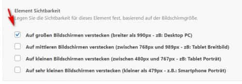
I see you have a custom class “zamma-screens-mobile” assigned to it but I don’t find any matching css, try un-checking the visibility option and creating a css rule to allow the visibility up to 1024px if you want this element to show on the iPad.
As for the blue bar, in my test on a Mac with Safari in Responsive Design Mode simulating an iPad (9.7″) & iPad Pro (10.5″) the bar is fullwidth in portrait view, in landscape it is hidden, iPad Pro (12.9″) it is hidden on portrait 7 landscape.
Which iPad are you using and was it your intention to only show the bar in portrait view?Best regards,
MikeOctober 14, 2021 at 11:09 am #1324899Hi Mike,
thanks for reply,
meanwhile we could solve the problems until the blue bar, as you can see in the screenshot under chrome,
is there a css code to give it full width?
Thanks and regards,
Pablo
October 14, 2021 at 2:49 pm #1324949Hi Mike,
we managed now the thing with the blue bar,
thanks,
regards,
Pablo -
AuthorPosts
- You must be logged in to reply to this topic.