
-
AuthorPosts
-
December 14, 2018 at 2:34 am #1045096
Hi team,
I’m trying to change a background image for a section of a page to a different one for mobile. Desktops are usually wider than they are tall, wheras most smartphones are longer than they are wide, hence why I want to make the change.
I’ve identified the correct div using inspect tool on chrome. When I put in the new background-image in inspect, it changes the image, so I know I have the right div. When I use the following CSS code though, it doesn’t change the image on mobile for wtvr reason:
@media only screen and (max-device-width: 400px) and (max-width: 767px) {
div.av-parallax-inner.main_color.avia-full-stretch{background-image: url(http://www.bonjiglass.com/wp-content/uploads/2018/12/longchill1.png)!important;
}
}Any chance you can help me out here?
Thanks,
-DDecember 14, 2018 at 11:29 pm #1045486Hey, just to follow-up.
I found this post: https://kriesi.at/documentation/enfold/color-section/#toggle-id-9
and attempted to use the code there, as follows:
@media only screen and (max-device-width: 767px) {
	#top #reviewinstagram {
		background-image: url(https://www.bonjiglass.com/wp-content/uploads/2018/12/longchill1.png) !important;
		background-position: 0% 50% !important;
		}
	}
Its still not working for me. I’ll continue to follow the steps that Ian took here: https://kriesi.at/support/topic/alternative-images-on-mobile-devices/#post-1039845
but would appreciate any help on your behalf. It seems like every website is slightly different, depending on the plugins and whatnot that someone includes on their site. I also just tried adding in the jquery code referenced in the thread above and that didn’t work.
Generally speaking, I would also love to learn how to make changes to sections on mobile. Will help me become a more well-rounded developer.
-D
-
This reply was modified 7 years, 4 months ago by
Dzimnikov. Reason: More perspective
December 15, 2018 at 5:50 am #1045537December 15, 2018 at 8:11 am #1045583This reply has been marked as private.December 16, 2018 at 6:15 pm #1045996Hi,
Sorry for the late reply, your code above was correct except you were targeting a parent div with the ID “#reviewinstagram”
where the current background image was a child of it with the class “av-parallax-inner”
Good job! you were so close :)@media only screen and (max-device-width: 767px) { #top #reviewinstagram .av-parallax-inner { background-image: url(https://www.bonjiglass.com/wp-content/uploads/2018/12/longchill1.png) !important; background-position: 0% 50% !important; } }
Best regards,
MikeDecember 17, 2018 at 3:44 am #1046126Oh wow, I was so close! Thank you for filling in the gaps for me Mike, you guys do a great job!
Happy Holidays!
December 17, 2018 at 6:22 am #1046175Hi,
Great, glad we could help and happy holidays to you too :-)
Please let us know if you should need any further help on the topic or if we can close it.
Best regards,
RikardDecember 18, 2018 at 4:21 am #1046725Hey yall.
Need some quick CSS help. As you can tell on the homepage (bonjiglass.com), the slider at the top of the page has text that sits in a black background with like .5 opacity (Spark Your Next Adventure). I was able to create that using the setting in the slider.
I’m looking to create a similar feel for special headings. For example, if you scroll towards the bottom of the page, just above the contact form, you will see that I was able to create a black background around “See Why Customers Love Us Around the World”. Its just a black box though, I want to be able to style it the way I did with the text in slider (as described above).
Is that possible?
Thanks,
-DDecember 19, 2018 at 4:59 am #1047098Hi,
You can use this css, but you will want to add a custom class to the special heading so that this doesn’t add the background to every special heading.h3.av-special-heading-tag { background: rgba(0,0,0,0.8) !important; padding: 10px 15px !important; }
Best regards,
MikeDecember 20, 2018 at 3:25 am #1047556Hi Mike,
Thank you for getting back to me. I tried your code and it worked. I then tried to add in the name of the colored section and it worked, was even able to isolate one of the two special headers in the colored section using div.avia-builder-el-17.
Thank you sooo much for helping me out here, CSS is a bit tricky, but I’m kinda getting the hang of it.
I then tried to add opacity to just the background, but it dulled out the entire section including the text. Is there a way to just set the background to be transparent? Like is there a way to add that command inside of: “background: black !important;”
Also, is there a way to control the width of the background. Can I do padding-left: -20px or something to that degree?
Much appreciated,
-D-
This reply was modified 7 years, 4 months ago by
December 20, 2018 at 5:38 am #1047573Hi,
For the background, I think this is what you are looking for:#reviewinstagram .active-parallax { opacity: 0.5 !important; }Please adjust to suit.
For the special headings, that will adjust both at the same time:#reviewinstagram .flex_column_div .av-special-heading { width: 60% !important; margin: auto !important; }Please adjust to suit.
Please note that we advise that when you want target a certain element it is best to add a custom class to the element, by first going to Enfold Theme Options > Layout Builder > Show element options for developers and checking the box. Then in your elements you will have a extra field Custom Css Class
The reason is because classes like avia-builder-el-17 are automatically generated by the theme and will change as you add more elements to your page, so one day you will be wondering why your css doesn’t work anymore.
Best regards,
MikeDecember 20, 2018 at 7:29 am #1047586Hi Mike,
Thank you for the quick response. The “show elements option” is a life saver, excellent advice!
I re-named builder-17 to “customerlove” and builder-22 to “instagramhome”. I was able to swap out the names and the backgrounds are still there. Good stuff!
Those are the sections though where I want the opacity change. It seems like the code in your response changes the opacity of the overall color section (reviewinstagram), but not the custom made backgrounds within the special headings. I added in .av-special-heading and even a .customerlove to be more specific, but neither worked. It seems like the “.active-parallax” div controls opacities, but I’m not sure it extends beyond the color section itself.
The second code you sent me changes the width of the backgrounds. It works!!! I tried to add .customerlove into the code to make it more specific, but it didn’t work… which is weird considering that it worked when creating the backgrounds themselves. How do I properly add them in?
Sorry for all the questions, but your responses are really helping me understand how CSS works. The more various examples I get, the better I’ll become. I truly appreciate your help.
Thanks,
-DDecember 20, 2018 at 2:44 pm #1047729Hi,
For your special headings your new custom classes are in the same div that the target is, so there should be no space between classes, and to target both we will add a comma, like this:.customerlove.av-special-heading,.instagramhome.av-special-heading { width: 60% !important; margin: auto !important; }Best regards,
MikeDecember 21, 2018 at 1:16 am #1047977Dank. It worked. Thank you so much! A little confused why we used “flex_column_div” the first time and then took it out when we tried to be more specific to a section. I guess you have to know what each identifier does and when to use it … will have to come with experience.
I tried to lower the opacity of the background by adding in this: “opacity: 0.5 !important;” but it lowered the opacity of the entire section, not just the background. How do I isolate and identify just the background, so I can lower its opacity while keeping the text within it at 100%.
December 21, 2018 at 3:43 am #1047993Hi,
I took it out because we are now using a custom class to be more specific, where before we were combining many classes to be specific.
Please try this code in the General Styling > Quick CSS field or in the WordPress > Customize > Additional CSS field:#reviewinstagram .av-section-color-overlay { opacity: 0.5 !important; }Please clear your browser cache and adjust to suit.
Best regards,
MikeDecember 21, 2018 at 4:41 am #1048012Hi Mike,
I tried out the code above, both in the general CSS editor where I normally add code (Appearance – Editor) and then in General Styling. It didn’t work either time. Still trying to figure out why.
Ran into another issue as well. In the section called “bottleview” (with the gold label bottle on the right), I’m looking to remove the hotspots attached to the image on mobile devices. I tried the following code:
@media only screen and (max-device-width: 700px) {
	#divbottleview div.av-image-hotspot.av-display-hotspot {
		display: none !important;
		}
	}
Didn’t seem to work, though I was able to resize the image itself with a similar code.
Thanks,
-DDecember 21, 2018 at 5:40 am #1048036Hi,
Please see the screenshot in Private Content area, the top image is how it is now, and the bottom is after the css above. Is this how you would like it?
For your hotspots, please try this css:@media only screen and (max-width: 700px) { #bottleview div.av-image-hotspot.av-display-hotspot { display: none !important; } }Please note the correct name for your ID, and this explanation on the media query.
Best regards,
MikeDecember 21, 2018 at 6:10 am #1048051Hi Mike,
Regarding the screenshot, its close but not quite. I’m looking for something similar to the slider at the top of the page, where the text itself remains bold and at 100% opacity, but the background (in this section black and pink) are at a lower opacity and blend with the background. In the screenshot, both the background and the text are at .5 opacity. Does that make sense?
For the hotspots, I essentially had the same code as you, just put the # before the div. Either way, I tried it out and no cigar. Also, the previous mobile editting code that you gave me, that worked before, no longer works for wtvr reason. I’m referring to this code:
@media only screen and (max-device-width: 767px) {
	#top #reviewinstagram .av-parallax-inner {
		background-image: url(https://www.bonjiglass.com/wp-content/uploads/2018/12/longchill1.png) !important;
		background-position: top center !important;
		}
	}
I refreshed my cache and everything. Sorry that I keep bothering you, just trying to figure this out.
December 21, 2018 at 7:24 am #1048072Hi,
So you want the text and the background image to have a opacity: 0.5?
I see you have already done that for the pink text, what about the testimony?As for the hotspot and chill background image not working, try copying all of your css and pasting in the WordPress > Customize > Additional CSS field to check for errors, perhaps you have a missing bracket causing a bunch of code not to work.
Where are you using your css, Enfold Theme Options > General Styling > Quick CSS field?
Best regards,
MikeDecember 21, 2018 at 7:55 am #1048076Im looking to have the background at .5 opacity, but NOT the text. So background 50% and text at 100%. Right now, I’ve only been able to get both the background and the text to 50%.
Ye, I’ll take a look. The mobile background code is now working, but not the hotspots.
My CSS is currently under Appearance – Editor. Its the style.css file i think.
December 21, 2018 at 2:47 pm #1048196Hi,
If your css is in the style.css of your child theme, then you should note that if you add css to the file your merged css from your Enfold Theme Options > Performance > JS & CSS file merging and compression will not rebuild until you save your theme options.
You can force it to rebuild by adding a blank space to your Quick CSS field and then save your theme options (the big blue button)I recommend while you are building your site to disable all caching plugins & the css & js merging at: Enfold Theme Options > Performance > JS & CSS file merging and compression and to test your css in the Enfold Theme Options > General Styling > Quick CSS field.
Once your site is done then you can move your css to style.css and enable your caching.If this doesn’t help, please include a admin login in the private content area so I can assist better, I will continue to explain the steps I take.
Best regards,
MikeJanuary 3, 2019 at 1:16 am #1049410Hi Mike, Happy holidays and Happy New Year. Hope you had time to celebrate and rang in the new year in style. Wishing yall all the best in 2019!
From your last message, its seems like the CSS i put into style.css may or may not work, unless I constantly save my “theme options”. From my experience, it has normally worked for me, though sometimes there is a lag time on mobile. I prefer style.css to the Quick CSS area for the exact reasons you mentioned in a previous reply, style.css has a wider typing area, helps me organize my code, and lets me know when I’m making errors and what the errors are. Quick CSS just isn’t as easy to use.
Regardless, I’m still having trouble with two things:
1) Lowering the opacity of the backgrounds, and only the backgrounds (the ones that we custom made in CSS), of the special headers on the homepage. I want the text to remain at 100%, but bring the background color to .5 opacity. So far we’ve only been able to bring the background AND the text to .5, which I don’t want.
2) Remove the hotspots on mobile. We both used the same code, but for some reason its not working on my site.
I’m going to include the URL and login info for my site below. Please help me out here, I would really appreciate it.
Thank you guys for the continues support, you rock!
January 3, 2019 at 5:09 am #1049449Hi,
Thank you for the wishes, also wishing you the best this year :)
Thank you for the login, I first looked at the hot spot bottle and your css seems to be working for me, for mobile the hot spots don’t show, but the hot spot text blocks under the bottle are white text on a white background so we can’t read the text, so I changed the color in your css:@media only screen and (max-device-width: 700px) { div#bottleview div.av-image-hotspot.av-display-hotspot { display: none !important; } #bottleview.alternate_color .av-hotspot-fallback-tooltip-inner,#bottleview .av-hotspot-fallback-tooltip-count { color: #000 !important; } }I lower the opacity of the instagram background image with this css:
#reviewinstagram .av-parallax-inner {
    opacity: 0.5 !important;
}
Please clear your browser cache and check.
Best regards,
MikeJanuary 3, 2019 at 8:58 pm #1049714Hey Mike,
Thanks for getting back to me. I did not realize that the hotspots and the text that goes along with them are separated in the code you gave me. Thank you for changing the font to black. Now that I can see the text, I guess I’ll keep the hotspots on mobile. Appreciate your help.
Regarding the background, we are still not on the same page as to which background we are lowering the opacity on. Please see the image below:
https://screenshots.firefox.com/XvvV8mncJcmx040R/www.bonjiglass.com – the pink background in the back. I’m looking to lower the opacity of that rectangle to .5, BUT NOT “And all the fun we are having on instagram”, aka the text. Looking for a similar effect as this: https://screenshots.firefox.com/9LELckDWVHCgbIop/www.bonjiglass.com
Does this clear things up? I know its confusing, I apologize for not making it clear.
______Here’s another thing I’m having an issue with. There is probably an easy fix that I’m not seeing, in which case, my bad. So I want to have three images centered within the bottom of a color section. At the moment, I have them centered like this: https://screenshots.firefox.com/DbCnRqEm2FjmhIpa/www.bonjiglass.com
When I try to make the images larger, or have them take up a bigger part of the screen’s width, I can’t center them because you can’t create elements that are 1/8 the width of the section (which I would then put around the 1/4 elements). Everything aligns left like this: https://screenshots.firefox.com/3LLmI4ytigTIgbgc/www.bonjiglass.com
How do I get those 3 1/4 images to center in the middle of the page?
Thanks,
-DJanuary 4, 2019 at 3:14 am #1049760Hi,
Sorry, how about this:
https://images2.imgbox.com/39/ef/M2cSAnLH_o.jpg
this is the change I made in your style.cssdiv#reviewinstagram div.instagramhome h3.av-special-heading-tag { background: rgba(212, 48, 137, .5) !important; padding: 10px 20px !important; }To center your images, try adding the custom class “marleft” to the first image column, then use this css:
@media only screen and (min-width: 1024px) {
.marleft {
    margin-left: 13% !important;
}
}
I tried to, but I think we were both working on the same page so the class kept disappearing :)
Best regards,
MikeJanuary 4, 2019 at 8:42 am #1049887Coolio, I got it to work. Thank you. I guess switching from hexadecimal to RGB did the trick. I never would have guessed. I also added a wood-dark background to the special heading background, but don’t know how to control the opacity of the wood-dark.
A few more things, though I’m getting pretty close to being done. Apologies for the continues requests.
One the “http://www.bonjiglass.com/ourstory/” page, I was able to change the image for mobile devices, but don’t know how to add a black overlay to it. Here is what I used:
@media only screen and (max-device-width: 767px) {
	#besthit.avia-section {
		background-color: rgba(0, 0, 0, .7) !important;
		background-image: url(https://www.bonjiglass.com/wp-content/uploads/2016/06/grainpass.8.png) !important;
		background-position: top center !important;
		}
	}
I tried various variations of “background”, “color”, background-color” but nothing worked. Not sure why.
Also, in that section, the rotating blue text is centered on desktop, but not on mobile for some reason. It leans slightly to the right of the white text above it. I’m referring to the blue text that rotates between “free pizza”, “star wars”, “dubstep”, etc.
Appreciate the continues support!!! Almost there!
January 5, 2019 at 5:20 am #1050177Hi,
To center your rotator I changed this css on line 27 of your style.css from 400px to 100%:span.av-rotator-text.av-rotator-multiline-on.av-rotation-active { width: 400px !important ; }As for the black overlay, I assume that you mean over the whole background image, and not just behind the text, in this case I changed your background color to this:
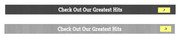
box-shadow: inset 0 0 0 305px rgba(0,0,0,0.7);I see the “wood-dark.png” in the special heading of “Check Out Our Greatest Hits” but I’m not sure what you want to do with the opacity because the background is white.
I’m thinking that you want to change this css:background: rgba(0, 0, 0, .7)from “.7” to “.3”
Best regards,
MikeJanuary 6, 2019 at 12:54 am #1050440Oh, wow, the centering thing was obvious. Thanks for pointing that out!!!
For the shop page, I was able to change the background, but can’t center it vertically and the black inset box-shadow isn’t working. It on this page (http://www.bonjiglass.com/shop/) and here is the code I’m using:
`div#av_product_description div.av-section-color-overlay {
background-image: url(http://www.bonjiglass.com/wp-content/uploads/2019/01/wallpaper2you_111610.jpg) !important;
padding: 10px 20px !important;
background-attachment: fixed !important;
background-position: 50% 50% !important;
background-size: cover !important;
box-shadow: inset 100px 100px 10 10 rgba(0,0,0,0.9) !important;
}’Also, for the drop-down mobile overlay menu, there is very little space in between the menu items, especially the inner ones (pages “shop” and “our story”). Is there a way to increase the width in between the menu items so that they are easier to select?
Happy NFL playoffs!!!
Thanks,
-DJanuary 6, 2019 at 3:19 am #1050459Hi,
For your shop page header what are you trying to achieve? Because the box shadow code is not correct to cover the image as in the
ourstory page.#av_product_description { box-shadow: inset 0 0 0 305px rgba(0,0,0,0.7) !important; }For the menu items please check this custom css, it is causing the issue by making the top and bottom padding zero:
.main_menu ul:first-child > li > a {
    padding: 0 15px !important;
}
Best regards,
MikeJanuary 13, 2019 at 9:35 pm #1053411Hi Mike,
Appreciate your continued help. I have a problem where I make CSS changes, but they are not recognized on mobile, or it takes forever for the changes to take into affect.
For example, the “See why customers around the world love us” on the home page (bonjiglass.com). I edited the code to make the background black on mobile. It worked. I then take that exact same code, and edit it to add a pattern to the background and a colored overlay … the background remains black on mobile. Which is confusing, because the code thats telling it to remain black literally no longer exists. I cleared my cashe like 43 times at this point making other changes to the page.
Here is the code I’m using:
@media only screen and (max-device-width: 767px) {
	 #reviewinstagram.avia-section  {
		background-image: url(https://www.bonjiglass.com/wp-content/uploads/2019/01/congruent_pentagon.png) !important;
		background: rgba(0, 0, 0, .6) !important;
		background-position: top center !important;
		}
	}
Can you please take a look?
Also, text blocks are not working properly for me on the FAQ page. They show up ok, but when editting the section, code brackets are showing up in the text and the text itself is white, so you can’t see it unless you highlight. Even happens when I create a new text block. Is this a wordpress 5.0 issue?
Thanks,
-D
-
This reply was modified 7 years, 3 months ago by
-
This reply was modified 7 years, 4 months ago by
-
AuthorPosts
- The topic ‘Change background-image for mobile’ is closed to new replies.