
-
AuthorPosts
-
May 29, 2019 at 9:19 pm #1105289
Hi there!
I’m having trouble getting the socket content to center on the mobile version only. They code I’ve tried most recently is:
@media only screen and (max-width:550px) {
  .responsive #socket .sub_menu_socket {
    display: block !important;
    width: 100%;
  }

  .responsive #socket .sub_menu_socket .menu {
    margin-left: 0;
  }

  .responsive #socket .sub_menu_socket .menu li {
    border: 0;
    display: block;
    float: none;
    text-align: center;
    line-height: 1.7;
  }
}
It works to center the socket menu (with each item stacked vertically), but the copyright won’t center. Also when I add that code, it conflicts with the center footer CSS I added, so that the footer widgets won’t center.
Thank you SO much in advance – login credentials in the Private Content!
Cheers.
May 30, 2019 at 7:51 am #1105384i would try only this ( and get rid of the rest )
@media only screen and (max-width:550px) {
	.copyright {
		width: 100%;
		text-align: center;
	}

	.responsive #socket .sub_menu_socket {
	    margin: 0;
	}

	#socket .sub_menu_socket .menu {
	    position: relative;
	    display: block;
	    margin-left: 0 !important;
	    text-align: center;
	}
}
for some pages it might be necessary to have instead the last rule :
#socket .sub_menu_socket .menu {
    position: relative;
    left: 50%;
    transform: translateX(-50%);
    display: inline-block;
    margin-left: 0 !important;
}
the best would be to see your site!
by the way: why not 768px breakpoint (max-width:767px) – the point where all the other things break?
Then you will have on ipad portrait the normal socket and centered belowJune 1, 2019 at 6:47 am #1105969Hi,
Thanks for sharing and for helping out @guenni007, did you try that out and did you have any luck with it @kellyCraftMedia?
Best regards,
RikardJune 5, 2019 at 1:48 am #1107322Hi all! Unfortunately that code didn’t work and the footer is aligned all to the left.
Thanks!
June 5, 2019 at 3:13 pm #1107628Hi,
Did you add the code to the very top of quick css so it runs first? Also, clear the cache a few times over.
Best regards,
Jordan ShannonJune 8, 2019 at 5:57 pm #1108465Hi,
Please try this code in the General Styling > Quick CSS field or in the WordPress > Customize > Additional CSS field:@media only screen and (max-width: 500px) { #socket > div { width: 65% !important; max-width: 65% !important; } #socket .avia3-menu { width: 85% !important; margin: auto !important; } #socket .avia3-menu li { padding-bottom: 2px !important; } }Best regards,
MikeJune 8, 2019 at 7:33 pm #1108484SO close! Is there any way to stack and the menu items? If not, perhaps I can hide them on the mobile version only – that would be a good workaround!
Thank you!
June 9, 2019 at 12:09 am #1108507January 6, 2021 at 7:14 pm #1270698This problem i have me too on socket 3 where i have the ( Terms & Condition / Cookies Policy and Confidential Policy ) where on mobile is not showing great ( https://ibb.co/qBbb9F1 ) i try to centered and every links to be inline but not working … any sugestion? Thank you very much, have a nice year.
January 7, 2021 at 6:25 am #1270777Hey bobbysap,
Please provide a link to the site/page in question so we can look into this further.
Best regards,
Jordan ShannonJanuary 7, 2021 at 3:21 pm #1270876This reply has been marked as private.January 8, 2021 at 1:35 pm #1271046Hi Bobby,
Thanks for that. I’m not sure exactly what you are looking to change in your socket though, could you try to explain a bit further or post a screenshot highlighting your intentions please?
Best regards,
RikardFebruary 19, 2021 at 5:37 pm #1282271This reply has been marked as private.February 20, 2021 at 12:17 pm #1282430Hi,
@Almahabitat gracias por el enlace a su sitio, veo que el texto en el campo de derechos de autor está centrado en el móvil, pero su menú de pie de página no lo está, el siguiente CSS ayudará, pero la longitud de los elementos del menú no permite la primera línea. competir.

Pruebe este código en el campo Estilo general> CSS rápido o en el campo WordPress> Personalizar> CSS adicional :#socket .sub_menu_socket li { float: none !important; display: inline-block !important; margin: auto !important; } #socket .sub_menu_socket { margin: auto !important; } ul#avia3-menu { margin: 0 !important; text-align: center !important; }— Translated with Google —
@Almahabitat thank you for the link to your site, I see that the text in the copyright field is centered on mobile, but your footer menu is not, the following css will help but the length of the menu items do not allow the first line to compete.
Please try this code in the General Styling > Quick CSS field or in the WordPress > Customize > Additional CSS field:#socket .sub_menu_socket li { float: none !important; display: inline-block !important; margin: auto !important; } #socket .sub_menu_socket { margin: auto !important; } ul#avia3-menu { margin: 0 !important; text-align: center !important; }Best regards,
MikeFebruary 20, 2021 at 1:15 pm #1282444WordPress > Customize > Additional CSS field.
Aqui sí me ha funcionado. muchisimas gracias por la ayuda!
Un saludo Mike!
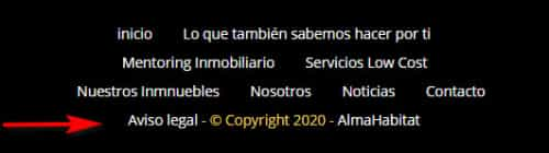
February 20, 2021 at 1:18 pm #1282445me sale el texto del © encima, como lo puedo poner debajo del menu?
gracias!February 21, 2021 at 3:52 pm #1282607Hi,
Prueba este código en el campo Estilo general> CSS rápido o en el campo WordPress> Personalizar> CSS adicional#socket > .container { display: flex !important; flex-direction: column-reverse !important; }Luego borre la caché de su navegador y cualquier complemento de caché, y verifique.
— Translated with Google —
Please try this code in the General Styling > Quick CSS field or in the WordPress > Customize > Additional CSS field:
#socket > .container { display: flex !important; flex-direction: column-reverse !important; }Then clear your browser cache and any cache plugin, and check.
Best regards,
MikeFebruary 21, 2021 at 4:56 pm #1282611Hola Mike, no me ha funcionado, pero en el ordenador sí lo veo bien. en el movil no.
lo he probado en campo Estilo general> CSS rápido y en el campo WordPress> Personalizar> CSS adicional
Alguna sugerencia?Gracias.
February 21, 2021 at 7:32 pm #1282635Hi,
I checked your site and I do not see this css in your source code, so please ensure that it is in only one place, I recommend WordPress > Customize > Additional CSS and also ensure the code looks exactly the same as in this thread on a desktop. Sometimes if you copy the code from an email the arrow in the code looks like letters:>or>Best regards,
MikeFebruary 22, 2021 at 11:07 am #1282748This reply has been marked as private.February 22, 2021 at 11:11 am #1282752Lo he puesto en enfold css y ya funciona. Muchisimas gracias Mike!!!!!
Un saludo!!!!!
February 22, 2021 at 11:37 am #1282759Hi,
Gracias por los comentarios, revisé su página nuevamente y el CSS parece estar funcionando correctamente. Intente borrar la caché de su navegador y cualquier complemento de almacenamiento en caché y vuelva a verificar.
— Translated with Google —
Thanks for the feedback, I checked your page again and the css seems to be working correctly. Please try clearing your browser cache and any caching plugins and check again.
Best regards,
Mike -
AuthorPosts
- You must be logged in to reply to this topic.