Hey guys,
I’m working on a site and i’m using buttons so the customers can download pdf files.
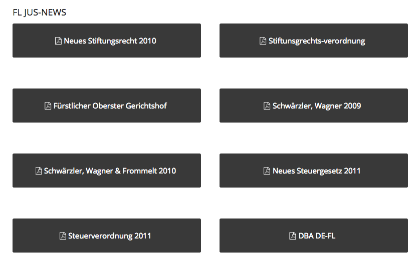
However when i make the width of the browser smaller the buttons start to go on top of each other, here’s a little preview of what i’m talking about:

I would like to keep the width of the buttons equal and for that i’m using the following custom css:
.avia-button.avia-size-x-large {
    min-width: 376px;
}
Could you help me solve this issue..like for example that the buttons don’t collide but they jump to the next line like this:

Thanks for your time,
Cheers,
Aathi
