
Tagged: boxed layout, grid row
-
AuthorPosts
-
September 24, 2018 at 8:48 am #1013513
Hi,
I need to use the grid row for design reasons for a custom footer on a site. I have #222222 as bacground and this need to be full width, but then I need the 2 cells/columns within to be on line with the boxed layout for the rest of the site with 1310px center. I have tried with columns and more cells within to make the space on the sides, but then it doesn’t look nice because it’s not on line with the rest. Please help!
Kindly regards, Mathilde
September 24, 2018 at 7:04 pm #1013757Hey mofix,
Could you please attach a mockup of what you’re trying to achieve?
Can you show us what you’ve got so far?
Please post the link to the page.
Best regards,
VictoriaSeptember 25, 2018 at 3:15 pm #1014221Hi Victoria,
Here’s a image of what I mean: https://www.dropbox.com/s/cb0ukb464afihm6/ex_grid.jpg?dl=0
It will be the “footer” for all of the pages. Look link in private content.
Thanks,
MathildeSeptember 25, 2018 at 5:01 pm #1014293Hi Mathilde,
The grid does not have the container that can be limited like that. So you need to use some other elements. Like 1/1 and two 1/2 inside.
Best regards,
VictoriaSeptember 25, 2018 at 5:29 pm #1014311it is always better to see a page than a screenshot.
if you got a grid-row – you can force it to be the same way as a normal container.
I use this often when i want to have nested containers.give to the grid-row a custom class: grid-notfull
do this to your functions.php of your child-theme:function grid_layout_notfull(){ ?> <script> (function($){ $('.av-layout-grid-container.grid-notfull' ).wrap( '<div class="main_color notfullsize"></div>'); $('.notfullsize').css({"clear": "both", "width": "100%" , "float": "left" , "position": "static" , "min-height": "100px" }); $('.grid-notfull').css({"max-width": "1310px", "margin": "0 auto" , "padding": "0 20px"}); })(jQuery); </script> <?php } add_action('wp_footer', 'grid_layout_notfull');you have to adjust this line to your settings:
$('.grid-notfull').css({"max-width": "1310px", "margin": "0 auto" , "padding": "0 20px"});
( the padding depends on the inner padding of the grid cells (on default it is 30px – so to come to the 50px left right … )
you see what it does: it wraps the grid-container with a div that has the attributes of a color-section.
it has on that the background-color on default from main_color – you can overwrite that with cssSeptember 25, 2018 at 7:28 pm #1014412Fantastic!!!!! Thanks a lot!!! That worked very well!! You saved my day!!
Cheers, Mathilde :-)September 25, 2018 at 7:37 pm #1014428Hi Mathilde,
Glad Guenni007 could help :)
If you need further assistance please let us know.
Best regards,
VictoriaNovember 5, 2025 at 3:08 pm #1490978Hi Guenni007 or someone else :-)
Can you help mw with this code again? I need one gridrow just as above with 1400px in boxed layout and fullwith background color, thats okay. But then I also need a gridrow with 1400px boxed layout with fullwidth background image bg. Now the background gets 1400px. Is it difficult to get another code for this? Thank you,
Kind regards, MathildeNovember 9, 2025 at 7:23 pm #1491075Hi,
It would be great if you could show us screenshots of what you are looking to achieve, and post links to where you want to implent the design.
Best regards,
RikardNovember 9, 2025 at 9:38 pm #1491078hallo @mofix – you can see here an updated snippet that will pull out the enfold options to determine the content width.
https://kriesi.at/support/topic/non-fullwidth-portfolio-or-grid-row-gets-colored-sides/#post-1491061
November 10, 2025 at 12:49 pm #1491113Thank you both,
I had to work around it with color section in th eend since I was heaving a meeting with my clients for a draft. But I still would like to use grid instead because it’s easyer to keep the columns in the right place also in rows.See screenshot in private content how I wanted it to look, and for now fixed with colorsection. So I need boxed layout with full width background image (second section at the image).
I tried to add the new function script, but then it all is 100% width, look at link in private content for first section woth colored columns. How to get the concainer 1400px and the bg image full width behind it?
Hope this can be fixed. Thank you!
Kind regards, Mathilde
November 10, 2025 at 1:51 pm #1491115i’m participant as you are – so i do not see any private content area.
on general layout – Maximum Container Width – this is the value i pull out in the snippet for the setting
$responsive_size = avia_get_option('responsive_size');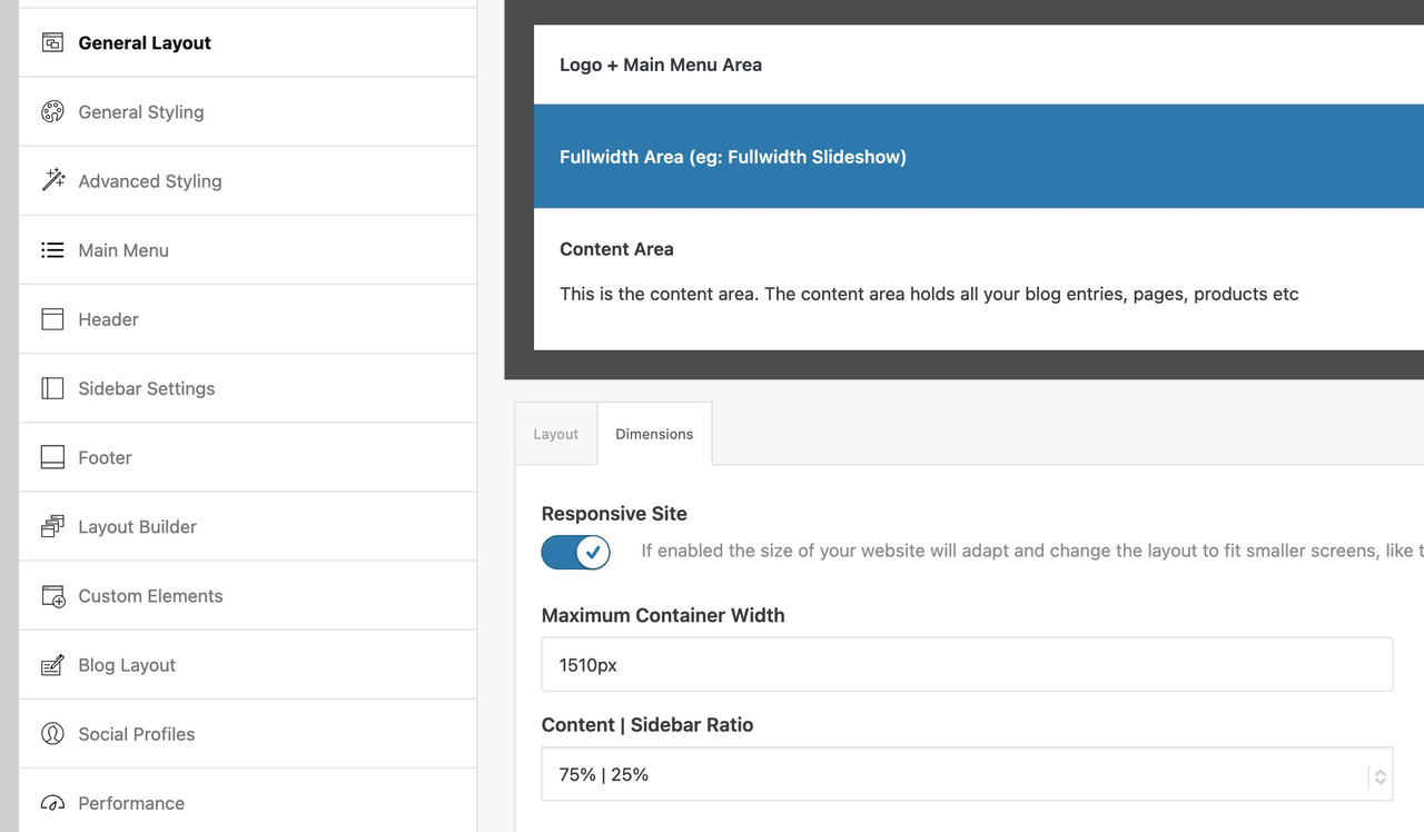
If you have there a 100% width set – then it wil be synchronized in the snippet too.
If that is the case – you have to use the other snippet with the “hard-coded” width and replace th 1310px with your 1400px now:function grid_layout_notfull(){ ?> <script> (function($){ $('.av-layout-grid-container.grid-notfull' ).each(function() { var notfullID = $(this).attr('id'); $(this).hasClass('main_color') ? $(this).wrap('<div class="main_color notfullsize '+notfullID+'"></div>') : ''; $(this).hasClass('alternate_color') ? $(this).wrap( '<div class="alternate_color notfullsize '+notfullID+'"></div>') : ''; }); $('.notfullsize').css({"clear": "both", "width": "100%" , "float": "left" , "position": "static" , "min-height": "100px" }); $('.grid-notfull').css({"max-width": "1400px", "margin": "0 auto" , "padding": "0 50px"}); })(jQuery); </script> <?php } add_action('wp_footer', 'grid_layout_notfull');November 10, 2025 at 2:06 pm #1491117This reply has been marked as private.November 10, 2025 at 5:27 pm #1491127i’m participant as you are – so i do not see any private content area.
so you have to wait for mods here
November 11, 2025 at 3:31 am #1491149Hi,
Thank you for the update.
We didn’t find any grid row elements on the test page. If you need to limit the width of the cells inside a grid row to 1400px, you can use the following css code. You may need to replace the selector #av-layout-grid-1 with your custom css class or element ID.
#av-layout-grid-1 {
  width: 100%;
  display: flex;
  justify-content: center;
  flex-wrap: wrap;
}

#av-layout-grid-1 > .av-gridrow-cell {
  flex: 0 0 25%;
  max-width: 350px;
  box-sizing: border-box;
}

#av-layout-grid-1 .flex_cell_inner {
  margin: 0 auto;
}

@media (max-width: 768px) {
  #av-layout-grid-1 > .av-gridrow-cell {
    flex: 0 0 100%;
    max-width: none;
  }
}
This should work for a grid row with 4 cells. Make sure to adjust the width values in this css rule based on the number of cells in the grid.
#av-layout-grid-1 > .av-gridrow-cell {
  flex: 0 0 25%;
  max-width: 350px;
  box-sizing: border-box;
}
Best regards,
IsmaelNovember 12, 2025 at 1:06 pm #1491240This reply has been marked as private.November 13, 2025 at 4:12 am #1491263Hi,
Thank you for the update.
We adjusted the css code further — applying a maximum width to each cell type or size.
#top #gridtest .av-gridrow-cell.no_margin.av_one_fifth {
    width: 20%;
    max-width: 280px;
}

#top #gridtest .av-gridrow-cell.no_margin.av_four_fifth {
    width: 80%;
    max-width: 1120px;
}

#top #gridtest {
  width: 100%;
  display: flex;
  justify-content: center;
  flex-wrap: wrap;
}

#top #gridtest > .av-gridrow-cell {
  box-sizing: border-box;
}

#top #gridtest .flex_cell_inner {
  margin: 0 auto;
}

@media (max-width: 768px) {
  ##top #gridtest > .av-gridrow-cell {
    flex: 0 0 100%;
    max-width: none;
  }
}
Result:

Best regards,
IsmaelNovember 19, 2025 at 12:52 pm #1491512This reply has been marked as private.November 20, 2025 at 7:12 am #1491554Hi,
We adjusted the css code to accommodate various column sizes and maintain a maximum content width of 1400px.
#top #gridtest {
  width: 100%;
  display: flex;
  justify-content: center;
  flex-wrap: wrap;
  margin: 0 auto;
}

#top #gridtest > .av-gridrow-cell {
  box-sizing: border-box;
}

#top #gridtest .flex_cell_inner {
  margin: 0 auto;
}

#top #gridtest .av-gridrow-cell.no_margin.av_one_fifth {
  flex: 0 0 20%;
  max-width: 280px;
}

#top #gridtest .av-gridrow-cell.no_margin.av_two_fifth {
  flex: 0 0 40%;
  max-width: 560px;
}

#top #gridtest .av-gridrow-cell.no_margin.av_three_fifth {
  flex: 0 0 60%;
  max-width: 840px;
}

#top #gridtest .av-gridrow-cell.no_margin.av_four_fifth {
  flex: 0 0 80%;
  max-width: 1120px;
}

#top #gridtest .av-gridrow-cell.no_margin.av_full {
  flex: 0 0 100%;
  max-width: 1400px;
}

@media (max-width: 768px) {
  #top #gridtest > .av-gridrow-cell {
    flex: 0 0 100%;
    max-width: 100%;
  }
}
Best regards,
IsmaelNovember 20, 2025 at 12:57 pm #1491578This reply has been marked as private.November 21, 2025 at 8:42 am #1491616Hi,
The grid should have the ID “gridtest” — it’s currently using “gridboxed”. Replace it with the custom css class “av-custom-grid-1400”, then replace all instances of the “#gridtest” selector in the css rules above with “.av-custom-grid-1400”.
Best regards,
IsmaelNovember 21, 2025 at 9:24 am #1491622This reply has been marked as private.November 21, 2025 at 9:40 am #1491625Hi,
Did you place “av-custom-grid-1400” in the Custom CSS Class field? Remove the # from the selector and replace it with a dot (.) — it should be .av-custom-grid-1400.
Best regards,
IsmaelNovember 21, 2025 at 12:18 pm #1491638This reply has been marked as private.November 21, 2025 at 1:20 pm #1491648Hi Agian, can you try to add something rather to the function file code on the top of this post? Gri-notfull is working perfect except that the image bacground still is boxed, so if we only can get the full width background on the function code, its all good.
Thanks, MathildeNovember 24, 2025 at 7:48 am #1491722Hi,
It seems to be working correctly when we checked (see screenshot below). To resize the background, make sure to set the Styling > Background > Background Repeat of the grid row element to Stretch to fit.

If you have any additional questions at this time we kindly ask that you open them up in a separate thread. The longer threads get in the forum, they become more difficult to support as they tend to drift off topic and they also make it troublesome for users trying to search for solutions. Keeping threads relevant to their original inquiry ensures that we can keep better track of what has been resolved and that users can more effectively find answers to similar issues they might be experiencing.
Thanks!
Best regards,
IsmaelNovember 24, 2025 at 10:59 am #1491737Hi Ismael,
Yes, I tried to crack this in the weekend :-) Very much css for each row now, so the best woud still be to have one code in the function file, but this will do for now then.
Thank you! Will remember to keep things short.
Kind regards, MathildeNovember 25, 2025 at 6:49 am #1491777 -
AuthorPosts
- The topic ‘Boxed content in grid row with fullwidth background’ is closed to new replies.