
-
AuthorPosts
-
June 22, 2015 at 8:52 pm #463045
The pictures are so big on mobile devices. Is there a way to keep it the same size as the bigger sceens.
https://iknowmyabcs.com/alphabet-page-1/
This is the mobile pic http://postimg.org/image/gt35ba921/
here is what it looks like before that on all the other devices bigger than mobile.
http://postimg.org/image/83mpn13gf/
This is what i like i think. is there a way tomake the mobile small and in order like this not big…BIG TY in advanced
June 22, 2015 at 9:41 pm #463069Hey dkowalewski!
Images are responsive so that is an expected behaviour. Please turn on custom CSS field for ALB elements – http://kriesi.at/documentation/enfold/turn-on-custom-css-field-for-all-alb-elements/ and give your images a custom class (such as “my-custom-img”) and then add following code to Quick CSS in Enfold theme options under General Styling tab
@media only screen and (max-width: 480px) {
.my-custom-img { max-width: 50%; }}
you may need to adjust the value
Cheers!
YigitJune 26, 2015 at 8:26 pm #465112Ok i got the code in there no problem no this part ” give your images a custom class (such as “my-custom-img”)” where do i put this my-custom-img please… does in go in functions?
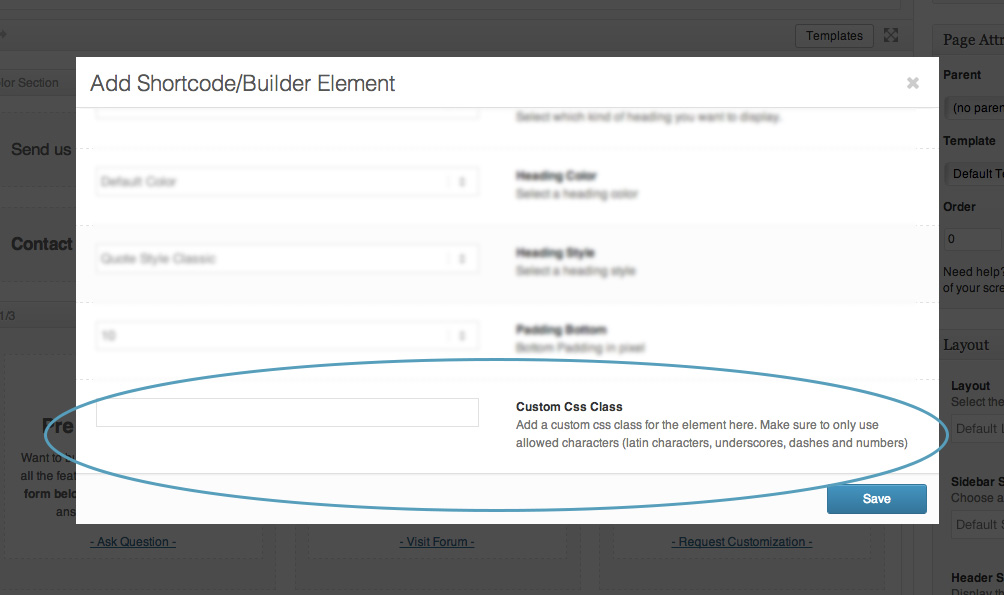
June 29, 2015 at 5:17 pm #465968Hi!
No, you should edit image elements that you would like to adjust and there should be a new field at the bottom called “custom CSS class” – http://kriesi.at/documentation/enfold/wp-content/uploads/sites/2/2013/12/blur.jpg
You should add “my-custom-img” thereBest regards,
YigitOctober 12, 2015 at 10:39 pm #517733So I can keep the 35 pictures 7 rows deep…? I need it to look just it does on all the rest of the devices…. 35 pictures 7 rows deep… Seems like this code is going to shrink the pictures and that order isn’t going to change… Does this code work on the Mason Galllary?
October 13, 2015 at 12:54 am #517794So I can keep the 35 pictures 7 rows deep…? I need it to look just it does on all the rest of the devices…. 35 pictures 7 rows deep… Seems like this code is going to shrink the pictures and that order isn’t going to change… Does this code work on the Mason Galllary on the smallest views?
October 13, 2015 at 11:46 pm #518437So on every view i need it to be 7 rows deep and 35 pics… When it gets to mobile views its 1 picture 1 row fullscreen. I tried to make the pictures smaller thinking they were to big but once it gets to the 3 smallest zoomed in views it goes down to 2 rows per page then 1 row… please please help….
October 15, 2015 at 11:07 am #519114Hi!
Please try this in the Quick CSS field:
@media only screen and (max-width: 767px) {
#av_section_1 div .av_three_fifth {
    margin-left: 6%;
    width: 57.599999999999994% !important;
}

#av_section_1 div .av_one_fifth {
    margin-left: 6%;
    width: 15.2% !important;
}
}
Use the color section’s Section ID field to specify a unique id for the container. Use “custom-section” for example. You can now replace the “#av_section_1” selector with “#custom-section”.
Regards,
IsmaelOctober 27, 2015 at 3:40 pm #525522Ok I did that change but its still one big row or 2 rows sometimes…. not 7 x 5 or what ever….
November 2, 2015 at 3:07 pm #528518Hi!
you need to play around with the different values in the code Ismael provided to you. Adjust width and margin values as needed.
If you still need help with this, send us admin access, so we can take a closer look into it. You can post login details here as private reply.
Regards,
Andy -
AuthorPosts
- You must be logged in to reply to this topic.