
-
AuthorPosts
-
November 21, 2025 at 7:26 am #1491608
Dear,
I tried many ways to reduce the space around before/after image for both mobile and disktop. I edited the margins but dint work for me.
could you please help me in this.
Thank you.
November 21, 2025 at 9:17 am #1491621Hey tariqyacoub82,
Thank you for the inquiry.
You may need to place the before/after image in a Color Section element and set its container to full width. Please check this documentation for more info.
— https://kriesi.at/documentation/enfold/color-section/#color-section-with-100-content-width
Best regards,
IsmaelNovember 25, 2025 at 11:55 am #1491791Dear Ismael,
Thanks for your reply.
the solution didn’t work.
I tried to paste this code on the style.cc file but also didn’t work.
/* Color section container width */
#section-container-width .container {
width: 100% !important;
min-width: 100%;
padding: 0;
margin: 0;
}November 25, 2025 at 5:12 pm #1491805Hi,
Could you post a link to where we can see the element in question please? Also, your screenshot link is returning a 404 page.
Best regards,
RikardNovember 25, 2025 at 7:07 pm #1491808Hi Rikard,
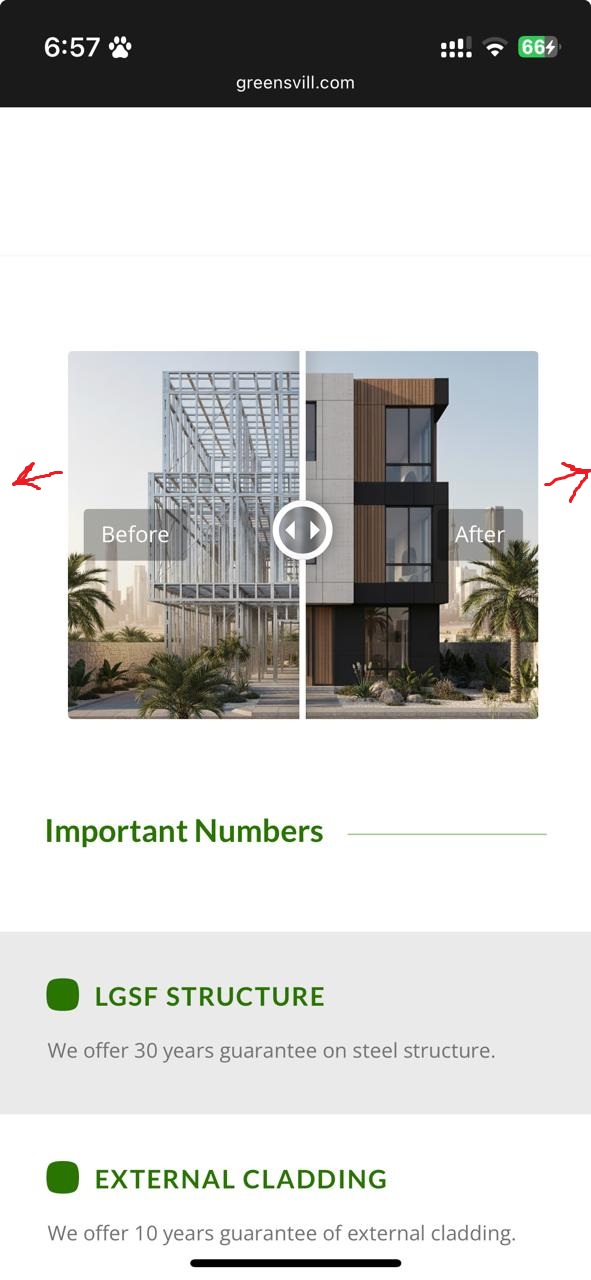
I want to make the Before/After section with full width.
Please see the image below
https://greensvill.com/wp-content/uploads/2025/11/Before-After.jpeg
November 26, 2025 at 6:10 am #1491822Hi,
Thank you for the update.
Did you try the suggestion above using the Color Section element to create a full-width container? We may need to inspect the actual page. Please create a test page and provide the URL in the private field.
Best regards,
IsmaelNovember 26, 2025 at 8:57 am #1491834Hi Ismael,
I created a test page which is a copy from my home page.
login details are in provate
November 26, 2025 at 3:54 pm #1491851Hi,
You can adjust the mobile container width using this CSS:
@media only screen and (max-width: 767px) {
  .responsive #top #wrap_all .container {
    width: 95%;
    max-width: 95%;
  }
}
Note that this will affect all container elements on your site on mobile resolutions.
Best regards,
Rikard-
This reply was modified 4 months ago by
Rikard.
November 27, 2025 at 8:58 am #1491871-
This reply was modified 4 months, 1 week ago by
tariqyacoub82.
-
This reply was modified 4 months, 1 week ago by
November 27, 2025 at 10:17 am #1491878Rikard,
I need only the Before/After section to be full width in all screens.
November 27, 2025 at 10:30 am #1491881Hi,
Thanks for the update. Are you saying that you only want to modify the container width in sections where you have the element in question?
Best regards,
RikardNovember 27, 2025 at 10:31 am #1491882November 27, 2025 at 3:46 pm #1491893Hi,
Please try this CSS instead:
@media only screen and (max-width: 767px) {
  #top #section-container-width .container {
    width: 100%;
    max-width: 100%;
  }
}
Best regards,
Rikard-
This reply was modified 4 months ago by
November 30, 2025 at 12:02 pm #1491959Rikard,
It didnt work
December 1, 2025 at 10:35 am #1491975Hi,
I’ve added the CSS for you, and it’s working. Please review your site.
Best regards,
RikardDecember 2, 2025 at 8:36 am #1492027Hi Rikard,
Its working on mobile but not on disktop
December 2, 2025 at 10:08 am #1492030try:
.responsive #top #section-container-width .container {
  width: 100% !important;
  max-width: 100% !important;
  padding: 0;
}

.responsive #top #section-container-width .avia-image-diff-container {
  margin: 0 !important;
}

.responsive #top #section-container-width .av-image-diff-wrapper,
.responsive #top #section-container-width .av-image-diff-wrapper img {
  width: 100%;
  max-width: 100% !important;
  margin: 0
}
your images are 1024px width – so you had to stretch them to the container width.
December 2, 2025 at 11:00 am #1492032Thanks for your efforts guys.
its perfect now
December 2, 2025 at 12:29 pm #1492035Hi,
Thanks for the update, we’ll close this thread for now then. Please open a new thread if you should have any further questions or problems.
Best regards,
Rikard -
This reply was modified 4 months ago by
-
AuthorPosts
- The topic ‘Before/After part’ is closed to new replies.