Hey Aaron,
Thank you for the link to your site, I see that you are using a color section with a background image and on screens larger than about 1440px the image seems to show the embedded text well, so I recommend adjusting for the smaller screens. Please try this code in the General Styling ▸ Quick CSS field or in the WordPress ▸ Customize ▸ Additional CSS field, it changes the background-size to cover for screens 650px to 1439px, and for smaller devices it changes the background-size to contain.
@media only screen and (min-width: 650px) and (max-width: 1439px) {
#top.home #av_section_1 {
	background-size: cover;
}
}
@media only screen and (max-width: 649px) {
#top.home #av_section_1 {
	background-size: contain;
}
#top.home #after_section_1 {
	border-color: transparent!important;
}
#top.home #av_section_1 > div > div {
	height: 36vh;
}
}
Please see the screenshots of the expected results in the Private Content area.
After applying the css, please clear your browser cache and check.
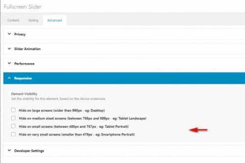
Another option would be to add another color section specifically for mobile devices with a portrait cropped image instead of the landscape image that desktop devices use, then you could show or hide these color sections based on screens size with the visibility option:
Best regards,
Mike
