
-
AuthorPosts
-
June 15, 2015 at 4:14 pm #459431
Hey guys,
so I have the below page that has background images within the ‘color section’ that works fine on a desktop…but looks obscured and excessively large on my mobile. Any thoughts on how to either reduce the images, or just get display:none them altogether?Thanks!
June 16, 2015 at 6:29 am #459851Hi Justin!
The page you linked looks fine on my end using latest version of Chrome, what browser are you using to get this error? I’m not sure what images you are referring to either, could you please provide us with screenshots of the issue?
Best regards,
RikardJune 16, 2015 at 3:37 pm #460086This reply has been marked as private.June 17, 2015 at 5:42 am #460543Hey!
Thanks for the screenshot, could you please provide us with a temporary admin login so that we can take a closer look? You can post the details here as a private reply.
Cheers!
RikardJune 17, 2015 at 6:29 am #460559This reply has been marked as private.June 17, 2015 at 9:51 pm #460992Hey!
try this code in Quick CSS field:
@media only screen and (max-device-width: 736px) {
.av-parallax.avia-full-stretch.enabled-parallax.active-parallax {
background-image: none !important;
}}
Regards,
AndyJune 17, 2015 at 10:56 pm #461006This reply has been marked as private.June 19, 2015 at 12:19 pm #461820Hi!
yes, and I think it should work. Please clear browser cache and refresh your browser a few times.
Regards,
AndyJune 23, 2015 at 5:53 pm #463519Hmm, thanks Andy ….
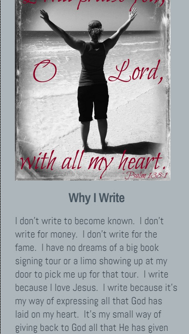
But what are you looking at exactly? And what smartphone are you using? When I go to the ABOUT page on my IPhone, under the section WHY I WRITE, I see a big flower that’s making the verbiage difficult to read. Mind sharing what you’re seeing? I tried clearing the cache.Thanks bud
June 24, 2015 at 10:18 am #463865Hey!
I checked the site and the flower background doesn’t display on mobile screens. I also noticed this incorrect css code:
@media only screen and (-webkit-min-device-pixel-ratio: 2) and (max-device-width: 667px) and (min-device-width: 375px)
div.av-parallax.avia-full-stretch.enabled-parallax.active-parallax {
  background: display:none!important;
}
Please remove that.
Cheers!
IsmaelJune 24, 2015 at 2:56 pm #464143Let me know if this helps guys. Cleaned the cache a couple times:
Thanks!June 25, 2015 at 10:03 am #464498Hi!
This is how it looks on our end:
Anyway, please try to replace the code with this:
@media only screen and (max-device-width: 736px) {
.av-parallax.avia-full-stretch.enabled-parallax.active-parallax {
background: none !important;
}}
Regards,
IsmaelJune 25, 2015 at 5:23 pm #464618Work your magic sir. It’s not working for me.
June 26, 2015 at 10:08 am #464828Hi!
That is how we actually see the site. I don’t think we can do anything else since it’s working.
Cheers!
IsmaelJune 26, 2015 at 3:40 pm #465024Yeah I cleared my cache again (Iphone 6+) and no change. So in other words there’s really no solution for it. :/
June 30, 2015 at 9:50 am #466243Hey!
I checked it again and it’s displaying fine on my end. Please try on another device as well to double check. We need to be able to reproduce the issue, otherwise we can’t do much. Let us know if it’s working for you on other devices and provide us screenshots please.
Regards,
AndyJune 30, 2015 at 3:57 pm #466542Andy, I will try a few other phones tonight. Thanks!
July 2, 2015 at 11:02 am #467396Hey!
Alright. Let us know if the background of the section is still showing there.
Best regards,
IsmaelJuly 22, 2015 at 12:04 am #476771Still seeking a solution here. Ad my client is also seeing it on her IPhone 5s
July 28, 2015 at 7:10 am #479475Hi!
I think it’s because of the retina display. Please try to add this css code:
@media
(-webkit-min-device-pixel-ratio: 2),
(min-resolution: 192dpi) {
.av-parallax.avia-full-stretch.enabled-parallax.active-parallax {
background: none !important;
}}
If it doesn’t work, replace the media query with this:
@media
only screen and (-webkit-min-device-pixel-ratio: 2),
only screen and (   min--moz-device-pixel-ratio: 2),
only screen and (     -o-min-device-pixel-ratio: 2/1),
only screen and (        min-device-pixel-ratio: 2),
only screen and (                min-resolution: 192dpi),
only screen and (                min-resolution: 2dppx) {

  /* Retina-specific stuff here */

}
Regards,
IsmaelJuly 28, 2015 at 4:33 pm #479793no luck..this is strange.
July 29, 2015 at 5:51 am #480024Hey!
Yeah.. It sure is. Please try this:
@media only screen and (max-width: 1200px) {
#smallgap .av-parallax {
  display: none !important;
}}
Please check the css modifications, make sure that there are no missing brackets in the css media queries. Don’t forget to remove browser and plugin cache.
Regards,
IsmaelJuly 29, 2015 at 9:25 pm #480427Ismael, that worked.
I did double-check my CSS to find a closing } missing from an @media query style.Thank you
July 29, 2015 at 10:12 pm #480442Hey!
Happy u gor it solved. I will close the ticket now, so you can work on the rest.
Regards,
Basilis -
AuthorPosts
- The topic ‘Background Image and mobile RESIZE’ is closed to new replies.