Hey Guenter,
Thank you, I have made this sticky to the top of the forum so more people will see this.
Best regards,
Mike
Hey Octopus4444,
Thank you for your patience, but the example links that you posted all lead to a 404, when I check a few of your pages the color section background image with wp_custom_field:_thumbnail_id} seem to work correctly when I check. For example on /modules-specifiques/ you have this

pointing to this thumbnail

and on the frontend it shows correctly

perhaps you have already sorted this out?
Best regards,
Mike
Hi,
Great, I’m glad to hear that you got things working. Please let us know if you should need any further help on the topic, or if we can close it.
Best regards,
Rikard
Hi,
The day before yesterday I updated my Enfold (followed: https://kriesi.at/support/topic/update-12/), because i can’t make new portfolio elements.
After I successfully uploaded the two portfolio items, I received the following messages in succession:
Fatal error: Allowed memory size of 134217728 bytes exhausted (tried to allocate 20480 bytes) in /web/vincent-design/vincent-design.com/wp-content/themes/enfold/config-templatebuilder/avia-template-builder/php/base-classes/class-popup-templates-callback.php on line 259
What should I do?
Thanks in advance,
István
There was a problem with Cache. I fixed it. You can close the topic.
Hi. I have 2 issues that I need assistance with:
1. I want to remove the grayscale effect for an inactive tab so that tab image (that is replacing icon) display in full colour rather than grayscale when inactive. I have added a custom icon image for this first tab that I want displayed in full colour at all times. I added the following custom css to remove grayscale from inactive tab icon which works in mobile/tablet view but is not working when viewing via desktop mode (still showing grayscale when inactive):
/*Remove grayscale */
.av-tab-section-image {
filter: none!important;
}
Any advice?
2. For this first tab I would also like the onclick action to open up the second tab – as in there is no content in first tab – its only purpose is to display this icon image. Possible?
Have input details in private content
Thanks for the help!
Hye,
Je souhaite que chacune des pages ai une image de fond différente qui premme l’ensemble de la page en largeur et ajouter ensuite des éléments au dessus (slider,…)
Je vois pas comment faire pour que l’image prenne l’ensemble de la page en largeur et hauteur et s’adapte à l’écran.
Merci d’avance, je débute dans la création
Jean-Christophe
Hi,
Thank you, I have made this sticky to the top of the forum so more people will see this.
Best regards,
Mike
Hey clbdcnpafe,
Try this CSS in your Enfold Theme Options ▸ General Styling ▸ Quick CSS field:
#top .avia-post-nav {
	display: none;
}
After applying the css, please clear your browser cache and check.
Best regards,
Mike
Hello,
This refers to WordPress posts appearing on a laptop or desktop monitor. We need to eliminate the navigation arrows that appear on the left and right side of the screen. They seem not to appear when viewing a post on a smartphone screen but we may not be seeing them. If they are on a smartphone, we need to eliminate them there as well. I have included a link to the jpg screenshot which highlights in red the navigation arrows that we are referring to. I have also included a link to that post.
Is there a Quick CSS solution to eliminate the navigation arrows? We tried
nav.navigation.post-navigation {
display: none !important;
}
and
.post-navigation{
display: none !important;
}
but neither worked.
Thanks.
Hi,
Thank you for the update.
If you need to specifically target the elements in the mega menu, you can start with this css code — take note of the comments:
/* description */
#top #header .avia_mega_div > .sub-menu > li > ul li {
    font-size: 100px;
}

/* menu items */
#top #header .avia_mega_div .sub-menu li a .avia-menu-text {
    font-size: 50px;
    padding: 50px 0;
}

/* mega menu title */
#top #header .mega_menu_title {
    margin-bottom: 8px;
    font-size: 90px;
    line-height: 1.1em;
    font-weight: 600;
    display: block;
}
You may need to remove this css code:
.sub-menu li a .avia-menu-text {
    font-size: 20px !important;
    padding: 20px 0 !important;
}
And make sure to toggle or temporarily disable the Enfold > Performance > File Compression settings and purge the cache after the modification.
Best regards,
Ismael
Hey stevengamez,
Thank you for the inquiry.
You may need to disable the audio by adding the mute parameter.
https://www.youtube.com/watch?v=x15sE0vgBGY?autoplay=1&mute=1
Please note that autoplay is only allowed on muted videos.
Best regards,
Ismael
Hey Daniel,
Thank you for the inquiry.
Did you manage to disable the default filters for the search icon? Is your modification working? If so, we can modify the function a bit to include the search icon again and make sure it only displays on mobile view using the available class names (e.g., av-desktop-hide, av-medium-hide, etc.) to control the visibility of elements on different screen sizes:
add_filter( 'wp_nav_menu_items', 'avia_append_search_nav', 10, 2 );

function avia_append_search_nav($items, $args) {
    if (avia_get_option('header_searchicon', 'header_searchicon') != 'header_searchicon') {
        return $items;
    }

    if (avia_get_option('header_position', 'header_top') != 'header_top') {
        return $items;
    }

    if ((is_object($args) && $args->theme_location == 'avia') || (is_string($args) && $args == 'fallback_menu')) {
        ob_start();
        $getform = get_search_form(false);
        $getform = ob_get_clean();

        $items .= '<li id="menu-item-search" class="av-medium-hide av-small-hide av-mini-hide menu-item menu-item-search-dropdown">' . $getform . '</li>';

        $items .= '<li id="menu-item-search-icon" class="menu-item menu-item-search-icon av-desktop-hide" role="menuitem">';
        $items .=    '<a aria-label="Search" href="?s=" ' . av_icon_string('search', false) . '>';
        $items .=        '<span class="avia_hidden_link_text">' . __('Search', 'avia_framework') . '</span>';
        $items .=    '</a>';
        $items .= '</li>';
    }

    return $items;
}
Best regards,
Ismael
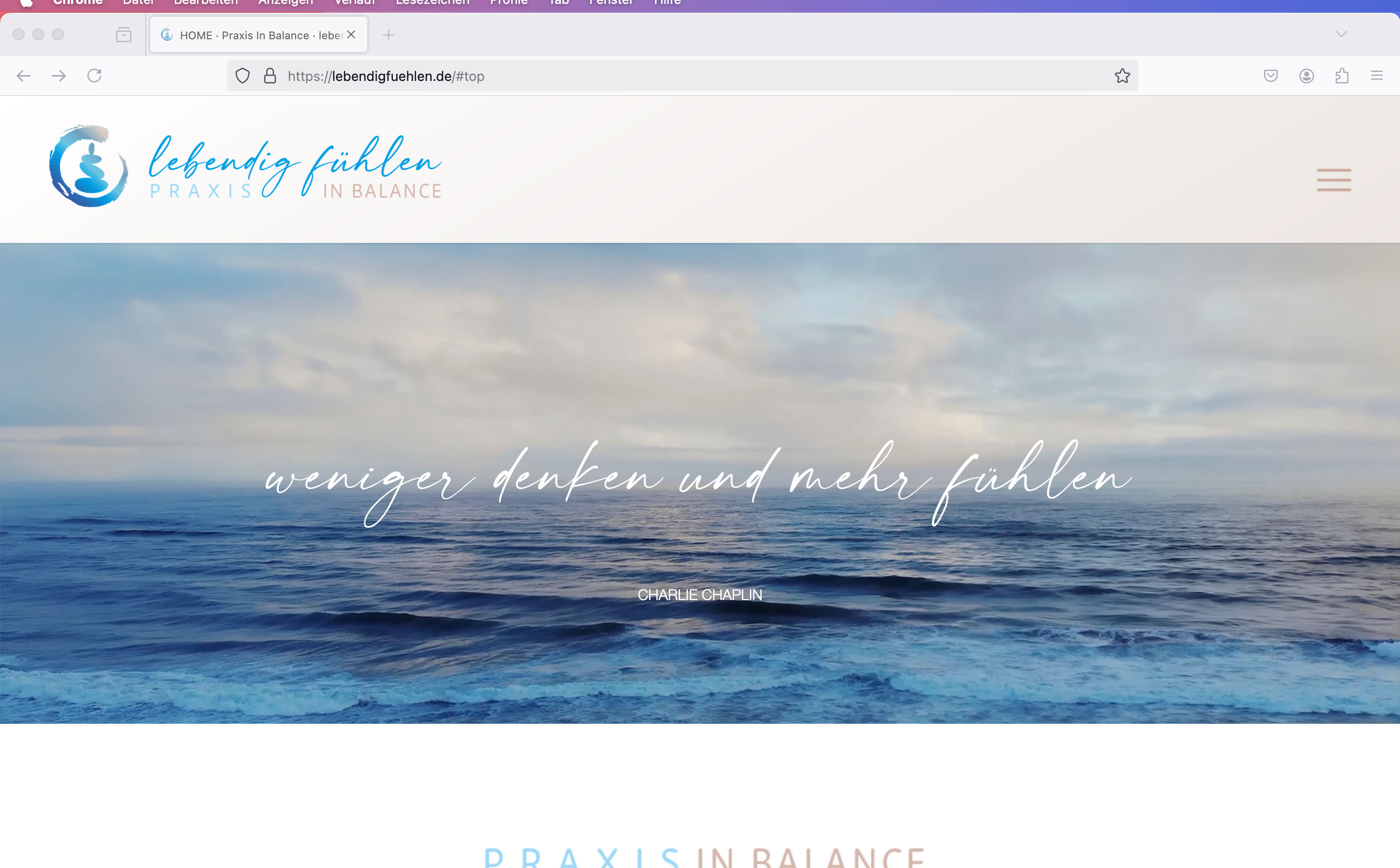
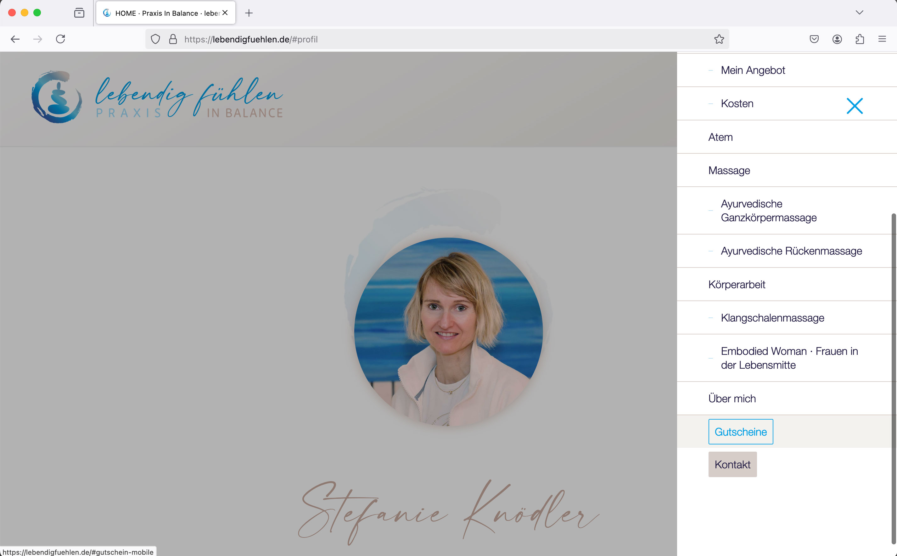
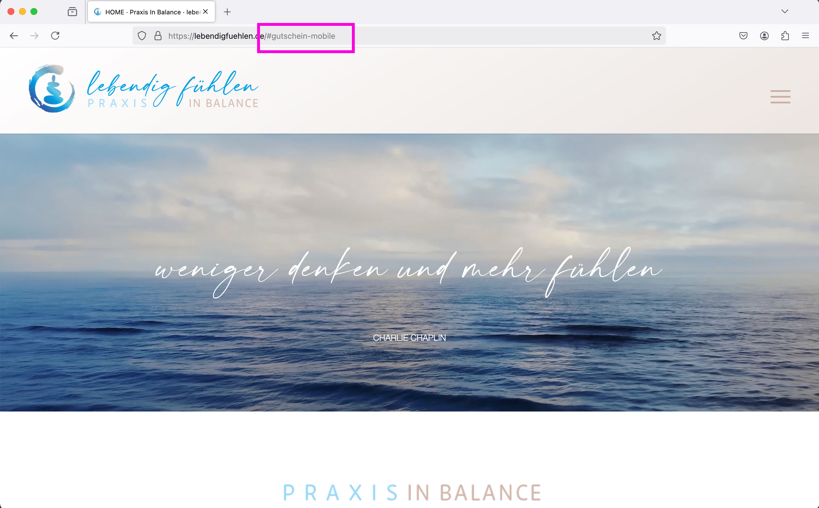
Dear Mike,
Thank you for your reply. I have now assigned separate IDs for the mobile sections: “#gutschein-mobile” and “#kontakt-mobile”.
The desktop version still links to the IDs “#gift-voucher” and “#contact”
For the mobile version, I have also created a second menu in which the menu items “Vouchers” and “Contact” are linked to the new mobile IDs.
1st desktop version: Menu is displayed normally as a bar: > Anchor links work
2. mobile version (cell phone): Menu is displayed as a burger menu: > Anchor links work
3. tablet version / laptop screen: Menu is displayed as a burger menu: Anchor links of the two problematic menu items “Vouchers” and “Contact” do not work: for both it jumps onClick to the top of the page.
Example: see screenshots:
Screen view 1-3:
https://lebendigfuehlen.de/support/1.jpg
https://lebendigfuehlen.de/support/2.jpg
https://lebendigfuehlen.de/support/3.jpg
The third screen shows that in this version, which jumps incorrectly to the top of the page, the link to the mobile version #gutschein-mobile” is displayed correctly in the browser bar at the top.
Can you help me further? I’m really at a loss as to what the problem could be.
Best regards Diana
Hi, I checked the resource you recommend but there is no way to change the just the font family or the link size for the links specifically in my mega menu. I do see a way to change all the element size using the advanced settings but I need the link element specifically in the mega menu. I wanted to have different fonts and sizes for the links and headers in the mega menu. The advanced styling setting make everything the same font. Please let me know if this is doable.
This thread highlights what I’m trying to do but the code did not work. https://kriesi.at/support/topic/enfold-mega-menu-font-sizes-and-spaces/
Basically I want the links a different font family than the header and smaller. I thought this code would work but it doesn’t
#top #header .avia_mega_div > .sub-menu > li > ul > li a { font-size: 16px; }
Hi Guenni, do you know if there is a filter or anything to set a custom percentage? The list stops at 90%.
Hi,
Try this CSS in your Enfold Theme Options ▸ General Styling ▸ Quick CSS field:
#top .av-custom-shipping-container {
    z-index: 9;
    position: relative;
}
@media only screen and (max-width: 735px) {
	#top .av-custom-shipping-container {
	line-height: 65px;
	}
}
After applying the css, please clear your browser cache and check.
Best regards,
Mike
Dear Support Team,
An anchor link on the website is not working on the mobile device:
When I call up this link on the desktop PC, it works without any problems. The link to the contact function is perfect.
When I call up the same link on my cell phone, it doesn’t jump to the contact section but to the start of the page (the Bittun KOntakt link doesn’t work in the cell phone navigation either). I don’t understand it at all: In the backend, the section with the ID #contact is 2x: once for desktop devices and once only for mobile version (all others hidden)
Can you please help me so that the link also works on mobile?
LG Diana
Translated with DeepL.com (free version)Dear Support Team,
An anchor link on the website is not working on the mobile device:
When I call up this link on the desktop PC, it works without any problems. The link to the contact function is perfect.
When I call up the same link on my cell phone, it doesn’t jump to the contact section but to the start of the page (the Bittun KOntakt link doesn’t work in the cell phone navigation either). I don’t understand it at all: In the backend, the section with the ID #contact is 2x: once for desktop devices and once only for mobile version (all others hidden)
Can you please help me so that the link also works on mobile?
LG Diana
Hi, I have a image widget with a ligthbox open for a youtube url which is added to the backend. For some reason this particular video is not opening and playing automatically. I added the code ?autoplay=1 to the end of the video in the manual url. I have 2 other videos on that particular page that do work and play automatically in the lightbox… I have added the full url to private content. Please advise.
no – this: https://kriesi.at/support/topic/change-a-color-sitewide/#post-1473933
but: Really now? – I thought we were talking about a few hundred posts that need to be changed. I would change the few things manually. Honestly – it is better to change the background color on generation than to change it afterwards via css or script.
open the column and replace the color.
Hi,
To center the logo on mobile try adding this css:
@media only screen and (max-width: 767px) {
#header_main .logo img {
	top:0;
}
}
After applying the css, please clear your browser cache and check.
Best regards,
Mike
Is there code that I need to make look better? It looks beautiful on desktops, but absolutely terrible on mobile phones. The tabs run together, so you can’t read anything on the page. When you click to go from tab to the other, only a portion of the tab even displays.
Thanks Ismael for getting back. We are looking into what did what.
I finished all the alt text before the weekend and in the weekend we were trying to finish up the website before launch. They people working on the website might have put some coding in and also tweaked some plugins. I probably have to re-enter all of the alt text by hand again for all of my 700+ photo’s then.
Hi Guenni007,
I entered at one picture: “Young surfers carrying surfboards under their arms are entering the water with an instructor.”
Capitals: I read somewhere to make sure you start the Alt Text with a capital and also use them for names etc. Just as you would when officially writing.
“.”‘s: I mean interpunction. So to make sure to use comma’s and dot’s (or full stops as you would call them in English.
Cheers!
first – maybe you decide not to have this immense padding of 100px of that cell – because expanding the content will end in a very hight container.
next: set for the background-image position : bottom center.
put this to your quick css and adjust to your needs:
#top .av-fold-unfold-container.unfolded {
  background-color: rgba(0,0,0,0.3);
  border-radius: 15px;
  padding: 10px;
  -webkit-backdrop-filter: blur(3px);
  backdrop-filter: blur(3px);
}
if you like to have a semi-transparent white bg – change to rgba(255,255,255,0.6)
but then i would change font color to f.e. #333
#top .av-fold-unfold-container.unfolded p {
  color: #333;
}
The first color-section : got custom class: bg-fixed
this color-section got the one background-image: substrato_background_page_top – but set it to scroll (background-attachment)
this is for quick css ( maybe we had to adjust later on – please activate that example page again):
.bg-fixed {
  background-size: 0px !important;
  overflow: hidden;
  position: relative;
  -webkit-clip-path: polygon(0 0, 100% 0, 100% 100%, 0% 100%);
  clip-path: polygon(0 0, 100% 0, 100% 100%, 0% 100%);
}

.bg-fixed:before {
  background-image: inherit !important;
  background-repeat: inherit !important;
  background-size: cover;
  background-position: inherit;
  content: "";
  position: fixed;
  width: 100%;
  height: 100%;
  top: 0;
  left: 0;
  z-index: -1 !important;
  pointer-events: none;
}
Now for the following color-section ( just for that bg-image) with the substrato_separatore.png – that image is 265px heigh –
On Layout Tab : set section height to “Miniumum custom height in px ” to 265px
Open “Margin and Padding” Tab : check “Custom Margins” and enter -260px (Top and Bottom) – this will shift the section to top.
On Styling Tab – “Custom Background Color” and set the slider on the right to minimum (0.01) that is defacto : transparent
Background Image – now your separator – set to scroll – Bottom Center and repeat-x
on Advanced Tab : set a higher z-Index e.g. 2 – and give (if needed) a custom class to that section f.e. shifted-bg
If you got this we will look what to adjust then.
maybe this might be necessary:
#top .bg-fixed ,
#top .shifted-bg {
  position: relative;
}
Hey Dzimnikov,
Thank you for the inquiry.
Try to add this script in the functions.php file to create another container below the product description or shop banner :
function ava_custom_add_shipping_text_script() {
    if (is_shop()) {
    ?>
        <script>
            (function ($) {
                $(document).ready(function () {
                    var newContainer = $('<div class="av-custom-shipping-container"><p>Free Shipping on All Orders!</p></div>');
                    $('#av_product_description .container').after(newContainer);
                });
            }(jQuery));
        </script>
    <?php
    }
}
add_action('wp_footer', 'ava_custom_add_shipping_text_script', 99);
Then add this css code to adjust the style of the new container:
#top .av-custom-shipping-container {
    background: red;
    padding: 20px;
}

#top .av-custom-shipping-container p {
    color: #ffffff;
    font-size: 40px;
}
Best regards,
Ismael
I installed the demo below.
Agency – Enfold Parallax Demo
However, it is not displayed normally on the TOP page.
Hey pietervanzaanen,
Thank you for the inquiry.
You can setup the knowledge base entries as posts with a unique category “documentation”. The demo https://kriesi.at/themes/enfold-2017/blog/ is created using the Advance Layout Builder (ALB) — it has a Color Section at the very top with a background image, Special Heading + Separator + Text Block element combo and Two Blog Posts element below the Color Section. One of the Blog Posts element displays only one entry and the other is set to have a Grid Layout with 2 Columns.
To copy the layout a lot easier, you can set the builder to debug mode then copy these code in the shortcode field: https://pastebin.com/EfxvsDwL
To enable debug mode, please check this documentation: https://kriesi.at/documentation/enfold/intro-to-layout-builder/#debug-mode
Let us now if you need further assistance.
Best regards,
Ismael
