Hi,
This code should fix the issue — you just need to supply your own password toggle images (eye-closed.svg, eye-open.svg).
— https://kriesi.at/support/topic/missing-eye-icon-on-login-page/#post-1494007
Best regards,
Ismael
Hi,
Thank you for the update.
You can add this css code to adjust the heading row.
#top .main_color .avia-data-table .avia-heading-row th {
    background: #ebebeb;
}
Result:
Let us know if you need more info.
Best regards,
Ismael
Thanks so much, Ismael, but this doesn’t seem to be working for me as-is — I dropped it in at the top of the functions.php for the child theme (https://snipboard.io/G9XSTj.jpg), but I’m still seeing two “main” landmarks (one for the footer-page) on https://abodedev.wpengine.com/about/story/ for example. Any idea what I might be doing wrong?
Hi,
Thanks for the update, please note that this is not a theme problem. The image is located in the section with the ihre-buchhalter ID. It’s hidden on desktop.
Best regards,
Rikard
Hi,
I have looked at table press and it seems to work well.
One thing, I need to add CSS so that the top table row header has a background colour of #ebebeb
Would you know the CSS coding to add for this?
See sample page in Private Content
Thanks
This reply has been marked as private.
Ok, thanks for tracing the problem. I’ll take a look at WP-Optimize and try and reduce the settings. Or try another Caching plugin.
It seems the Enfold theme has a lot of issues with Caching and compression plugins.
I previously had SpeedyCache Pro running for a long time. But then the home page suddenly started throwing errors, with huge amounts of garbage code appearing at the top of my home page… it looked like compressed and minified CSS wasn’t getting parsed properly. So I had to ditch SpeedCache.
Do you have any recommended caching plugins that work well with this theme?
Nik
Hi,
Thank you for the update.
It’s probably a style conflict between the theme and one of the plugins. Did you apply the suggestions from the previous thread and try the ones we suggested here?
.woocommerce .woocommerce-form-login .show-password-input {
    position: absolute;
    top: 0.8rem;
    right: 1.2rem;
    cursor: pointer;
}
Best regards,
Ismael
Hi,
Did you apply the changes we recommended here https://kriesi.at/support/topic/cpt-sticky-posts-in-masonry/#post-1493891 before adjusting the date format? If you can create a test and provide the login details in the private field, we’ll try to take a closer look.
Best regards,
Ismael
Hi,
The site is still not accessible on our endas mentioned in our previous reply: https://kriesi.at/support/topic/woocommerce-features-not-working/#post-1493886
We recommend hiring a freelance developer if you’re having trouble implementing the changes we suggested above. Thank you for your patience.
Best regards,
Ismael
Hey Ismael, thanks for the reply. What I don’t understand is why the plain theme of enfold doesn’t work properly on it’s own, and why when I select any other theme I see correctly the eye icon.
I also encountered another thread on this forum and I tried to add that css to solve the issue and ( content: “\e010” !important;) except it doesn’t work, like it’s not loading properly the fontello font or something.
In fact if you go on my client website you’ll see that I got a square instead of the eye icon.
I’m sure the function you wrote will work properly, but why it’s not working on the enfold version of the website?
Thanks!
Hi there,
how can I update the following page on the website, as there is no “Edit (advanced AVIA layout builder)” button on the top menu of the front office, like in all other pages? It’s showing Blog posts from the “archive” link. I would like to add a 50 px whitespace on top, so on mobile you can view it properly. If possible I would also like to customise it a bit more.
https://porscheownersclubandalucia.com/2026/01/
If I go to this page instead, it shows everything properly:
Thank you so much!
Antonio
Hey SurigliaStudio,
When I test your site the “Taglie” button doesn’t create a mobile style flyout menu, I assume that you now have the plugin disabled, but I think that I understand. I have created a custom function that will create a mobile style overlay menu from a sticky button on the right using a image that you can choose:


and on mobile the overlay is about 95% of the screen.
The function uses the Named Menus from your WordPress menus to show:
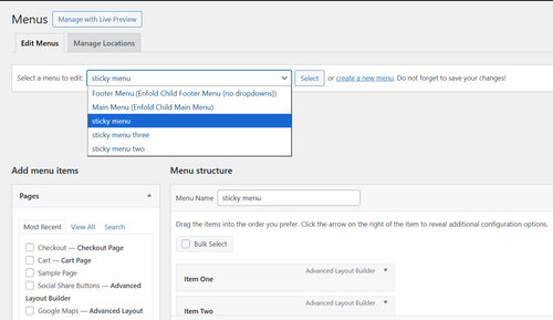
In Configuration there is a line to choose your menu image/icon and the default menu to show on all pages:
and below you can add as many additional menus with an array of pages that they will show on:
The code also has all of the css built-in for styling if you want to adjust.
Add this code to your child theme functions.php file, if you are not using a child theme you could use the WP Code plugin then add a new snippet, in the top right corner use the PHP snippet as the code type:
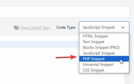
then add the above code and save.
/**
* Add Sticky Button with Fly-out Menu
* Add this to your Enfold child theme's functions.php
*/
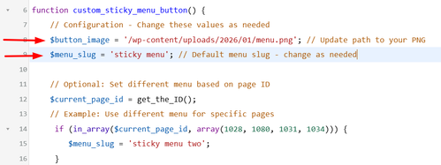
function custom_sticky_menu_button() {
// Configuration - Change these values as needed
$button_image = '/wp-content/uploads/2026/01/menu.png'; // Update path to your PNG
$menu_slug = 'sticky menu'; // Default menu slug - change as needed
// Optional: Set different menu based on page ID
$current_page_id = get_the_ID();
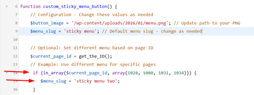
// Example: Use different menu for specific pages
if (in_array($current_page_id, array(1028, 1080, 1031, 1034))) {
$menu_slug = 'sticky menu two';
}
if (in_array($current_page_id, array(1376, 1331, 1277, 1283))) {
$menu_slug = 'sticky menu three';
}
// Get the menu
$menu_items = wp_get_nav_menu_items($menu_slug);
if (!$menu_items) {
return; // Exit if menu doesn't exist
}
?>
<!-- Sticky Button -->
<div id="sticky-menu-btn" class="sticky-menu-button">
![]() " alt="Menu">
</div>
<!-- Fly-out Menu Overlay -->
<div id="flyout-menu-overlay" class="flyout-menu-overlay">
<div class="flyout-menu-close">×</div>
<nav class="flyout-menu-content">
<?php
wp_nav_menu(array(
'menu' => $menu_slug,
'container' => false,
'menu_class' => 'flyout-nav-menu',
'fallback_cb' => false
));
?>
</nav>
</div>
<style>
/* Sticky Button Styles */
.sticky-menu-button {
position: fixed;
right: 20px;
top: 50%;
transform: translateY(-50%);
width: 50px;
height: 50px;
border-radius: 50%;
cursor: pointer;
z-index: 9998;
transition: opacity 0.3s ease;
box-shadow: 0 2px 10px rgba(0,0,0,0.3);
overflow: hidden;
}
.sticky-menu-button img {
width: 100%;
height: 100%;
object-fit: cover;
}
.sticky-menu-button.hidden {
opacity: 0;
pointer-events: none;
}
/* Fly-out Menu Overlay */
.flyout-menu-overlay {
position: fixed;
top: 0;
right: -100%;
width: 25%;
height: 100vh;
background: #fff;
z-index: 9999;
transition: right 0.4s ease;
box-shadow: -2px 0 10px rgba(0,0,0,0.2);
overflow-y: auto;
}
.flyout-menu-overlay.active {
right: 0;
}
/* Close Button */
.flyout-menu-close {
position: absolute;
top: 20px;
right: 20px;
font-size: 36px;
cursor: pointer;
color: #333;
width: 40px;
height: 40px;
display: flex;
align-items: center;
justify-content: center;
line-height: 1;
transition: color 0.3s ease;
}
.flyout-menu-close:hover {
color: #000;
}
/* Menu Content */
.flyout-menu-content {
padding: 80px 30px 30px;
}
.flyout-nav-menu {
list-style: none;
margin: 0;
padding: 0;
}
.flyout-nav-menu li {
margin: 0 0 15px 0;
}
.flyout-nav-menu a {
display: block;
padding: 12px 0;
color: #333;
text-decoration: none;
font-size: 16px;
transition: color 0.3s ease;
border-bottom: 1px solid #eee;
}
.flyout-nav-menu a:hover {
color: #000;
}
/* Sub-menu styles */
.flyout-nav-menu .sub-menu {
list-style: none;
margin: 10px 0 0 20px;
padding: 0;
}
.flyout-nav-menu .sub-menu a {
font-size: 14px;
padding: 8px 0;
}
/* Mobile Styles */
@media (max-width: 768px) {
.flyout-menu-overlay {
width: 95%;
}
}
</style>
<script>
(function() {
var btn = document.getElementById('sticky-menu-btn');
var overlay = document.getElementById('flyout-menu-overlay');
var closeBtn = document.querySelector('.flyout-menu-close');
// Open menu
btn.addEventListener('click', function() {
overlay.classList.add('active');
btn.classList.add('hidden');
document.body.style.overflow = 'hidden'; // Prevent body scroll
});
// Close menu
closeBtn.addEventListener('click', function() {
overlay.classList.remove('active');
btn.classList.remove('hidden');
document.body.style.overflow = ''; // Restore body scroll
});
// Close on overlay click outside menu
overlay.addEventListener('click', function(e) {
if (e.target === overlay) {
overlay.classList.remove('active');
btn.classList.remove('hidden');
document.body.style.overflow = '';
}
});
})();
</script>
<?php
}
add_action('wp_footer', 'custom_sticky_menu_button');
" alt="Menu">
</div>
<!-- Fly-out Menu Overlay -->
<div id="flyout-menu-overlay" class="flyout-menu-overlay">
<div class="flyout-menu-close">×</div>
<nav class="flyout-menu-content">
<?php
wp_nav_menu(array(
'menu' => $menu_slug,
'container' => false,
'menu_class' => 'flyout-nav-menu',
'fallback_cb' => false
));
?>
</nav>
</div>
<style>
/* Sticky Button Styles */
.sticky-menu-button {
position: fixed;
right: 20px;
top: 50%;
transform: translateY(-50%);
width: 50px;
height: 50px;
border-radius: 50%;
cursor: pointer;
z-index: 9998;
transition: opacity 0.3s ease;
box-shadow: 0 2px 10px rgba(0,0,0,0.3);
overflow: hidden;
}
.sticky-menu-button img {
width: 100%;
height: 100%;
object-fit: cover;
}
.sticky-menu-button.hidden {
opacity: 0;
pointer-events: none;
}
/* Fly-out Menu Overlay */
.flyout-menu-overlay {
position: fixed;
top: 0;
right: -100%;
width: 25%;
height: 100vh;
background: #fff;
z-index: 9999;
transition: right 0.4s ease;
box-shadow: -2px 0 10px rgba(0,0,0,0.2);
overflow-y: auto;
}
.flyout-menu-overlay.active {
right: 0;
}
/* Close Button */
.flyout-menu-close {
position: absolute;
top: 20px;
right: 20px;
font-size: 36px;
cursor: pointer;
color: #333;
width: 40px;
height: 40px;
display: flex;
align-items: center;
justify-content: center;
line-height: 1;
transition: color 0.3s ease;
}
.flyout-menu-close:hover {
color: #000;
}
/* Menu Content */
.flyout-menu-content {
padding: 80px 30px 30px;
}
.flyout-nav-menu {
list-style: none;
margin: 0;
padding: 0;
}
.flyout-nav-menu li {
margin: 0 0 15px 0;
}
.flyout-nav-menu a {
display: block;
padding: 12px 0;
color: #333;
text-decoration: none;
font-size: 16px;
transition: color 0.3s ease;
border-bottom: 1px solid #eee;
}
.flyout-nav-menu a:hover {
color: #000;
}
/* Sub-menu styles */
.flyout-nav-menu .sub-menu {
list-style: none;
margin: 10px 0 0 20px;
padding: 0;
}
.flyout-nav-menu .sub-menu a {
font-size: 14px;
padding: 8px 0;
}
/* Mobile Styles */
@media (max-width: 768px) {
.flyout-menu-overlay {
width: 95%;
}
}
</style>
<script>
(function() {
var btn = document.getElementById('sticky-menu-btn');
var overlay = document.getElementById('flyout-menu-overlay');
var closeBtn = document.querySelector('.flyout-menu-close');
// Open menu
btn.addEventListener('click', function() {
overlay.classList.add('active');
btn.classList.add('hidden');
document.body.style.overflow = 'hidden'; // Prevent body scroll
});
// Close menu
closeBtn.addEventListener('click', function() {
overlay.classList.remove('active');
btn.classList.remove('hidden');
document.body.style.overflow = ''; // Restore body scroll
});
// Close on overlay click outside menu
overlay.addEventListener('click', function(e) {
if (e.target === overlay) {
overlay.classList.remove('active');
btn.classList.remove('hidden');
document.body.style.overflow = '';
}
});
})();
</script>
<?php
}
add_action('wp_footer', 'custom_sticky_menu_button');
Adjust the image, menus, and page IDs to suit.
Best regards,
Mike
Hi Ismael, Even after uploading a 512px PNG and clearing all server caches, the output remains stuck at 96x96px. Maybe the theme is filtering the apple-touch-icon size.
Google requires a higher resolution (at least 144×144 or 180×180) to show the icon in SERPs. Since Enfold is downscaling it, can you provide please the specific filter to disable this automatic resizing in the theme’s header?
Best regards, Stefano”
Below the report: realfavicongenerator.net
Classic and SVG favicon
There is no SVG favicon
There is no 96×96 desktop PNG favicon
An implicit ICO favicon is found at /favicon.ico
ICO favicon found
The ICO favicon has the expected sizes (16×16, 32×32, 48×48)
by the way: if you like to have the hight of the descriptive box ruled by enfolds text-block fold /unfold setting – just remove that height and overflow styling inside the snippet (// 3. Output the result)
and if you like to have that text only for SEO pupose – use that setting for invisibility from my page
if you like to have it only for SEO : use that setting globaly:
#top .yt-desc-box {
  border: 0 !important;
  clip: rect(0 0 0 0);
  height: 1px !important;
  margin: -1px;
  overflow: hidden;
  padding: 0 !important;
  position: absolute;
  width: 1px;
}
Hi,
Thank you for the clarification.
You can try this css code to apply your own toggle password icon to the password input field.
.show-password-input {
  width: 24px;
  height: 24px;
  border: 0;
  background-color: transparent;
  background-repeat: no-repeat;
  background-position: center;
  cursor: pointer;
  position: absolute;
  top: 4px;
  right; 9px;
}

.show-password-input[aria-label="Show password"] {
  background-image: url("eye-closed.svg");
}

.show-password-input[aria-label="Hide password"] {
  background-image: url("eye-open.svg");
}
Make sure to replace eye-closed.svg and eye-open.svg images with your own images.
Best regards,
Ismael
Hello Rikard,
trying putting a break did not work. <br> was shown in the text.
I reduced the words and now it fit’s inside the button.
So you can close the topic now.
Thanks again for your help!
Kind regards,
Nina
Hi,
I would like create a easy slider with lightbox, I have find this but it no works:
Could you help me?
Thanks advance,
BR,
Antonio.
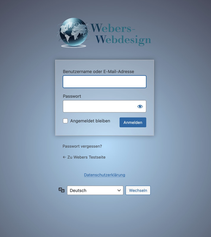
well this wordpress login screen is not influenced by the themes installed !
This is a pure wordpress setting – so you have to check where it might be set a different Login Page.
i often make an own settup for it by this snippet for child-theme functions.php:
function custom_loginlogo_url($url) {
  $url = get_site_url();
  return $url;
}
add_filter( 'login_headerurl', 'custom_loginlogo_url' );

function my_login_logo(){
$logo = avia_get_option('logo');
?>
<style type="text/css">
    #login h1 a, .login h1 a {
      background-image: url(<?php echo $logo; ?>);
      height: 120px;
      width: 320px;
      background-size: contain !important;
      background-repeat: no-repeat;
      background-position: center top;
      position: relative;
      left: 50%;
      transform: translateX(-50%);
    }
    body.login {
      background-image: -webkit-radial-gradient(circle farthest-corner at center center, #B8E1FC 0%, #231421 100%) !important;
      background-image: radial-gradient(circle farthest-corner at center center, #B8E1FC 0%, #231421 100%) !important;
      background-repeat: repeat;
    }
    body.login form {
      background: rgba(255,255,255,0.2);
      box-shadow: 0 0 15px rgba(0,0,0,0.3);
    }
</style>
<?php
}
add_action( 'login_enqueue_scripts', 'my_login_logo' );
you see in the snippet that the logo you set in the logo input field of enfold will be dynamically inserted there. If you like to have a differente one – then insert an absolute url on that place: background-image: url(<?php echo $logo; ?>);
this is then the look for it:
This reply has been marked as private.
Hi Ismael,
Thanks for getting back to me.
I’ve gone through the documentation, installed an SMTP plugin, and configured it using the settings from SiteGround. That part is now working in the sense that emails from the Enfold contact form are being delivered to my SiteGround mailbox.
However, even after speaking with SiteGround support, I still can’t get those emails to arrive in my Gmail inbox via forwarding. SiteGround say the messages are leaving their server, but nothing shows in Gmail (not in spam either). This only started happening recently, and it seems to coincide with WordPress updates and the need to move away from the default PHP mail function to SMTP.
My concern is that I now have to rely on an extra plugin just to get a basic contact form working, which ideally shouldn’t be necessary for a core feature of the theme.
Could you clarify:
1. What exactly has changed recently that caused the built-in Enfold contact form emailing to stop working in the way it previously did?
2. Whether there is a recommended solution that doesn’t rely on an additional SMTP plugin?
3. If this is something that is likely to be addressed in future Enfold updates so that the contact form can send reliably again without extra plugins?
At the moment everything “half works”, but the forwarding/Gmail side is still unreliable, and I’d like to avoid a fragile setup if possible.
Thanks in advance for any clarification you can provide.
Kind regards,
Andrew
This reply has been marked as private.
Hi Enfold Support Team,
I’m experiencing persistent CSS issues with the Enfold theme on my WordPress site that are affecting responsiveness and styling, particularly for mobile and desktop layouts. Custom CSS added via Quick CSS or the child theme’s style.css often fails to apply, gets overridden, or doesn’t update despite clearing all caches (browser, plugins, server-side). Changes to theme options like advanced styling, colors, or typography also don’t reflect on the frontend reliably.
Specific Problems
Caching/Loading Issues: Styles revert or show defaults even after disabling CSS/JS merging and compression in Enfold > Performance.
Responsive Design Breaks: Headings get cut off on iPad/smaller screens (e.g., change font-weight to bold, font-size smaller, text-transform uppercase based on viewport).
Typography Overrides: Headings and text styles (bold, small caps, uppercase/lowercase transforms) fail to adapt responsively across devices, requiring constant !important hacks that still don’t stick.
Overrides and Conflicts: Theme options ignore inputs; unclosed Quick CSS blocks break everything; plugin conflicts (e.g., forms, checkouts) exacerbate issues.
Troubleshooting Steps Tried
Cleared caches everywhere and tested in incognito mode across browsers (Chrome, Safari, Firefox).
Disabled caching plugins, performance optimizations, and child theme customizations temporarily—no fix.
Updated WordPress, Enfold, PHP (tested 7.4 vs. 8), and relevant plugins; issue persists across devices including Mac OS.
A staging site/credentials can be provided for testing. Any guidance on debugging responsive heading styles, CSS caching, or fixes would be greatly appreciated!
-
This topic was modified 2 months ago by
 Sonno.
Hi,
Thank you for the update.
Try to use this css code instead:
#top .grid-sort-container .no_margin.av_one_third.grid-entry {
    width: 30%;
    margin-right: 3%;
}
Result:
Best regards,
Ismael
Hey Ismael,
Thank you for your reply, but unfortunately it’s not – what you’re seeing is the full size, and that was always working. When the my account / login buttons are visible, this is the full size
The search icon still isn’t visible on smaller screens (i.e when the hamburger menu is in use) – I’ve cleared all cache, tried incognito mode, and also tried a different browser but it’s still not visible (https://www.dropbox.com/scl/fi/3jftsql2o77qfkonnqt2c/Signosaur_home_laptop-searchmissing-withcode.png?rlkey=9exzi4fdgzc8x2h1l2g1l4p8v&dl=0)
Is there something else I may be able to try please? :)
Cheers
Sarah
Hi,
Thank you for the update.
You can add this css code to make the grid items transparent and add spaces between them.
#top .grid-entry.av_one_fourth {
    width: 20%;
    margin-right: 5%;
}

#top .grid-entry .inner-entry {
    background-color: transparent;
}

#top .grid-entry .grid-image img {
    width: 100%;
    max-width: 100%;
    height: auto;
}
Let us know the result.
Best regards,
Ismael
Hi,
WooCommerce filter to our home page.
Please note that the default Woocommerce filters or widgets will only display on standard product pages or templates, such as product category pages or the base shop page. They will not display on custom pages, such as your homepage. This behavior is determined by the widget function, which we don’t have control over. You may need to look for a custom solution if you want to display filters on the homepage.
For the single product page, please try to follow these steps: https://kriesi.at/support/topic/enfold-sidebar-on-single-product-pages/#post-1162484
Best regards,
Ismael
Hi,
Thank you for the update.
that if not using a fullscreen Slider the portfolio navigation disappears completely
The post navigation should not be affected by the slider — it should actually not display when a slider is added to a page, not the other way around. Please create a test page and post the URL in the private field so we can check the issue properly.
To bring back the post navigation on mobile view, please add this css code:
@media only screen and (max-width: 767px) {

  /* Add your Mobile Styles here */
  .responsive #top .avia-post-nav {
    display: block;
  }
}
Best regards,
Ismael
Hi guys,
I hope you’re well.
I’m having an issue with the Enfold contact form across several websites I own. The forms were working fine previously, but have recently stopped sending emails without any changes on my side.
A few details:
* All sites are running the **latest version of WordPress**
* The **Enfold theme is updated** to the latest version
* I’ve double-checked the **admin email addresses** and settings
* The contact forms **used to work**, and then suddenly stopped
* I installed **Contact Form 7** as a test and its emails are sending and being received in my Gmail inbox without any issues
I’ve gone through the documentation you recommend regarding email delivery and contact forms, but I still haven’t been able to get the built-in Enfold contact form working again.
Could you please advise
Many thanks in advance for your help.
Kind regards,
Andrew