Hi,
Thank you for the inquiry.
That is the default behavior of the menu. The main menu displays in desktop view and switches to the hamburger (mobile) menu at certain breakpoints, such as tablet view and smaller screens.
If you want to display the hamburger menu on desktop, go to Enfold > Main Menu > General > Menu Items For Desktop and set it to Display as Icon.
Let us know if you need more info.
Best regards,
Ismael
Hi there
I have a 5 column layout in a colour section that displays side by side on desktop but stacks on mobile – how can I get it to stay side by sode and not stack vertically?
 Hender
Guest
Hello friends, I am writing to you because I am currently using your Enfold theme and suddenly the footer has stopped being displayed completely, and in the configuration everything seems to be correct, can you help me?
I have not been able to figure out how to post this in the support forum.
this will hard to get i see:
https://webers-testseite.de/sandy/
because all three columns are inside the same parent container – the stick will not end when the 1/1 column reaches the top.
________
but you can have a page/post without sidebar and use then color-sections – the sidebar then is shown as content element : widget area:
click to enlarge the preview:
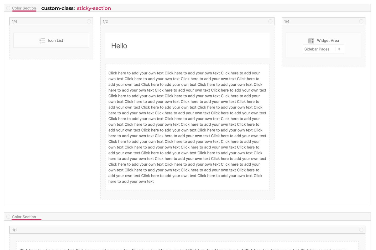
see code and example page:
https://webers-testseite.de/sandy-2/
This reply has been marked as private.
Hello, we have recently noticed that on both our development and prod site the “Hamburger” button is not displaying in the header on desktop but does on mobile & tablet view. Please find the images attached in Private Content for clarification & detail. Any help on resolving this would be greatly appreciated.
you can have on child-theme functions.php :
function add_slug_body_class( $classes ) {
global $post;
  if ( isset( $post ) ) {
    $classes[] = $post->post_type . '_' . $post->post_name;
  }
  return $classes;
}
add_filter( 'body_class', 'add_slug_body_class' );
then a post/portfolio/page will have on body (#top) an additional class f.e.
post_name-of-my-post
portfolio_name-of-my-post
page_name-of-my-post
maybe that helps you to better select.
On your example page it will then be : post_sand-box-post
why do i include to that class the post-type? because it might be that you have post and a page with same slug – then you can differ between them
if you do not need that – remove the instertion of the post-type:
function add_slug_body_class( $classes ) {
global $post;
  if ( isset( $post ) ) {
    $classes[] = $post->post_name;
  }
  return $classes;
}
add_filter( 'body_class', 'add_slug_body_class' );
because of there is only a layout with columns.
So please go and set a 1/1 column below that – to see how enfold handles the rest.
the first column now can be select via:
#top.postid-335 .entry-content-wrapper .submenu-col instead of #top.postid-335 .entry-content-wrapper .flex_column.first
on your layout there is no parent element that you can give a custom class to. So we had to work with page/post IDs
If you have that on all single posts – than we can select more global as f.e.: single-post etc.
PS : there is no slug of the post on default enfold.
Hello everyone, unfortunately the Paypal addon from Ninja Forms has recently stopped working with Enfold. if I set wordpress to a standard theme it works, if I activate it in Enfold, it no longer works. A customer sells his product through it, so I hope you can help. I assume it happened with the last or penultimate update, because before it worked without any problems.
Thanks in advance and greetings KiM
Hallo zusammen, leider funktioniert seit kurzem das Paypal Addon von Ninja Forms nicht mehr zusammen mit Enfold. setze ich wordpress auf ein standard Theme geht es, aktiviere in Enfold, geht es nicht mehr. Ein Kunde verkauft darüber sein Produkt, daher hoffe ich ihr könnt helfen. Ich vermute es ist mit dem letzten oder vorletzten Update passiert, denn zuvor ging es problemlos.
Danke im voraus und Gruß KiM
I think this is better.
I tryed my side it works
Best regards,
James
/* ———————————— */
/* ——- WIDGET MENU ——- */
/* ———————————— */
#top .widget ul {
font-size: large;
line-height: 121%;
}
/* —— personalize current page appearence —— */
#top .widget ul li.current_page_item {
background: url(“icon.png”) left no-repeat;
padding-left: 14px;
font-weight: 900;
}
/* link appareance of current page */
#top .widget ul li.current_page_item a,
#top .widget ul li.current_page_item a:hover {
background-color: #c7eafc;
padding: 0 4%;
border-radius: 9px;
}
/* —— HOVER links appareance (but current page) —— */
#top .widget ul a:hover {
background-color: gold;
padding: 0 4%;
border-radius: 9px;
}
/* deleting background color */
#top .widget ul.children a {
background-color: transparent;
padding: 0;
border-radius: 9px;
}
Hi Mike,
Thank you.
Yes, I finally found the solution on my own ;-)
I post here my CSS.
I know this can be improved.
However it could be usefull for other users that read this post so i hope this could help.
Best regards
James
/* ———————————— */
/* ——- WIDGET MENU PERSONALIZE ——- */
/* ———————————— */
#top .widget ul {
font-size: large;
line-height: 121%;
}
/* —— personalize current page link —— */
/*—- adding icon for current page link —- */
#top .widget ul li.current_page_item {
background-image: url(“icon.png”);
background-position: left;
background-repeat: no-repeat;
padding-left: 14px;
font-weight: 900 !important;
}
/*—- adding specific background color for current page —- */
/*—- and adding little spacing between letters —- */
#top .widget ul li.current_page_item a {
background-color: #c7eafc;
padding: 0% 4% 0% 4%;
letter-spacing: 0.007em;
border-radius: 9px;
}
/* — HOVER – adding background color for current page — */
#top .widget ul li.current_page_item a:hover {
background-color: #c7eafc;
padding: 0% 4% 0% 4%;
letter-spacing: 0.007em;
border-radius: 9px;
}
/* —— HOVER – appearence for all links (but current page) —— */
#top .widget ul a:hover {
background-color: gold;
padding: 0% 4% 0% 4% !important;
letter-spacing: 0.007em;
border-radius: 9px;
}
#top .widget ul.children inherit a {
background-color: none;
padding: 0%;
border-radius: 9px;
}
you can have both – column sticky and sidebar sticky
.responsive body#top.postid-335 {
    overflow-x: visible;
}

#top.postid-335 #wrap_all {
    overflow: visible;
}

@media only screen and (min-width: 768px){
  #top.postid-335 .entry-content-wrapper {
    display: flex;
    justify-content: space-around;
    align-items: flex-start;
  }

  #top.postid-335 .entry-content-wrapper .flex_column.first{
    position: -webkit-sticky !important;
    position: sticky !important;
    top: 100px;   /*** depends on your header-height after scrolling ***/
    min-width: 120px;  /*** you can have here absolute Values  ***/
  }
  #top.postid-335 #main div > .container {
    display: flex;
    justify-content: space-around;
    align-items: flex-start;
  }

  #top.postid-335 .sidebar{
    position: -webkit-sticky !important;
    position: sticky !important;
    top: 60px;   /*** depends on your header-height after scrolling ***/
    width: 30% !important; /*** you can have here different width than on global settings of Enfold ***/
  }
}
so for that page:
.responsive body#top.postid-335 {
    overflow-x: visible;
}

#top.postid-335 #wrap_all {
    overflow: visible;
}

@media only screen and (min-width: 768px){
  #top.postid-335 .entry-content-wrapper {
    display: flex;
    justify-content: space-around;
    align-items: flex-start;
  }

  #top.postid-335 .entry-content-wrapper .flex_column.first{
    position: -webkit-sticky !important;
    position: sticky !important;
    top: 100px;   /*** depends on your header-height after scrolling ***/
    min-width: 120px;  /*** you can have here absolute or relative Values ***/
  }
}
to be more selectiv using custom classes on some elements.
and keep in mind, that the element is sticky only in its parent container. If the parent container is the same height as the f.e. color-section it looks like the sticky element is fixed inside that container:
https://webers-testseite.de/sticky-elements/
PS: if you break your columns at 990px you had to adjust that media query inside the snippet.
Hello everyone,
I have read Guenni’s post but unfortunately I haven’t been able to make a sticky column.
Need help please.
From Guenni’s advices, I understood that there should be a parent container, like a color section.
But if I set a color section, I loose the right sidebar and I’d like to keep it that way.
On that sand-box post, I would like the left column (titles) remains sticky, while the main column scrolls.
That would be a bonus option if the right sidebar could remain sticky as well.
I can’t wait to try your css code…
-
This topic was modified 1 year, 1 month ago by
 rvga. Reason: mispelling correction
Hi,
I’ve edited the CSS a bit, please have a look again. Let’s do the mobile layout once you are happy with the desktop layout.
Best regards,
Rikard
Hey eggc,
Thank you for the inquiry.
You may need to adjust the top padding of the #main container. Please try this css code:
.html_header_top.html_header_sticky #top #wrap_all #main {
    padding-top: 0;
}
Let us know if the issue persists.
Best regards,
Ismael
Hey Kate,
Thank you for the inquiry.
Please use the following css code and make sure to toggle or temporarily disable the Enfold > Performance > File Compression settings afterward.
#top .main_color .av-catalogue-content {
    color: #ececec;
}
Let us know of the result.
Best regards,
Ismael
Hey schweg33,
Thank you for the inquiry.
We could apply a minimum height to the div element inside the text block. Please try this css code:
#top .av-6xdhph-d676d236253fe9da7b5542127b7590e9 .flex_column .av_textblock_section > div > div {
  min-height: 540px !important;
}

@media only screen and (max-width: 1300px) {
  #top .av-6xdhph-d676d236253fe9da7b5542127b7590e9 .flex_column .av_textblock_section > div > div {
    min-height: 600px !important;
  }
}
Let us know the result.
Best regards,
Ismael
Hey schweg33,
Thank you for the inquiry.
You can start with this css code:
@media only screen and (max-width: 767px) {

  /* Add your Mobile Styles here */
  #top .av-m1yjw3j3-8de8ef07635f179e0beedc245c4c38a7 {
    position: fixed !important;
    right: 0;
    top: 10px;
    width: 50px;
  }
}
Please check this screenshot:
View post on imgur.com
Let us know if you need more help.
Best regards,
Ismael
Hey whdsolutions,
Click Screen Options in the top right hand corner of the screen and select to show Portfolio items there.
Best regards,
Rikard
Dear enfold support team
I implemented the social media icons in my enfold mobile burger menu
with code from Mike
https://kriesi.at/support/topic/fullwith-dropdown-unter-hamburger-menu-mit-social-media-icons/#post-1266922
The social icons are only shown in the burger mobile menu if the user has an account and is logged in.
How can I fix this?
Regards,
Michael
Thanks,
i deactivated all plugins once and it did not change.
I have added some css code from here.
This is in the quick css:
.avia_textblock p a, .avia_textblock li a {
  text-decoration:underline !important;
}
@media only screen and (max-width: 767px) {
.responsive #header_main .container {
    height: 50px !important;
}
.responsive .logo a {
    vertical-align: top !important;
}
.responsive .logo img {
    max-height: 50px !important;
}
@media only screen and (max-width: 1270px) {
#top #main .avia-gallery .avia-gallery-big-inner {
    height: auto;
}
}
And added something regarded lightbox and google conversion but cannot find anymore.
Does that help?
Hi,
Thank you for the update.
Please remove the previous css code:
.home #av-layout-grid-5 .avia-button {
  width: 230px;
  min-width: 230px;
}
Replace it with:
#top .avia-buttonrow-wrap.av-ku7mrxsc-40fdfe89f208e1f1b8a114dfc53feee8 {
    display: flex;
}

#top .avia-buttonrow-wrap.av-ku7mrxsc-40fdfe89f208e1f1b8a114dfc53feee8 .avia-button {
    width: 16%;
    padding: 15px 10px 13px;
}
Let us know the result.
Best regards,
Ismael
Hi,
I believe that I answered your question in this thread: https://kriesi.at/support/topic/categories-with-blog/
If so, lets close this one, or ask more in the first one and we will close this duplicate thread.
Best regards,
Mike
Hey MysticMimi,
I believe that I answered your question in this thread: https://kriesi.at/support/topic/categories-with-blog/
If so, lets close this one, or ask more in the first one and we will close this duplicate thread.
Best regards,
Mike
Hey MysticMimi,
I believe that I answered your question in this thread: https://kriesi.at/support/topic/categories-with-blog/
If so, lets close this one, or ask more in the first one and we will close this duplicate thread.
Best regards,
Mike
Great, I did that. I chose 3 columns, but I assumed it would go across the page. Also, the sidebar is still not up top. Did I do something wrong?
I really appreciate your help with this!