Hey mosaic,
Thank you for the inquiry.
You can add this code in the functions.php file to adjust the default size of the featured image:
function avf_customization_modify_thumb_size( $size ) {
      $size['entry_without_sidebar'] = array( 'width' => 9999, 'height' => 9999 );
      $size['entry_with_sidebar'] = array( 'width' => 9999, 'height' => 9999 );
      return $size;
}

add_filter( 'avf_modify_thumb_size', 'avf_customization_modify_thumb_size', 10, 1 );
After adding the filter or code, you’ll have to regenerate the thumbnails or upload the images again:
— https://wordpress.org/plugins/regenerate-thumbnails/
IMPORTANT: Please make sure to create a site backup or restore point before proceeding.
Related thread: https://kriesi.at/support/topic/full-image-on-single-post/#post-1471379
Best regards,
Ismael
Hey ditteditte,
Thank you for the inquiry.
Based on the class parameter in the shortcode, the selector should be “.only-desktop”. Please replace the css with the following code:
@media only screen and (max-width: 768px) {
  .only-desktop {
    display: none !important;
  }
}
Best regards,
Ismael
That’s not working here are the 2 sections of code I have for the header meta phone area
#top #header_meta .container {
display: flex!Important;
justify-content: center!Important;
min-height: 30px;
height: 50px;
font-size:18px!Important;
}
#header_meta .phone-info {
color: #ffffff;
padding-top: 15px;
text-align:center!Important;
font-size:18px!Important;
}
I have recently updated our website (WordPress, Enfold theme), now this page
uses three slideshows. They work fine on PCs, but are not displayed from an Android browser with less width. This mainly affects smartphones and in case tablets. I have not made any settings in the slideshow that it should not be displayed on mobile devices. What could be the reason? Thank you.
I have checked couple of lazy loading seetings (based on https://kriesi.at/support/topic/slide-show-volle-breite-wird-auf-mobilen-geraten-nicht-angezeigt/), but could not find a solution so far.
Hey Freek,
I see you have the error: Uncaught TypeError: $ is not a function
your top half of the code is javascript, but the second half is jQuery which needs to be wrapped with this:
(function($) {
//your code here
})(jQuery);
like this:
<style>
.bootstrap .player-selection-ul li.player-selection-li{
padding: 6px 15px;
line-height: 1;
}
</style>
<link href="https://nl.escapeall.com/Content/API/styles.css" rel="stylesheet">
<link href="https://nl.escapeall.com/CustomCss/fun-thrills.css" rel="stylesheet">
<script type="text/javascript">
function updatePlayersOptions(element) {
    var jThis = ea_jQuery(element);
    const selectedLanes = parseInt(jThis.find('option:selected').data('quantity')) || 0;
    const maxPlayers = selectedLanes * 6;
    jThis.closest(".alert-reservation-added").find('.extra-options-row-2 option').each(function () {
        const playerCount = parseInt(ea_jQuery(this).val()) || 0;
        if (playerCount > maxPlayers) {
            ea_jQuery(this).prop('disabled', true).hide();
        } else {
            ea_jQuery(this).prop('disabled', false).show();
        }
    });
}
(function($) {
$(document).ready(function() {
$.getScript("https://nl.escapeall.com/Scripts/API/all.js", function (data, textStatus, jqxhr) {
GetBookingCalendra('#BookingId', {
        ServiceId: ['23fa314b-449e-4881-9b8d-3674fa6bdeab'],
        lang: 'nl',
        Template: 9,
        QuantitySelectionAsPlayers: true,
        FirstWeekDay: 'Monday',
        InitialQuantity: 1,
        successReservationSelected: function (reserv) {
            console.log('hello');
        },
        success: function () {
            ea_jQuery('.choose-player-panel h4').text('Aantal banen');
            ea_jQuery('.service-time-selection-panel h4').text('Tijd en Prijs');
            ea_jQuery('.player-selection-ul li[data-quantity="1"]').html('1<br/><small>1-6 spelers</small>');
            ea_jQuery('.player-selection-ul li[data-quantity="2"]').html('2<br/><small>2-12 spelers</small>');
            ea_jQuery('.player-selection-ul li[data-quantity="3"]').html('3<br/><small>3-18 spelers</small>');
            ea_jQuery('.player-selection-ul li[data-quantity="4"]').html('4<br/><small>4-24 spelers</small>');
            ea_jQuery('.service-time-selection-panel h4').text(' Activiteit en tijd');
            ea_jQuery(document).on('change', '.multiple-reservation-price', function (e) {
                updatePlayersOptions(this);
            });
        },
        successReservationSelected: function (toBeAppended) {
            updatePlayersOptions(ea_jQuery(".multiple-reservation-price", toBeAppended));
        }
    });
});
});
})(jQuery);
</script>
<div id="BookingId"></div>
<div class="escapeall">Booking System powered by: <a href="https://nl.escapeall.com/">Escape<span>All</span></a></div>
Best regards,
Mike
Hi,
I want to add a second menu underneath the main menu. To do so, I added this piece of code to my functions.php file.
php
add_action(‘ava_after_main_container’, ‘custom_submenu’);
function custom_submenu() {
$classes = get_body_class();
if ((in_array(‘woocommerce-page’, $classes)) || (in_array(‘archive’, $classes))) {
echo do_shortcode(“[av_submenu which_menu='' menu='3251' position='right' sticky='aviaTBsticky' color='footer_color' mobile='disabled' mobile_switch='av-switch-768' alb_description='' id='' custom_class='only-desktop' template_class='' av_uid='av-m8fv68yn' sc_version='1.0']
[av_submenu_item title='Menu Item 1' button_style='' link='' link_dynamic='' linktarget='' title_attr='' av_uid='av-d3kl3k2' sc_version='1.0']
[av_submenu_item title='Menu Item 2' button_style='' link='' link_dynamic='' linktarget='' title_attr='' av_uid='av-683en9e' sc_version='1.0']
[/av_submenu]“);
}
}
This is working perfectly on desktops. However, on mobile devices, it breaks the layout on WooCommerce pages—my two columns of products are squeezed to one side, taking up only half of the screen while leaving the other half blank.
Since I don’t want the menu to appear on mobile devices, I tried hiding it with this CSS:
css
@media only screen and (max-width: 768px) {
.desktop-only {
display: none !important;
}
}
But it doesn’t work. Can you help me figure out a way to hide the full-width submenu on mobile devices so it doesn’t break the layout?
Hi,
Thanks for your feedback and glad we could solve the problem.
Enjoy the theme and have a great day.
Feel free to come back when you need further assistance – simply open a new topic.
Best regards,
Günter
PS. If you can spare a few minutes please leave a positive review at our product page https://themeforest.net/item/enfold-responsive-multipurpose-theme/reviews/4519990
thanks in advance.
Hey amanda-mdllc,
Thank you for the inquiry.
Try to add this code to the Quick CSS field to center-align the phone info.
#top #header_meta .container {
    display: flex;
    justify-content: center;
}
Best regards,
Ismael
Hi,
Thank you for the update.
We added this code in the Quick CSS field to adjust the size and color of the icons on Safari.
#top #menu-item-search .avia-svg-icon svg, #top .av-logo-container .social_bookmarks li a svg  {
    width: 18px;
    height: 18px;
    color: white;
    fill: white;
}
Result:
View post on imgur.com
Best regards,
Ismael
Hi,
Thank you for the update.
Try to add this css code to disable the animation of the masonry items and make them visible immediately on page load.
#top .av-masonry-image-container, #top .av-inner-masonry-content, #top .av-masonry-pagination {
    transition: none;
}

#top .av-inner-masonry {
    transform: translateZ(0px) translateY(0px) rotateX(0deg);
    opacity: 1;
    animation: none;
}

#top .av-masonry-entry {
    opacity: 1;
    visibility: visible;
}
Best regards,
Ismael
Hi!
Thank you for the inquiry.
You can download the fontello zip file from the following thread and follow the instructions in order to add the new social icon in the list: https://kriesi.at/support/topic/setting-up-two-new-social-profiles-under-enfold-7-1/#post-1479658
Best regards,
Ismael
Hey Christopher,
Thank you for the inquiry.
We added this code in the Quick CSS field to hide the extra language switcher in the main header.
#header_main .avia_wpml_language_switch {
    display: none;
}
Please make sure to purge the cache before testing.
Best regards,
Ismael
Hi,
Thanks for the update. Please let us know if you should need any further help on the topic, or if we can close it.
Best regards,
Rikard
Thank you! topic can be closed!
HI Rikard,
it’s fine to close this topic – thanks so much for your help :)
best
Eugenie
Good Morning I am trying to center the top socket phone info area. I have the code in there and I’ve tried several different things and I cannot seem to get it to corporate. Can you please help me? Details in the private link area.
It is quite simple: for now the header simply scrolls with content on all devices since the client needs the page to function tomorrow. It is doing that now but there is still too much space between header and content. When I reduce the padding of the top of the text disappears. Please send other sollution.
Dear Enfoldteam,
i tried to set the Header on logo left, TopMenu left. Logo and the normal text are in one line on the left side. The Topmenu is indented to about 20px, i guess on behalft of the normal distance between every item, this must be the half of this distance.
Anyway it does not look good. Are there any options to fix this?
Thanks a lot!
Regards,
Constanze
if header scrolls away – think of correcting the padding-top for #main
_____________
PS: I’m sure you’ll agree that it’s best to save this for another day, until the moment you have a clear idea of what your header should look like and how it should behave. I know you’re working on it, but just be aware that many of the solutions found wouldn’t work with a shrinking header. I’m sorry to say that I think we’ve lost time.
The next problem we might encounter is with mobile devices. Unfortunately, Enfold doesn’t provide a shrinking header for these, so it uses the scroll variant. But don’t worry, there’s a way around this! If we can adjust this (using a child theme avia-snippet-sticky-header.js), we can make sure your header reacts as you like it. So, what do you think, how big should it be at the start (maybe relative to the screen height)? And then, how small should it get?
Is this still the usual support we’re dealing with? You might want to consider getting in touch with a web design freelancer. ;)
I would image you have done a basic check on this function.
The problem does not occur if you click VIEW PAGE from the bar at the top of the page.
But it does if you reload the page or load the page from front end cache when signed out.
Something is preventing the animation on the text running.
I’ve swapped the elements to colour sections with background images instead of full width sliders which has solved the issue.
But this is still a bug present in Enfold.
by the way: on former times it is better to place the anchor-tag inside the heading-tag (as enfold do with f.e. entry-title etc.)
since html5 / xhtml this is not mandatory. You can have it vice-versa:
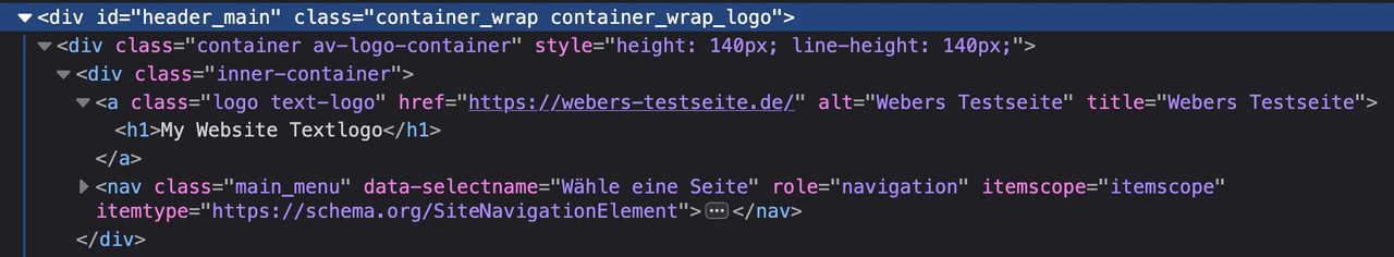
function use_text_logo_only($logo){
    $link = apply_filters( 'avf_logo_link', home_url( '/' ) );
    $logo_tag = "h1";
    $logo_heading = "My Website Textlogo";
    $alt = get_bloginfo( 'name' );
    $title = get_bloginfo( 'name' );

    $logo = '<a class="logo text-logo" href="'.$link.'" alt="'.$alt.'" title="'.$title.'"><'.$logo_tag.'>'  .$logo_heading.  '</'.$logo_tag.'></a>';
    return $logo;
}
add_filter('avf_logo_final_output','use_text_logo_only');
to aline that heading with f.e. navigation to the right some css is needed:
#top .logo.text-logo  {
  display: flex;
  justify-content: left;
  align-items: center;
  width: auto;
}

#top .logo.text-logo h1  {
  margin: 0 !important;
  font-size: 30px;
}
Hello,
I am trying to disable the standard language flags in the Header Top Bar (frontend).
I managed to hide them via css at first, but they appeard again, after activating a flag in the main menu list.
I only want a flag to appear under the last menu item not in the top bar.
The problem appears only on the german version of the site.
I have tried varios solutions (CSS and PHP) i found in your forum but without success.
I contacted WMPL support but they have been unable to help, because it seems to be part of Enfold.
Tried this in functions.php:
//————————————————————–
// Remove Enfold Language Switcher
//————————————————————–
function avia_remove_main_menu_flags(){
global $avia_WPML;
add_filter( ‘wp_nav_menu_items’, ‘avia_append_lang_flags’, 9999, 2 );
remove_filter( ‘wp_nav_menu_items’, [ ‘avia_WPML’, ‘handler_append_lang_flags’ ], 9998, 2 );
remove_filter( ‘avf_fallback_menu_items’, [ ‘avia_WPML’, ‘handler_append_lang_flags’ ], 9998, 2 );
remove_action( ‘avia_meta_header’, ‘avia_wpml_language_switch’, 10 );
remove_action( ‘ava_main_header_sidebar’, ‘avia_wpml_language_switch’, 10 );
}
add_action(‘init’,’avia_remove_main_menu_flags’, 9999);
Best regards,
Christopher
Hi,
Thank you for the short clip.
The extra space is caused by this css rule:
.html_header_top #top #main {
    padding-top: 300px !important;
}
Adjusting the top padding to 230px should remove the unwanted space.
Best regards,
Ismael
forget about that – use: https://kriesi.at/support/topic/how-to-make-the-text-logo-h1/#post-1479660
no subtext is needed!
on shrinking header you need:
#top .logo.text-logo,
#top .logo.text-logo a {
  display: flex;
  justify-content: left;
  align-items: center;
  width: auto;
  margin: 0 !important;
}
In the Avia Layout Builder, I’m using the Table Content Element on a page. On the Styling tab, I’ve selected Use the table as a Pricing Table + Default + Show empty cells. At this point, the table has a Heading Row at the top, followed by two Default Rows, with two columns.
When viewed, the Heading Row has a red background with white letters.
My question is, how are the colors (background, text) of the Heading Row controlled? Is there any way to adjust those colors, perhaps in the Enfold theme options? Or . . .?
While I’m at it, I searched for documentation for how to use the Table Content Element in the Enfold documentation. Couldn’t find anything. Is there any such “how to” documentation?
Thanks! Lance
Hi,
I tested your fontello-d73127ed.zip and added this php code to my functions.php
function avia_add_custom_icon($icons) {
$icons['mastodon'] = array( 'font' =>'mastodon-bluesky', 'icon' => 'ue800');
$icons['bluesky'] = array( 'font' =>'mastodon-bluesky', 'icon' => 'ue801');
return $icons;
}
add_filter('avf_default_icons','avia_add_custom_icon', 10, 1);

function avia_add_custom_social_icon($icons) {
$icons['mastodon'] = 'mastodon';
$icons['bluesky'] = 'bluesky';
return $icons;
}
add_filter('avf_social_icons_options','avia_add_custom_social_icon', 10, 1);
add_filter('avia_social_share_link_arguments', 'avia_add_social_share_link_arguments', 10, 1);
function avia_add_social_share_link_arguments($args){
    $mastodon = array('mastodon' => array("encode"=>true, "encode_urls"=>false, "pattern" => "https://www.mastodon.com/", 'label' => __("Share on mastodon",'avia_framework')));
	$bluesky = array('bluesky' => array("encode"=>true, "encode_urls"=>false, "pattern" => "https://www.bluesky.com/", 'label' => __("Share on bluesky",'avia_framework')));
    $args = array_merge($mastodon,$bluesky, $args);
    return $args;
}
and this css to my quick css:
#top #wrap_all .av-social-link-mastodon:hover a{
    color:#fff;
    background-color:blue;
}
#top #wrap_all .av-social-link-bluesky:hover a{
    color:#fff;
    background-color:blue;
}
and they both show in my social profiles:

and in my “Profile Links At The Bottom Of Your Blog Post”

and in the header:

and in the “Share this entry” on blog posts:

please give this a try.
Best regards,
Mike
Please feel free to close this topic. Thank you.
Hello, The Slider image on my homepage is skewed. It looks fine on desktop and tablet but not mobile. I’m not sure if this is being caused by some css code. I have included all the css from my current site in private.
you can do that via jQuery – but if that is the right way to influence SEO ? – i guess on seo purpose the solution from https://kriesi.at/support/topic/how-to-make-the-text-logo-h1/#post-1479497
is ok.
Edit : use the snippet on bottom.