-
Search Results
-
Hi all, It’s been a while since I’ve had an Enfold question. i hope this finds you all well. On our property pages for homes for sale, we use the photo element for mobile, and then for desktop we use a color section with a background image that fills the screen. It provides a beautiful immersive effect, an d under “background attachment” setting I use “scroll” and “fixed” settings.
For the fixed setting, it provides a really cool effect where the photos appear from the bottom of the screen and cover the one in view. It looks great on desktop I think. We just discovered that if you view these pages on an ipad in landscape mode, the color sections with the fixed backgrounds are highly distorted and the photo does not display. You can see an example of this here:
https://www.thomashenthorne.com/6-bay-laurel-lane-san-rafael/
Questions:
1. Is this a bug that can be fixed? Or perhaps Apple has updated their ios and Enfold needs an update to match their changes?
2. If not and this is native to Apple, is there a way to keep the “fixed” on desktop but switch to “scroll” on iPad without messing up how it works on mobile (which is just photos, no color sections)? I don’t want to ruin the desktop experience just for iPads in landscape if I don’t have to.I seem to recall that this worked fine in the past but frankly I don’t use my iPad very much so I could be wrong.
Thanks,
RobTopic: Burger menu display
Hi,
Sorry to bother you again, but I have another problem that I can’t solve.
On mobile and tablet, the search bar is displayed above the menu when it is opened. This anomaly is not present on desktop. I tried several CSS codes (z-index) but nothing changes, can you help me?
Thank you for your help,
Topic: Tablet version Grid Row
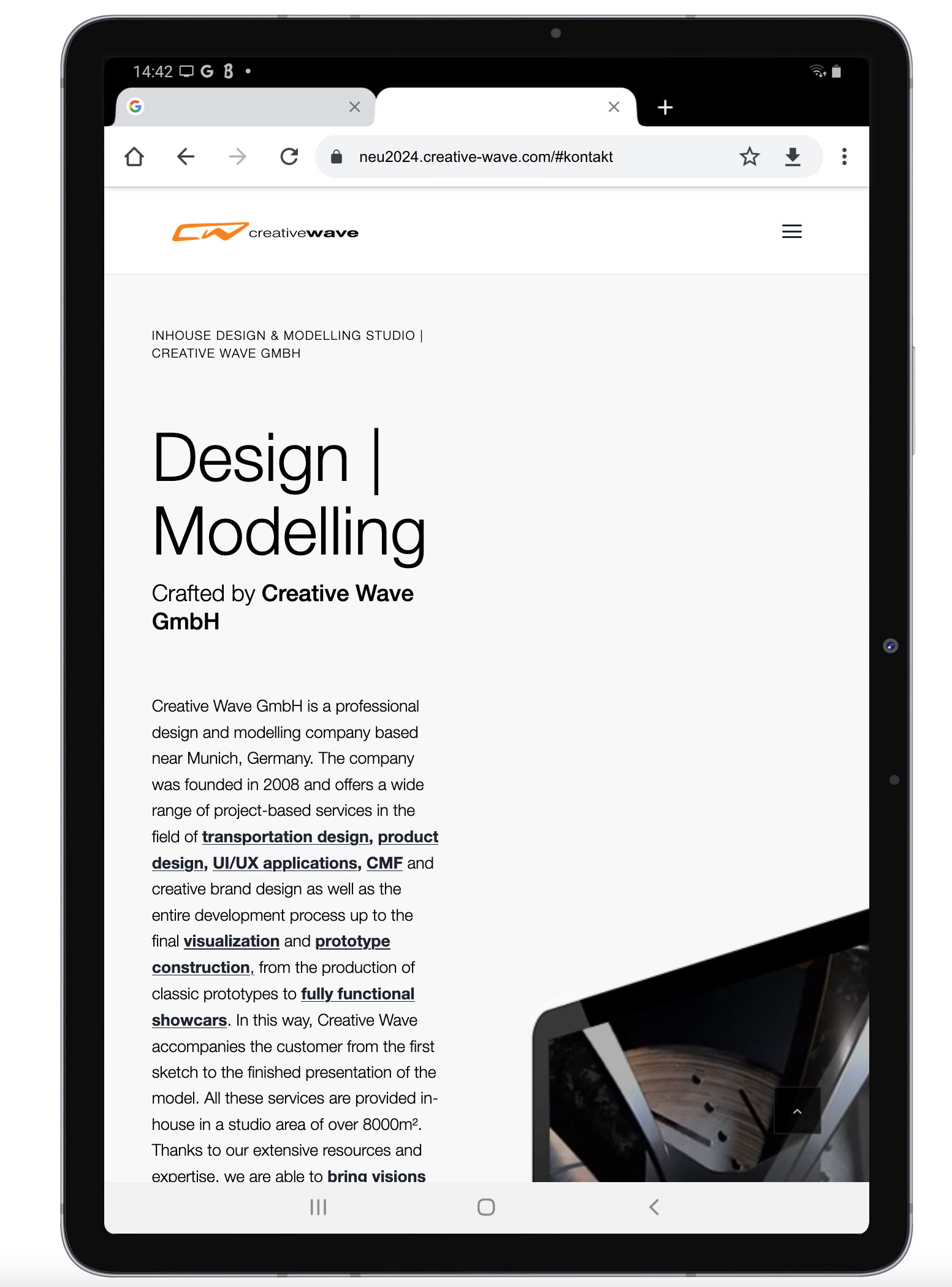
Dear Support Team
On the website http://neu2024.creative-wave.com/#home-enter, for example, we have a gridrow that unfortunately does not work correctly on the tablet – both landscape and portrait format:
see screenshots:
Portrait: http://neu2024.creative-wave.com/support/cells.jpg
Here the cells should not be displayed next to each other but one below the other.
Landscape: http://neu2024.creative-wave.com/support/cell2.jpg
Although I have entered the inner spacing settings all around 50px for the tablet landscape, it is not executed and the strong indentation of the desktop version is also displayed here.Since I asked you about a similar problem on another website some time ago and you solved it perfectly back then, I applied the solution script from that post (Question number 2) > (see link: https://kriesi.at/support/topic/mobile-version-tablet-landcape-not-working-well/) to this website as well. Unfortunately without success.
We have the problem umpteen times on the website, since the website is very extensive, this is now very often. We also have the same problem on the home page further down: http://neu2024.creative-wave.com/#kontaktCould you please help me? I have also searched through the CSS, but have not found any clue as to what causes this…
Best regards, Diana
Topic: White bar at the top
Hello, I can’t figure out how to remove the top bar on the site. Can you take a look and help?
And also how to make the social media icons white, instead of black, next to the burger menu icon.
Thanks!
NSFW
I am currently using Woocommerce “sitewide notice” to display message at top of page, but it uses to much script and slows down the site.
How can I just add a top bar to the website, that displays text, like the currently notice? It doesn’t need to “dismiss”.
Thanks!
Topic: Model parallax
Hello
I’d like my logo (design and name) to have the same animation as in the parallax demo, but for it to be at the bottom left of the image (here it’s at the top and centered).
Another problem is the shadow, which is placed behind the PNG image instead of behind the logo and text. How can I resolve these two issues?Thank you for your help.
Hallo Enfold-Team,
ich verwende Enfold mit WooCommerce und möchte die Sortieroptionen im Produktkatalog auf „Datum“ (Neueste zuerst) beschränken. Alle anderen Sortieroptionen – insbesondere „Standard“ (menu_order) – sollen vollständig entfernt werden, da sie für meinen Anwendungsfall nicht sinnvoll sind.
Ich habe den folgenden Code auf Basis eures Forenbeitrags hier verwendet:
Das brachte uns hierhin:
https://woo.gwup.org/shop/ (nur noch zwei Optionen)Problem:
Trotz Entfernung von menu_order über alle relevanten Filter erscheint im Frontend weiterhin die Sortieroption „Standard“ PLUS „Datum“ – das ist redundant weil der Standard bereits “nach Datum” ist..
Die tatsächliche Standardsortierung funktioniert korrekt (neueste Produkte zuerst), aber das Dropdown zeigt weiterhin „Standard“ an.Frage:
Gibt es in Enfold (ggf. via avia_woocommerce_catalog_ordering oder internem Template) noch eine Stelle, die menu_order oder „Standard“ manuell wieder hinzufügt oder ignoriert diese Filter vollständig?Ich wäre für einen konkreten Hinweis oder einen override-sicheren Lösungsansatz sehr dankbar.
Mit freundlichen Grüßen
Andrè————————————————————-
Hi Enfold team,
I’m using Enfold with WooCommerce and would like to restrict the product sorting dropdown to show only “Date” (newest first). All other options should be removed, as they are not relevant for our shop.
Based on your support forum post i used the code from here:
That is the result
https://woo.gwup.org/shop/ ( only two sortings left)The issue:
Despite all filters removing menu_order, the “Standard” option is still visible in the sorting dropdown alongside “Date”.
This is redundant since the standard is already set to “date” and we dont need any other sort option than “date”
The sorting functionality works correctly — products are sorted by date as expected — but the “Standard” label is still displayed and selectable in the frontend.Question:
Is there any part of Enfold (e.g. avia_woocommerce_catalog_ordering or a template override) that forcibly adds back the “Standard” entry or bypasses the WooCommerce filters?I would appreciate any advice or a clean and update-safe way to fully remove that option.
Best regards,
Andrè

