Hey Munford,
Using a header.php in your child theme will often cause errors when you update as the new updated header.php will not be used.
Please don’t add a header.php or footer.php to your child theme as this is the top reason for errors after updating, if you have a specific piece of code that you need to add to your header it is better to add it in your child theme functions.php, but I don’t see this in the code above.
Best regards,
Mike
see here a working example: https://webers-testseite.de/mie2/
these are three color-section ( with small padding )
if you do not like to have it full-width just remove that rule:
#top .avia-section.grid-layout .container {
  max-width: 100%;
  /*! padding: 0; */
}
for me the responsive alternative is nicer. you see how it works – the width of the columns is globaly set to : unset – so 1/3 is not working here – the grid-template-columns determines the width now.
On that alternative responsive behaviour – we got two columns then – first with 1part (fraction) the second column with 2parts.
As on former table layout we can make a “colspan” if we fill those grid-cells this way:
grid-template-areas:
      "feld2 feld1"
      "feld3 feld3";
it is like this on former table layout:
<table>
	<tbody>
		<tr>
			<td>feld2</td>
			<td>feld1</td>
		</tr>
		<tr>
			<td colspan="2">feld3</td>
		</tr>
	</tbody>
</table>
but now you can have a very flexible layout with responsive options
PS: The advantage of a layout like this is that it can be styled with media queries. Try it with tables (this is a remnant from the old days)
Hey Akhurst,
To increse the font sizes for the price, sku, & categories, try this CSS in your Enfold Theme Options ▸ General Styling ▸ Quick CSS field:
#top.single-product .price span {
	font-size: 30px;
}
#top.single-product .main_color .product_meta span {
	font-size: 30px;
}
adjust the font size to suit.
To remove the related products, try adding this code to the end of your child theme functions.php file in Appearance ▸ Editor:
function remove_woo_relate_products(){
    remove_action( 'woocommerce_after_single_product_summary', 'avia_woocommerce_output_related_products', 20);
}
add_action('init', 'remove_woo_relate_products', 10);
Please ensure to copy the code from the forum and not an email notification so the symbols are not converted.
Best regards,
Mike
Hello, in the mobile version, I would like the tab section to be a bit wider. As you can see in the screenshot, it’s not fully aligned with the other content.

Also, in the mobile version, the active tab has a purple background color, which I think looks great. In the desktop version, this isn’t the case. How can I change that?
Best regards
if you need to do it that way with background-images in columns: give a custom-class to those columns f.e. : with-bg-overlay
and use the psuedo-container before for that:
#top .flex_column.with-bg-overlay::before {
  content: "";
  position: absolute;
  display: block;
  top: 0;
  left: 0;
  width: 100%;
  height: 100%;
  background-color: rgba(0,0,0,0.3);
  visibility: visible;
  z-index: -1;
}
see both variants again on: https://webers-testseite.de/adamad/
PS there is a declaration with backdrop-filter – so you can blur the effect – but that is optional.
PPS: see responsive behaviour on both cases !
Hi,
you can close the topic.
Best regards,
Alessio
Hi,
That is the default behavior of the pagination, which is why it’s recommended to place all post elements at the very top of the page. If you need the document to scroll to the appropriate section on load, you can try this modification.
— https://kriesi.at/support/topic/pagination-to-open-at-the-same-anchor-point-and-not-at-the-beginning-of-the-page/#post-1476867
Best regards,
Ismael
Hey limedrop,
Thank you for the inquiry.
Edit the Grid Row element, go to the Advanced > Developer Settings, then place the value “av-layout-grid-overflow” in the Custom CSS Class field. In the Enfold > General Styling > Quick CSS field, add this css code to put the grid above the layer slider:
#top #wrap_all .av-layout-grid-overflow {
    z-index: 1000;
}
Best regards,
Ismael
Hi,
I added this css:
.category .title_container h1 a {
font-size: 300%!important;
line-height: 55px;
font-family: "sacramento", cursive;
font-weight: 400;
}
and this code to your to the end of your child theme functions.php file in Appearance ▸ Editor:
function custom_script() { ?>
  <script>
(function($){
  $('#top.category .title_container h1.main-title.entry-title  a').contents().filter(function() {
    return this.nodeType == 3
  }).each(function(){
    this.textContent = this.textContent.replace('Archive for category:','');
    this.textContent = this.textContent.replace('Tag Archive for:','');
    this.textContent = this.textContent.replace('Archive for:','');
  });
  })(jQuery);
</script>
  <?php
}
add_action( 'wp_footer', 'custom_script', 99 );
the result now:

Please clear your browser cache and check.
Best regards,
Mike
Hi,
Great, I’m glad that you found a solution and thanks for sharing. Please let us know if you should need any further help on the topic, or if we can close it.
Best regards,
Rikard
Hey jscarlett,
Please try the following in Quick CSS under Enfold->General Styling:
#top #header_meta .phone-info {
  line-height: inherit;
}
Best regards,
Rikard
Hi
I needed to add a small Sign In button on a website, onto the top bar underneath the strapline on a mobile and to the right on desktop view.
I managed to add the button, but it is too large.
There are three buttons on the homepage and more buttons inside the site and I do not want CSS changes to affect the other buttons.
How can I change the size of the Sign In button without changing the size of the other buttons?
Thanks
Jane
-
This topic was modified 1 year ago by
 jscarlett.
I amusing the Advanced layer slier in top. But how can I make two boxes appear on top of the slider?
Hi,
Thank you for the update.
You can use this css code to adjust the style of the pagination:
#top .pagination .current, #top .pagination a, #top .fullsize .template-blog .pagination a {
    height: 50px;
    width: 50px;
    line-height: 50px;
    margin-right: 6px;
    box-shadow: 0px 0px 1px 0px rgba(0,0,0,0.2);
    font-size: 18px;
}

#top .main_color .pagination a {
    background-color: #f2f1ef;
    color: #000000;
}

#top .main_color .pagination .current {
    background-color: #d5d5d5;
}
Best regards,
Ismael
Hey kevinraposo7,
Thank you for the inquiry.
Did you set the Slide Animation > Slideshow Transition to Slide (sideways/up/down)? If so, you can add this css code to disable the initial fade-in transition of the slider.
#top .avia-slideshow-inner li {
  opacity: 1 !important;
}
This will not work if Fade is selected for the Slideshow Transition.
Best regards,
Ismael
Hi,
Thank you for the update.
The menu is set to be below the logo, so this has be adjusted with css. To make sure that the search bar is still visible on mobile view and that the burger menu is correctly placed, please add this css code:
@media only screen and (max-width: 768px) {

  /* Add your Mobile Styles here */
  .responsive #header_main_alternate {
    display: block;
  }

  .responsive #top #header_main_alternate .av-main-nav .menu-item-avia-special {
    display: none !important;
  }

  .responsive #top #header .main_menu {
    width: auto !important;
  }
}
View post on imgur.com
Best regards,
Ismael
Hi,
I disabled your Enfold Theme Options ▸ Header ▸ Header Layout ▸ Header Title and Breadcrumbs ▸ Display only title and added this to your code to the end of your child theme functions.php file in Appearance ▸ Editor:
add_filter('avf_header_setting_filter', 'avf_header_setting_filter_mod', 50, 1);
function avf_header_setting_filter_mod($header_settings) {
    if (is_tax() || is_archive()) {
        $header_settings['header_title_bar'] = "title_bar";
    }
    return $header_settings;
}
to only show the title on your category pages.
and I added this css:
.category .container_wrap_first {
	border: none;
}
.category .title_container {
	text-align: center;
	padding-top: 50px;
	background-color: #f2f0eb !important;
}
.category .title_container h1 a {
	font-weight: 600 !important;
	line-height: 1.3em;
	font-size: 30px;
}
so compared to one of you posts:

your category title looks like this:

But note that they are both H1, I don’t see H2 like you asked.
Best regards,
Mike
 jessica venturi
Guest
In my last message as a guest, where I explained the problems related to being unable to access my account (#1481091), Rikard (Keymaster) asked if I authorized you to change the email I had written incorrectly to the current one: (Email address hidden if logged out) . Absolutely! and thank you very much, but I can’t reply to the topic because I can’t access my account at the moment, so I hope to resolve this with this post… thanks again.
jessica venturiGuest
In my last message as a guest, where I explained the problems related to being unable to access my account (#1481091), Rikard (Keymaster) asked if I authorized you to change the email I had written incorrectly to the current one: (Email address hidden if logged out) . Absolutely! and thank you very much, but I can’t reply to the topic because I can’t access my account at the moment, so I hope to resolve this with this post… thanks again.
Ismael,
Thank you very much for your solution. I have added your shortcode generator in functions.php of the child-theme.
function av_wpbs_wpml_cb() {
    $lang = apply_filters('wpml_current_language', null);
    $id = 1;
    $language = 'en';

    switch ($lang) {
        case 'nl':
            $id = 1;
            $language = 'nl';
            break;
        case 'en':
            $id = 1;
            $language = 'en';
            break;
        case 'fr':
            $id = 1;
            $language = 'de';
            break;
        default:
            $id = 1;
            $language = 'nl';
            break;
    }

    return do_shortcode('[wpbs id="' . esc_attr($id) . '" language="' . esc_attr($lang) . '" show_prices="yes" title="no" legend="yes" legend_position="side" display="1" year="0" month="0" start="1" dropdown="yes" jump="no" history="1" tooltip="1" highlighttoday="no" weeknumbers="no" show_first_available_date="no" form_id="1" form_position="bottom" auto_pending="yes" selection_type="multiple" selection_style="split" minimum_days="7" maximum_days="0" booking_start_day="6" booking_end_day="6" show_date_selection="no"]');

}
add_shortcode('av_wpbs_wpml', 'av_wpbs_wpml_cb');
Then added the shortcode to a text block:
[av_wpbs_wpml]
Test URL:
https://villasari.de/nl/test-shortcode/
I get this error:
Fatal error: Uncaught TypeError: ksort(): Argument #1 ($array) must be of type array, null given in /var/www/vhosts/villasari.de/httpdocs/wp-content/plugins/multilingual-tools-2.2.6/inc/class-mltools-shortcode-attribute-filter.php:86 Stack trace: #0 /var/www/vhosts/villasari.de/httpdocs/wp-content/plugins/multilingual-tools-2.2.6/inc/class-mltools-shortcode-attribute-filter.php(86): ksort() #1 /var/www/vhosts/villasari.de/httpdocs/wp-content/plugins/multilingual-tools-2.2.6/inc/class-mltools-shortcode-attribute-filter.php(66): MLTools_Shortcode_Attribute_Filter->add_tag() #2 /var/www/vhosts/villasari.de/httpdocs/wp-includes/class-wp-hook.php(326): MLTools_Shortcode_Attribute_Filter->do_shortcode_tag_filter() #3 /var/www/vhosts/villasari.de/httpdocs/wp-includes/plugin.php(205): WP_Hook->apply_filters() #4 /var/www/vhosts/villasari.de/httpdocs/wp-includes/shortcodes.php(447): apply_filters() #5 [internal function]: do_shortcode_tag() #6 /var/www/vhosts/villasari.de/httpdocs/wp-includes/shortcodes.php(273): preg_replace_callback() #7 /var/www/vhosts/villasari.de/httpdocs/wp-content/themes/enfold/config-templatebuilder/avia-template-builder/php/class-shortcode-helper.php(580): do_shortcode() #8 /var/www/vhosts/villasari.de/httpdocs/wp-content/themes/enfold/config-templatebuilder/avia-shortcodes/textblock/textblock.php(541): ShortcodeHelper::avia_apply_autop() #9 /var/www/vhosts/villasari.de/httpdocs/wp-content/themes/enfold/config-templatebuilder/avia-template-builder/php/class-shortcode-template.php(1329): avia_sc_text->shortcode_handler() #10 /var/www/vhosts/villasari.de/httpdocs/wp-includes/shortcodes.php(434): aviaShortcodeTemplate->shortcode_handler_prepare() #11 [internal function]: do_shortcode_tag() #12 /var/www/vhosts/villasari.de/httpdocs/wp-includes/shortcodes.php(273): preg_replace_callback() #13 /var/www/vhosts/villasari.de/httpdocs/wp-includes/class-wp-hook.php(324): do_shortcode() #14 /var/www/vhosts/villasari.de/httpdocs/wp-includes/plugin.php(205): WP_Hook->apply_filters() #15 /var/www/vhosts/villasari.de/httpdocs/wp-content/themes/enfold/template-builder.php(102): apply_filters() #16 /var/www/vhosts/villasari.de/httpdocs/wp-includes/template-loader.php(106): include('...') #17 /var/www/vhosts/villasari.de/httpdocs/wp-blog-header.php(19): require_once('...') #18 /var/www/vhosts/villasari.de/httpdocs/index.php(17): require('...') #19 {main} thrown in /var/www/vhosts/villasari.de/httpdocs/wp-content/plugins/multilingual-tools-2.2.6/inc/class-mltools-shortcode-attribute-filter.php on line 86
Any clue?
 Marieke Braamskamp
Guest
Good afternoon,
I’m rebuilding the website for my son’s rugbyclub. It’s going very well, but I have 1 problem I can’t fix myself. When you click on 1 of the board members a popup appears with more information. With the popup, the main menu moves to the right. How can I stop this from happening?
Kind regards,
Marieke
Hi,
Please try the following in Quick CSS under Enfold->General Styling:
#top div .avia-gallery .avia-gallery-big {
  padding: 0;
  border-width: 0;
}
Best regards,
Rikard
Hey sitadi,
Thank you for the inquiry.
You can add this css code to align the burger menu with the logo.
.av-burger-menu-main.menu-item-avia-special {
    left: 0 !important;
    top: -70px;
}
Best regards,
Ismael
Hey mosaic,
Thank you for the inquiry.
Try to add this css code to adjust the aspect ratio of the thumbnails:
#top .av-related-style-full .related_image_wrap, #top .av-related-style-full .related_image_wrap img, #top .av-related-style-full .related_image_wrap .related_posts_default_image {
    object-fit: cover;
}
Best regards,
Ismael
No I am in the Enfold alternate content Font color for links, dropcaps and other element and changing the color there and it is not changing in the website.
this page has a lot of links… when I change the color in the Enfold page it does not change in website and back to where we started yes I cleared the cache:
I do not understand anything about the picture of the code you sent me.
Thank you for your patience since I don’t know code.
see here an example page: https://webers-testseite.de/adamad/
i use for it a color-section with custom class: slanted-background – let the content determine the height.
this color-section contains the columns and is set with a svg-divider ( tilt ) – bring it back and maybe flip.
the next color-section got the same color as the svg-divider
then :
#top .slanted-background .avia-divider-svg-tilt.avia-divider-svg-bottom,
#top .slanted-background .avia-divider-svg-tilt.avia-divider-svg-bottom svg {
  height: 75% !important;
}
#top .slanted-background .flex_column img {
  box-shadow: 5px 5px 10px -3px #333;
}
You can use the height setting (here 75%) to determine the degree of incline.
but isn’t it a simple section / section boundary – with shiftet content elements?
see f.e.: the Church Demo: https://kriesi.at/themes/enfold-church/
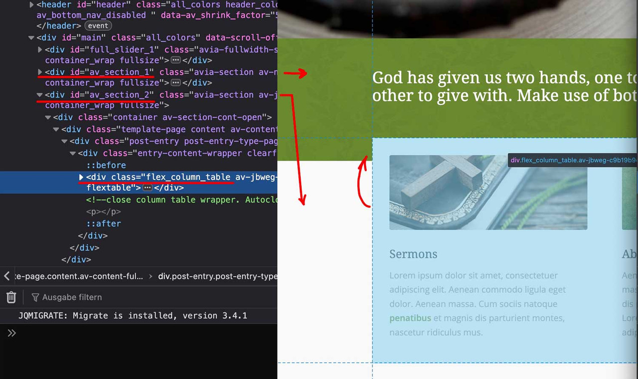
you see both color-sections – and the content of the second one is shifted with negative top margin.
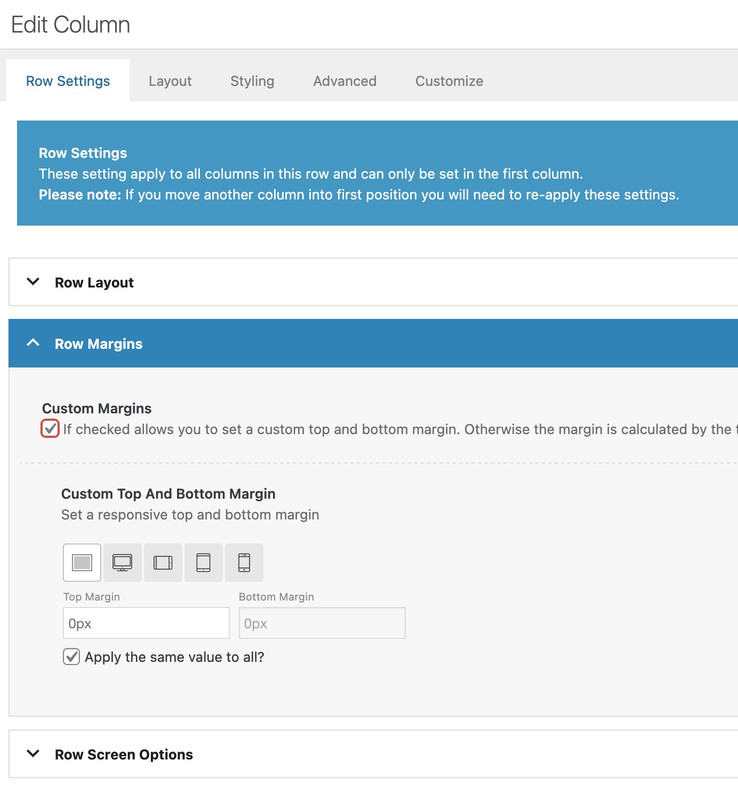
this can be done ( in this case the first column ) on row-settings – row margins:
because the columns are set to equal height – the value of only -60px goes to flex_column_table – but you can use even relative values like -50%