-
AuthorSearch Results
-
April 2, 2025 at 11:45 am #1480637
In reply to: Uploaded google font doesn’t work on iPhone/iPad
ich sehe du hast die Enfold Option des Merging bei css und js eingestellt. Hast du das mal neu generieren lassen?
Unter Performance – ganz unten.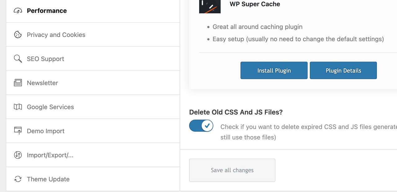
Im Übrigen wird deine Seite in meinem Desktop Safari auch nicht mit der Schrift dargestellt.
April 2, 2025 at 7:54 am #1480621In reply to: one-fourth columns 2 up on mobile
see section on top : https://webers-testseite.de/flexed/
( the other way is for more komplex styling – thats gridlayout )April 2, 2025 at 6:35 am #1480616In reply to: magnific popup missing form
Hi,
Regarding the scroll issue, this might help:
— https://kriesi.at/support/topic/pop-up-lightbox/#post-1429477
— https://kriesi.at/support/topic/inline-popup-enabler-not-working/#post-1371459This adds the no-scroll class name to the popup link.
Best regards,
IsmaelApril 1, 2025 at 3:42 pm #1480584In reply to: Blog posts element – preview image size not working
Hi,
Thanks for the update. Please let us know if you should need any further help on the topic, or if we can close it.
Best regards,
RikardApril 1, 2025 at 12:01 pm #1480577In reply to: Add logo to Full Screen Slider
The problem, of course, is that the height of a responsive background will always be smaller on a mobile phone. So unless you want to reduce the size of the logo by the same amount, “nailing” the logo to a specific position will not work. I have already tried to achieve this by using values relative to the screen width.
test this :
#top .html5-video .overlay {
  position: absolute;
  width: 25vw !important;
  height: 21.25vw;
  min-width: 140px;
  min-height: 119px;
  max-width: 411px;
  max-height: 349px;
  padding:15px;
  top: 80px;
  left: 50px;
}
@media only screen and (max-width:767px) {
  #top .html5-video .overlay {
    top: 20px
  }
}
April 1, 2025 at 11:56 am #1480575In reply to: Add logo to Full Screen Slider
just remove those
  border-radius:20px;
  background-color:rgba(0,0,0,0.1);
  backdrop-filter:blur(6px)
so it is only for that selector:
#top .html5-video .overlay {
  position:absolute;
  width:25vw !important;
  height:21.25vw;
  min-width:140px;
  min-height:119px;
  max-width:411px;
  max-height:349px;
  top:12vw;
  left:8vw;
  padding:15px;
}
April 1, 2025 at 11:23 am #1480573In reply to: magnific popup missing form
OK – and the scroll-to-top issue? It’s not great on mobile where the form disappears at the bottom of the page.
April 1, 2025 at 10:39 am #1480565In reply to: Add logo to Full Screen Slider
ok – sometimes the value had to be set to important – if another rule is set the same way.
there is inside one of your css:.responsive .container { max-width: 1310px !important; }so you had to change that one selector to :
.responsive #top #wrap_all .html5-video .container {
  max-width: 100% !important;
  width: 100%;
  padding:0;
}
April 1, 2025 at 9:48 am #1480564In reply to: Sticky element
This reply has been marked as private.March 31, 2025 at 3:49 pm #1480532In reply to: How to put responsive video on top of homepage
https://webers-testseite.de/html5-video-fanlokbun-2/
test my example page on your phone if it is working there.I’m not sure if there’s anything else I can tell you, other than what you can see on the page.
On top ? Well it is the first color-section on that page. If you like to have it behind header – then you had to choose the enfold transparency option for the page.Color-Section with custom-class: html5-video ; inside that color-section a code-block element and column (custom-class: overlay) with your image (logo). The width of that column is ruled by css.
If you do not need an overlay for your video – then put inside only the codeblock element.
March 31, 2025 at 2:29 pm #1480528In reply to: Add logo to Full Screen Slider
I’m not sure if there’s anything else I can tell you, other than what you can see on the page.
On top ? Well it is the first color-section on that page. If you like to have it behind header – then you had to choose the enfold transparency option for the page.Color-Section with custom-class: html5-video ; inside that color-section a code-block element and column (custom-class: overlay) with your image (logo). The width of that column is ruled by css.
March 31, 2025 at 1:33 pm #1480525In reply to: magnific popup missing form
ok will try that.
When the form opens it makes the page scroll to the top.
I see a problem also if I click on the link and then close it, if I click on it again the form doesn’t show up.
Do you know what’s causing that?March 31, 2025 at 10:02 am #1480515In reply to: Add logo to Full Screen Slider
Hi Guenni007
https://webers-testseite.de/html5-video-fanlokbun-2/ seems to work okay.
Sorry I am a bit thick. How do I add this to the top of the page.
Many thanks for all your help.March 31, 2025 at 7:24 am #1480505In reply to: Transparent header on mobile
Hi Ismael,
Thanks for the fast response and the helpful reply.
I think we finally have it working! My initial testing looks good, I’ll let you know if I hit any more issues with it once I shift it to the live site. Perhaps keep this open for another week or two, I’ll let you know when it can be closed.
Thanks, really appreciate the help.
Tim.
PS – Could I suggest that having a transparent header for mobile be considered for inclusion in the theme options (rather than custom CSS)? It seems like something that would be good to have as a feature, since a transparent header is already included for desktop.
March 31, 2025 at 7:10 am #1480503In reply to: Transparent header on mobile
Hi,
Thank you for the update.
We removed the screenshot. Try to include thi css code to remove the top padding on pages with transparent headers:
.html_header_top.html_header_sticky.html_header_transparency #top #wrap_all #main {
    padding-top: 0 !important;
}
Make sure to place this below the first css rule suggested above, inside the css media query.
Best regards,
IsmaelMarch 31, 2025 at 7:06 am #1480502In reply to: How to remove tab in Tab Section?
Hi,
Thank you for the inquiry.
You need to click the X icon in the top right corner of the tab section content. Please check the screenshot below.
If you need more assistance, please feel free to open another thread.
Best regards,
IsmaelMarch 31, 2025 at 6:48 am #1480499In reply to: Scaling and aligning videos
Hi,
Thank you for the inquiry.
You may need to remove the css rules that define specific dimension to the video on different screens sizes such as this:
.bheAnimation {
    background-color: #fff !important;
    width: 807px !important;
    height: 504px !important;
}
Then, try to add this to make sure that the whole video is visible within the container:
#top .avia-video .mejs-container, #top .avia-video .mejs-container video {
    object-fit: contain;
}
This might create black spaces around the video.
Best regards,
IsmaelMarch 31, 2025 at 5:51 am #1480497Topic: one-fourth columns 2 up on mobile
in forum Enfoldfinchkelsey
Participant@media only screen and (max-width: 767px) {
.responsive #top #wrap_all #ccbtp80 .post-entry-26494 .flex_column.av_one_fourth {
max-width: 48%!important;
clear: none!important;
float: left!important;
}Hi, this is not working across browsers to get 1/4 columns to display side by side.
I would think mobile layout would be easier in Enfold by now.
Thank you
March 30, 2025 at 8:36 pm #1480490In reply to: Category background, title and image
1. #f2f0eb Dandelion-post-background2.png (in the Media tab).
2. This is one of the category pages: /category/issue-1/. As with all the category pages, there is no category title at all. Only the posts within the category display. I need to add an H2 text category title at the top.
3. I tried the Categories Images plugin but it didn’t work, as images didn’t display on the category page.
4. Same colour and image as #1.March 30, 2025 at 1:09 pm #1480475Hey Silje,
Try this CSS in your Enfold Theme Options ▸ General Styling ▸ Quick CSS field:@media only screen and (max-width: 1439px) { .single-product .avia-svg-icon svg:first-child,.single-product .avia-svg-icon img[is-svg-img="true"] { height: .5em; width: .5em; } #top.single-product .avia-slideshow-arrows a.avia-svg-icon svg:first-child { margin-top: 9px; } #top.single-product .av-slideshow-ui.av-loop-manual-endless .avia-slideshow-arrows > a, #top.single-product .av-slideshow-ui .avia-slideshow-arrows.av-visible-prev > a.prev-slide, #top.single-product .av-slideshow-ui .avia-slideshow-arrows.av-visible-next > a.next-slide { width: 30px; height: 30px; line-height: 30px; } }After applying the css, please clear your browser cache and check.
Please note that testing with iPads & iPhones can be hard to clear the cache, often you need to also clear the history to fully purge the cache, following these steps for Safari and note Step 4 where you will Clear the History.

Best regards,
MikeMarch 29, 2025 at 7:56 pm #1480463In reply to: How to put responsive video on top of homepage
You can do that with code-block element inside color-section. Best is to better select – a custom class for the color-section.
in my example page it is: html5-videosee code and example on : https://webers-testseite.de/html5-video-embed/
btw: if you change some declaration inside the given css code – this overlay might be fixed :
(change means not to replace the whole rule but just to f.e. change the position to fixed – the rest of the declarations had to be in place.)
f.e.:.responsive #top #wrap_all .html5-video .container { clip-path: inset(0 0 0 0); } #top .html5-video .overlay { position: fixed; top: 0; transform: translate(-50%, 25vw); }or you shift the next section over the first one … etc.
March 29, 2025 at 4:39 pm #1480454In reply to: How to put responsive video on top of homepage
Hi Mike, thanks so much for replying!
I would like the user to have a more pleasant experience when entering the site, with a video running on the page without the visual pollution that appears with the vimeo or youtube player.
Simply the video running, and a phrase on top of it, for the 20 or 30 seconds that it is, until the loop.
I haven’t managed to do this yet. Even in the slide layer.
Any other tips?
Thanks!March 29, 2025 at 1:18 pm #1480438Topic: How to put responsive video on top of homepage
in forum Enfoldmruthalvarez
ParticipantHi. I need to put a video at the top of the site’s homepage, and I can’t find a solution that works on both desktop and smartphone. I’ve tried colorsection with backgroud, just the video, all types of slides. I need this video to work responsively, I don’t want to replace it with a fallback image. Does anyone have any suggestions for me?
Thank you so much!March 28, 2025 at 9:02 pm #1480417In reply to: Urgent! Slider images not displaying
Found the problem! Topic can be closed *LOL*
March 28, 2025 at 5:33 pm #1480407In reply to: Add logo to Full Screen Slider
just like on :
https://kriesi.at/support/topic/add-logo-to-full-screen-slider/#post-1480358
f.e.:
(and maybe a small drop-shadow to the png#top .avia-fullwidth-slider::after { position: absolute; display: block; content: ""; width: 18vw; height: 15.3vw; max-width: 411px; max-height: 349px; min-width: 200px; min-height: 170px; top: 120px; left: 80px; background-image: url(/wp-content/uploads/2025/03/Gathering-Barn-Banner-Logo-.png); background-repeat: no-repeat; background-size: calc(100% - 40px) calc(100% - 40px); background-position:center center; filter: drop-shadow(1px 1px 2px #666); } @media only screen and (max-width: 767px) { #top .avia-fullwidth-slider::after { top: 2vw; left: 2vw; } }but i see that the slider is not shown on mobile? And we had to place always a fallback image for videos?
dear mods – has this always been the case with Enfold?
It is unfortunate that we do not have the opportunity to decide for ourselves.March 28, 2025 at 5:30 pm #1480405Hey nancyT,
I don’t have a iPhone, do you mean this:

If so try this css:@media only screen and (max-width: 450px) { #top #payment div.payment_box { width: 100%; padding: 0; } }After applying the css, please clear your browser cache and check.

Best regards,
MikeMarch 28, 2025 at 5:02 pm #1480400In reply to: spacing between blocks
Hi,
Try this CSS in your Enfold Theme Options ▸ General Styling ▸ Quick CSS field:.avia-icon-list .iconlist_icon svg:first-child, .avia-icon-list .iconlist_icon img[is-svg-img="true"] { margin-top: 11px; margin-left: -6px; } .avia-svg-icon svg:first-child, .avia-svg-icon img[is-svg-img="true"] { height: 1em; width: 2em; }After applying the css, please clear your browser cache and check.
Best regards,
MikeMarch 28, 2025 at 4:56 pm #1480399In reply to: Second menu colour
Hi,
Try adding this CSS in your Enfold Theme Options ▸ General Styling ▸ Quick CSS field:#top.page-id-1424 .header_color.av_header_transparency .avia-menu-fx { background: #7d8286; }After applying the css, please clear your browser cache and check.
please note the page ID in the csspage-id-1424Best regards,
MikeMarch 28, 2025 at 3:36 pm #1480392Topic: Icon List Blank
in forum Pre Sale QuestionsLee Germeroth
GuestI saw the response to my request here: https://kriesi.at/support/topic/icon-list-blank/?avia_support_contact=avs_67e6a88e031722.10305165_1480385
I can’t respond to the ticket because I don’t have an account to be able to respond.
I had upgraded to the 7.1 version, but that is when the issues started so I restored it back to the 6.0.9 version which is what it was when I inherited the site.
If I got you the admin login information, would you be able to look in there to figure it out?
Thanks!
-LeeMarch 28, 2025 at 2:27 pm #1480382In reply to: Second menu colour
-
AuthorSearch Results
-
Search Results
-
@media only screen and (max-width: 767px) {
.responsive #top #wrap_all #ccbtp80 .post-entry-26494 .flex_column.av_one_fourth {
max-width: 48%!important;
clear: none!important;
float: left!important;
}Hi, this is not working across browsers to get 1/4 columns to display side by side.
I would think mobile layout would be easier in Enfold by now.
Thank you
Hi. I need to put a video at the top of the site’s homepage, and I can’t find a solution that works on both desktop and smartphone. I’ve tried colorsection with backgroud, just the video, all types of slides. I need this video to work responsively, I don’t want to replace it with a fallback image. Does anyone have any suggestions for me?
Thank you so much!Topic: Icon List Blank
I saw the response to my request here: https://kriesi.at/support/topic/icon-list-blank/?avia_support_contact=avs_67e6a88e031722.10305165_1480385
I can’t respond to the ticket because I don’t have an account to be able to respond.
I had upgraded to the 7.1 version, but that is when the issues started so I restored it back to the 6.0.9 version which is what it was when I inherited the site.
If I got you the admin login information, would you be able to look in there to figure it out?
Thanks!
-Lee