Thank you. When I tried that on the test version it works but when I go to the live page and use the 44% responsive setting which is what gives me the exact size I want on mobile and try and adjust the height calc nothing changes on the Desktop view.
Also it seems to have created more of a gap now under the black color section that sits under the main banner and the text section under the black color section – how can I reduce that big gap on monile – looks fine on desktop.
I’ve tried the solutions for this from previous questions, but so far I’ve had no luck. I’m trying to use a different font from what is set for default headings (Open Sans) in Enfold for just one easy slider caption. When I change the default font in the theme settings, I can see the font I want (Tangerine). When set the default back to Open Sans and use the CSS override in Quick CSS, I see the font switch to serif, but it will not resolve Tangerine. What am I doing wrong?
I inspected the caption in Chrome and copied the selector, so the CSS is
#faithtop > div > ul > li > div > div > div > div > div > div > h2.avia-caption-title {
font-family: “Tangerine”, serif !important; font-size: 4em !important; color: #2d5c88 !important;
}
Hello,
I found this thread in a search because I am having the same issue.
An anchor link in the menu works flawlessly on desktop and on an iPad (including portrait orientation) in Chrome/Firefox/Safari, but doesn’t work at all on iphone/Safari. Tapping the link in the mobile menu closes the menu, but doesn’t scroll down to the anchor link whether you are on the homepage or any other page.
My client has noticed the issue, and wants to keep the anchor link so I need a fix if there is one.
Thanks in advance!
HI there is too much space between our header and our page content on mobile.
How do I do the following for mobile only:
– reduce the white space between the header and the breadcrumb info
– remove the page title above the breadcrumb info
– reduce the small menu at the top ‘Calendar’ etc down to just ‘Contant Us’
All the above for mobile only.
Many thanks
Jenny
Hey KatjaL,
The update to 7.1 has to be done manually from the version you are running, please refer to my replies in this thread: https://kriesi.at/support/topic/enfold-4-5-theme-update-update-failed-download-failed-a-valid-url-was-not-pro/#post-1021541
You can either update manually via FTP: https://kriesi.at/documentation/enfold/how-to-install-enfold-theme/#theme-update, or upload the theme as if it was new under Appearance->Themes->Add New Theme.
If that doesn’t work then please try to delete the whole theme folder, then replace it with the new version. Make sure that you have backups of the site before starting updating.
Also please read this after you have updated: https://kriesi.at/documentation/enfold/theme-registration/
Best regards,
Rikard
Kriesi team:
At the lower art of the page (indicated in Private Content), I have 9 column elements, 3 elements across (1/3, 1/3, 1/3) and three “rows” vertically.
On desktop view all looks good except I have extra space vertically between the rows. I would like the spacing between columns to be consistent with the spacing between the “rows.”
On small mobile, it is a similar issue. When the layout goes to a single column view, the three 1/3 columns present visually as a “group,” —so it looks like three groups of three with extra spacing between the “group.”
Can you help? —Bill B
Hello,
I am new with enfold.
Just learning a lot to create a nice website.
You can see it here:
https://imkervereinstuttgart.de/staging/
I wonder how I can change the text of the buttons in the top slider. (fullscreen-slider)
If I edit it via Code-Editor an saved the page no change is vissible.
Is it necessary to edit it outside wordpress?
Thank you very much,
Tobi
-
This topic was modified 10 months, 3 weeks ago by
 rechner1.
-
This topic was modified 10 months, 3 weeks ago by rechner1.
-
This topic was modified 10 months, 3 weeks ago by rechner1.
that is the reason why i asked if you have clicked the “salvare” button after inserting your settings. And then save the page.
PS it is now ( but check the above said please )
#top.page-id-918 #av_section_6 {
  background-color: #7bb0e7;
}

#top.page-id-918 #av_section_6 .flex_column.av_one_full {
  padding: 0 150px;
}
and ( hm?)
#top.page-id-918 #av_section_6.main_color {
  color: #eeee22;
}
Hi,
Thank you for the screenshot.
Try to add this css code to adjust the height of the color section desktop view.
/*
Desktop Styles
================================================== */
/* Note: Add new css to the media query below that you want to only effect the desktop view of your site */

@media only screen and (min-width: 768px) {

  /* Add your Desktop Styles here */
  .no-touch-device .av-minimum-height-44vw:not(.av-slideshow-section) .container {
    height: calc(100vh - 342px) !important;
  }
}
Result after adding the modification:
View post on imgur.com
Best regards,
Ismael
hi there please see screenshots of what I am talking about. the desktop is too large and the mobile is perfect. So not sure how to get it to look like the screenshot named “Grace_how I want the Desktop version to look” and the mobile version using the one color section (so be responsive in the way I want them to display). Instead of how the current live site where I have had to create 2 versions of the color section to get the right sizing for mobile and desktop display
Hi,
Thank you for the inquiry.
We tried deactivating the Solid Security plugin, but the site stopped loading on our end. Would you mind checking the issue on your end?
The notice _load_textdomain_just_in_time above should not affect the Advance Layout Builder.
Best regards,
Ismael
Hi there I have created a banner using a color section and using an image as the background image. However when I tried to make it responsive for mobile and get the perfect sizing on mobile it became huge on desktop even when I had the settings for responsive. Ive tried a million different combinations and just cant get it right on both. On the live site I resorted to having 2 different banners one for mobile and one for desktop – but I can see both load when I go to the page so I dont want this as the final option. Can you please help. Im trying to acheive what Ive done with the 2 different versions on the one.
Live page where I have 2 different banners: https://gracegedeon.com/
Dev page where I am trying to just have the one banner but get the right sizing for mobile and desktop: https://gracegedeon.com/home-redesign-2025/
Hi,
That’s odd. We created a short clip showing how it looks on our end (see private field) — ignore the red background (that’s a custom modification while testing). You may also need to add this inside the previous css media query:
.responsive #top #main {
    margin-top: 0;
}
If you have time, you can also try @Guenni007’s suggestion above.
Best regards,
Ismael
Hi,
.main-title looks like a different font or font weight
Looks like the title is set to use a lighter font weight instead of the default 400. Did you configure the Heading elements in the Enfold > Advanced Styling tab? You can also adjust it with this css:
#top #wrap_all .main_color h1, #top #wrap_all .alternate_color h1, #top #wrap_all .socket_color h1 {
    font-weight: 400;
}
Regarding the burger/mobile menu, try to edit the Main Menu (Icon) elements in the Advanced Styling panel, or use this css code:
#top #wrap_all .av-burger-overlay .av-burger-overlay-scroll #av-burger-menu-ul li a {
    color: #ffffff;
    font-size: 18px;
    line-height: 1.8em;
}

.html_av-overlay-side #top #wrap_all div .av-burger-overlay-scroll #av-burger-menu-ul li:hover a, #top #wrap_all .av-burger-overlay .av-burger-overlay-scroll #av-burger-menu-ul li a:hover {
    background-color: #333366;
    color: #ffffff !important;
}
If you have any additional questions at this time we kindly ask that you open them up in a separate thread. The longer threads get in the forum, they become more difficult to support as they tend to drift off topic and they also make it troublesome for users trying to search for solutions. Keeping threads relevant to their original inquiry ensures that we can keep better track of what has been resolved and that users can more effectively find answers to similar issues they might be experiencing.
Thanks!
Best regards,
Ismael
Hello, support, happy to see you again.
I disabled iconfont as suggested here: https://kriesi.at/support/topic/completely-remove-entypo-fontello/
adding to child theme: add_filter(‘avf_default_iconfont’, function($icon_font) { return array(); }, 10, 1);
Website skyrocketed the speed, but advanced page builder works only after commenting this line and cleaning cache.
Could you suggest effective way to get rid of this font preserving functionality of the advanced builder.
Thank you!
-
This topic was modified 10 months, 3 weeks ago by
 ibuzaev.
-
This topic was modified 10 months, 3 weeks ago by ibuzaev.
Hello everyone,
I can’t get the video on the home page fullscreen. The Vimeo link is inserted via media element “fullscreen slider”. Previously I had inserted the video directly via a URL in a lower quality, where it still worked full screen. Now it no longer works via the Vimeo link. I have solved this differently on mobile. Can anyone help me?
https://derpixelnaut.com/_em
Sometimes there is a black bar at the top or bottom, depending on the size of the browser.
regards mickhb
-
This topic was modified 10 months, 3 weeks ago by
 mickhb.
this (huge padding left/right) is not the best method to restrict the content width; because what would you do on mobile?
There are settings on the column element itself to rule those settings for smaller screens. But – none of them is seen in the DOM – inspecting that page with dev tools.
now here is a pre question to be clear. After setting up your background-color on color-section – and the padding on 1/1 column :
Did you always complete the corresponding entries at the bottom of the element with “save” before you saved the page?


#top.page-id-918 #av_section_7 {
  background-color: #7bb0e7;
}

#top.page-id-918 #av_section_7 .flex_column.av_one_full {
  padding: 0 150px;
}
And btw. on all your other color-sections and 1/1 columns you do not have there a padding of 0 150px
The width is determined by manually set line-breaks !
Is there a way to center the “Phone Number or small info text” in my header
I have trieed this solution https://kriesi.at/support/topic/center-the-phone-number-or-small-info-text-in-header/
but css did not work
Can you provide help please
see here my test page: https://webers-testseite.de/
my code to have a fixed header on mobile first – then after scroll a header with background-color:
because i do not see your page – the values ( of height / line-heigt etc. had to be adjusted ) – and I can give no better advice.
if your breakpoint is at 767px – change the media-query.
@media only screen and (max-width: 989px) {
    .responsive #top #wrap_all #header .container {
        width: 95%;
        max-width: 95%;
    }

  /* === values depends on if header_meta is present (80px + 35px) === 35px is the min-height of header_meta */
  #top #header {
    position:fixed !important;
    height:115px !important;
    max-height:115px !important
  }

    #top #header.av_header_transparency #header_meta {
        background-color: transparent;
    }

    #header_main {
        border-bottom: none;
    }

    #header:not(.av_header_transparency) #header_main {
        box-shadow: 0 5px 10px #eee;
    }

    .responsive #top .av-logo-container ,
    .responsive #top .logo a,
    .responsive #top .logo img,
    .responsive #top .logo svg {
        height: 80px !important;
        max-height: 80px !important;
        line-height: 80px !important;
    }

    .responsive #top .av-main-nav .menu-item-avia-special a {
        height: 80px !important;
        line-height: 80px !important;
    }

    .responsive.html_mobile_menu_tablet #top #wrap_all .av_header_transparency {
        background-color: transparent !important;
    }

    #top .header_bg {
        background-color: transparent !important;
    }

    #top #header:not(.av_header_transparency) .header_bg {
        background-color: #FFF !important;  / *** change to your needed bg-color *** /
    }

    .responsive.html_mobile_menu_tablet #top .av_header_transparency .logo img.alternate,
    .responsive.html_mobile_menu_tablet #top .av_header_transparency .logo .subtext.avia-svg-logo-sub {
    display: block !important;
    }

    .responsive.html_mobile_menu_tablet #top .av_header_transparency.av_alternate_logo_active .logo a > img,
    .responsive.html_mobile_menu_tablet #top .av_header_transparency.av_alternate_logo_active .logo a > svg {
    opacity: 0;
    }

    /*** if you got header_meta ***/
    #top #header.av_header_transparency #header_meta .phone-info * {
        color: #FFF !important;   / *** change to your needed bg-color *** /
    }

    .html_mobile_menu_tablet .header_color  #header.av_header_transparency div .av-hamburger-inner,
    .html_mobile_menu_tablet .header_color  #header.av_header_transparency div .av-hamburger-inner::before,
    .html_mobile_menu_tablet .header_color  #header.av_header_transparency div .av-hamburger-inner::after {
        background-color: #FFF;  / *** change to your needed bg-color *** /
    }
    .html_mobile_menu_tablet .header_color  #header.av_header_transparency .menu-item-search a:before {
        color: #FFF;  / *** change to your needed bg-color *** /
    }
    .responsive.html_header_top.html_mobile_menu_tablet  #top #main {
        padding-top: 80px !important;
    }
    .responsive.html_header_top.html_header_transparency.html_mobile_menu_tablet  #top #main {
        padding-top: 0 !important;
    }
}
there might be some rulesets not neccessary for your setting – but as mentioned above your page is in maintainance mode.
Hi,
I added the code, cleared the cache, and checked the result on both my phone and other phones that hadn’t accessed the site before. It still shows a solid black at the top, flickers slightly to transparent when I start scrolling, and then turns black again.
If it’s not possible to achieve the effect I want, I’d at least like to eliminate the flickering.
Hi,
Thank you for the update. Try adding this css code and let us know the result.
@media only screen and (max-width: 989px) {

  /* Add your Mobile Styles here */
  .responsive #top #wrap_all .av_header_transparency {
    background-color: transparent !important;
  }
}
Best regards,
Ismael
Hi,
Thank you for the screenshots.
You can use this css code to create the desired layout. Add the image or icon as background of the ::after pseudo-element.
#top #header.av_minimal_header .main_menu ul:first-child > li > ul > li:first-child a::before {
    content: '';
    display: block;
    position: absolute;
    top: 10px;
    left: 50%;
    transform: translateX(-50%);
    width: 300px;
    height: 1px;
    background: #5e504a;
}

#top #header.av_minimal_header .main_menu ul:first-child > li > ul > li:first-child a::after {
    content: '';
    position: absolute;
    top: 0;
    left: 50%;
    transform: translateX(-50%);
    width: 30px;
    height: 20px;
    background-image: url('your-image-url.png');
    background-size: contain;
    background-repeat: no-repeat;
    background-position: center;
    z-index: 100;
}
Result:
View post on imgur.com
Best regards,
Ismael
Hi,
Thank you for the screenshot.
You can use this css code to adjust the height of the title in the breadcrumb container.
@media only screen and (max-width: 767px) {

  /* Add your Mobile Styles here */
  #top .title_container .main-title {
    line-height: 0.8em;
    margin-bottom: 20px;
  }
}
View post on imgur.com
Best regards,
Ismael
Hi,
Do I need to add soms z-index code to ensure it’s always shown on top?
Yes, you have to adjust the z-index of the widget containing the search icon.
Best regards,
Ismael
Hey Tilman,
Thank you for the inquiry.
You can use the following css code to adjust the height of the burger menu items and the width of the overlay container.
.html_av-overlay-side #top #wrap_all .av-burger-overlay li a {
    line-height: 2em;
    height: auto;
    padding: 15px 50px;
}

.html_av-overlay-side #top #wrap_all .av-burger-overlay-scroll {
    width: calc(100vw - 65%);
}
Best regards,
Ismael
The blue box marks the container, which you set to 1500px in the Enfold settings – see my comment above : link
Since the font is set to centered, it will be placed in the middle of the container. If the size is smaller, there will be a gap to the outer edges of the blue box.
Originally, you can see in the first screenshot that there is a manually placed line break (<br>) at the point marked in red.
(click to enlarge the images)

In the second screenshot, I have removed this manual line break in my browser’s dev tools to show you that when there are no line breaks, these lines have the said 1500px width.

Where you are now reporting the lack of smaller widths, you have simply not set manual breaks as above inside the text-block elements.
Hi Ismael,
thanks for your quick response.
You can find links to screenshots in the private content section of this message.
I discovered one more bug: The “X” Close Button of the Burger Menu is displayed correctly when the burger menu is opened from the top of the page, but is white (and not visible – because color is white) when opened from the middle of a page (problem might occur because of the transparent header) how can I change the color of the “X” close button of the burger menu?
Thanks for your help!
Best, Konrad
you do not need to have multiple layersliders. On each layer you got on content tab :
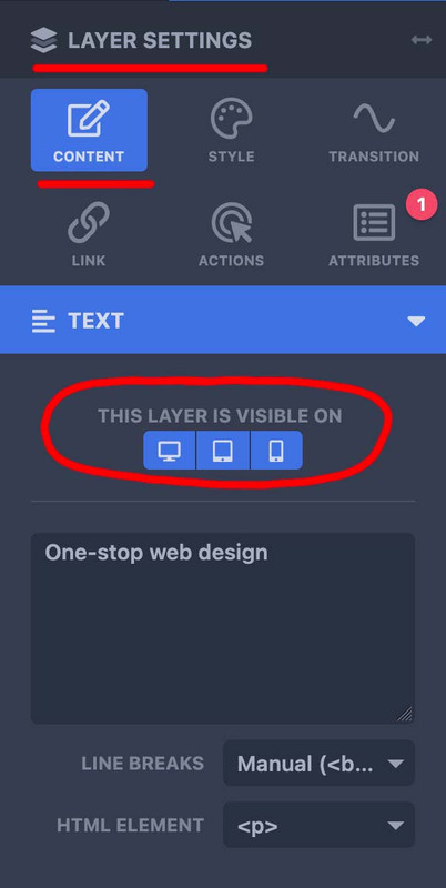
– so for mobile content – duplicate that layer you like to have in a different way or position – and select your visibility option ( desktop, tablett, mobile)
– the first one you show on desktop and tablett – the copy – show on mobile.
now – if you like to change the way they look : – on top there is the preview mode:

select your mode – mobile (now all layers that belong to this mode are only editable and visible) – and edit now the content for that mobile layer.
sorry i did not read the whole text here on that topic; but if i see something with inline-svg : did you have any css rule managing the width or height of svg’s ?
__________________
so this might be offtopic – but that was one reason why some of my svg icons seems not to be in place
On former installations of mine – i use a snippet to convert all img tags that are svgs to inline svgs. those svg’s that do not have a width and height definition inside the svg code ( only viewport settings ) need an absolute width to be shown. Otherwise these svgs are listed as 0x0 dimension.
For those svgs i have set in my quick css a rule like:
#top #main svg {width: 1500px}
with those new svg icons we have on iconbox.css this rule:
.iconbox_icon.avia-svg-icon img[is-svg-img=true],
.iconbox_icon.avia-svg-icon svg:first-child {
  height:1em;
  width:1em;
  margin-top:3px
}
so my setting for inline svgs is more selective – and wins the game!
to avoid that :
.iconbox_icon.avia-svg-icon img[is-svg-img=true],
.iconbox_icon.avia-svg-icon svg:first-child {
  height:1em !important;
  width:1em !important;
  margin-top:3px
}