Hello,
I’d like the main menu underlined (with a distance). Two different colors for normal a and hover. The lines should be as long as the words. The lines should lay exactly on top of the below image. See screenshot and link as private content.
Thanks for your help!
Hi,
Try adding this CSS in your Enfold Theme Options ▸ General Styling ▸ Quick CSS field:
#top .avia-slideshow-arrows a.avia-svg-icon svg:first-child {
    fill: #ee1d85;
}
#top .avia-slideshow-arrows.avia-slideshow-controls a {
    background: transparent !important;
}
for this effect:

Best regards,
Mike
in most cases these columns will be inside a color-section. Inside that section the one that should scroll has to be with huge content. the other one with less.
Do not use the equal height option on the coluns!
i would give a custom class to that section! f.e. : sticky-parent (this is not the direct parent of those columns. But we can address now better – and use it for that case generally.
The column that should stick got the custom class: sticky-element
then we have:
(we can have the overflow setting inside the media query too – it only needs to work there)
NB: the media query min-width depends on your setting where the columns should go to 100% width – if it is 989px then change that value
@media only screen and (min-width: 767px) {
  .responsive #top {
    overflow-x: visible !important;
  }
  .responsive #top #wrap_all {
    overflow: visible !important;
  }
  #top .sticky-parent .entry-content-wrapper {
    display: flex;
  }
  #top .sticky-element {
    height: unset !important;
    width: unset !important;
    position: -webkit-sticky !important;
    position: sticky !important;
    top: 80px;
    align-self: flex-start;
    min-width: 40%;
  }
}
again – see: https://webers-testseite.de/sticky-elements/
Hi,
Try this CSS in your Enfold Theme Options ▸ General Styling ▸ Quick CSS field:
.gm-style-iw-chr button {
	height: 0 !important;
  top: -10px !important;
}
.gm-style-iw-ch {
	padding: 0 !important;
}
for this result:

Best regards,
Mike
Thank you so much!! I really appreciate the help. I would love to have the arrow background be transparent and the arrows be #ee1d85. I tried to do this myself and only managed to either do nothing or make the arrows disappear.
If this helps, here is all of the Quick CSS that I can find about the arrows.
From the top:
#top .avia-slideshow-arrows.avia-slideshow-controls a {
    background: #a6a6a6 !important;
}

#top .avia-slideshow-arrows.avia-slideshow-controls a:before {
    left: -4px;
}
From the middle of the file:
/* === STYLING SLIDER ARROWS === */

#top .avia-smallarrow-slider .avia-slideshow-arrows a {
   color: #ed1d84;
}

.prev-slide:before, .next-slide:before {
   background-color: transparent !important;
   margin-right: 15px !important;
}

#top  .avia-slideshow-arrows.avia-slideshow-controls {
width: 100%;
position: absolute;
top: 65px;
transform: translateY(-50%);
width: 100%;
z-index: 999;
}

/* Right arrow*/
.avia-slideshow-arrows.avia-slideshow-controls .next-slide {
right: 0 !important;
bottom: -10px;
}

/* Left arrow */
 .avia-slideshow-arrows.avia-slideshow-controls .prev-slide {
left: 0px !important;
margin-right: 20px !important;
}
ok now you got 2columns besides each other.
if you follow my link for the instructions – you see that the direct parent had to be the flex container.
just for you to test ( better would be to use custom classes to be more specific.
.responsive body#top.blog,
.responsive body#top.wp-singular {
  overflow-x: visible !important;
}

.responsive body#top.blog #wrap_all ,
#top.wp-singular #wrap_all{
  overflow: visible !important;
}

@media only screen and (min-width: 767px){
  #after_section_1 .av-column-wrapper-individual {
    display: flex;
  }

  #after_section_1 .av-column-wrapper-individual .flex_column:nth-child(2){
    height: unset !important;
    position: -webkit-sticky !important;
    position: sticky !important;
    top: 180px;
    align-self: flex-start;
    flex: 0 1 40%
  }
}
Hi,
For your /making-a-remote-control/ page I see that you are not using a sidebar, it would be better if you follow Guenni007’s instructions as you will need a parent container. But you can try this css:
@media only screen and (min-width: 1905px) {
.responsive #top #wrap_all .av-d0kp1-a2d2e6eb6b73ac933b7b21ac10cbf36f {
    position: fixed;
    width: 435px;
    right: 19%;
    top: 57%;
  }
  .responsive #top #header.header-scrolled ~ #main .av-d0kp1-a2d2e6eb6b73ac933b7b21ac10cbf36f {
    position: fixed;
    width: 435px;
    right: 19%;
    top: 18%;
  }
}
This will make your author box fixed (sticky) under your header after scrolling, it would be better if your column had a custom class name, right now it is: .av-d0kp1-a2d2e6eb6b73ac933b7b21ac10cbf36f
I also note that your author box is quite tall on my desktop, you may want to make it shorter so it will fit in smaller screens.
For this the css only works after 1905px so the whole box is shown, you will not be able to scroll in the box to see all of the content.
Another option would be to use the WP Sticky Anything plugin.
Best regards,
Mike
Hi,
Glad that the update worked for you. I have not used the GT Translate plugin and I don’t see any errors in the browser console on your site.
Please open a new thread for this new issue, since the opening title for this thread is now solved, this helps other users find solutions based on the opening subject line quicker and helps keep the thread length manageable and on topic for multiple mods to assist. Thank you for your understanding.
Best regards,
Mike
Ok, so the shortcode thing is cleared. My own shortcodes written with php then seems to be with failures.
But you didn’t answered about this:
And there is a strange thing happening: I use a php-snippet with the Plugin code snippet. I run it on the site mentioned in the private area. There I activate a List with child-pages, which works fine – but only for some ours (or logout). Then the settings are overwirtten. If you set “Child Pages Top Level Shortdode” to “Enable at end of content”, it works. Some hours later the checkbox is empty and the snippet is ignored! Very strange.
I guess its a caching-issue (all cachings are disabled everywhere!), bacause there is another problem: when refreshing a page after editing something in snippets, it is not laoded. If I do a hard-reset of the site it works.
I am using a plugin on a website built on Enfold to manage real estate listings. The plugin is Real Estate Pro.
We are having issues uploading images to listings. When we click on “Add Image” we get a JavaScript void message in our browser and nothing happens.
The developer of the plugin has looked into this and determined it is related to what is described in this Enflod support post:
https://kriesi.at/support/topic/wp_enqueue_media-not-working-on-frontend-after-latest-update/
Help resolving this issue would be greatly appreciated.
Hi,
Thank you for the update.
You can also try this css code:
#top .slide-entry .slide-content {
    min-height: 400px;
    display: flex;
    flex-direction: column;
    justify-content: flex-end;
}
You may need to remove the previous css code and adjust the min-height on different screen sizes using css media queries.
View post on imgur.com
Best regards,
Ismael
maybe a mod knows a better way to shift the quick css input field to top of the styling options section.
(I was familiar with that filter because I had used it before to place a new input field for Apple Touch icons behind the favicon.)
/**
 * Custom function to reorder Enfold theme options.
 * Moves the 'Quick CSS' input field above the 'Color Scheme' selector.
 * Assumes both 'quick_css' and 'color_scheme' elements are always present.
 */

function custom_enfold_reorder_styling_options($avia_elements) {
    $quick_css_option = null;
    $color_scheme_option_index = -1;
    $quick_css_option_index = -1;

    // Find the 'quick_css' and 'color_scheme' options and their original indices.
    foreach ($avia_elements as $index => $element) {
        if (isset($element['id']) && $element['id'] === 'quick_css') {
            $quick_css_option = $element;
            $quick_css_option_index = $index;
        }
        if (isset($element['id']) && $element['id'] === 'color_scheme') {
            $color_scheme_option_index = $index;
        }
    }

    if ($quick_css_option_index > $color_scheme_option_index) {
        // Remove the 'quick_css' option from its original position.
        array_splice($avia_elements, $quick_css_option_index, 1);
        array_splice($avia_elements, $color_scheme_option_index, 0, [$quick_css_option]);
    }

    // Return the modified array of theme options.
    return $avia_elements;
}

// Hook into Enfold's option page data initialization filter.
add_filter('avf_option_page_data_init', 'custom_enfold_reorder_styling_options', 10, 1);
I use the Quick CSS section extensively, especially when designing and developing, before pushing back out to a child theme css file. But, during the design/development phase, I am constantly having to scroll through a narrow window, even if I do extend it, it is incredibly wasteful on screen real estate.
Would you consider either putting the section description at the top or the bottom and allowing the text area to spread across the entire width?
Huge bonus points if you would consider giving this whole section an upgrade like many other css editors. It is definitely not worth it holding the full-width changes, though.
Hi,
If you need the buttons and post meta info (date, comments) to align, you can either apply a minimum height to the post title and excerpt, or make sure they have the same number of characters, which is probably not ideal. To do the former, you can add the following css code:
#top .avia-content-slider .slide-entry-title {
    min-height: 118px;
}
In the end, the position of the “read more” button will depend on the length of the title and post excerpt.
Best regards,
Ismael
Hi,
If you want the left image to be taller or larger on smaller screen sizes, try adding another image element with a taller aspect ratio. The current image is a bit square and gets squeezed disproportionately in height compared to the right widget because it’s inside a smaller column (1/4 width). After adding the other image, you can toggle the visibility of both images on different screen sizes using Advanced > Responsive > Element Visibility options.
You can also add this css code to adjust the width of the column containing the image.
@media only screen and (max-width: 1024px) {

  /* Add your Mobile Styles here */
  #top .flex_column.av-acgfsc-cb6752318e4619c3295e6429d893dcfc {
    width: 50%;
    margin-left: 0;
  }
}
After adding the css:
View post on imgur.com
Best regards,
Ismael
How do I include a picture that is on my desktop into this support chat?
The client wish is to display roundabout 30 Kitchens, that are sold in a portal called https://www.kleinanzeigen.de. One solution to integrate this listing in the current website is to display a gallery of portfolios and there realize it with an iFrame. Another: solve it with a plugin or something similar.
1) How is it possible to integrate a responsive iFrame without issues – I didn´t succeed with the following code – it crashes the website complete?
2) And the other problem is that browsers doesn´t allow the display of iFrames. How to solve this?
3) Or is it possible to integrate directly the adverts via plugin/other solution?
IFRAME EXAMPLE
<div class="container"><iframe class="responsive-iframe" src="https://www.kleinanzeigen.de/s-anzeige/moderne-doppelhaushaelfte-mit-keller-in-ruhiger-lage-kueche-geschenkt-/3077951470-208-6482"></iframe></div>
CSS
/***** RESPONSIVE IFRAME *****/
.container {
  position: relative;
  overflow: hidden;
  width: 100%;
  padding-top: 56.25%; /* 16:9 Aspect Ratio (divide 9 by 16 = 0.5625) */
}

/* Then style the iframe to fit in the container div with full height and width */
.responsive-iframe {
  position: absolute;
  top: 0;
  left: 0;
  bottom: 0;
  right: 0;
  width: 100%;
  height: 100%;
}
After update Enfold, the Search Icon To Main Menu does not appear in a site with “Stretched Or Boxed Layout: Boxed Layout; Logo And Main Menu: Top Header”.
Please see Private Content
Best regards,
Oriano
Hi Ismael,
No plugin, As I said, EVERY shortcode is not rendered!
Setup a Admin-Account for you.
And there is a strange thing happening: I use a php-snippet with the Plugin code snippet. I run it on the site mentioned in the private area. There I activate a List with child-pages, which works fine – but only for some ours (or logout). Then the settings are overwirtten. If you set “Child Pages Top Level Shortdode” to “Enable at end of content”, it works. Some hours later the checkbox is empty and the snippet is ignored! Very strange.
I guess its a caching-issue (all cachings are disabled everywhere!), bacause there is another problem: when refreshing a page after editing something in snippets, it is not laoded. If I do a hard-reset of the site it works.
Hey smithyoung,
The update to 7.1.1 has to be done manually from the version you are running, please refer to my replies in this thread: https://kriesi.at/support/topic/enfold-4-5-theme-update-update-failed-download-failed-a-valid-url-was-not-pro/#post-1021541
You can either update manually via FTP: https://kriesi.at/documentation/enfold/how-to-install-enfold-theme/#theme-update, or upload the theme as if it was new under Appearance->Themes->Add New Theme.
If that doesn’t work then please try to delete the whole theme folder, then replace it with the new version. Make sure that you have backups of the site before starting updating.
Also please read this after you have updated: https://kriesi.at/documentation/enfold/theme-registration/
Best regards,
Rikard
Hey Jackie,
You can edit the excerpt in the Exerpt field. If you can’t see it, then select to show it under Screen Options in the top right hand corner of the screen while editing a post.
Best regards,
Rikard
you are talking about the news sites?
but if there are additonal columns below – what should happen?

have a look to one of your news pages or the blog page itself:
.responsive body#top.blog,
.responsive body#top.wp-singular {
  overflow-x: visible !important;
}

.responsive body#top.blog #wrap_all ,
#top.wp-singular #wrap_all{
  overflow: visible !important;
}

@media only screen and (min-width: 767px){
  .responsive body#top.blog .sidebar_right .container,
  #top.wp-singular .sidebar_right .container{
    display: flex;
  }

  .responsive body#top.blog .sidebar ,
  #top.wp-singular .sidebar{
    position: -webkit-sticky !important;
    position: sticky !important;
    top: 180px;
    align-self: flex-start;
    flex: 0 1 30%
  }
}
but that does not work with following sections under the sticky container.
Hi,
Thanks for that. Please try the following in Quick CSS under Enfold->General Styling:
@media only screen and (max-width: 767px) {
#top .fullsize .template-blog .post .entry-content-wrapper {
  text-align: left;
}
}
Best regards,
Rikard
Hi,
while trying different methods to implement shortcodes (as text, html block-type shortcode and content-elment “code”, in the main site , the footer or the widget) the shortcode is not rendererd and always occurs literally as shortcode.
So, for e.g. [pagelist] doesn’t show a list of all pager but “[pagelist]”.
Due to every shortcode I tried.
I found in an very old topic from 2013 that there was a problem in the functions.php, but this seems not to be the case here.
How to troubleshoot this problem?
A link of example in the private area.
Good morning, the page https://easyzanzibar.com/dove-alloggiare-a-zanzibar/ loads a large image even when opened on mobile. In your test, you show me that it should use a 218 Kb image in the desktop slide, while my optimized image is 141 kb. If it then always uses the large image on mobile, what kind of optimization is that?
The technical programmers who are trying to solve the problem of a very slow site and CPU that exceeds the limit have sent me reports stating: ‘Enfold is a heavy and outdated theme for a site like yours.’
If this is the case, I have to eliminate Enfold from all four of my websites and completely redo them.
Does it turn out that Enfold creates problems with slow loading and high CPU demand for sites like ours?
AI answers:
Regarding your question about Enfold:
Yes, it is a known issue that the Enfold theme can sometimes cause slow loading times and high CPU usage for some websites. This can be due to several factors:
Theme Features: Enfold is a feature-rich theme, and while this offers a lot of flexibility, it can also lead to more code and assets that need to be loaded, potentially slowing down the site. Some of these features, if not used, can still contribute to the load.
Image Handling: As you’ve noticed, how the theme handles images across different devices can impact performance. If the theme isn’t correctly serving optimized images for mobile, it can significantly slow down loading times on those devices.
I would like to understand from you if there is anything that can be done to avoid redoing everything
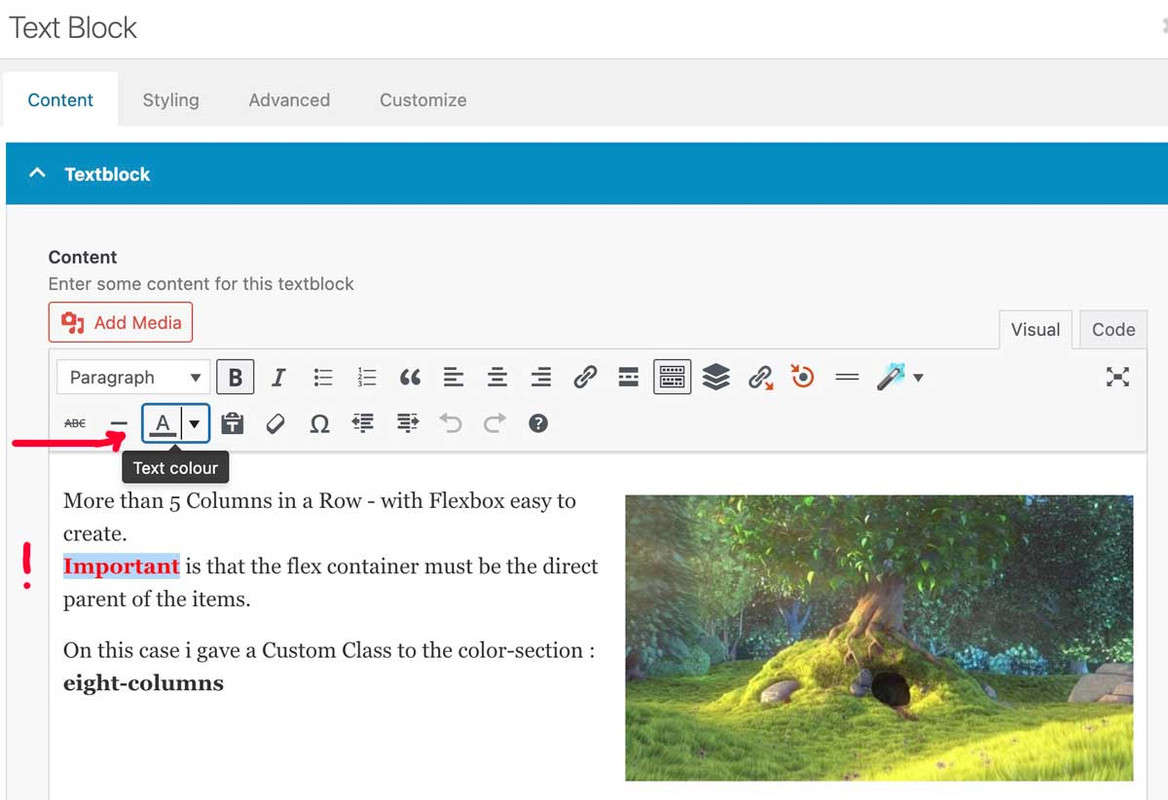
If you use more specific selectors, you can style “strong” differently.
if you want it only on some words in a textblock you had to use the way above from Rikard.
for example if you like to have a different color for them only on one page – use the page ID :
#top.page-id-12345 strong {
  color: black;
}
sometimes it might be necessary to have an !important on the value. (black !important;)
PS: if you are editing text-blocks the editor could do that for you
this will create an inline-style:
<span style="color: #ff0000;"><strong>Important</strong></span>
see here on very small screens: https://webers-web.info/datenschutz/
that sidebar menu on the left goes to a hamburger on top right on small screen width.
you see on the link above (https://jonsuh.com/hamburgers/) – and (on enfold main burger DOM ) what are the class names – i used them too – because then a predefined look is allready present.:
and the script to manage the burger is allready loaded
(page-id-3 – is my privacy page)
add_action('ava_after_main_menu', function() {
if ( is_page(3)){
echo '<nav class="datenschutz-menu" role="navigation">';
echo '<div class="container av-menu-mobile-active">';
echo '<a href="#" class="mobile_menu_toggle no-scroll" aria-hidden="true" data-av_icon="" data-av_iconfont="entypo-fontello"><span class="av-current-placeholder">Datenschutz</span>';
echo '<span class="subnav-hamburger subnav-hamburger--spin-r"><span class="subnav-hamburger-box"><span class="subnav-hamburger-inner"></span></span></span>';
echo '</a>';
echo do_shortcode('[menu name="datenschutz"]');
echo '</div>';
echo '</nav>';
}
});
on that line: echo do_shortcode('[menu name="datenschutz"]'); you see the usage of that menu shortcode
now i got that extra subnav-hamburger (this name is set by me – it only reminds me that this is subnavigation on privacy page )
now i have to have the same behaviour on that second burger menu:
function subnav_hamburger_first(){
if(is_page(array( 3))){
?>
<script>
(function($){
    var $subham = $(".mobile_menu_toggle");
    $subham.on("click", function(a) {
		$subham.find(".subnav-hamburger").toggleClass("is-active");
		$subham.next(".menu-datenschutz-container").find('#menu-datenschutz').toggleClass("av-open-submenu");
    });
	$('#menu-datenschutz li').on("click", function(b) {
		$(this).addClass('selected').siblings().removeClass('selected');
		$(this).parents('#menu-datenschutz').toggleClass('av-open-submenu');
		$(this).parents('.av-menu-mobile-active').find('.subnav-hamburger').toggleClass('is-active');
	});
})(jQuery);
</script>
<?php
}}
add_action('wp_footer', 'subnav_hamburger_first');
This is not a trivial request, which is why there are several paid plugins available. To grasp the complexity of a multilevel burger menu, take a look at the avia-snippet-hamburger-menu.js code.
Hi,
The other sorting items are displayed because some portfolio items belong to multiple categories. For example, the item Harrisonburg Innovation Hub is assigned to “Commercial and Retail”, which is a selected category, but it also belongs to three additional categories, Anthony Barone’s Projects, Ben Reid’s Projects, and Kevin Gabel’s Projects.
Please note that all categories associated with the items will display as sorting options. The “Which Entries Should Be Used” option only controls which items are shown in the masonry element, but it does not control or limit the sorting/filter categories.
If you need to hide the other categories and only display the selected ones, try adding this css code:
#top .av-sort-by-term a, #top .av-sort-by-term .text-sep {
    display: none;
}

#top .av-sort-by-term .commercial-retail_sort_button, #top .av-sort-by-term .education_sort_button, #top .av-sort-by-term .healthcare_sort_button, #top .av-sort-by-term .industrial_sort_button, #top .av-sort-by-term .municipal-civic_sort_button, #top .av-sort-by-term .religious_sort_button {
    display: inline-block;
}
Best regards,
Ismael
Hey Alan,
Thank you for the inquiry.
There is no option for this in the Color section by default, but you can add a custom class name (e.g., av-section-border-radius) to the element under Advanced > Developer Settings > Custom CSS Class field, then add the following css to apply the border radius.
#top #wrap_all .av-section-border-radius {
    border-bottom-right-radius: 100px;
    border-bottom-left-radius: 100px;
}
Another option is the Layout > SVG Divider settings.
View post on imgur.com
Best regards,
Ismael
Hi,
We are trying to load a backup version of one of our sites into a dev environment. When we loaded it, we received the same error as this thread discusses: https://kriesi.at/support/topic/magister10/
To try and fix it, we updated Enfold via FTP, but there are still some issues. I’ve added the dev URL in the private section along with FTP login details.
Any help would be great.
Thanks