Hey tchamp77,
Thank you for the inquiry,
This is to be expected, since the default behavior when clicking an inactive Horizontal Gallery item is to navigate or slide it to the center. This behavior overrides the anchoring to the Accordion items. Once the image is centered, the anchor should work without issue.
To override this behavior, you can try this script in the functions.php file:
<?php
add_action( 'wp_footer', 'ava_wp_footer_script_mod', 99 );

function ava_wp_footer_script_mod() {
    ?>
    <script>
    // override default horizontal gallery clicks behavior to open accordion and scroll to title
    (function($) {
        $(document).on('click', '.av-horizontal-gallery-slider a[href^="#toggle-id-"]', function(e) {
            e.preventDefault();
            e.stopImmediatePropagation();

            var targetId = $(this).attr('href').slice(1);

            setTimeout(function() {
                var $title = $('#toggle-toggle-' + targetId);
                var $wrap  = $('#' + targetId);

                if (!$title.length) return;

                if (!$wrap.hasClass('active_tc')) $title.trigger('click');

                setTimeout(function() {
                    $('html, body').animate({ scrollTop: $title.offset().top - 80 }, 500);
                }, 50);
            }, 50);
        });
    })(jQuery);
    </script>
    <?php
}
Best regards,
Ismael
Hi,
I need a specific header layout that I cannot configure in Enfold.
Required layout desktop and mobile:
– Burger menu left
– Logo perfectly centered in the header
– Transparent header
– Header height 120px desktop / 80px mobile
Both elements should sit on the same vertical center line.
Is there a recommended way to achieve this with Enfold?
Thanks
T
Dear Team,
I want to display one out of 2 two layers slider depending on the device. I tried the following code, but still both sliders are appearing on both devices. How to correct the code?
Thanks a lot and best regards,
Tilman
/* 1. Laptop/Desktop: Slider 1 zeigen, Slider 2 ausblenden */
@media only screen and (min-width: 768px) {
#layerslider_1 { display: block !important; }
#layerslider_25 { display: none !important; }
}
/* 2. Mobile (Handys/Tablets): Slider 2 zeigen, Slider 1 ausblenden */
@media only screen and (max-width: 767px) {
#layerslider_25 { display: none !important; }
#layerslider_1 { display: block !important; }
}
Hi,
We’re using a fixed header on mobile. Also with more height because of an integrated widget. The problem is, if you jump to an anchor on mobile, the anchor and the following headline are hidden behind the fixed header.
Is there a way to adapt the anchor links on mobile?
I tried the solution from the thread https://kriesi.at/support/topic/anchor-links-do-not-work-properly-only-on-mobile/ with a js in functions.php. But this results in a JS error:
Uncaught Error: Syntax error, unrecognized expression: a[href*=#]:not([href=#])
Regards,
Bernd
Morning.
Is there a way of making the background of an element variably transparent for a selected background colour?
Not sure if I have asked the question correctly so please have a look at the top header on the site https://citizenscience.org.za
In order to get the effect of the black transparent background holding the title text in white, I am using a 1/1 Column with a background image inserted to repeat across the element. This background image is a black square with 50% transparency.
I am trying to find out if there are settings for the background of the Column (or other element) which would (1) set the background colour and then (2) allow you to set the transparency of that background colour.
Thank you.
MdF
-
This topic was modified 1 month ago by
 MdF.
MdF.
Hi,
Thanks for the update. Please let us know if you should need any further help on the topic, or if we can close it.
Best regards,
Rikard
@Ismael – that restores the symbol, thanks. But why did the theme change something to stop it working?
Hey zimbo,
Thank you for the inquiry.
What happens when you add the following css code?
#top #header .av-main-nav>li>a>svg:first-child, #top #wrap_all .header_color .cart_dropdown_first .cart_dropdown_link.avia-svg-icon svg:first-child {
    fill: #000;
    stroke: #000;
}
Best regards,
Ismael
This is because of
#top #wrap_all .header_color .cart_dropdown_first .cart_dropdown_link.avia-svg-icon svg:first-child {
    fill: #fff;
Something has changed in the theme because this used to display correctly.
See https://ibb.co/9Hryxdfr (you can see/create this for yourself by adding any painting to the Cart via “Add to basket” then just delete it from the Cart after investigating)
Please can you advise what I need to change (presumably) in Theme Options to get this showing again?
Hi,
I can not view your page as it is maintenance mode. You can not use the advanced layer builder on category pages.
But we can change the Prints link in the breadcrumb to your prints page instead of the new prints page that you want to use as a custom category page.
So the first step is to add a new product category “Prints” and make it the parent of any other category that you wish for it to show in the breadcrumb trail.
Then add this code to your child theme functions.php if you are not using a child theme you could use the WP Code plugin then add a new snippet, in the top right corner use the PHP snippet as the code type: 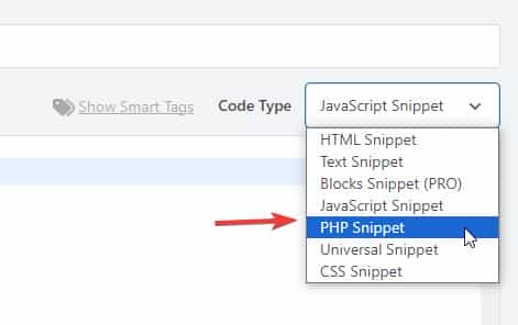 then add the code below and save.
function change_breadcrumb_trail() { ?>
  <script>
document.addEventListener('DOMContentLoaded', function() {
const printsLink = document.querySelector('.breadcrumb-trail a[href="http://enfold.test/product-category/prints/"]');

if (printsLink) {
  printsLink.href = 'http://enfold.test/prints/';
}
});
</script>
  <?php
}
add_action( 'wp_footer', 'change_breadcrumb_trail', 99 );
Ensure that you change the URLs in the code above to your site, and make sure to use the full URL.
Best regards,
Mike
Hey A1city,
The demo images were purchased with an extended license from Photodune.net (the Envato Stock website) with some images from peopleimages.com that are Royalty Free Images. I’m not sure exactly which site that image is from, but I think it’s from Photodune.net due to it’s age.
See this thread: https://kriesi.at/support/topic/abmahnung-wegen-bildrechtverstos/
Kriesi states that his extended license allows end users to use the images in the theme, but not outside the theme.
If you want to have your own license to images on your site for future reference, there are many Royalty Free Images sites, this would also ensure that you site doesn’t look exactly like the demo and other sites that use the same demo. Just a thought.
Best regards,
Mike
Hi,
To shrink the header and logo on mobile scroll I added this css to the end of your Quick CSS field:
/* mobile shrinking header */
@media only screen and (max-width: 767px) {
#top #header:not(.av_header_transparency) #header_main > .container {
	 height: 70px !important;
   line-height: 70px !important;
}
.responsive #top #header:not(.av_header_transparency) .logo img {
   height: 60px !important;
}
.responsive #top #wrap_all #header:not(.av_header_transparency) .main_menu {
    top: -12px;
}
}
adjust to suit.
As for moving the logo up away from the text try this css and adjust to suit:
.responsive #top #header .logo img {
top: -10px;
}
but you don’t have much room in the header, so you may need to adjust the previous css that changed the size of the logo to suit, I can not because I don’t see the same as you do, to me it looks like plenty of room:

Best regards,
Mike
And when I click on the elfsight link, it seem to send me to the top of the Home page, instead of the section I was in when I click the link.
Hey Tilman,
When I check your page the horizontal galleries behave as intended, clicking a image enlarges it until the next one is clicked. It’s true that they stay enlarged. If you want the image size to be restored after 5 seconds, try this function in your child theme function.php file. If you are not using a child theme you could use the WP Code plugin then add a new snippet, in the top right corner use the PHP snippet as the code type:
then add the code below and save.
function restore_horizontal_gallery_size() { ?>
  <script>
document.querySelectorAll('.av-horizontal-gallery-wrap').forEach(item => {
    item.addEventListener('click', function () {
        clearTimeout(this._galTimer);
        this._galTimer = setTimeout(() => {
            this.classList.remove('av-active-gal-item');
        }, 5000);
    });
});
</script>
  <?php
}
add_action( 'wp_footer', 'restore_horizontal_gallery_size', 99 );
Best regards,
Mike
Hi,
Try this css and adjust to suit:
.html_av-overlay-full #top #wrap_all #av-burger-menu-ul li li {
    line-height: 0.4em;
}

Best regards,
Mike
Hi,
There is not a setting, you will need to use css. Since I’m not seeing the same as you I had to guess a little, try the following css and adjust to suit:
@media only screen and (max-width: 767px) {
    #top .logo img {
    max-height: 140px;
    }
    #top .logo img {
    left: 55%;
    transform: translateX(-50%);
    }
    #top .av-burger-menu-main {
    transform: translateY(-38%) !important;
    }
    .av-hamburger-box {
    width: 50px!important;
    }
    .av-hamburger-inner::before{
    top: -15px;
    }
    .av-hamburger-inner::after {
    bottom: -15px;
		}
		.av-hamburger-inner, .av-hamburger-inner::before, .av-hamburger-inner::after {
    height: 6px;
		}
}
This is how it looks for me with this css:

Best regards,
Mike
Hey Sabina,
Did you try to activate the Layout Builder at the top of each page?
You need to register at the support forum: https://kriesi.at/support/register/. The start a new thread in the Enfold sub forum.
Best regards,
Rikard
Hi,
This is how it looks on my mobile:

The logo & burger menu both look large to me, do you still want them larger?
If you want to show the social icons on mobile, I recommend showing them in the top bar, but this will also show on desktop, probably not what you want.
How about adding the social icons to mobile menu?
Best regards,
Mike
Hey Erik,
The update to 7.1.4 has to be done manually from the version you are running, please refer to my replies in this thread: https://kriesi.at/support/topic/enfold-4-5-theme-update-update-failed-download-failed-a-valid-url-was-not-pro/#post-1021541
You can either update manually via FTP: https://kriesi.at/documentation/enfold/how-to-install-enfold-theme/#theme-update, or upload the theme as if it was new under Appearance->Themes->Add New Theme.
If that doesn’t work then please try to delete the whole theme folder, then replace it with the new version. Make sure that you have backups of the site before starting updating.
Also please read this after you have updated: https://kriesi.at/documentation/enfold/theme-registration/
Best regards,
Rikard
Hi Ismael,
I wanted to follow up with one additional detail that may be relevant.
Around the same time this issue started, we were also investigating a possible increase in bot or automated traffic on the site. In response, some changes were made on the Cloudflare side. Since the timing overlaps with when the Avia Layout Builder stopped working properly, I wanted to share that in case it helps identify the cause.
The Cloudflare-side changes that were made included the following:
• Bot Fight Mode enabled
• Rate limiting / protection rules added for:
• /wp-admin/admin-ajax.php
• /wp-json/*
• Custom WAF / firewall rules added to:
• block or restrict unusual hostnames
• challenge traffic hitting /cdn-cgi/
• Performance-related settings enabled, including:
• Rocket Loader
• Auto Minify
• possibly other optimization / caching-related settings
• Cache rules added for some localized paths
Because Avia relies heavily on JavaScript and AJAX in the WordPress admin, I am wondering whether one or more of these Cloudflare changes could be interfering with the builder load process. In particular, I wanted to mention:
• whether Rocket Loader could be affecting script execution in the admin
• whether requests to /wp-admin/admin-ajax.php are being throttled, challenged, or blocked
• whether /wp-json/* requests that the builder depends on are being affected
• whether any caching or optimization is unintentionally touching admin/backend requests
We are also checking this from the Cloudflare side, but I wanted to make sure you had the full picture in case this helps explain the script errors you mentioned seeing.
We edit the site daily, so this is quite urgent for us. I would be very grateful if you could please let us know whether these types of changes could plausibly cause the Avia Layout Builder to fail to load, and whether there is anything specific you would recommend checking.
Thank you again for your help.
Roberta
Hi Ismael,
Thank you so much for looking into this further.
We have not installed any new plugins recently. However, we have been updating existing plugins, as well as the Enfold theme. The last changes we pushed from our dev environment to live were the Enfold theme update and the Yoast plugin update five days ago, and we believe that may be when this issue started.
What I find especially interesting is that I checked our dev site, and the builder appears to be working properly there, while the issue is happening on our live site. I’m sharing the dev login credentials below as well in case it is helpful for comparison.
One other thing that may be worth mentioning: last month I made a change to the functions.php file because our EveryAction (our nonprofit CRM we use for donations, data collection) forms that are embedded throughout our website had stopped working on the backend (same issue, infinite spinning, but just on the pages were the forms were embedded). I added a script there to fix that issue, and it resolved the problem. Since everything was working fine afterward, I do not think that is the cause here, but I wanted to mention it just in case it may be relevant. I’m also sharing the code changes below for reference.
Unfortunately, as a very small nonprofit, we do not have in-house developers. I am largely self-taught and far from an expert, so I would be very grateful if you could please help us identify what is causing this issue and what might be going wrong. We edit our site on a daily basis, so not being able to access or use the builder properly is a significant issue for us right now.
Thank you again for your help, we really appreciate it.
Roberta
Hi,
Thank you for the inquiry.
Try this css code to adjust the color and font size of the submenu items.
.html_av-overlay-side #top #wrap_all .av-burger-overlay-scroll #av-burger-menu-ul li ul a {
    color: rgba(255,255,255) !important;
    font-size: 0.8rem;
}
The menu items with submenus should have angled brackets (>) by default.
Best regards,
Ismael
Hi,
Your screenshots are not working but I understand. Your issue seems to be related to a cache, when I check your page with Firefox & Edge the accodeon toggles are gray because the mouseover color is set by the main-color-bg set in the theme options #e1e1e1:
.main_color .toggler:hover {
background: var(--enfold-main-color-bg2);
}
If you what them to be orange then try changing that color in the theme settings, but note that this color setting changes many elements in the theme. If you don’t want everything to change then try this css:
#top .main_color .toggler:hover {
	background: #db5200;
}
As for your second question, I can’t see the screenshot but I see that the top color section has a background color of white. Try changing the color in the color section, or try this css:
.page-id-9206 #av_section_1.main_color {
	background-color: #d5c58a;
}
After these changes clear all of your caches.
Best regards,
Mike
Hi,
On your /find-food/ page your column Vertical Alignment was set to middle, I changed it to top
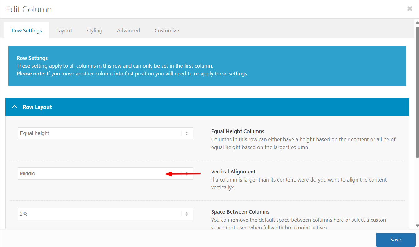
The reason is that the first column has more text which sets the height for the other two columns, but with the Vertical Alignment set to middle the other two columns center the content. In the screenshot notice how the special heading titles and images do not line up:
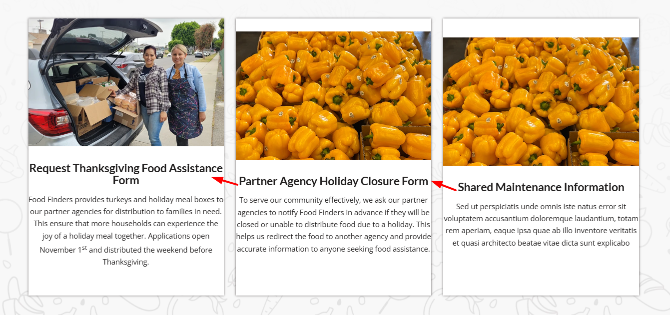
After making the change everything lines up:
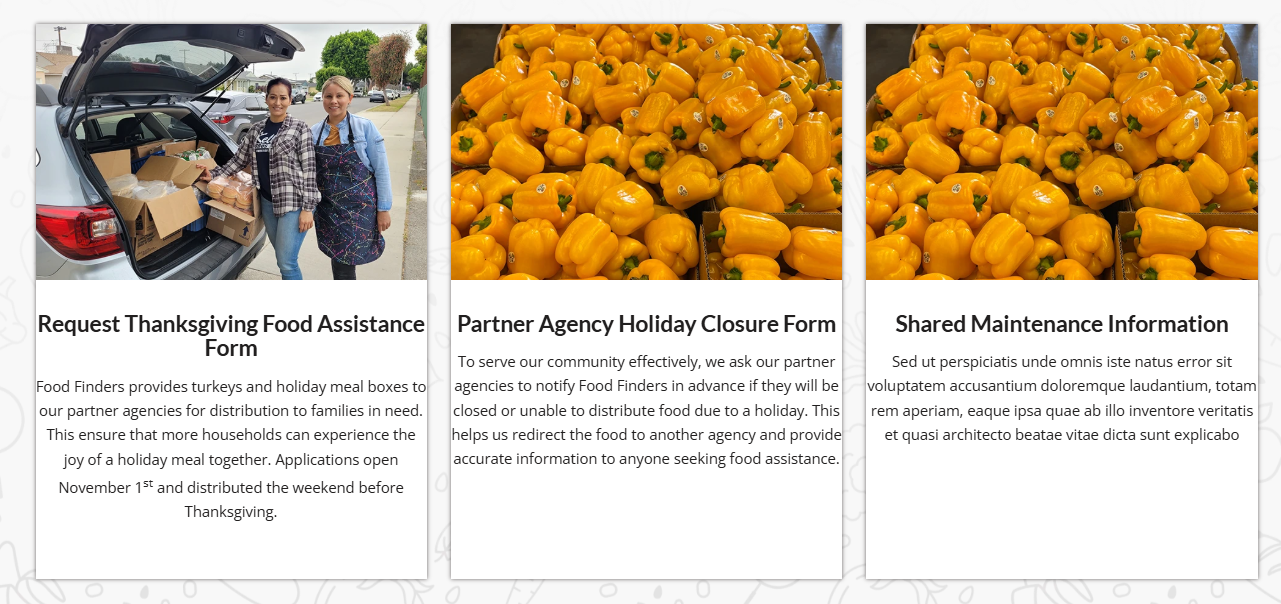
I made this change to the other pages that you listed above and the all work now.
Keep Ismael’s CSS above as it forces the buttons to the bottom of the columns without using extra HR elements.
Best regards,
Mike
I just realized that there’s a second problem : the top banner with “la gamme” should be on a kaki background like this : https://ibb.co/DDHwJLwz
But again, it works correctly on firefox on my computer, but as soon as I try on edge I only have a black title on a white background.
THe exacdt same thing happens if I try on a different computer or on a phone.
Something semms to be broken somewhere…
Can you help please ?
Note : I work on many websites with Enfold and I’ve never had that kind of troubles…
In advance, thank you for your help.
Dear team, On my draft page below, I use in the middle section a horizontal gallery. Below: “Ein paar Dinge, die hier einfach normal sind”:
it looks fine on laptop, but on mobile the pics are cutted top and bottom. on mobile It does not make a difference to set the gallery with a different percentage of height. the image setting is and shall be: no scaling
How can I ensure that the pictures are not cropped on mobile?
Thanks and best regards,
Tilman!
Hi,
You can try setting the width of the iconbox to 90% or lower. Let us know the result.
#top .iconbox {
    background: white;
    padding: 20px;
    border: 1px solid gray;
    width: 90%;
}
Best regards,
Ismael
Hi,
Kindly edit the Color Section that contains the columns and assign it the class name “av-program-columns”. We have updated one of the pages (see private field) with the new class name and applied the following css in the Quick CSS field.
#top .av-program-columns .flex_column_table.av-equal-height-column-flextable .avia-button-wrap {
    position: absolute;
    bottom: 0;
    width: 100%;
}

#top .av-program-columns .flex_column_table.av-equal-height-column-flextable .flex_column {
    padding-bottom: 50px;
}
You can do the same for the remaining pages.
Best regards,
Ismael
maybe this helps you on that:
only to show that you can have video, websites or images in one lightbox group.
INFO: due to GDPR ( DSGVO in Germany ) i can not show the working script for video content – it is hard to block this – playing videos from a masonry or from an image linked to a video.
or not only for masonries:
https://kriesi.at/support/topic/lightbox-pdf-not-working-shows-up-black-multiple-solutios/#post-1495451
Hi, I ‘m trying to have my pdfs load in a lightbox. I have tried 2 methods – the first being adding this code which didnt work. The second thing I treid (which I prefer) is the adding the plugin ARI Fancy Lightbox. But the same things happens and it is just black and the pdf wont load.