Hi there,
yes, I need still some help. My CSS is working quite well in desktop mode, but it is not really responsive. When switching to tablet and mobile view, the background image is getting compressed.
Any idea for a good looking solution?
Best regards
Bettina
Hi,
Please try the following in Quick CSS under Enfold->General Styling:
@media only screen and (max-width: 767px) {
#top .avia-gallery.av-mb6m8z6a-b9f99ac9fd31fe48d94c453aabd891f1 .avia-gallery-thumb a {
  width: 50%;
}
}
Best regards,
Rikard
Hi
as you see here the navigation controls for the gallery are “far out”.
Image:
https://gwup.org/temporaer/enfold-navi-bug.jpg
Live:
They are supposed to be IN the gallery and not miles above.
This bug can be reproduced.
Please tell me how to fix it (and fix it in your next update!)
Here is the shortcode to reproduce it:
[av_section min_height='100' min_height_pc='25' min_height_px='500px' shadow='no-border-styling' bottom_border='no-border-styling' bottom_border_diagonal_color='#333333' bottom_border_diagonal_direction='' bottom_border_style='' padding='default' margin='aviaTBmargin' custom_margin='0' custom_margin_sync='true' av-desktop-custom_margin='' av-desktop-custom_margin_sync='true' av-medium-custom_margin='' av-medium-custom_margin_sync='true' av-small-custom_margin='' av-small-custom_margin_sync='true' av-mini-custom_margin='' av-mini-custom_margin_sync='true' svg_div_top='' svg_div_top_color='#333333' svg_div_top_width='100' svg_div_top_height='50' svg_div_top_max_height='none' svg_div_top_opacity='' svg_div_bottom='' svg_div_bottom_color='#333333' svg_div_bottom_width='100' svg_div_bottom_height='50' svg_div_bottom_max_height='none' svg_div_bottom_opacity='' fold_type='' fold_height='' fold_more='Weiterlesen' fold_less='Read less' fold_text_style='' fold_btn_align='' color='main_color' background='bg_color' custom_bg='' background_gradient_direction='vertical' background_gradient_color1='#000000' background_gradient_color2='#ffffff' background_gradient_color3='' src='' attachment='' attachment_size='' src_dynamic='' attach='scroll' position='top left' repeat='stretch' video='' video_ratio='16:9' overlay_enable='aviaTBoverlay_enable' overlay_opacity='1' overlay_color='#003833' overlay_pattern='{{AVIA_BASE_URL}}images/background-images/diagonal-thin-dark.png' overlay_custom_pattern='' custom_arrow_bg='' fold_overlay_color='' fold_text_color='' fold_btn_color='theme-color' fold_btn_bg_color='' fold_btn_font_color='' size-btn-text='' av-desktop-font-size-btn-text='' av-medium-font-size-btn-text='' av-small-font-size-btn-text='' av-mini-font-size-btn-text='' fold_timer='' z_index_fold='' css_position_z_index='' av-desktop-css_position_z_index='' av-medium-css_position_z_index='' av-small-css_position_z_index='' av-mini-css_position_z_index='' id='' custom_class='backgroundvilla' template_class='' aria_label='' av_element_hidden_in_editor='0' av_uid='av-fhey3j' sc_version='1.0']
[av_icon_box icon='ue80b' font='entypo-fontello' title='Lorem Ipsum' position='top' icon_style='' boxed='' font_color='' custom_title='' custom_content='' color='' custom_bg='' custom_font='' custom_border='' custom_title_size='' av-desktop-font-size-title='' av-medium-font-size-title='' av-small-font-size-title='' av-mini-font-size-title='' custom_content_size='' av-desktop-font-size='' av-medium-font-size='' av-small-font-size='' av-mini-font-size='' heading_tag='div' heading_class='biszu' link='' link_dynamic='' linktarget='' title_attr='' linkelement='' id='' custom_class='' template_class='' av_uid='av-c6iolb' sc_version='1.0' admin_preview_bg='']
<h1>Lorem Ipsum dolor sid amend dolores</h1>
Weit hinten, hinter den Wortbergen, fern der Länder Vokalien und Konsonantien leben die Blindtexte. Abgeschieden wohnen sie in Buchstabhausen an der Küste des Semantik, eines großen Sprachozeans. Ein kleines Bächlein namens Duden fließt durch ihren Ort und versorgt sie mit den nötigen Regelialien. Es ist ein paradiesmatisches Land, in dem einem gebratene Satzteile in den Mund fliegen. Nicht einmal von der allmächtigen Interpunktion werden die Blindtexte beherrscht – ein geradezu unorthographisches Leben. Eines Tages aber beschloß eine kleine Zeile Blindtext, ihr Name war Lorem Ipsum, hinaus zu gehen in die weite Grammatik.
[/av_icon_box]
[av_gallery ids='12076,12077,12078,12079,12080' ids_dynamic='' style='big_thumb lightbox_gallery' preview_size='no scaling' crop_big_preview_thumbnail='avia-gallery-big-crop-thumb' thumb_size='medium' columns='12' thumbs_hover='' control_layout='av-control-default' slider_navigation='av-navigate-arrows' nav_visibility_desktop='av-nav-arrows-visible' nav_arrow_color='' nav_arrow_bg_color='' imagelink='lightbox' link_dest='' lightbox_text='no_text' lazyload='avia_lazyload' img_scrset='' html_lazy_loading='disabled' alb_description='' id='' custom_class='' template_class='' av_uid='av-mb5at8df' sc_version='1.0' admin_preview_bg='']
[/av_section]
kind regards
Andrè
Hi,
Thank you for the update.
To hide the post tags, you can add this code in the Quick CSS field or the style.css file:
#top #wrap_all .slide-meta-tags {
    display: none;
}
Let us know the result.
Best regards,
Ismael
Hey Sebastian,
Thank you for the inquiry.
Apply a Custom CSS Class name (e.g “avia-custom-gallery”) to the Gallery element in the Advanced > Developer Settings panel, then add this css code to adjust the width of the items on mobile view.
@media only screen and (max-width: 767px) {

  /* Add your Mobile Styles here */
  #top .avia-custom-gallery .avia-gallery-thumb a {
    width: 25%;
  }
}
Best regards,
Ismael
It is only one slide as a static graphic that the desire is for that graphic to butt up to the top menu bar.
It only appears in tablet and smartphone dimensions, but does not appear in desktop dimensions.
Hopefully this answers your question.
Thanks!
Thank you for the quick reply!
The occurrence happens when viewing on my desktop screen with at least 1200 pixels wide on the browser setting. When I collapse the screen width to tablet and smartphone sizing the slider appears, but not on the desktop.
I look forward to your feedback.
Thanks again!
Hey guylene1,
I see that you are running an old version of the theme, could you try to update to the latest version (7.1.1) to see if that helps please? The update to 7.1.1 has to be done manually from the version you are running, please refer to my replies in this thread: https://kriesi.at/support/topic/enfold-4-5-theme-update-update-failed-download-failed-a-valid-url-was-not-pro/#post-1021541
You can either update manually via FTP: https://kriesi.at/documentation/enfold/how-to-install-enfold-theme/#theme-update, or upload the theme as if it was new under Appearance->Themes->Add New Theme.
If that doesn’t work then please try to delete the whole theme folder, then replace it with the new version. Make sure that you have backups of the site before starting updating.
Also please read this after you have updated: https://kriesi.at/documentation/enfold/theme-registration/
Best regards,
Rikard
Hello, since I have a positioned text on the main image in top that lays on top of the blue field (where the button is), part of the Botton is not clickable. How to position only the Botton to be on top?
I’m stuck with the Fullwidth Easy Slider. It only works in smartphone and tablet environments, but not desktop. I will supply a private link for your review. I hope that you can point me the way.
Thank you!
Hi,
Thank you for the update.
and when I set it to “scale to fit”, it doesn’t show on mobile.
The background is set to “scale to fit” and it’s still visible on smaller screens when we checked. If the issue still occurs on your end, try to duplicate the section, adjust the background size settings, one using “scale to fit” and the other “stretch to fit”, then toggle the sections’ visibility for different sizes using the Advanced > Responsive > Element Visibility options.
View post on imgur.com
You can also add this css code to manually adjust the background size to “cover” or “stretch to fit” on smaller screens:
@media only screen and (max-width: 989px) {

  /* Add your Mobile Styles here */
  #top #wrap_all .flex_cell.av-m7hqe6b7-0a95c68b280818d6da5bb44681988588 {
    background-size: cover !important;
  }
}
Best regards,
Ismael
Hi,
We can’t reproduce the issue with the section backgrounds. Would you mind providing a screenshot of the issue? You can use platforms like Savvyify, Imgur or Dropbox to upload and share the screenshot.
View post on imgur.com
If you have any additional questions at this time we kindly ask that you open them up in a separate thread. The longer threads get in the forum, they become more difficult to support as they tend to drift off topic and they also make it troublesome for users trying to search for solutions. Keeping threads relevant to their original inquiry ensures that we can keep better track of what has been resolved and that users can more effectively find answers to similar issues they might be experiencing.
Thanks!
Best regards,
Ismael
Hello again,
I still have the problem: I’ve now moved the site to the original domain, and the issue is not related to the browser, but to the column settings. I’m using the image as a column background, and when I set it to “scale to fit”, it doesn’t show on mobile. When I change it to “stretch to fit”, it does appear — but then the resolution looks strange and unattractive on desktop. What’s the solution?
Best regards
Don´t know if I got this right…only put this in?
Like this?
@media only screen and (max-width: 767px) {
/* Add your Mobile Styles here */
#top .header_color .av-hamburger-inner,
#top .header_color .av-hamburger-inner::before,
#top .header_color .av-hamburger-inner::after {
background-color: #000000;
}
}
Hey!
Thank you for the inquiry.
Did you add this css code?
@media only screen and (max-width: 767px) {
    #top .header_color .av-hamburger-inner,#top .header_color .av-hamburger-inner::before,#top .header_color .av-hamburger-inner::after {
        background-color: var(--enfold-header_burger_color);
    }
}
This sets the color of the hamburger menu icon to white. You can replace it with:
@media only screen and (max-width: 767px) {

  /* Add your Mobile Styles here */
  #top .header_color .av-hamburger-inner,
  #top .header_color .av-hamburger-inner::before,
  #top .header_color .av-hamburger-inner::after {
    background-color: var(--enfold-main-color-color);
  }
}
Regards,
Ismael
Hi,
However, I believe there may have been a misunderstanding regarding the issue. The problem is not with the icon itself or its aria-hidden attribute, but with the structure and function of the link that wraps the icon.
If we’re not mistaken, the issue occurs because the SVG icon includes the aria-hidden attribute, which makes it unreadable to accessibility tools. As a result, the parent link is marked as “suspicious” since the icon is hidden and the link lacks any accessible text or description. The span avia_hidden_link_text, which contains the word “Search” also has its display property set to none, making it inaccessible to screen readers as well.
Removing the aria-hidden attribute from the SVG icon or adjusting the visibility of the avia_hidden_link_text should help.
#top .avia_hidden_link_text {
    position: absolute;
    width: 1px;
    height: 1px;
    padding: 0;
    margin: -1px;
    overflow: hidden;
    clip: rect(0 0 0 0);
    white-space: nowrap;
    border: 0;
}
You can also try editing the enfold/includes/config-enfold/functions-enfold.php, around line 125, change the text “Search” to “Click here to search”.
$items .= '<span class="avia_hidden_link_text">' . __( 'Click Here to Search', 'avia_framework' ) . '</span>';
According to https://wave.webaim.org/, screen readers tend to better interpret buttons or links when it contains more descriptive text.
View post on imgur.com
If this doesn’t help, you can always try the suggestions above.
Let us know the result.
Best regards,
Ismael
Hey tonyiatridis,
Thank you for the inquiry.
We enabled the Project Settings > Navigation > Show Navigation Buttons > Slide Navigation Buttons, then added this css code to make the thumbnail navigation fullwidth.
.ls-noskin .ls-thumbnail {
    top: 0px;
    width: 100% !important;
}
View post on imgur.com
Best regards,
Ismael
Hi Guys,
Just wondering if there will be any new demo releases and widgets coming through in any of the updates? I love Enfold and really used to it but would be good if there were different hamburger menu designs and header styles for mob etc also different header styles for desktop for phone numbers and emails with icons ready to go?
Just asking if there is anything new bubbling to get excited about
Cheers
Aron
Hey Enfoldfanatic,
It looks like you have this css that is making it white:
#top #wrap_all .header_color .cart_dropdown_first .cart_dropdown_link.avia-svg-icon svg:first-child {
    fill: #ffffff;
}
see if you can remove this, or you can try adding this:
#top #wrap_all .header_color #menu-item-shop .cart_dropdown_first .cart_dropdown_link.avia-svg-icon svg:first-child {
    fill: #000;
}
Best regards,
Mike
#menu-item-2351 {
  margin-left: 5px;
}
#av-burger-menu-ul .menu-item-2351 {
  margin-top: 10px !important;
}
if you like to have more distance in hamburger menue too.
you mean when hamburger is visible.
put that rule of ismael inside a media-query:
@media only screen and (min-width: 989px) {
  #top .av_header_transparency .header_bg {
    opacity:1;
    background:linear-gradient(to bottom,#132444,rgba(17,18,53,0))
  }
}
I have uploaded an example on ImgBB: https://ibb.co/8LpmsTLR
Those headings should be placed on top of every section of my onepager. The background form (or image) should have those diagonal edges. Any idea?
try this:
#top .avia-slideshow .avia-slideshow-arrows a::before {
  background: rgba(0,0,0,0.7) !important;
}

#top .avia-slideshow .avia-slideshow-arrows svg {
  height: 2em;
  margin-top: 0 !important;
  line-height: 0 !important;
  position: absolute;
  top: 50%;
  transform: translate(-50%, -50%);
  left: 50%;
}

#top .avia-slideshow .avia-slideshow-arrows a:hover svg {
  fill: yellow;
  transition: all 0.7s ease;
}

#top .avia-slideshow .avia-slideshow-arrows a:hover svg path {
  stroke-width: 1;
  stroke: yellow;
  stroke-linecap: round;
}
because now i guess these icons are svg files allready. so to make them thicker use stroke-width on the path.
Hi,
i have a gallery with 4 columns – looks nice on desktop.
But in the mobile version ist a bit to small – so is there a way to make 2 columns on mobile with CSS like this “@media only screen and (max-width: 767px){”
Thank you for helping!
Hey limedrop,
Thank you for the inquiry.
You can try this css code to apply a linear gradient background color to the header:
#top .av_header_transparency .header_bg {
    opacity: 1;
    background: linear-gradient(to bottom, #0f114c, rgba(15, 17, 76, 0));
}
You may need to adjust the color of the main menu items as well.
Best regards,
Ismael
Can I please have a css the will give me the opportunities to have a gradient color in top header? Now I have it in the image, but it would be easier to have it in the code.
see a similar Problem with an inline svg in the content. https://kriesi.at/support/topic/svg-transparent/#post-1469552
both svg logos are present in the DOM only opacity rules the visibility. The transparency logo is after the normal logo:
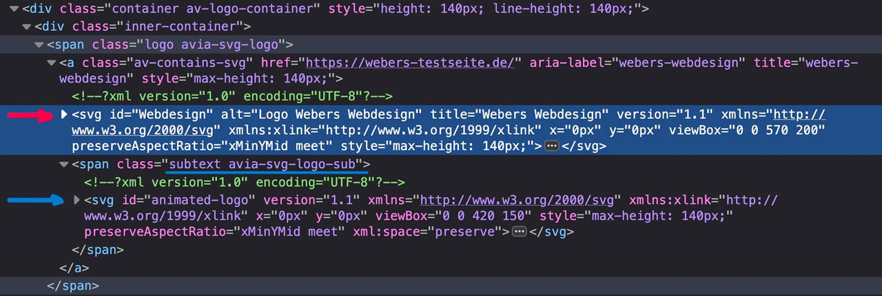
if there are same classes defined inside the inline svg files the last one (transparency logo inside the subtext) will win the css race ;)
Look with a good text editor to your svg files to see the culprit.
If you can make the link to your page public – i can give you better advice.
maybe you get rid of that top border by:
#after_full_slider_1.container_wrap {
  border-top-width: 0;
}